
position 속성은 요소의 위치를 지정하는 데 사용됩니다. 그러나 위치를 직접적으로 지정하는 것이 아니라, 해당 요소를 어떤 기준으로 배치할지를 지정하는 역할을 합니다. 따라서 요소를 배치할 때는 어떠한 기준을 먼저 잡고 나서 위치값(top, bottom, left, right, z-index)을 설정해야 합니다.
position 속성
- static
- relative
- absolute
- fixed
- sticky
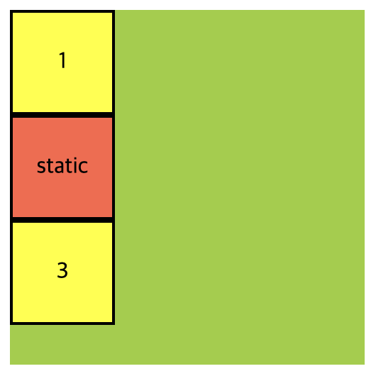
static
position의 속성을 별도로 지정해주지 않으면 기본값인 static이 적용되며 이 설정은 일반적으로 다른 position 값들과는 달리 추가적인 위치 조정이나 이동을 하지 않습니다. 요소는 문서 흐름에 따라 순서대로 배치되며 다른 요소들과 겹치지 않습니다.
.container {
  width: 400px;
  height: 400px;
  background-color: yellowgreen;
}

.container .item {
  text-align: center;
  line-height: 100px;
  width: 150px;
  height: 100px;
  border: 2px solid black;
  background-color: yellow;
}

.container .item:nth-child(2) {
  position: static;
  background-color: tomato;
}<div class="container">
<div class="item">1</div>
<div class="item">static</div>
<div class="item">3</div>
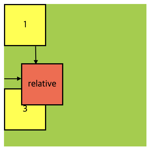
</div>relative
요소를 자기 자신을 기준으로 상대적인 위치로 이동시킵니다. 이것은 요소를 일반적인 문서 흐름에 따라 배치하되, 추가적인 위치 조정을 할 수 있게 합니다. position: relative를 설정한 후에 위치값을 지정해주지 않으면 요소는 원래 위치에 그대로 배치됩니다.
.container {
  width: 400px;
  height: 400px;
  background-color: yellowgreen;
}

.container .item {
  text-align: center;
  line-height: 100px;
  width: 150px;
  height: 100px;
  border: 2px solid black;
  background-color: yellow;
}

.container .item:nth-child(2) {
  position: relative;
  top: 30px; /* 위치값 지정 */
  left: 30px; /* 위치값 지정 */
  background-color: tomato;
}
해당 요소가 원래 있던 위치를 기준으로 위에서 30px, 왼쪽에서 30px 지점으로 이동되었음을 확인할 수 있습니다. 이동된 위치에 요소가 배치된 후에는, 시각적으로는 이전 위치가 비어 있는 것처럼 보일 수 있지만 실제로는 해당 요소가 원래 위치에 존재합니다. 다만 그 위치에서 시각적으로 가려져있을 뿐 입니다. 이는 relative의 특징 중 하나이며, 일반적으로 relative를 사용할 때 자기 자신을 기준으로 상대적인 위치 이동보다는 부모 요소를 기준으로 자식 요소를 배치하는 경우가 더 많습니다.
absolute
absolute를 사용할 때 해당 요소는 위치 상 부모 요소를 기준으로 배치됩니다. 부모 요소 중에서 가장 가까운 position속성이 relative, absolute, fixed 또는 stiky로 설정된 요소가 기준이 됩니다. 만약 이러한 부모 요소가 없다면, 문서(body) 전체를 기준으로 배치됩니다.

.container {
width: 400px;
height: 400px;
background-color: yellowgreen;
}
.container .item {
text-align: center;
line-height: 100px;
width: 150px;
height: 100px;
border: 2px solid black;
background-color: yellow;
}
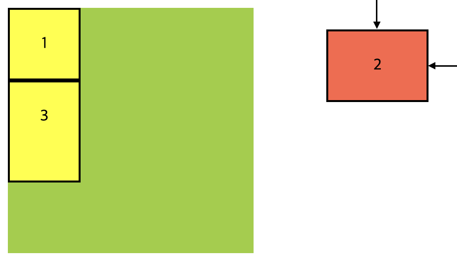
.container .item:nth-child(2) {
position: absolute;
background-color: tomato;
}
.container .item:nth-child(3) {
height: 100px;
}item2에 가려서 보이지 않지만 item3은 item1과 붙어있는 상태 입니다. position: absolute를 사용하면 해당 요소는 일반적인 문서 흐름에서 제거되고, 가까운 부모 요소중 position값이 relative, absolute, fixed 또는 stiky로 설정된 요소를 기준으로 위치가 결정됩니다. 만약 이러한 부모 요소가 없다면 문서 전체(body)를 기준으로 배치됩니다.
.container {
width: 250px;
height: 250px;
background-color: yellowgreen;
}
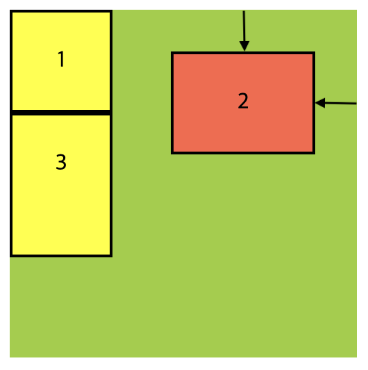
.container .item:nth-child(2) {
position: absolute;
top: 30px;
right: 30px;
}position: absolute를 사용한 요소의 위치 값은 해당 요소를 둘러싼 위치상의 부모 요소 중에서 position 값이 relative, absolute, fixed로 설정된 요소를 기준으로 결정됩니다. 현재의 구조상의 부모 요소인 .container에 대한 position 속성이 설정되어 있지 않기 때문에position: absolute를 가진 item2는 문서 전체(body)를 기준으로 위치가 결정되며, 뷰포트 상단에서 30px 아래, 오른쪽에서 30px 위치로 이동하게 됩니다.
.container {
  width: 250px;
  height: 250px;
  background-color: yellowgreen;
  position: relative;
}

.container .item:nth-child(2) {
  position: absolute;
  top: 30px;
  right: 30px;
}.container에 position: relative를 추가하면 해당 요소가 위치상 부모 요소가 되어, 그 안에 포함된 자식 요소들에게 상대적인 위치를 설정할 수 있게 됩니다. 따라서, position: absolute를 가진 item2는 이제 .container를 기준으로 위치가 결정 되며 오른쪽에서 30px, 위쪽에서 30px 아래로 이동한 위치에 표시됩니다.
fixed
요소를 뷰포트(viewport) 기준으로 고정시키는 CSS 속성입니다. 뷰포트는 사용자가 현재 보고 있는 브라우저 창의 영역을 말합니다. fixed로 설정된 요소는 스크롤되더라도 항상 뷰포트의 특정 위치에 고정되어 표시됩니다.
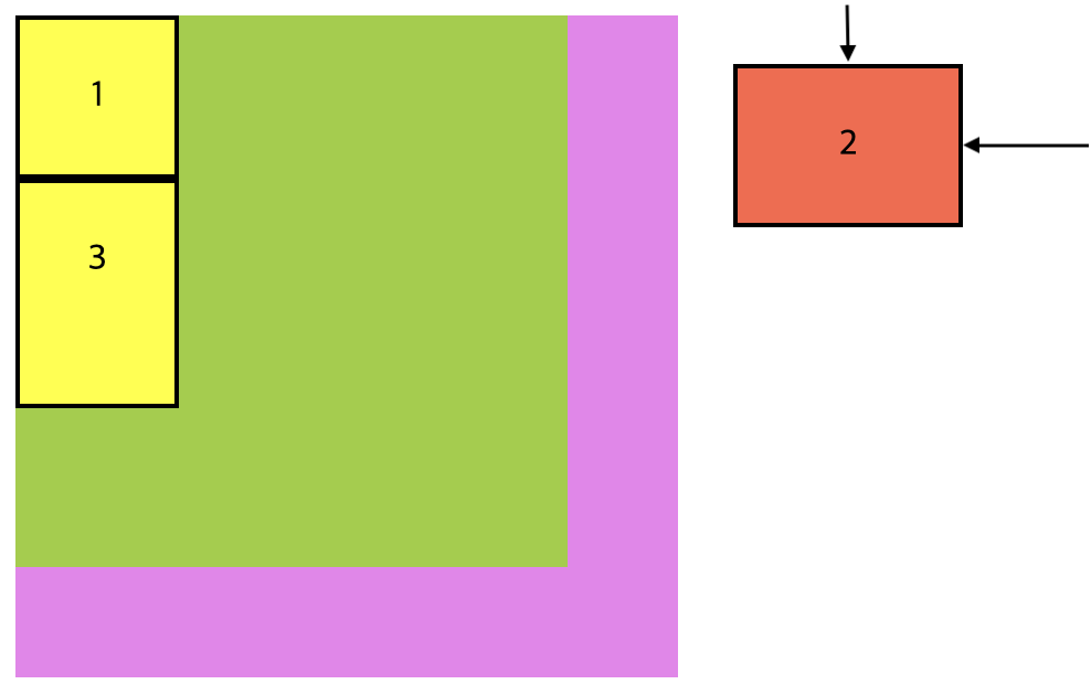
<div class="wrap">
    <div class="container">
      <div class="item">1</div>
      <div class="item">2</div>
      <div class="item">3</div>
    </div>
</div>
.wrap {
width: 350px;
height: 350px;
background-color: violet;
position: relative;
}
.container {
width: 250px;
height: 250px;
background-color: yellowgreen;
position: relative;
}
.container .item:nth-child(2) {
position: fixed;
top: 30px;
right: 30px;
}position: fixed로 설정된 요소는 부모 요소의 위치 상태와 상관없이 뷰포트를 기준으로 배치됩니다. 부모 요소가 position: relative를 가지고 있더라도 fixed가 적용된 요소는 그 부모 요소에 상대적이지 않고 뷰포트에 대해 고정된 위치에 표시됩니다.
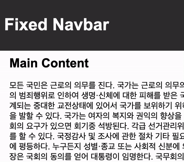
<div class="navbar">
  <h1>Fixed Navbar</h1>
</div>

<div class="content">
  <h2>Main Content</h2>
  <p> <!-- 스크롤 가능한 내용 --> </p>
</div>
body {
margin: 0;
}
.navbar {
position: fixed;
top: 0;
left: 0;
width: 100%;
background-color: #333;
color: white;
padding: 10px;
}
.content {
margin-top: 70px;
padding: 20px;
}해당 코드에서 .navbar는 position: fixed; 속성을 가지고 있어서 항상 화면 상단에 고정되어 있습니다. 스크롤을 내리더라도 네비게이션 바가 항상 화면 상단에 머무르게 됩니다.
stiky
이 속성을 사용하면 요소가 일정한 스크롤 위치에 도달할 때까지는 일반적인 문서 흐름에 따라 배치되지만, 스크롤이 특정 지점에 도달하면 해당 요소가 화면에 고정되도록 설정할 수 있습니다.
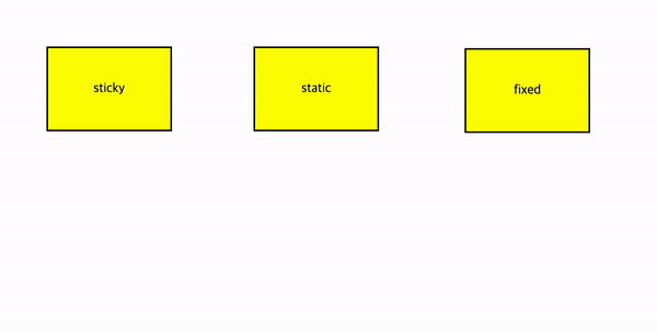
<div class="container">
    <div class="item">sticky</div>
    <div class="item">static</div>
    <div class="item">fixed</div>
</div>
.container {
width: 100%;
height: 3000px;
display: flex;
flex-direction: row;
}
.container .item {
text-align: center;
line-height: 100px;
width: 150px;
height: 100px;
border: 2px solid black;
background-color: yellow;
margin: 50px;
}
.container .item:nth-child(1) {
position: sticky;
top: 10px;
}
.container .item:nth-child(2) {
position: static;
}
.container .item:nth-child(3) {
position: fixed;
top: 10px;
right: 185px;
}해당 요소가 스크롤이 시작되기 전까지는 일반적인 문서 흐름에 따라 배치되다가, 스크롤이 일어나면 일정 위치(화면 상단에서 10px 아래)에 도달하면 고정되며 이후 스크롤이 화면을 떠날 때까지 고정 상태를 유지하게 됩니다.
요소 쌓임 순서(Stack order)
요소들이 화면에 겹쳐 있을 때, 어떤 요소가 위에 나타날지를 결정하는 규칙입니다. 이는 요소들이 쌓이는 순서를 말하며, 높은 순서의 요소가 낮은 순서의 요소 위에 나타납니다.
Stack Order를 결정하는 주요 요소
- 포지션 속성 : 요소의 위치 속성에 따라서 stack Order가 결정 됩니다.
position속성의 값 중에relative,absolute,fixed가 있는데 이들은 다른 요소들과의 상대적인 위치를 결정하게 됩니다.(기본값 static은 제외입니다.) - z-index 속성 :
z-index속성은 요소의 stack Order를 직접적으로 제어할 수 있는 속성입니다. 더 높은z-index값을 가진 요소가 더 위에 나타납니다. - HTML 구조 : 보다 상위에 위치한 요소가 하위에 위치한 요소 위에 나타납니다.
사용 예시
<div class="container">
    <div class="item item1">1</div>
    <div class="item item2">2</div>
    <div class="item item3">3</div>
</div>
.container {
display: flex;
}
.container .item {
width: 100px;
height: 100px;
background-color: #333;
border-radius: 10px;
font-size: 50px;
color: white;
display: flex;
justify-content: center;
align-items: center;
margin-right: -30px;
box-shadow: 0 20px 50px rgba(0, 0, 0, 0.8);
}
.container .item:nth-child(odd) {
margin-top: 30px;
}
.item1 {
}
.item2 {
}
.item3 {
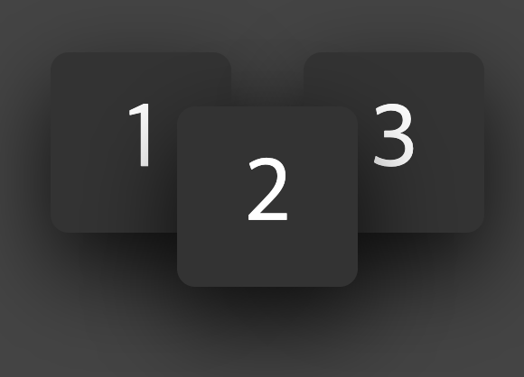
}- HTML 문서의 흐름에 따라 작성된 순서대로 쌓이게 되며 3이 제일 위에 표시됩니다.(1, 2, 3 순서로 쌓여 있습니다.)
.item1 {

}

.item2 {
  position: relative;
}

.item3 {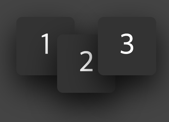
}.item2에position: relative를 추가하면, 2번이 가장 높은 순위의 요소로 가장 위에 나타나게 됩니다. (1, 3, 2 순서로 쌓여있습니다.)
.item1 {

}

.item2 {
  position: relative;
}

.item3 {
  position: relative;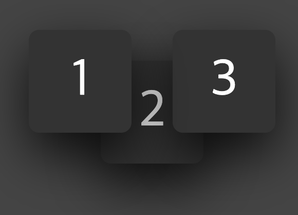
}.item2와.item3모두position: relative가 추가되어 있으며, 화면상의 변화는 없지만 동등한 조건으로 설정된 경우,.item3가 더 높은 순서를 가지게 됩니다.(1, 2, 3 순서로 쌓여있습니다.)
.item1 {
  position: relative;
  z-index: 1;
}

.item2 {
  position: relative;
}

.item3 {
  position: relative;
}- 모든
item에position: relative를 추가한뒤,item1에z-index를 추가합니다. z-index를 사용하려면 해당 요소에position속성이 설정되어 있어야 합니다.z-index의 숫자가 높을수록 높은 순서를 가지게 됩니다. (2, 3, 1 순서로 쌓이게 됩니다.)