Flex
Flex가 등장하기 전에는 웹 페이지 레이아웃을 display, float, position 등의 속성을 사용하여 구성하곤 했습니다. 이 방식은 레이아웃 구성이 복잡하고 유지보수가 어려운 단점이 있었습니다. 이러한 문제를 해결하기 위해, 레이아웃을 간단하게 만들 수 있는 Flex가 도입되었습니다. Flex를 통해 레이아웃 설계와 유지보수가 더욱 쉬워졌습니다.
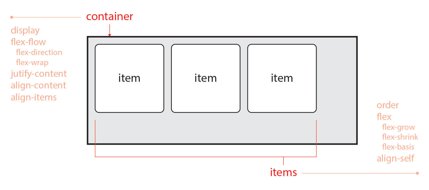
Flex의 구조
flexbox는 부모 요소인 flex container와 그 안에 있는 자식 요소인 flex item으로 구성됩니다.
<div class="container"> <!-- 부모 요소 -->
    <div class="item"></div> <!-- 자식 요소 -->
    <div class="item"></div> <!-- 자식 요소 -->
    <div class="item"></div> <!-- 자식 요소 -->
</div>
Flex의 속성
Flex에서 사용하는 속성은 부모 요소인 Flex Container와 자식 요소인 Flex Item에 따라 정의됩니다. 전체적인 정렬이나 흐름과 관련된 속성은 Flex Container에, 크기나 순서와 관련된 속성은 Flex Item에 정의합니다.
Flex Container 속성
| 속성 | 의미 |
|---|---|
| display | Flex Container를 정의 |
| flex-flow | flex-direction와 flex-wrap의 단축 속성 |
| flex-direction | Flex Items의 주 축(Main Axis)을 설정 |
| flex-wrap | Flex Items의 여러 줄 묶음(줄 바꿈) 설정 |
| justify-content | 주 축(Main Axis)의 정렬 방법을 설정 |
| align-content | 교차 축(Cross Axis)의 정렬 방법을 설정(2줄 이상) |
| align-items | 교차 축(Cross Axis)에서 Items의 정렬 방법을 설정(1줄) |
| gap | 각 아이템 사이의 간격을 설정 |
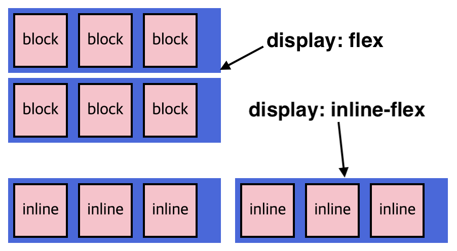
dispaly: flex
flex item은 가로 방향으로 배치됩니다. 만약 flex item의 너비를 지정하지 않으면, 아이템 내용(content)만큼의 너비를 가지게 됩니다.
.container {
  width: 300px;
  height: 150px;
  background-color: gray;
  display: flex; /* 수평 정렬 됩니다. */
}

.container .item {
  width: 50px;
  height: 50px;
  background-color: tomato;
  border: 1px solid black;
}
display: inline-flex
display: inline-flex를 사용하여 flex container를 인라인 레벨로 정의했습니다. 그래서 .inline 클래스를 가진 컨테이너는 왼쪽에서 오른쪽으로 수평으로 인라인 요소처럼 쌓이게 됩니다.
.block {
  display: flex;
}

.inline {
  display: inline-flex;
}
flex-direction
flex-direction속성은 flex container의 주 축(main axis)을 설정하는데 사용됩니다.
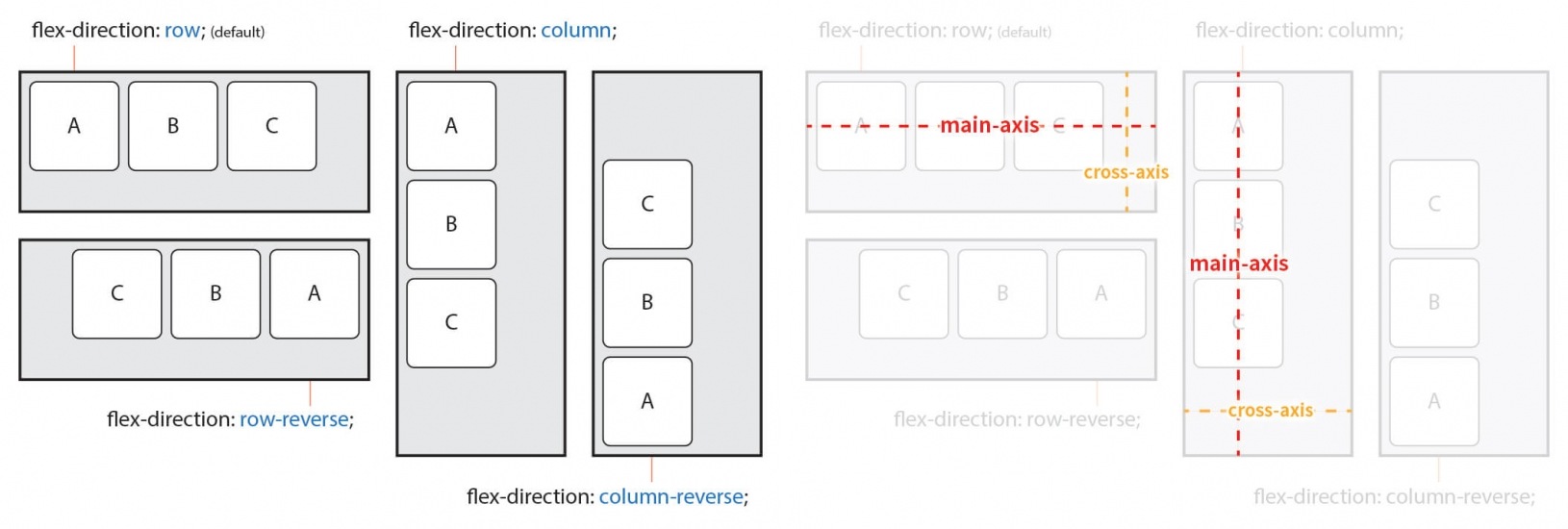
row는 아이템을 수평축으로 배치하기 때문에 주축(main axis)은 수평이며, 교차축(cross axis)은 수직입니다.column은 아이템을 수직축으로 배치하기 때문에 주축은 수직이며, 교차축은 수평입니다.
.container {
  display: flex;
}

.row {
  flex-direction: row; /* 좌 -> 우로 정렬 */
}

.row-reverse {
  flex-direction: row-reverse; /* 우 -> 좌로 정렬 */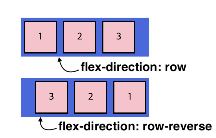
}row(기본값) : 주축을 수평 방향으로 설정합니다. flex container의 자식 요소들은 왼쪽에서 오른쪽으로 흐르는 방향으로 배치됩니다.row-reverse:row와 유사하지만, 주축 방향이 반대로 됩니다. 자식 요소들은 오른쪽에서 왼쪽으로 배치됩니다.
.container {
  display: flex;
}

.column {
  flex-direction: column; /* 위 -> 아래로 정렬 */
}

.column-reverse {
  flex-direction: column-reverse; /* 아래 -> 위로 정렬 */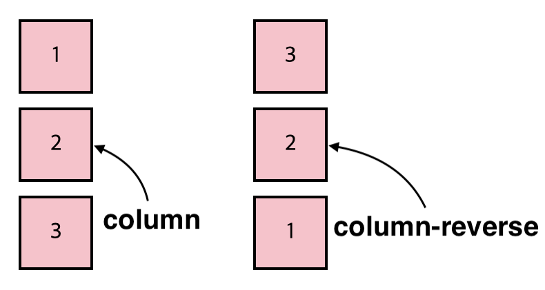
}column: 주축을 수직 방향으로 설정합니다. flex container의 자식 요소들은 위에서 아래로 배치되는 방향으로 정렬됩니다.column-reverse:column과 유사하지만, 주축 방향이 반대입니다. 자식 요소들은 아래에서 위로 배치됩니다.
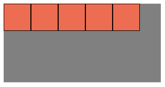
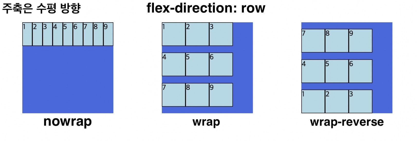
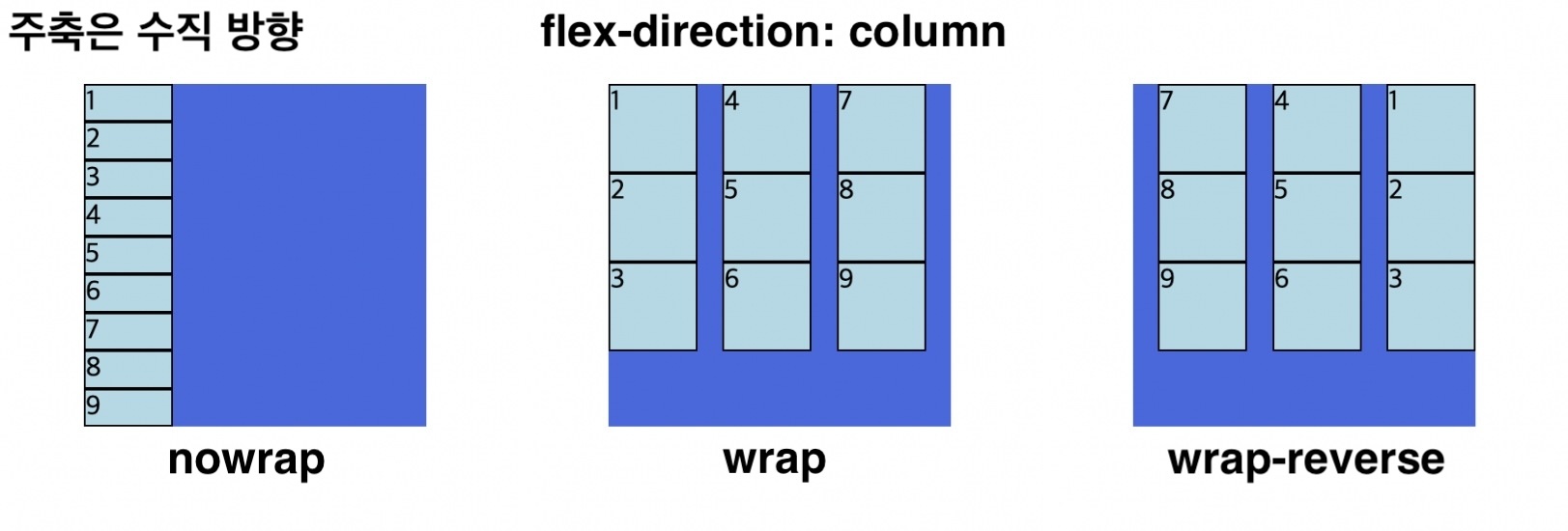
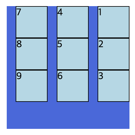
flex-wrap
flex item의 크기가 flex container를 벗어났을 때 줄을 바꾸는 속성입니다.
| 속성 | 내용 | 기본값 |
|---|---|---|
| nowrap | container의 영역을 벗어나더라도 item요소들을 한줄에 배치합니다. | nowrap |
| wrap | Item이 container의 영역을 벗어나면, 다음 줄로 이동하여 배치됩니다. | |
| wrap-reverse | Item이 container의 영역을 벗어나면, 아이템은 다음 줄로 이동하고 역순으로 배치됩니다. |
  <div class="container">
    <div class="item">1</div>
    <div class="item">2</div>
    <div class="item">3</div>
    <div class="item">4</div>
    <div class="item">5</div>
    <div class="item">6</div>
    <div class="item">7</div>
    <div class="item">8</div>
    <div class="item">9</div>
  </div>
.container {
width: 200px;
height: 200px;
background-color: royalblue;
flex-direction: row; /* 주축은 수평 방향, 좌 -> 우로 정렬 */
display: flex;
flex-wrap: nowrap;
/* 아이템이 컨테이너보다 커도 줄바꿈을 하지 않는다 */
flex-wrap: wrap;
/* 아이템이 컨테이너의 영역을 벗어나면 줄을 바꿔서 배치됩니다. */
flex-wrap: nowrap;
/* 아이템이 컨테이너의 영역을 벗어나면, 다음 줄로 이동하면서 역순으로 배치됩니다. */
}
.container .item {
width: 50px; /* item의 크기가 container의 크기보다 크다. */
height: 50px;
background-color: lightblue;
border: 1px solid black;
}
  <div class="container">
    <div class="item">1</div>
    <div class="item">2</div>
    <div class="item">3</div>
    <div class="item">4</div>
    <div class="item">5</div>
    <div class="item">6</div>
    <div class="item">7</div>
    <div class="item">8</div>
    <div class="item">9</div>
  </div>
.container {
width: 200px;
height: 200px;
background-color: royalblue;
display: flex;
flex-direction: column; /* 주축은 수직 방향, 위 -> 아래로 정렬 */
flex-wrap: nowrap;
/* 아이템이 컨테이너보다 커도 줄바꿈을 하지 않는다 */
flex-wrap: wrap;
/* 아이템이 컨테이너의 영역을 벗어나면 줄을 바꿔서 배치됩니다. */
flex-wrap: wrap-reverse;
/* 아이템이 컨테이너의 영역을 벗어나면, 다음 줄로 이동하면서 역순으로 배치됩니다. */
}
.container .item {
width: 50px; /* item의 크기가 container의 크기보다 크다. */
height: 50px;
background-color: lightblue;
border: 1px solid black;
}
flex-flow
flex-direction과 flex-wrap을 한번에 설정하는 단축 속성입니다.
.container {
  width: 200px;
  height: 200px;
  background-color: royalblue;
  display: flex;
  flex-flow: column wrap-reverse;
  /* flex-direction과 flex-wrap을 한 번에 설정합니다 */
}

.container .item {
  width: 50px;
  height: 50px;
  background-color: lightblue;
  border: 1px solid black;
}
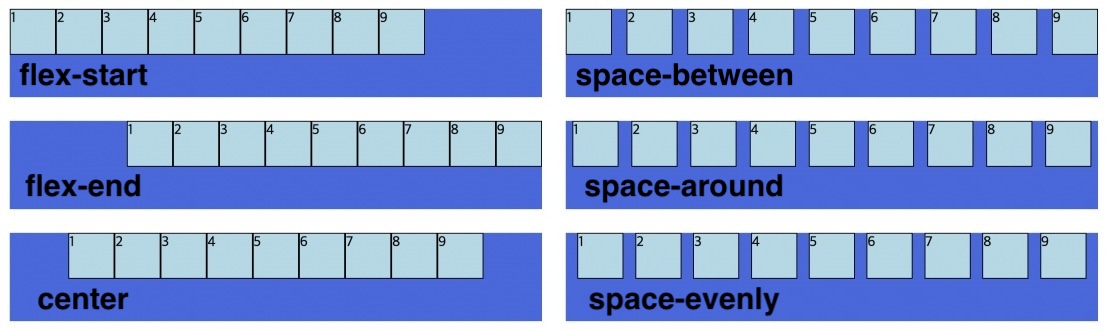
justify-content
Flexbox에서는 flex 아이템들이 주축(main axis)을 따라 어떻게 정렬되는지를 지정하는 속성입니다.
| 속성 | 내용 | 기본값 |
|---|---|---|
| flex-start (start) | 플렉스 아이템을 시작 위치로 정렬합니다. 주축의 시작 위치는 flex-direction에 따라 달라집니다. | flex-start |
| flex-end (end) | 플렉스 아이템을 끝 위치로 정렬합니다. 주축의 끝 위치는 flex-direction에 따라 달라집니다. | |
| center | 플렉스 아이템을 가운데 정렬합니다. | |
| space-between | 첫 번째 아이템은 시작 위치에, 마지막 아이템은 끝 위치에 정렬되고, 나머지 아이템들은 균등한 간격으로 배치됩니다. | |
| space-around | 첫 번째 아이템과 마지막 아이템은 컨테이너의 시작과 끝에 반 간격의 여유 공간이 있고, 나머지 아이템은 주변에 균등한 간격으로 배치합니다. | |
| space-evenly | 모든 플렉스 아이템은 균등한 간격으로 배치되며, 양쪽 끝과 각 아이템 사이에도 동일한 간격이 존재합니다. |
.container {
  width: 600px;
  height: 100px;
  background-color: royalblue;
  display: flex;
  flex-direction: row; /* 주축은 수평 방향, 좌 -> 우로 정렬 */

  justify-content: flex-start;
  /* 아이템을 시작 위치로 정렬 */

  justify-content: flex-end;
  /* 아이템을 끝 위치로 정렬 */

  justify-content: center;
  /* 아이템을 가운데 정렬 */

  justify-content: space-between;
  /* 시작과 끝 위치에 첫 번째와 마지막 아이템을 배치하고, 나머지는 일정 간격으로 배치 */

  justify-content: space-around;
  /* 첫 아이템과 마지막 아이템은 시작과 끝에 반 간격으로 배치하며, 나머지는 균등하게 배치 */

  justify-content: space-evenly;
  /* 모든 아이템을 균등하고 동일한 간격으로 배치 */
}

.container .item {
  width: 50px;
  height: 50px;
  background-color: lightblue;
  border: 1px solid black;
}
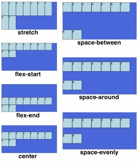
align-content
align-content는 flex-wrap 속성이 설정되어 여러 줄(2줄 이상)이 생성되는 경우, 교차 축(cross axis)을 기준으로 컨테이너 안의 아이템 간 여백을 설정합니다.
| 속성 | 내용 | 기본값 |
|---|---|---|
| stretch | container의 교차 축을 채우기 위해 아이템을 늘린다. | stretch |
| flex-start (start) | 아이템을 시작점으로 정렬합니다. | |
| flex-end (end) | 아이템을 끝점으로 정렬합니다. | |
| center | 아이템을 가운데 정렬합니다. | |
| space-between | 첫 번째 아이템은 시작 위치에, 마지막 아이템은 끝 위치에 정렬되고, 나머지 아이템들은 균등한 간격으로 배치됩니다. | |
| space-around | 첫 번째 아이템과 마지막 아이템은 컨테이너의 시작과 끝에 반 간격의 여유 공간이 있고, 나머지 아이템은 주변에 균등한 간격으로 배치합니다. | |
| space-evenly | 모든 플렉스 아이템은 균등한 간격으로 배치되며, 양쪽 끝과 각 아이템 사이에도 동일한 간격이 존재합니다. |
.container {
  width: 600px;
  height: 100px;
  background-color: royalblue;
  display: flex;
  flex-direction: row; /* 주축은 수평 방향, 좌 -> 우로 정렬 */
  flex-wrap: wrap;
  /* 아이템이 컨테이너의 영역을 벗어나면 줄을 바꿔서 배치됩니다. */

  align-content: stretch;
  /* 교차 축을 채우기 위해 아이템을 늘림, 높이나 너비가 명시된 경우 늘어나지 않는다 */

  align-content: flex-start;
  /* 아이템을 시작점으로 정렬 */

  align-content: flex-end;
  /* 아이템을 끝점으로 정렬 */

  align-content: center;
  /* 아이템을 가운데 정렬 */

  align-content: space-between;
  /* 시작과 끝 위치에 첫 번째와 마지막 아이템을 배치하고, 나머지는 일정 간격으로 배치 */

  align-content: space-around;
  /* 첫 아이템과 마지막 아이템은 시작과 끝에 반 간격으로 배치하며, 나머지는 균등하게 배치 */

  align-content: space-evenly;
  /* 모든 아이템을 균등하고 동일한 간격으로 배치 */
}

.container .item {
  width: 50px;
  height: 50px;
  background-color: lightblue;
  border: 1px solid black;
}
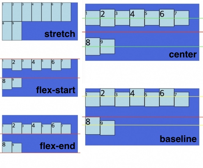
align-items
플렉스 컨테이너 내의 각 아이템을 교차 축(cross-axis)에서 정렬하는 데 사용됩니다. 아이템이 한 줄일 경우 많이 사용합니다.
| 속성 | 내용 | 기본값 |
|---|---|---|
| stretch | container의 교차 축을 채우기 위해 아이템을 늘린다. | stretch |
| flex-start (start) | 아이템을 각 줄의 시작점으로 정렬합니다. | |
| flex-end (end) | 아이템을 각 줄의 끝점으로 정렬합니다. | |
| center | 아이템을 각 줄의 가운데 정렬합니다. | |
| baseline | 아이템을 문자 기준선에 정렬합니다. |
.container {
  width: 400px;
  height: 200px;
  background-color: royalblue;
  display: flex;
  flex-direction: row; /* 주축은 수평 방향, 좌 -> 우로 정렬 */
  flex-wrap: wrap;
  /* 아이템이 컨테이너의 영역을 벗어나면 줄을 바꿔서 배치됩니다. */

  align-items: stretch;
  /* 교차 축을 채우기 위해 아이템을 늘림, 높이나 너비가 명시된 경우 늘어나지 않는다 */

  align-items: flex-start;
  /* 아이템을 각 줄의 시작점으로 정렬합니다. */

  align-items: flex-end;
  /* 아이템을 각 줄의 끝점으로 정렬합니다. */

  align-items: center;
  /* 아이템을 각 줄의 가운데 정렬합니다. */

  align-items: baseline;
  /* 아이템을 문자 기준선에 정렬 */
}

.container .item:nth-child(even) {
  height: 60px;
  font-size: 30px;
}

.container .item {
  width: 50px;
  height: 50px;
  background-color: lightblue;
  border: 1px solid black;
}
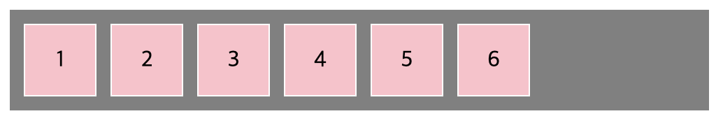
gap
컨테이너 내의 아이템들 간의 간격을 설정합니다. 이 속성은 상하좌우 방향으로 아이템들 사이의 간격을 지정할 수 있습니다.
| 값 | 의미 | 기본값 |
|---|---|---|
| 단위 | px, em, cm 등 단위로 지정 | 0 |
.container {
  gap: 10px; /* 가로와 세로 간격이 모두 10픽셀로 설정 */
}

.container {
  gap: 10px 20px; /* 상하 간격이 10px, 좌우 간격이 20픽셀로 설정 */
}
.container {
width: 50%;
display: flex;
gap: 10px; /* 가로와 세로 간격이 모두 10픽셀 */
background-color: gray;
padding: 10px;
}
.item {
width: 50px;
height: 50px;
background-color: pink;
border: 1px solid white;
display: flex;
align-items: center;
justify-content: center;
font-size: 16px;
}
Flex Items 속성
| 속성 | 내용 |
|---|---|
| order | Flex 아이템의 순서를 결정합니다. 숫자가 작을수록 앞에 배치되며, 기본값은 0입니다. |
| flex-grow | Flex Item의 증가 너비 비율을 설정 |
| flex-shrink | Flex Item의 감소 너비 비율을 설정 |
| flex-basis | Flex Item의 (공간 배분 전) 기본 너비 설정 |
| flex | flex-grow, flex-shrink, flex-basis의 단축 속성, 이 순서대로 값을 지정합니다. |
| align-self | 교차 축(cross-axis)에서 Item의 정렬 방법을 설정 |
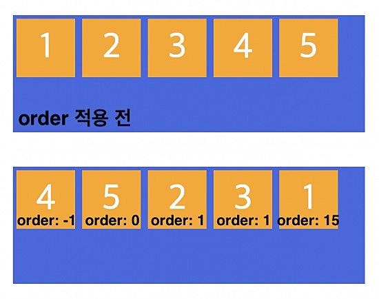
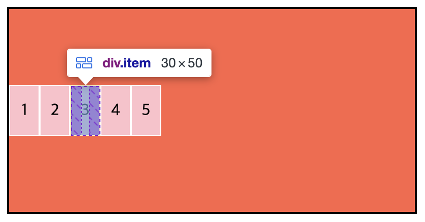
order
아이템의 순서를 설정합니다. 아이템에 숫자를 지정하고 숫자가 작을수록 앞에 배치되고, 클수록 뒤에 배치됩니다. 음수가 허용 됩니다.
| 값 | 의미 | 기본값 |
|---|---|---|
| 숫자 | Item의 순서를 설정 | 0 |
  <div class="container">
    <div class="item item1">1</div>
    <div class="item item2">2</div>
    <div class="item item3">3</div>
    <div class="item item4">4</div>
    <div class="item item5">5</div>
  </div>
.container {
width: 300px;
height: 100px;
background-color: royalblue;
display: flex;
}
.container .item {
width: 50px;
height: 50px;
background-color: orange;
color: white;
font-size: 30px;
margin: 3px;
text-align: center;
line-height: 50px;
}
.item1 {
order: 15;
}
.item2 {
order: 1;
}
.item3 {
order: 1;
}
.item4 {
order: -1;
}
.item5 {
order: 0;
}
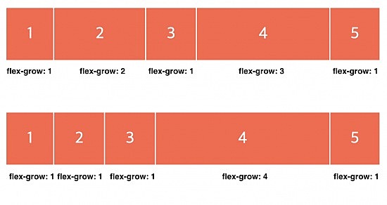
flex-grow
Flex 컨테이너에 공간이 남아 있을 때, Flex 아이템은 남은 공간을 어떤 비율로 채울지를 결정합니다. 숫자가 클수록 아이템은 더 많은 너비를 차지합니다.
| 값 | 의미 | 기본값 |
|---|---|---|
| 숫자 | Item의 증가 너비 비율을 설정 | 0 |
  <div class="container">
    <div class="item">1</div>
    <div class="item">2</div>
    <div class="item">3</div>
    <div class="item">4</div>
    <div class="item">5</div>
  </div>
.container {
display: flex;
height: 200px;
background-color: powderblue;
flex-direction: row;
}
.container .item {
display: flex;
align-items: center;
justify-content: center;
background-color: tomato;
border: 1px solid white;
color: white;
font-size: 30px;
flex-grow: 1;
}
.container .item:nth-child(2) {
flex-grow: 2;
}
.container .item:nth-child(4) {
flex-grow: 3;
}
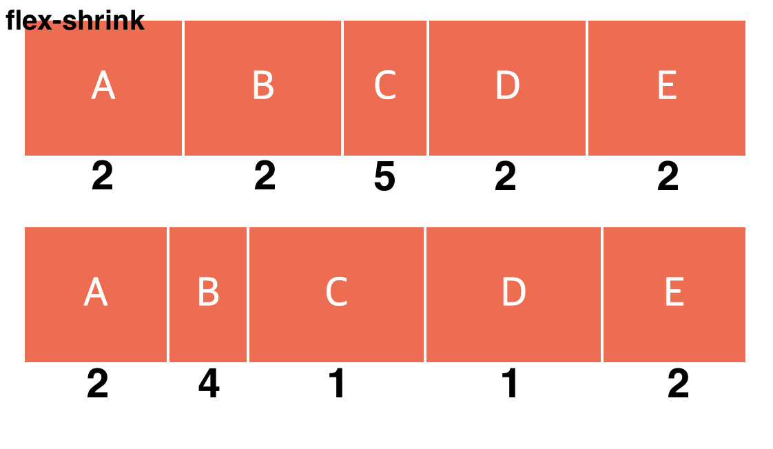
flex-shrink
Flex 컨테이너의 공간이 부족할 경우, Flex 아이템의 크기가 얼마나 줄어들 수 있는지를 결정합니다. 숫자가 클수록 더 많은 크기가 감소하게 됩니다.
| 값 | 의미 | 기본값 |
|---|---|---|
| 숫자 | Item의 감소 너비 비율을 설정 | 1 |
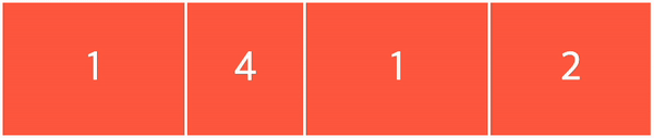
  <div class="container">
    <div class="item">1</div>
    <div class="item">4</div>
    <div class="item">1</div>
    <div class="item">2</div>
  </div>
.container {
display: flex;
width: 80%;
height: 100px;
background-color: powderblue;
flex-direction: row;
}
.container .item {
display: flex;
align-items: center;
justify-content: center;
background-color: tomato;
border: 1px solid white;
color: white;
font-size: 30px;
flex-basis: 150px;
}
.container .item:nth-child(1) {
flex-shrink: 1;
}
.container .item:nth-child(2) {
flex-shrink: 4;
}
.container .item:nth-child(3) {
flex-shrink: 1;
}
.container .item:nth-child(4) {
flex-shrink: 2;
}
flex-basis
주축(main axis)에서 아이템의 초기 크기를 (공간 배분 전에) 설정합니다. 기본값은 auto이기 때문에, 너비나 높이를 설정하지 않으면 컨텐츠의 크기에 따라 사이즈가 결정됩니다.
| 값 | 의미 | 기본값 |
|---|---|---|
| auto | 가변 Item과 같은 너비 | auto |
| 단위 | px, em, cm 등 단위로 지정 |
 <div class="container">
   <div class="item">Good job!</div>
   <div class="item">zero</div>
   <div class="item">Hello world</div>
 </div>
.container {
display: flex;
width: 80%;
height: 100px;
flex-direction: row;
border: 1px solid black;
justify-content: space-around;
}
.container .item {
display: flex;
justify-content: center;
align-items: center;
background-color: tomato;
border: 1px solid white;
box-sizing: border-box;
font-size: 20px;
}
.container .item:nth-child(1) {
width: 50px; /* width 값은 무시됨 */
flex-basis: 100px; /* 아이템의 초기 크기는 100px로 지정됨 */
}
.container .item:nth-child(2) {
width: 100px;
flex-basis: 100px;
}
.container .item:nth-child(3) {
width: 150px;
flex-basis: 100px;
}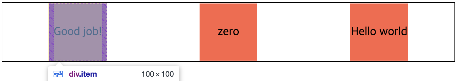
flex-basis가 width와 함께 사용되는 경우 flex-basis에 의해 초기 크기가 결정되고, width값은 무시될 수 있습니다.
flex-basis: auto 와 0의 차이점
.container {
  width: 50%;
  border: 1px solid black;
  display: flex;
  flex-direction: row;
  flex-wrap: wrap;
  align-items: center;
  margin: 50px;
}

.auto .item {
  background-color: skyblue;
  border: 1px solid gray;
  box-sizing: border-box;
  color: white;
  display: flex;
  align-items: center;
  justify-content: center;
  flex-basis: auto;
  flex-grow: 1;
  margin: 3px;
}

.zero .item {
  background-color: tomato;
  border: 1px solid gray;
  box-sizing: border-box;
  color: white;
  display: flex;
  align-items: center;
  justify-content: center;
  flex-basis: 0;
  flex-grow: 1;
  margin: 3px;
}
flex-basis: auto: 아이템의 크기는 자동으로 설정되며, 크기가 명시되지 않은 경우, 아이템의 콘텐츠 크기로 설정됩니다. 또한flex-grow는 콘텐츠 내용을 제외한 부분에 대해 남은 공간을 비율에 따라 분배합니다.flex-basis: 0: 아이템이 초기에 크기가 0인 상태라서, 콘텐츠의 크기와 무관하게flex-grow에 설정된 비율에 따라 아이템의 크기가 배분됩니다. 그 결과 시각적으로 실제 비율에 맞게 보이게 됩니다.
flex
flex는 Flex Items의 단축 속성으로 사용됩니다. flex-grow, flex-shrink, flex-basis를 한 번에 설정할 수 있으며, 이 속성을 사용하면 각 플렉스 아이템의 세 가지 속성을 간편하게 표현할 수 있습니다.
| 값 | 의미 | 기본값 |
|---|---|---|
| flex-grow | Item의 증가 너비 비율을 설정 | 0 |
| flex-shrink | Item의 감소 너비 비율을 설정 | 1 |
| flex-basis | Item의 (공간 배분 전) 기본 너비 설정 | auto |
 <div class="container">
   <div class="item">1</div>
   <div class="item">2</div>
   <div class="item">3</div>
   <div class="item">4</div>
   <div class="item">5</div>
   <div class="item">6</div>
   <div class="item">7</div>
   <div class="item">8</div>
   <div class="item">9</div>
 </div>
.container {
width: 400px;
height: 200px;
background-color: tomato;
border: 2px solid black;
display: flex;
flex-direction: row; /* 주축은 수평 방향, 좌 -> 우로 정렬 */
flex-wrap: wrap;
/* 아이템이 컨테이너의 영역을 벗어나면 줄을 바꿔서 배치됩니다. */
align-items: center;
/* 아이템을 각 줄의 가운데 정렬합니다. */
}
.container .item {
width: 50px;
height: 50px;
background-color: pink;
border: 1px solid white;
box-sizing: border-box;
display: flex;
align-items: center;
justify-content: center;
flex: 0 1 30px; /* 증가너비 감소너비 기본너비 */
}
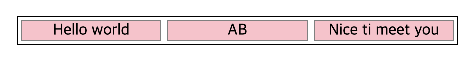
flex: 1 의미
flex는 flex-grow, flex-shrink, flex-basis 속성을 단축하여 만든 것입니다. 속성값으로 하나의 정수만 선언하는 경우, 그 값은 flex-grow의 속성값이 되며, 나머지는 flex-shrink: 1, flex-basis: 0 값을 적용합니다.
<div class="container">
 <div class="item">Hello world</div>
 <div class="item">AB</div>
 <div class="item">Nice ti meet you</div>
</div>
.container {
width: 50%;
border: 1px solid black;
display: flex;
flex-direction: row;
align-items: center;
}
.container .item {
background-color: pink;
border: 1px solid gray;
box-sizing: border-box;
display: flex;
align-items: center;
justify-content: center;
margin: 3px;
flex: 1; /* 증가너비:1 감소너비:1 기본너비:0 */
}
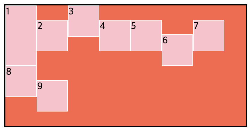
align-self
align-self는 교차 축(cross-axis)에서 개별 아이템의 정렬을 지정하는 데 사용됩니다. align-items와 유사하나, 차이점은 align-items는 컨테이너의 모든 아이템에 대한 정렬을 설정하는 반면, align-self는 개별 아이템에 대한 정렬을 설정합니다. 이 속성은 align-items 속성보다 우선순위가 높습니다.
| 값 | 의미 | 기본값 |
|---|---|---|
| auto | 컨테이너의 align-items 속성을 상속받음 | auto |
| stretch | 컨테이너 교차 축을 채우기 위해 Item을 늘림 | |
| flex-start(start) | 아이템을 각 줄의 시작점으로 정렬 | |
| flex-end(end) | 아이템을 각 줄의 끝점으로 정렬 | |
| center | 아이템을 가운데 정렬 | |
| baseline | 아이템을 문자 기준선에 정렬 |
<div class="container">
 <div class="item">1</div>
 <div class="item">2</div>
 <div class="item">3</div>
 <div class="item">4</div>
 <div class="item">5</div>
 <div class="item">6</div>
 <div class="item">7</div>
 <div class="item">8</div>
 <div class="item">9</div>
</div>
.container {
width: 400px;
height: 200px;
background-color: tomato;
border: 2px solid black;
display: flex;
flex-direction: row; /* 주축은 수평 방향, 좌 -> 우로 정렬 */
flex-wrap: wrap;
/* 아이템이 컨테이너의 영역을 벗어나면 줄을 바꿔서 배치됩니다. */
align-items: center;
/* 아이템을 각 줄의 가운데 정렬합니다. */
}
.container .item {
width: 50px;
height: 50px;
background-color: pink;
border: 1px solid white;
}
.container .item:nth-child(1) {
height: auto;
align-self: stretch; /* 아이템을 교차 축으로 확장 */
}
.container .item:nth-child(6) {
align-self: flex-end; /* 아이템을 각 줄의 끝점으로 정렬 */
}
.container .item:nth-child(3) {
align-self: flex-start; /* 아이템을 각 줄의 시작점으로 정렬 */
}
.container .item:nth-child(8) {
align-self: baseline; /* 아이템을 문자 기준선에 정렬 */
}
참고