.gif)
width 변화 시 이미지 크기 변화
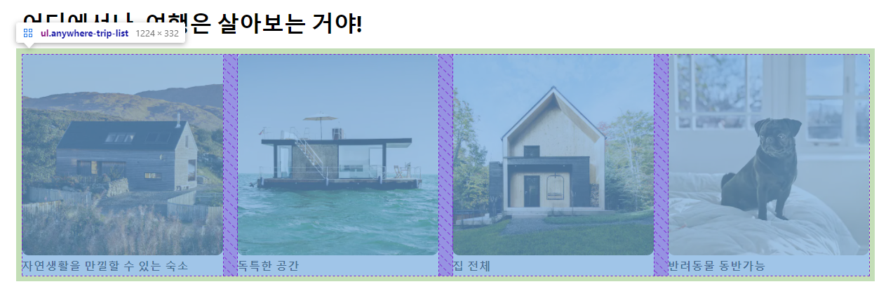
메인화면의 body 부분들은 grid를 활용하여 구현하였고 아래와 같은 방법으로 폭에 따라 이미지 크기를 변화 시킬 수 있었다.
.anywhere-trip-list {
    display: grid;
    grid-template-columns: repeat(4, 1fr);
    grid-template-rows: repeat(1, 1fr);
    padding: 8px;
    gap: 20px;
}

.anywhere-trip-list img {
    width: 100%;
    border-radius: 10px;
}
line-height

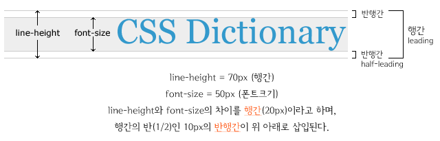
아무것도 설정해주지 않았을 때, 이런 차이를 볼 수가 있는데 이는 line-height를 사용해 줄간격을 동일하게 하여 해결할 수 있다.
line-height: 30px;