
DACON에 있는 데이콘 베이직 Basic 코드 + 사람들이 공유한 코드를 따라하며 공부하기로 했다. 그래서 여기 적힌 코드는 원본 코드가 있음을 알린다.
코드 + 코드 작성하다 모르는 부분 공부 글, 참고 출처로 구성되어 있다.
train 데이터 설명
- train.csv (학습 데이터)
id : 샘플 아이디
Gender : 성별
Customer Type : Disloyal 또는 Loyal 고객
Age : 나이
Type of Travel : Business 또는 Personal Travel
Class : 등급
Flight Distance : 비행 거리
Seat comfort : 좌석 만족도
Departure/Arrival time convenient : 출발/도착 시간 편의성 만족도
Food and drink : 식음료 만족도
Gate location : 게이트 위치 만족도
Inflight wifi service : 기내 와이파이 서비스 만족도
Inflight entertainment : 기내 엔터테인먼트 만족도
Online support : 온라인 지원 만족도
Ease of Online booking : 온라인 예매 편리성 만족도
On-board service : 탑승 서비스 만족도
Leg room service : Leg room 서비스 만족도
Baggage handling : 수하물 처리 만족도
Checkin service : 체크인 서비스 만족도
Cleanliness : 청결도 만족도
Online boarding : 온라인보딩 만족도
Departure Delay in Minutes : 출발 지연 시간
Arrival Delay in Minutes : 도착 지연 시간
target : 만족 여부
경진대회 링크:
https://dacon.io/competitions/official/235871/overview/description
데이터 불러오기
import pandas as pd
import matplotlib.pyplot as plt
import seaborn as sns
data = pd.read_csv('/content/drive/MyDrive/dacon/항공사 고객 만족도 예측 경진대회/train.csv')
data = data.drop('id', axis=1) #id 제거하고 분석
pd.set_option('display.max_columns', None) #열 요약되지 않고 전부 출력, display.max_rows: 행 요약x
data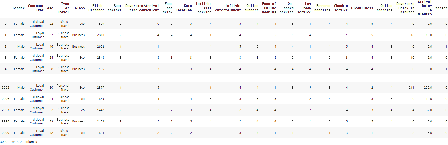
-> Gender, Customer Type, Type of Travel, Class는 텍스트로 이루어진 카테고리형 데이터
수치형 데이터 중 Age, Flight Distance, Departure Delay in Minutes, Arrival Delay in Minutes를 제외한 데이터는 0~5 사이의 정도(degree)를 나타내는 정수형 데이터
EDA
결측치 확인
def check_missing_col(dataframe):
  missing_col = []
  for col in dataframe.columns:
    missing_values = sum(dataframe[col].isna())
    is_missing = True if missing_values >= 1 else False
    if is_missing :
      print(f'결측치가 있는 컬럼은: {col} 입니다') # 문자열 포매팅 방법: https://blockdmask.tistory.com/429
      print(f'해당 컬럼에 총 {missing_values} 개의 결측치가 존재합니다.')
      missing_col.append([col,dataframe[col].dtype]) #컬럼과 타입 추가
  if missing_col == []:
    print('결측치가 존재하지 않습니다')
  return missing_col
missing_col = check_missing_col(data)
>> 결측치가 존재하지 않습니다기초 통계 분석
#기초 통계량
data.describe()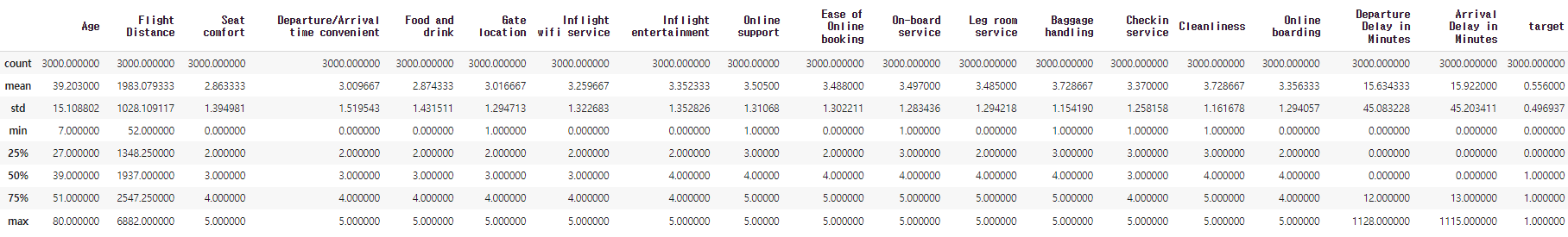
#전체의 데이터 타입 확인 #각각: data['열이름'].dtype
data.dtypes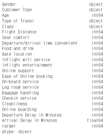
시각화
plt.style.use("ggplot") # https://hong-yp-ml-records.tistory.com/88

plt.figure(figsize=(25,20))
plt.suptitle("Data Histogram", fontsize=40) # 모든 서브 플로트 위에 메인 타이틀 설정

#id 제외 시각화
cols = data.columns
for i in range(len(cols)):
  plt.subplot(5,5,i+1) # 5*5의 형태, 1~25번 위치, https://codetorial.net/matplotlib/subplot.html
  plt.title(cols[i], fontsize=20)
  if len(data[cols[i]].unique()) > 20:
      plt.hist(data[cols[i]],bins=20, color='b', alpha=0.7) #bins: 칸 개수, color: 색깔, alpha: 투명도 https://jimmy-ai.tistory.com/74
  else:
      temp = data[cols[i]].value_counts() #동일한 요소가 몇 개나 있는지 출력, 각 요소별로 개수 출력한다면 히스토그램 작성 가능 https://kongdols-room.tistory.com/174
      plt.bar(temp.keys(), temp.values, width=0.5, alpha=0.7)
      plt.xticks(temp.keys()) #x축 눈금 설정 함수 https://jimmy-ai.tistory.com/17
plt.tight_layout(rect=[0,0.03, 1, 0.95]) # https://kongdols-room.tistory.com/98
plt.show()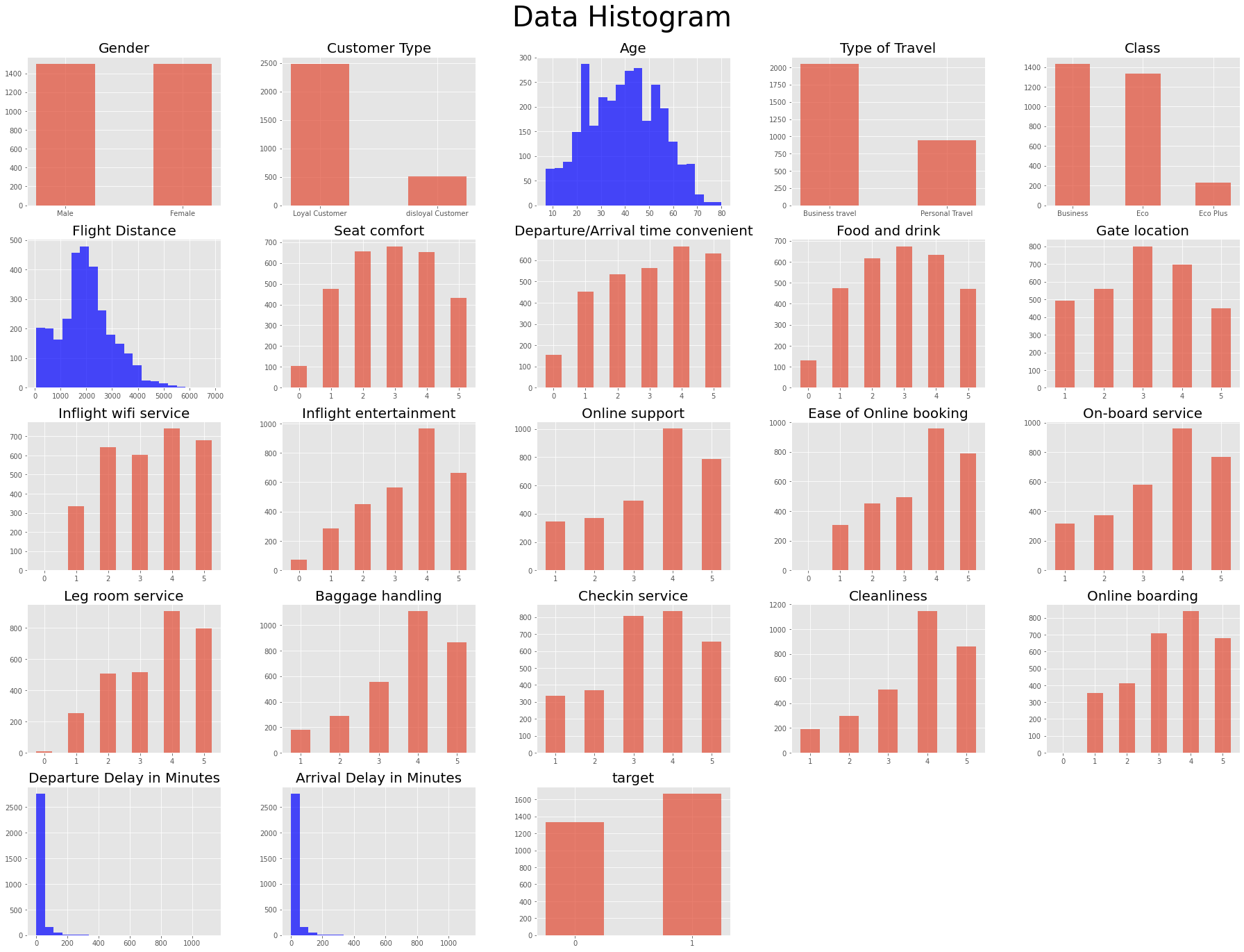
- Age는 정규 분포 형태를 이루는 것처럼 보임
- Gender는 남여 비율 비슷
- Age를 제외한 연속형 변수들이 왼쪽으로 치우쳐져 있는 것이 눈에 띔.
- target은 약간 차이가 있지만 심각한 imbalance는 아닌 것처럼 보임
target과 feature의 관계
1) 범주형 변수의 카테고리에 따른 target feature 분포 _ violin 그래프 사용
violin 그래프: 데이터의 분포와 범위를 한 눈에 보기 쉽게 나타내는 그래프 형식, 박스 플롯과 비슷하지만 더 실제와 가까운 분포를 알 수 있다.
참고)
https://blog.naver.com/PostView.nhn?blogId=youji4ever&logNo=221864110030
https://hleecaster.com/python-seaborn-violinplot/
target = "target" #타겟 설정
categorical_feature = data.columns[data.dtypes == 'object'] #범주형 데이터 분리

plt.figure(figsize = (20,15))
plt.suptitle("Violin Plot", fontsize=40)

# id는 제외하고 시각화
for i in range(len(categorical_feature)):
    plt.subplot(2,2,i+1)
    plt.xlabel(categorical_feature[i])
    plt.ylabel(target)
    sns.violinplot(x=data[categorical_feature[i]], y=data[target])
plt.tight_layout(rect=[0,0.03, 1, 0.95])
plt.show()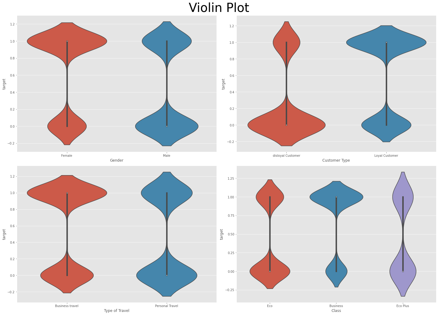
바이올린 플롯을 보면 Customer Type 변수에서 disloyal인지 loyal인지에 따라 만족도(target)가 상당히 차이가 나는 것을 확인할 수 있다.
-> 해당 변수는 예측에 있어 중요한 변수라고 볼 수 있음!
2) 수치형 변수의 카테고리에 따른 target feature 분포 _ box plot 사용
fig, axes = plt.subplots(3,6,figsize=(25,20)) #nrows = 3, ncols = 6
이렇게 코드 짜는 이유:
fig는 그래프의 큰 틀이고 axes는 그 안에 들어가는 subplot들이다.
즉, fig, axes1, axes2, ... axes18을 한 번에 만들어 주는 것과 다름없음.
zip():
iterable 객체를 인자로 받아서 사용. 여러 개의 iterable 객체를 받은 후 자료형들을 묶어 튜플 형태로 출력해줌
https://chancoding.tistory.com/144
axes.flat
axes는 numpy 배열이다. flat은 numpy함수로 평평하게 만드는 역할을 한다.
https://stackoverflow.com/questions/46862861/what-does-axes-flat-in-matplotlib-do
https://www.delftstack.com/ko/howto/python/how-to-flatten-a-list-in-python/
#수치형 데이터 분리
numeric_feature = data.columns[(data.dtypes == 'int64') | (data.dtypes == 'float')]
num_data = data[numeric_feature]

#박스플롯
fig, axes = plt.subplots(3,6,figsize=(25,20)) #nrows = 3, ncols = 6 #이렇게 코드 짜는 이유: fig는 그래프의 큰 틀이고 axes는 그 안에 들어가는 subplot들이다.

fig.suptitle("feature distributions per quality", fontsize=40)
for ax, col in zip(axes.flat, num_data.columns[:-1]): #[:-1]: 맨 오른쪽 값 제외하고 모두(맨 오른쪽 값: target)
    sns.boxplot(x='target', y=col, ax=ax, data=num_data)
    ax.set_title(col, fontsize=20)
plt.tight_layout(rect=[0, 0.03, 1, 0.95])
plt.show()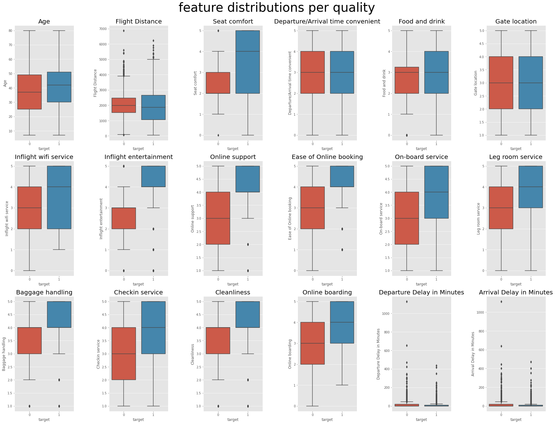
박스 플롯을 통해 Age, Departure/Arrival time convenient, Gate location은 target에 영향이 없는 듯 하다는 것을 알 수 있다. (분석에서 제거해도 무관할 것 같다)
상관관계 시각화
전체 feature들 간의 상관관계
#계산을 위해 텍스트 형식의 데이터를 숫자로 변환
corr_df=data.copy() #얕은 복사, 깊은 복사 https://blockdmask.tistory.com/576, https://wikidocs.net/16038
corr_df[corr_df.columns[corr_df.dtypes=='O']] = corr_df[corr_df.columns[corr_df.dtypes=='O']].astype(str).apply(LabelEncoder().fit_transform) #카테고리->수치형 https://teddylee777.github.io/scikit-learn/labelencoder-%EC%82%AC%EC%9A%A9%EB%B2%95
#dtypes == 'O' https://stackoverflow.com/questions/37561991/what-is-dtypeo-in-pandasplt.figure(figsize=(35,25))
heat_table = corr_df.corr() #상관계수
mask = np.zeros_like(heat_table) #배열의 크기만큼 0으로 채움. https://aigong.tistory.com/62
mask[np.triu_indices_from(mask)] = True #위 쪽 삼각형에 마스크를 만듬(아래쪽 삼각형만 보이게) #https://m.blog.naver.com/kiddwannabe/221763497317
heatmap_ax = sns.heatmap(heat_table, annot=True, mask=mask, cmap='coolwarm') #annot= True 각 셀에 숫자 입력, cmap 색깔 지정 #https://rfriend.tistory.com/419
heatmap_ax.set_xticklabels(heatmap_ax.get_xticklabels(), fontsize=15, rotation=45) #눈금이름 설정
heatmap_ax.set_yticklabels(heatmap_ax.get_yticklabels(), fontsize=15)
plt.title('correlation between features', fontsize=40)
plt.show()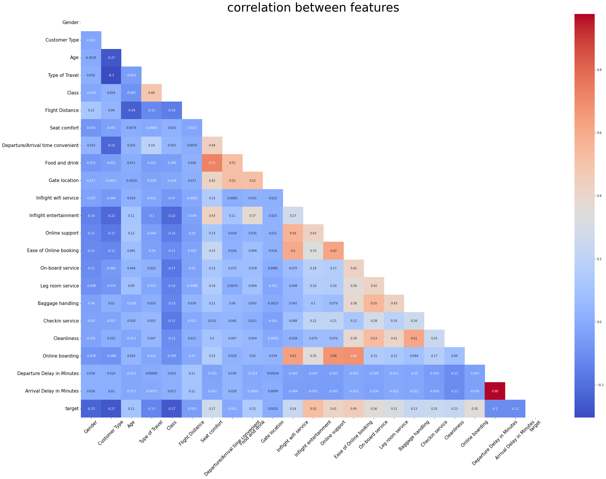
고객 만족도인 target은 Inflight entertainment와 가장 높은 상관(0.52)를 보인다.
그 외에도 Online Support, Ease of Online booking, On-board service와도 높은 상관을 보인다.
