웹 페이지 하나를 열어보자, 화면의 크기를 늘이고 줄였을 때, 자연스럽게 레이아웃이 변하는 페이지들이 있다. 이런 작업을 할 때 필요한 것이 css의 Media Query이다.
1. 김버그의 CSS는 재밌다
2. CSS: 반응형 웹(Responsive Web)_넥스트리
반응형 Web
반응형 웹이란 디바이스 종류에 따라 웹 페이지의 크기가 자동으로 재조정 되는 것을 말한다. 여러 개의 HTML을 따로 작성할 필요 없이 하나로 해결할 수 있는 장점이 있다.
모바일 퍼스트
반응형 웹을 작성할 때 중요한 점은 모바일을 우선으로 생각하는 것이 좋다는 점이다. 태블릿 PC, 스마트 폰 등 모바일 기기의 사용자가 일반적인 웹 사용자보다 늘어나게 되면서 생긴 개념이다. 모바일 퍼스트의 핵심은 모바일이 가진 제약에 집중한다는 것이다. 모바일의 제약은 다음과 같다.
- 스크린 크기
- 네트워크 속도 및 품질
- 사용하는 모드
이런 모바일의 제약을 통해서 일반 웹이 가진 특징들 중에서 모바일 웹에서는 불필요한 요소가 있음을 파악하고 이를 제외한 채 핵심적인 기능과 내용들을 사용자에게 제공해야 한다.
Media Query
@media screen and (min-width:768px) {
  .desktop{
    font-size: 30px;
    width: 400px;
  }
}
@media screen Media Query를 시작할 때 작성해 준다. screen은 미디어 타입을 뜻한다.
min-width 레이아웃이 변경되는 최소 화면 크기를 설정할 수 있다.
{ . . . } Curly Brakets 안에는 변경 적용할 css를 작성해 주면 된다.
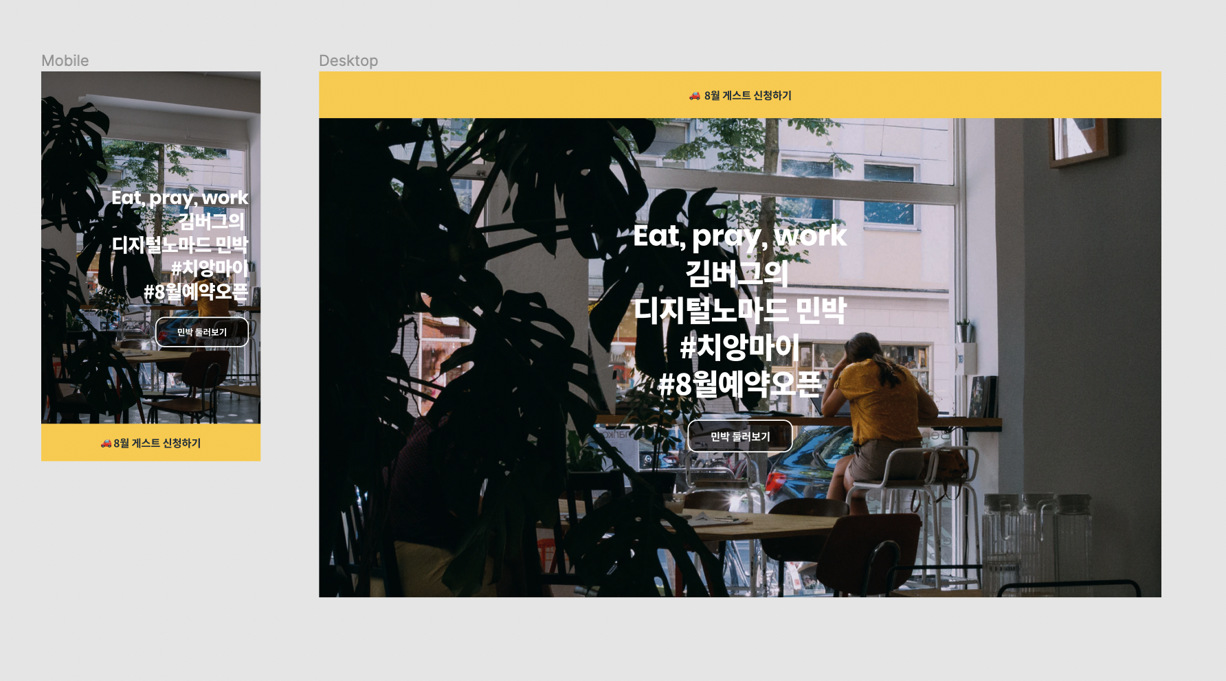
간단한 실습예제
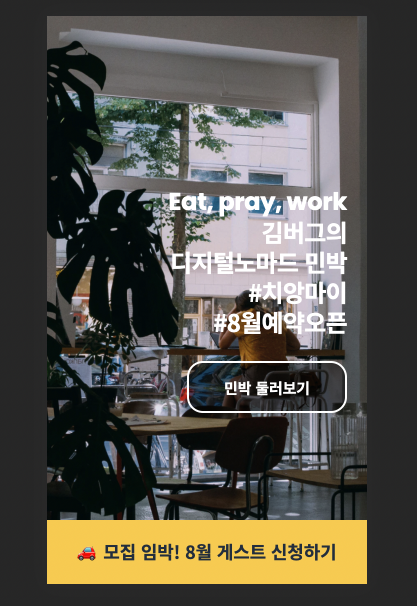
모바일 화면을 기준으로 먼저 작성해 준다. iphone5/se의 화면을 기준으로 작성해 주었다. 이 때, 구글 크롬에서 제공하는 개발자 도구의 모바일 화면 기능을 사용하면 편리하다.
<!-- html -->
<body>
    <aside class="banner">
      <h1 class="banner-title">
        <a href="#">
          🚗 모집 임박! 8월 게스트 신청하기
        </a>
      </h1>
    </aside>

    <section class="landing">
      <h1 class="landing-title">
        <strong lang="en">Eat, pray, work</strong>
        김버그의<br />
        디지털노마드 민박<br />
        #치앙마이<br />
        #8월예약오픈
      </h1>
      <a href="#" class="landing-link">
        민박 둘러보기
      </a>
    </section>
  </body>
/* css mobile version */
.banner {
position: fixed;
bottom: 0;
left: 0;
width: 100%;
}
.banner-title a {
display: flex;
justify-content: center;
align-items: center;
width: 100%;
height: 64px;
font-size: 18px;
background-color: #ffc82c;
}
.landing {
display: flex;
flex-direction: column;
justify-content: center;
align-items: flex-end;
width: 100%;
height: 100vh;
padding: 0 20px;
}
.landing-title {
margin-bottom: 24px;
text-align: right;
}
.landing-link {
display: flex;
justify-content: center;
align-items: center;
width: 160px;
height: 52px;
border: 2px solid #fff;
border-radius: 16px;
font-size: 15px;
background-color: rgba(0, 0, 0, 0.5);
}
모바일 화면을 작성한 후에 Media Query를 사용해서 desktop 버전을 작성하였다. 모바일 버전을 기준으로 변경점에 대해서만 css를 작성하면 된다.
/* css desktop version */
@media screen and (min-width: 768px) {
  .banner {
    top: 0;
    bottom: auto;
  }

  .banner-title a {
    height: 80px;
  }

  .landing {
    align-items: center;
  }

  .landing-title {
    text-align: center;
    font-size: 50px;
    margin-bottom: 32px;
  }

  .landing-link {
    width: 180px;
    height: 56px;
  }
}