실습시간에 flex 속성을 연습하는 시간을 가졌습니다. 전체적으로 레이아웃을 짜고 header까지 flex를 이용해서 구현을 해보았습니다. ul태그를 활용해서 가상 요소 등도 연습해 보았고, 대부분 상대단위를 사용하여 반응형까지 고려했습니다.
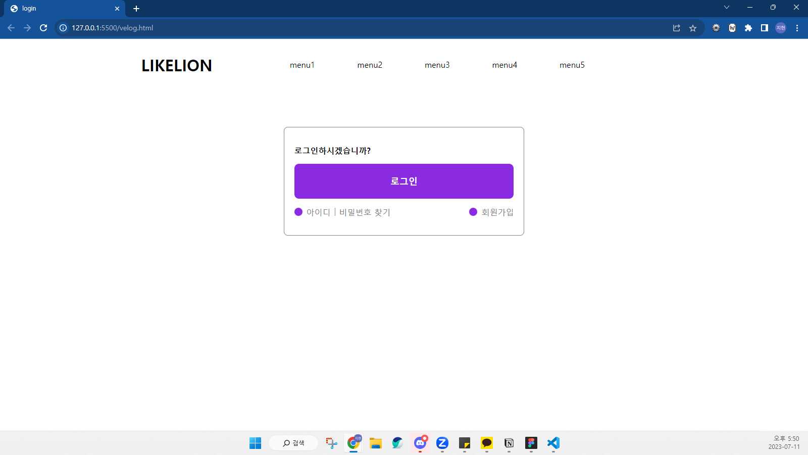
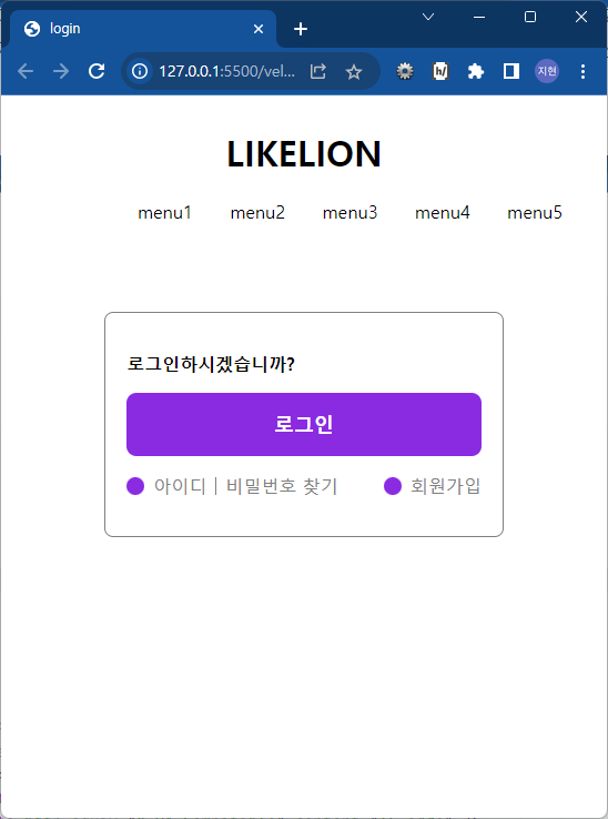
html 파일입니다.
<!DOCTYPE html>
<html lang="ko">
  <head>
    <meta charset="UTF-8" />
    <meta http-equiv="X-UA-Compatible" content="IE=edge" />
    <meta name="viewport" content="width=device-width, initial-scale=1.0" />
    <title>login</title>
    <link rel="stylesheet" href="velog.css" />
  </head>
  <body>
    <header>
      <div class="wrap">
        <h1>LIKELION</h1>
        <nav>
          <ul class="gnb">
            <li><a href="">menu1</a></li>
            <li><a href="">menu2</a></li>
            <li><a href="">menu3</a></li>
            <li><a href="">menu4</a></li>
            <li><a href="">menu5</a></li>
          </ul>
        </nav>
      </div>
    </header>
    <main>
      <h2 class="hidden">로그인</h2>
      <section>
        <div class="wrap">
          <p>로그인하시겠습니까?</p>
          <button class="btn-login">로그인</button>
          <ul class="login-link">
            <li><a href="#">아이디</a></li>
            <li><a href="#">비밀번호 찾기</a></li>
            <li><a href="#">회원가입</a></li>
          </ul>
        </div>
      </section>
    </main>
    <footer></footer>
  </body>
</html>
css 파일입니다.
/* reset.css */
* {
    box-sizing: border-box;
}

a {
    text-decoration: none;
    color: inherit;
}

ul {
    margin: 0;
    padding: 0;
    list-style-type: none;
}

/* header */
header {
    display: flex;
    justify-content: center;
    align-items: center;
    width: 100%;
    min-height: 80px;
    position: sticky;
    background-color: white;
}

header .wrap {
    display: flex;
    justify-content: center;
    align-items: center;
    flex-wrap: wrap;
    width: 100%;
    max-width: 1200px;
    height: 100%;
    margin: 0 auto;
}

header h1 {
    min-width: 25%;
    text-align: center;
}

header nav {
    padding: 0 2em;
    width: 75%;
}

.gnb {
    display: flex;
    justify-content: flex-start;
    align-items: center;
}

.gnb li {
    padding: 0 5%;
}

/* main */
main section {
    padding-top: 80px;
}

.hidden {
    display: none;
}

section .wrap {
    min-width: 360px;
    width: 30%;
    padding: 1.2em;
    border: 1px solid grey;
    border-radius: 0.5em;
    margin: 0 auto;
}

.wrap p {
    font-weight: bold;
}

button.btn-login {
    display: block;
    width: 100%;
    height: 30%;
    padding: 5%;
    border: none;
    border-radius: 0.5em;
    color: white;
    font-size: large;
    font-weight: bold;
    background-color: blueviolet;
}

ul.login-link {
    margin: 1em 0;
    display: flex;
    justify-content: space-between;
    align-items: center;
    flex-grow: 1;
}

ul.login-link li {
    display: flex;
    align-items: center;
    color: grey;
}

ul.login-link li:nth-child(2) {
    flex-grow: 2;
    justify-self: left;
}

ul.login-link li::before {
    content: "";
    display: block;
    width: 1em;
    height: 1em;
    margin-right: 0.5em;
    background: blueviolet;
    border-radius: 50%;
}

ul.login-link li:nth-child(1)::before {
    background-image: url();
}

ul.login-link li:nth-child(2)::before {
    width: 1px;
    margin: 0 8px;
    background: grey;

}

ul.login-link li:nth-child(3)::before {
    background-image: url();
}
건축학도의 프론트엔드 개발자 되기