학습한 내용
네이버 메인 실습 - 기본 세팅
HTML 문서
<!DOCTYPE html>
<html>
<head>
	<meta charset="utf-8">
	<title>네이버</title>

	<link rel="stylesheet" type="text/css" href="css/style.css">
</head>
CSS 문서
/* Default CSS */
* {
	margin: 0;
	padding: 0;

	box-sizing: border-box;
}

ol, ul {
	list-style: none;
}

a {
	text-decoration: none;
	color: #000000;
}

img {
	vertical-align: middle;
}

button {
	border: none;
}

input, textarea {
	outline: none;
}

.clearfix {
	clear: both;
}

.container {
	width: 1130px;
	margin: 0 auto;
}
네이버 메인 오른쪽 실습 - 로그인, 배너
- 'https://flexbox.help/' 사이트를 잘 이용할 것, 필요없는 속성은 지우면 됨
HTML 문서
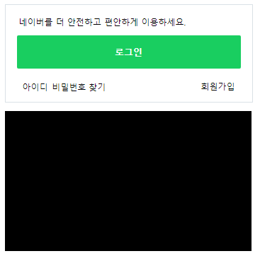
<body>
	<main role="main" class="container">
		<div id="main_right">
			<div id="account">
				<p>네이버를 더 안전하고 편안하게 이용하세요.</p>
				<a href="#">로그인</a>

				<div class="account_sub">
					<div class="left">
						<span>아이디</span>
						<span>비밀번호 찾기</span>
					</div>

					<span>회원가입</span>
				</div>
			</div>

			<div id="banner"></div>
		</div>
	</main>
</body>
CSS 문서 1 - style.css
#main_right #account {
	width: 100%;
	border: solid 1px #dae1e6;
	padding: 16px 16px 12px 16px;
	margin-bottom: 12px;
}

#main_right #account p {
	font-size: 12px;
	padding-left: 3px;
	margin-bottom: 11px;
}

#main_right #account a {
	display: block;
	width: 100%;
	background-color: #19ce60;
	border-radius: 2px;

	padding: 15px 0;
	margin-bottom: 14px;

	text-align: center;
	font-size: 13px;
	color: #fff;
	font-weight: 700;

}

#main_right #account .account_sub{
	display: flex;
	flex-wrap: wrap;
	justify-content: space-between;
	align-items: center;

	padding: 0 8px;
}

#main_right #account .account_sub span {
	font-size: 12px;
}

#main_right #banner {
	width: 348px;
	height: 198px;
	background-color: #000000;

	margin-bottom: 20px;
}
네이버 메인 오른쪽 실습 - 쇼핑
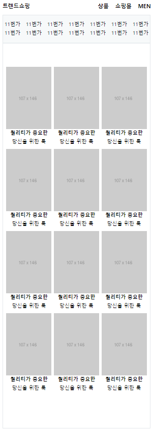
justify-content: space-between은 좌우 끝으로 배치시키는 속성
flex-wrap: wrap상태에서 첫 줄과 둘째 줄의 컨텐츠 개수가 각각 다를 경우엔, 좌우 끝으로 극단적으로 배치됨 (해결하기 위해서는 개수를 맞추거나,flaot: left속성을 이용하면 됨)
HTML 문서
<body>
<body>
<main role="main" class="container">
<div id="main_right">
<div class="shop_content">
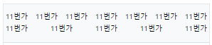
<ul class="commerce-lists">
<li><a href="#">11번가</a></li>
<li><a href="#">11번가</a></li>
<li><a href="#">11번가</a></li>
<li><a href="#">11번가</a></li>
<li><a href="#">11번가</a></li>
<li><a href="#">11번가</a></li>
<li><a href="#">11번가</a></li>
<li><a href="#">11번가</a></li>
<li><a href="#">11번가</a></li>
<li><a href="#">11번가</a></li>
<li><a href="#">11번가</a></li>
<li><a href="#">11번가</a></li>
<li><a href="#">11번가</a></li>
<li><a href="#">11번가</a></li>
</ul>
<div class="shop_goods">
<ul class="product-lists">
<li>
<a href="#">
<img src="https://via.placeholder.com/107x146">
<div class="product-info">
<h3>퀄리티가 중요한</h3>
<span>당신을 위한 룩</span>
</div>
</a>
</li>
<li>
<a href="#">
<img src="https://via.placeholder.com/107x146">
<div class="product-info">
<h3>퀄리티가 중요한</h3>
<span>당신을 위한 룩</span>
</div>
</a>
</li>
<li>
<a href="#">
<img src="https://via.placeholder.com/107x146">
<div class="product-info">
<h3>퀄리티가 중요한</h3>
<span>당신을 위한 룩</span>
</div>
</a>
</li>
<li>
<a href="#">
<img src="https://via.placeholder.com/107x146">
<div class="product-info">
<h3>퀄리티가 중요한</h3>
<span>당신을 위한 룩</span>
</div>
</a>
</li>
<li>
<a href="#">
<img src="https://via.placeholder.com/107x146">
<div class="product-info">
<h3>퀄리티가 중요한</h3>
<span>당신을 위한 룩</span>
</div>
</a>
</li>
<li>
<a href="#">
<img src="https://via.placeholder.com/107x146">
<div class="product-info">
<h3>퀄리티가 중요한</h3>
<span>당신을 위한 룩</span>
</div>
</a>
</li>
<li>
<a href="#">
<img src="https://via.placeholder.com/107x146">
<div class="product-info">
<h3>퀄리티가 중요한</h3>
<span>당신을 위한 룩</span>
</div>
</a>
</li>
<li>
<a href="#">
<img src="https://via.placeholder.com/107x146">
<div class="product-info">
<h3>퀄리티가 중요한</h3>
<span>당신을 위한 룩</span>
</div>
</a>
</li>
<li>
<a href="#">
<img src="https://via.placeholder.com/107x146">
<div class="product-info">
<h3>퀄리티가 중요한</h3>
<span>당신을 위한 룩</span>
</div>
</a>
</li>
<li>
<a href="#">
<img src="https://via.placeholder.com/107x146">
<div class="product-info">
<h3>퀄리티가 중요한</h3>
<span>당신을 위한 룩</span>
</div>
</a>
</li>
<li>
<a href="#">
<img src="https://via.placeholder.com/107x146">
<div class="product-info">
<h3>퀄리티가 중요한</h3>
<span>당신을 위한 룩</span>
</div>
</a>
</li>
<li>
<a href="#">
<img src="https://via.placeholder.com/107x146">
<div class="product-info">
<h3>퀄리티가 중요한</h3>
<span>당신을 위한 룩</span>
</div>
</a>
</li>
</ul>
</div>
</div>
</div>
</div>
</main>
</body>
</body>CSS 문서 1 - style.css
#main_right #shop_wrap .shop_title {
	display: flex;
	flex-wrap: wrap;
	justify-content: space-between;
	align-items: center;

	padding: 12px 0;
}

#main_right #shop_wrap .shop_title h3,
#main_right #shop_wrap .shop_title h4 {
	font-size: 13px;
}

#main_right #shop_wrap .shop_title h4 {
	margin-left: 15px;
}

#main_right #shop_wrap .shop_title .right {
	display: flex;
	flex-wrap: wrap;
	justify-content: flex-end;
	align-items: center;
}

#main_right #shop_wrap .shop_content {
	border: solid 1px #e4e8eb;
	padding: 0 0 22px;
}

#main_right #shop_wrap .shop_content .shop_goods {
	padding: 55px 8px;
}

#main_right #shop_wrap .shop_content .commerce-lists {
	display: flex;
	flex-wrap: wrap;
	justify-content: space-between;
	align-items: center;

	padding: 12px 4px;
	background-color: #f7f9fa;
	border-bottom: solid 1px #dae1e6;
}

#main_right #shop_wrap .shop_content .commerce-lists li {
	font-size: 12px;
	margin-left: 10px;
	margin-bottom: 5px;
}

#main_right #shop_wrap .shop_content .commerce-lists li:nth-child(1),
#main_right #shop_wrap .shop_content .commerce-lists li:nth-child(8) {
	margin-left: 0;
}

#main_right #shop_wrap .product-lists {
	display: flex;
	flex-wrap: wrap;
	justify-content: space-between;
	align-items: center;
}

#main_right #shop_wrap .product-lists li {
	margin-bottom: 10px;
}

#main_right #shop_wrap .product-lists .product-info {
	text-align: center;
}

#main_right #shop_wrap .product-lists h3,
#main_right #shop_wrap .product-lists span {
	font-size: 12px;
}
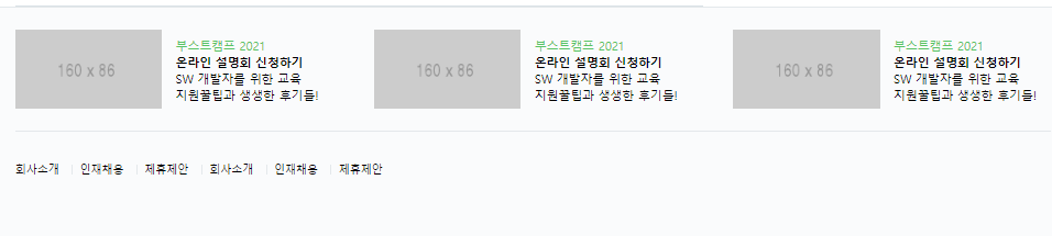
네이버 메인 하단 실습
justify-content: flex-start기본 설정, 앞 쪽에서부터 배치- 태그 앞 디자인을 위해서 가상 선택자(
:before) 사용, 첫 번째에는 없기 때문에 가상 선택자(:first-child) 사용하여initial속성 적용 vertical-align은 문자가 아닌 숫자도 적용 가능,vertical-align: -1px적용 시, 1px 만큼 내려감
HTML 문서
<body>
	<footer id="main-footer">
		<div class="container">

			<ul class="news_lists">
				<li>
					<img src="https://via.placeholder.com/160x86">
					<div class="news_info">
						<span>부스트캠프 2021</span>
						<h3>온라인 설명회 신청하기</h3>
						<p>
						SW 개발자를 위한 교육<br>
						지원꿀팁과 생생한 후기들!
					</p>
					</div>
				</li>
				<li>
					<img src="https://via.placeholder.com/160x86">
					<div class="news_info">
						<span>부스트캠프 2021</span>
						<h3>온라인 설명회 신청하기</h3>
						<p>
						SW 개발자를 위한 교육<br>
						지원꿀팁과 생생한 후기들!
					</p>
					</div>
				</li>
				<li>
					<img src="https://via.placeholder.com/160x86">
					<div class="news_info">
						<span>부스트캠프 2021</span>
						<h3>온라인 설명회 신청하기</h3>
						<p>
						SW 개발자를 위한 교육<br>
						지원꿀팁과 생생한 후기들!
					</p>
					</div>
				</li>
			</ul>

			<ul class="corp_lists">
				<li><a href="#">회사소개</a></li>
				<li><a href="#">인재채용</a></li>
				<li><a href="#">제휴제안</a></li>
				<li><a href="#">회사소개</a></li>
				<li><a href="#">인재채용</a></li>
				<li><a href="#">제휴제안</a></li>
			</ul>

		</div>
	</footer>
</body>
CSS 문서 1 - style.css
#main-footer {
	background-color: #fafbfc;
	border-top: solid 1px #e4e8eb;
	padding-bottom: 92px;
}

#main-footer .news_lists {
	display: flex;
	flex-wrap: wrap;
	justify-content: space-between;
	align-items: center;

	padding: 24px 0;
}

#main-footer .news_lists li {
	display: flex;
	flex-wrap: wrap;
	justify-content: flex-start;
	align-items: center;
}

#main-footer .news_lists li img {
	margin-right: 15px;
}

#main-footer .news_lists li .news_info {
	width: 172px;
}

#main-footer .news_lists li .news_info span,
#main-footer .news_lists li .news_info h3,
#main-footer .news_lists li .news_info p {
	font-size: 13px;
}

#main-footer .news_lists li .news_info span {
	color: #58c464;
}

#main-footer .corp_lists {
	padding-top: 25px;
	border-top: solid 1px #e4e8eb;
}

#main-footer .corp_lists li {
	display: inline-block;
	vertical-align: middle;
}

#main-footer .corp_lists li:first-child:before {
	content: initial;
}

#main-footer .corp_lists li:before {
	content: "";
	display: inline-block;
	width: 1px;
	height: 11px;
	background-color: #e4e8eb;
	margin: 0 8px;

	vertical-align: -1px;
}

#main-footer .corp_lists li a {
	font-size: 12px;
}
학습한 내용 중 어려웠던 점 또는 해결못한 것들
vertical-align속성에 숫자 적용
해결방법
- 검색을 통해 기본 값은 0px로 적용되어 있으며, 양수는 위 쪽으로, 음수는 아래 쪽으로 정렬이 조정됨을 알 수 있었음.
학습 소감
- 오늘은 어제 실습을 진행하였던 네이버 메인의 남은 부분을 진행하였음. 생각보다는 쉬운 구조로 이루어져 있어서, 복잡한 레이아웃을 구성하지는 않았기에 생각보다 수월하였음. 정렬이나 레이아웃 배치에 대한 감각만 조금더 이해한다면 쉽게 만들 수 있을 것 같음.

안녕하세요. 맡은 업무를 확실하게 수행하는 웹 개발자가 되기 위하여 끊임없이 학습에 정진하겠습니다.