학습한 내용
네이버 쇼핑 실습 - 기본 세팅
HTML 문서
<!DOCTYPE html>
<html>
<head>
	<meta charset="utf-8">
	<title>네이버</title>

	<link rel="stylesheet" type="text/css" href="css/style.css">
</head>
<body id="shop-body">
CSS 문서
* {
	margin: 0;
	padding: 0;

	box-sizing: border-box;
}

ol, ul {
	list-style: none;
}

a {
	text-decoration: none;
	color: #000000;
}

img {
	vertical-align: middle;
}

button {
	border: none;
}

input, textarea {
	outline: none;
}
네이버 쇼핑 실습 - 상단 영역
max-width웹사이트 최대 너비값 지정 (예시로 웹의 가로 크기는max-width값 이상 커지지 않고,min-width값 이하로 줄어들지 않음)
HTML 문서
<body>
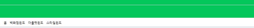
<header id="shop-header">
<div id="shop-header-top"></div>
<div id="shop-header-middle"></div>
<nav>
<div class="shop-container">
<ul>
<li><a href="#">홈</a></li>
<li><a href="#">백화점</a></li>
<li><a href="#">아울렛</a></li>
<li><a href="#">스타일</a></li>
</ul>
</div>
</nav>
</header>
</body>CSS 문서 1 - style.css
#shop-body {
background-color: #e9ecef;
}
.shop-container {
width: 1300px;
margin: 0 auto;
}
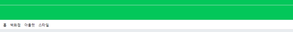
#shop-header #shop-header-top {
width: 100%;
height: 36px;
background-color: #03c75a;
border-bottom: solid 1px #e8e8e8;
}
#shop-header #shop-header-middle {
width: 100%;
height: 66px;
background-color: #03c75a;
}
#shop-header nav {
width: 100%;
background-color: #ffffff;
border-top: solid 1px #e8e8e8;
border-bottom: solid 1px #e8e8e8;
}
#shop-header nav ul {
display: flex;
flex-wrap: wrap;
align-items: center;
padding: 13px 0 8px 0;
}
#shop-header nav ul li {
margin-right: 16px;
}
네이버 쇼핑 실습 - 메인 영역(1)
-
같은 CSS 문서를 공유하기 때문에, 이미 설정해두었던
class속성이 공유 됨 (여기서는main의padding-top: 20px속성이shop-main에 공유 됨) -
태그에 새로운 부모 태그를 만들어, 자식 태그 끼리
flex속성을 이용하여 레이아웃 배치 작업을 진행할 수 있음 -
레이아웃의
width,height값을 설정할 때에는,border값 또한 고려하여 설정 (레이아웃 전체 크기 에서border값을 빼고 설정) -
width: auto설정 시, 안에 내용이 많으면width값이 계속 늘어나기 때문에,max-width값을 지정해주어야 함 -
자식 태그들의 크기가 부모 태그 크기보다 크면, 자동으로 줄바꿈 현상이 나타남
HTML 문서
<body>
    <main role="main" id="shop-main">
        <div class="shop-container">

            <div class="list-wrap">
                <div class="list-item">
                    <div class="category-wrap w-100 h-100 shop-border">

                        <div class="category-left">
                            <h3>카테고리</h3>
                            <ul>
                                <li><a href="#">패션의류</a></li>
                                <li><a href="#">패션잡화</a></li>
                                <li><a href="#">화장품</a></li>
                                <li><a href="#">디지털/가전</a></li>
                            </ul>
                        </div>

                        <div class="category-right">
                            <div class="category-right-top">
                                <div class="category-info">
                                    <span class="headline">인기상품</span>
                                    <h3>
                                        견고함의 차이<br>
                                        세라믹 식탁 세트
                                    </h3>
                                    <span class="price">308,800원</span>
                                </div>

                                <div class="image-wrap">
                                    <img src="https://via.placeholder.com/140x160">
                                </div>
                            </div>

                            <div class="category-right-bottom">
                                <span class="headline">추천태그</span>

                                <div class="tag-wrap">
                                    <span class="tag">#유아마스크</span>
                                    <span class="tag">#하객원피스</span>
                                    <span class="tag">#멀티밤</span>
                                    <span class="tag">#서큘레이터</span>
                                    <span class="tag">#유아마스크</span>
                                    <span class="tag">#하객원피스</span>
                                    <span class="tag">#멀티밤</span>
                                    <span class="tag">#서큘레이터</span>
                                </div>
                            </div>
                        </div>

                    </div>
                </div>

                <div class="list-item banner">
                    <div class="w-100 h-100 shop-border">
                        <img src="https://via.placeholder.com/150">
                    </div>
                </div>

                <div class="list-item"></div>
                <div class="list-item"></div>
                <div class="list-item"></div>
                <div class="list-item"></div>
                <div class="list-item"></div>
                <div class="list-item"></div>
            </div>
        </div>
    </main>
</body>
CSS 문서 1 - style.css
.shop-border {
    border: solid 1px #ced2d7;
}

.w-100 {
    width: 100%;
}

.h-100 {
    height: 100%;
}

#shop-main .shop-container .list-wrap{
    display: flex;
	flex-wrap: wrap;
	justify-content: space-between;
}

#shop-main .shop-container .list-item {
    width: 308px;
    height: 496px;
    background-color: yellow;

    margin-bottom: 20px;
}

#shop-main .list-item.banner img {
    width: 100%;
    height: 100%;
}

#shop-main .list-item .category-wrap {
    overflow: hidden;
}

#shop-main .list-item .category-wrap .category-left {
    float: left;

    width: 124px;
    height: 100%;
    background-color: #333949;
}

#shop-main .list-item .category-wrap .category-left h3 {
    padding: 14px 0 14px 13px;
    border-bottom: solid 1px #2b313f;

    font-size: 13px;
    color: rgba(255, 255, 255, 0.46);
}

#shop-main .list-item .category-wrap .category-left a {
    display: block;

    padding: 7px 8px;
    font-size: 13px;
    font-weight: 700;
    color: rgba(255, 255, 255, 0.46);
}

#shop-main .list-item .category-wrap .category-right {
    float: right;

    width: 182px;
    height: 100%;
    background-color: #ffffff;
}

#shop-main .list-item .category-wrap .category-right-top {
    width: 100%;
    height: 306px;
    border-bottom: solid 1px #e7e7e7;

    text-align: center;
}

#shop-main .list-item .category-wrap .category-right-top .category-info {
    padding: 20px 0;
}

#shop-main .list-item .category-wrap .category-right-top .headline,
#shop-main .list-item .category-wrap .category-right-bottom .headline {
    display: inline-block;

    font-size: 12px;
    border: solid 1px #00ab33;
    color: #00ab33;

    margin-bottom: 7px;
}

#shop-main .list-item .category-wrap .category-right-top .category-info h3 {
    font-size: 18px;
}

#shop-main .list-item .category-wrap .category-right-top .category-info .price {
    font-size: 16px;
    color: skyblue;
}

#shop-main .list-item .category-wrap .category-right-bottom {
    padding-top: 20px;

    text-align: center;
}

#shop-main .list-item .category-wrap .category-right-bottom .tag-wrap .tag {
    display: inline-block;

    width: auto;
    max-width: 75px;
    height: 24px;

    margin: 6px 1px 0 1px;
    padding: 0 5px;

    background-color: #e8eef4;

    line-height: 26px;
    font-size: 12px;
    color: #666;
    vertical-align: top;
}.png)
학습한 내용 중 어려웠던 점 또는 해결못한 것들
- 레이아웃 영역의 크기를 지정할 때,
border값을 뺀 후 설정하는 것.
해결방법
- 강의 복습을 통해
heigth,width속성을 정할 때, 각각 영역 중에서도border값과 맞닿는 부분만 조정하여 길이를 지정하면 된다는 것을 깨달았음.
학습 소감
-
오늘은 어제 CSS 문서를 이어서 새로운 네이버 쇼핑 사이트 카피캣 실습을 진행하였음.
진행한 실습 과정 중에는 CSS 속성을 지정해둔 CSS 디폴트들을 많이 이용했는데, 빠르게 속성을 기입할 수 있다는 특성이 있지만, 문뜩 그것을 잘 기억해두고 잘 사용하는 것은 개발자에게 달렸다는 생각이 들었음.
오히려 속성을 지정해두고 쓰지 않는다면, 불필요한 로딩 과정이 늘어나다는 것을 배웠기 때문에 스스로 잘 기억해두고 잘 사용해보는 것을 연습 해봐야겠음.

안녕하세요. 맡은 업무를 확실하게 수행하는 웹 개발자가 되기 위하여 끊임없이 학습에 정진하겠습니다.