학습한 내용
트위치 실습 - 기본 세팅
HTML 문서
<!DOCTYPE html>
<html>
<head>
	<meta charset="utf-8">
	<title>트위치</title>
	<link rel="stylesheet" type="text/css" href="css/style.css">
</head>
CSS 문서
/* Default CSS */
* {
	margin: 0;
	padding: 0;
	box-sizing: border-box;
}

html, body {
	width: 100%;
	height: 100%;
}

body {
	background-color: #0e0e10;
}

ol, ul {
	list-style: none;
}

a {
	text-decoration: none;
}

img {
	vertical-align: top;
}

input {
	outline: none;
	border: none;
}

button {
	outline: none;
	border: none;
	background: transparent;
}

h1, h2, h3, h4, h5, h6, p, span, input, button, a {
	color: #ffffff;
}

.btn-purple {
	background-color: #9147ff;
	color: #ffffff;
}

.font-purple {
	color: #9147ff;
}
트위치 실습 - 상단 영역
-
실제 페이지에서
rem이라는 단위가 나왔는데, 구글링을 통해 쉽게 단위 변환이 가능함.
https://nekocalc.com/rem-to-px-converter 와 같은 사이트 이용 -
영역의 크기가 달라서 어긋난 위치로
flex의 영향을 받을 때, 받지 않게 하려면 3차원 속성을 적용해주면 됨 -
position: fixed속성을 적용할 때, 레이아웃이 틀어지면width: 100%값을 설정해주면 됨. 3차원 속성으로 작업할 때는 종종width속성이 필요함
HTML 문서
<body>
	<nav id="top-nav">
		<div class="nav-wrap">
			<div class="nav-left">
				<h1 class="logo">
					<a href="#">
						<img src="https://via.placeholder.com/24x28">
					</a>
				</h1>

				<ul>
					<li><a href="#">탐색</a></li>
					<li><a href="#">e스포츠</a></li>
					<li><a href="#">음악</a></li>
				</ul>

				<div class="more">
					<a href="#">더보기</a>
				</div>
			</div>

			<div class="nav-center">
				<div class="search-wrap">
					<input type="text" placeholder="검색">
					<button class="btn-search"></button>
				</div>
			</div>

			<div class="nav-right">
				<div class="mark-wrap">
					<i class="icon-mark"></i>
					<span class="alarm">45</span>
				</div>

				<a href="#" class="btn-login">로그인</a>
				<a href="#" class="btn-purple">회원가입</a>
				<button class="btn-profile"></button>
			</div>
		</div>
	</nav>
</body>
CSS 문서 1 - style.css
#top-nav {
	position: fixed;
	width: 100%;
	height: 50px;
	background-color: #0e0e10;
	padding: 0 15px;
	min-width: 1340px;
}

#top-nav .nav-wrap {
	display: flex;
	flex-wrap: wrap;
	justify-content: space-between;
	align-items: center;
}

#top-nav .nav-wrap .nav-left {
	display: flex;
	flex-wrap: wrap;
	justify-content: flex-start;
	align-items: center;
}

#top-nav .nav-wrap .nav-left .logo a img {
	width: 24px;
	height: 28px;
}

#top-nav .nav-wrap .nav-left ul {
	display: flex;
	flex-wrap: wrap;
	justify-content: flex-start;
	align-items: center;
}

#top-nav .nav-wrap .nav-left ul li {
	height: 50px;
	font-size: 20px;
	padding: 0 20px;
}

#top-nav .nav-wrap .nav-left ul li a {
	display: block;
	width: 100%;
	height: 100%;
	line-height: 50px;
}

#top-nav .nav-wrap .nav-left ul li:first-child {
	padding-right: 0;
}

#top-nav .nav-wrap .nav-left ul li:first-child a:after {
	position: relative;
	display: inline-block;
	content: '';
	width: 1px;
	height: 30px;
	background-color: grey;

	margin-left: 20px;

	top: 8px;
}

#top-nav .nav-wrap .nav-left .more a {
	display: block;
	height: 50px;
	font-size: 20px;

	line-height: 50px;
	padding-left: 20px;
}

#top-nav .nav-center {
	position: absolute;
    left: 50%;
    transform: translateX(-50%);
}

#top-nav .nav-center .search-wrap {
	display: flex;
	flex-wrap: wrap;
	justify-content: space-between;
	align-items: center;

	width: 380px;
	height: 36px;
	background-color: yellow;
	overflow: hidden;
	border-radius: 5px;
}

#top-nav .nav-center .search-wrap input {
	width: calc(100% - 34px);
	height: 100%;
	background-color: grey;
}

#top-nav .nav-center .search-wrap .btn-search {
	width: 34px;
	height: 100%;
	background-color: darkgrey;
}

#top-nav .nav-right {
	display: flex;
	flex-wrap: wrap;
	justify-content: flex-end;
	align-items: center;
}

#top-nav .nav-right .mark-wrap {
	position: relative;
}

#top-nav .nav-right .mark-wrap .icon-mark {
	display: block;
	width: 20px;
	height: 20px;
	background-color: yellow;

	cursor: pointer;
}

#top-nav .nav-right .mark-wrap .alarm{
	position: absolute;
	border-radius: 15px;
	background-color: red;
	color: #ffffff;
	font-size: 14px;

	padding: 4px 8px 2px;

	top: -12px;
    right: -20px;
}

#top-nav .nav-right .btn-login {
	width: 53px;
	height: 30px;
	background-color: grey;
	border-radius: 5px;
	margin-left: 20px;

	text-align: center;
	line-height: 30px;
	font-size: 12px;
}

#top-nav .nav-right .btn-purple {
	width: 53px;
	height: 30px;
	border-radius: 5px;
	margin-left: 10px;

	text-align: center;
	line-height: 30px;
	font-size: 12px;
}

#top-nav .nav-right .btn-profile {
	cursor: pointer;
	width: 20px;
	height: 20px;
	background-color: #ffffff;
	margin-left: 10px;
}
트위치 실습 - 왼쪽 영역
- 브라우저 크기를 줄이면 레이아웃이 틀어질 때는,
min-width속성을 이용하여 브라우저 최소 크기 설정 - 브라우저 크기를 줄여도 영역의 크기를 고정할 때는, 3차원 속성 및
top값과bottom: 0값을 지정해주면, 브라우저 크기를 줄여도 크기가 유지됨 - 스크롤을 추가하고 싶으면
overflow-y: auto속성을 적용. 혹시나 스크롤 때문에 내용이 밀리면, 다른 사람들이 만들어둔 기능을 검색해서 사용 (구글에 "jquery scrollbar" 검색)
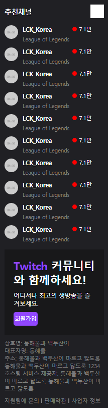
HTML 문서
<body>
	<div class="main-container">
		<div class="left-area">
			<div class="channel-wrap">
				<div class="channel-header">
					<h3>추천채널</h3>
					<i class="icon-arrow"></i>
				</div>

				<div class="channel-body">
					<ul>
						<li>
							<a href="#">
								<img src="https://via.placeholder.com/30">

								<div class="txt-wrap">
									<h4>LCK_Korea</h4>
									<span class="source">League of Legends</span>
								</div>

								<span class="count">7.1만</span>
							</a>
						</li>

						<li>
							<a href="#">
								<img src="https://via.placeholder.com/30">

								<div class="txt-wrap">
									<h4>LCK_Korea</h4>
									<span class="source">League of Legends</span>
								</div>

								<span class="count">7.1만</span>
							</a>
						</li>

						<li>
							<a href="#">
								<img src="https://via.placeholder.com/30">

								<div class="txt-wrap">
									<h4>LCK_Korea</h4>
									<span class="source">League of Legends</span>
								</div>

								<span class="count">7.1만</span>
							</a>
						</li>

						<li>
							<a href="#">
								<img src="https://via.placeholder.com/30">

								<div class="txt-wrap">
									<h4>LCK_Korea</h4>
									<span class="source">League of Legends</span>
								</div>

								<span class="count">7.1만</span>
							</a>
						</li>

						<li>
							<a href="#">
								<img src="https://via.placeholder.com/30">

								<div class="txt-wrap">
									<h4>LCK_Korea</h4>
									<span class="source">League of Legends</span>
								</div>

								<span class="count">7.1만</span>
							</a>
						</li>

						<li>
							<a href="#">
								<img src="https://via.placeholder.com/30">

								<div class="txt-wrap">
									<h4>LCK_Korea</h4>
									<span class="source">League of Legends</span>
								</div>

								<span class="count">7.1만</span>
							</a>
						</li>

						<li>
							<a href="#">
								<img src="https://via.placeholder.com/30">

								<div class="txt-wrap">
									<h4>LCK_Korea</h4>
									<span class="source">League of Legends</span>
								</div>

								<span class="count">7.1만</span>
							</a>
						</li>

						<li>
							<a href="#">
								<img src="https://via.placeholder.com/30">

								<div class="txt-wrap">
									<h4>LCK_Korea</h4>
									<span class="source">League of Legends</span>
								</div>

								<span class="count">7.1만</span>
							</a>
						</li>

						<li>
							<a href="#">
								<img src="https://via.placeholder.com/30">

								<div class="txt-wrap">
									<h4>LCK_Korea</h4>
									<span class="source">League of Legends</span>
								</div>

								<span class="count">7.1만</span>
							</a>
						</li>

						<li>
							<a href="#">
								<img src="https://via.placeholder.com/30">

								<div class="txt-wrap">
									<h4>LCK_Korea</h4>
									<span class="source">League of Legends</span>
								</div>

								<span class="count">7.1만</span>
							</a>
						</li>
					</ul>
				</div>
			</div>

			<div class="join-wrap">
				<div class="txt-wrap">
					<h2><span class="font-purple">Twitch</span> 커뮤니티와 함께하세요!</h2>
					<p>어디서나 최고의 생방송을 즐겨보세요.</p>
					<button type="button" class="btn-purple">회원가입</button>
				</div>
			</div>

			<div class="info-wrap">
				<p>상호명: 동해물과 백두산이</p>
				<p>대표자명: 동해물</p>
				<p>주소: 동해물과 백두산이 마르고 닳도록 동해물과 백두산이 마르고 닳도록 1234</p>
				<p>호스팅 서비스 제공자: 동해물과 백두산이 마르고 닳도록 동해물과 백두산이 마르고 닳도록</p>

				<ul>
					<li><a href="#">지원팀에 문의</a></li>
					<li><a href="#">판매약관</a></li>
					<li><a href="#">사업자 정보</a></li>
				</ul>
			</div>
		</div>
	</main>
</body>
CSS 문서 1 - style.css
.main-container {
	position: relative;
	width: 100%;
	height: 100%;
	min-width: 1340px;
}

.left-area {
	position: fixed;
    width: 240px;
    background-color: #202024;
    top: 50px;
    bottom: 0;
    left: 0;
    overflow-y: auto;
}

.left-area .channel-wrap .channel-header {
	display: flex;
	flex-wrap: wrap;
	justify-content: space-between;
	align-items: center;

	padding: 10px;
}

.left-area .channel-wrap .channel-header h3 {
	font-size: 15px;
}

.left-area .channel-wrap .channel-header .icon-arrow {
	display: inline-block;
	width: 30px;
	height: 30px;
	background-color: #ffffff;
}

.left-area .channel-wrap .channel-body a {
	display: flex;
	flex-wrap: wrap;
	align-items: flex-start;

	padding: 5px 10px;
}

.left-area .channel-wrap .channel-body img {
	width: 30px;
	height: 30px;
	border-radius: 50%;
}

.left-area .channel-wrap .channel-body .txt-wrap {
	width: 110px;
	margin-left: 10px;
}

.left-area .channel-wrap .channel-body .txt-wrap h4 {
	font-size: 13px;
}

.left-area .channel-wrap .channel-body .txt-wrap .source {
	font-size: 12px;
	color: grey;
}

.left-area .channel-wrap .channel-body .count {
	display: block;
	width: 53px;
	font-size: 12px;
}

.left-area .channel-wrap .channel-body .count:before {
	content: '';
	position: relative;
	display: inline-block;
	width: 10px;
	height: 10px;
	background-color: red;
	border-radius: 50%;

	margin-right: 5px;
	top: 1px;
}

.left-area .join-wrap {
	margin: 10px;
}

.left-area .join-wrap .txt-wrap {
	background-color: #18181a;
	padding: 20px;
}

.left-area .join-wrap .txt-wrap h2 {
	font-size: 24px;
}

.left-area .join-wrap .txt-wrap p {
	margin-top: 10px;
	font-size: 13px;
}

.left-area .join-wrap .txt-wrap .btn-purple {
	width: 53px;
    height: 30px;
    border-radius: 5px;
    text-align: center;
    line-height: 30px;
    font-size: 12px;

	margin-top: 10px;
}

.left-area .info-wrap {
	font-size: 12px;
	margin: 0 10px 10px 10px;
}

.left-area .info-wrap p {
	color: grey;
}

.left-area .info-wrap ul {
	display: flex;
	flex-wrap: wrap;
	align-items: center;

	margin-top: 10px;
}

.left-area .info-wrap li a {
	color: grey;
}

.left-area .info-wrap li a:after {
	content: '';
	position: relative;
	display: inline-block;
	width: 2px;
	height: 10px;
	background-color: grey;

	margin: 0 5px;
}

.left-area .info-wrap li:last-child a:after {
	content: none;
}
학습한 내용 중 어려웠던 점 또는 해결못한 것들
- 브라우저 크기에 맞게 영역의 크기를 고정할 때는,
bottom: 0속성 적용
해결방법
- 브라우저 크기를 조절할 때마다, 그 크기에 맞게 값이 변하면서 영역의 크기를 고정시킨다는 개념으로 이해하였음.
학습 소감
-
오늘은 네이버 페이지를 떠나서, 해외 사이트인 트위치 페이지 카피캣 실습을 진행하였음. 원래는 상단 영역만 진행하는데, 내용이 짧아서 왼쪽 영역까지 진행해보았음. 멘토님 말씀으로는 트위치 페이지가 최신 기술이 많이 사용된 편이라고 말씀하셨는데, 확실히 네이버 페이지보다 개발자 도구로 확인할 때 보기 어려운 부분이 많았음. 하지만 강의를 보면서 하나하나 천천히 따라가다보니 나름 또 이 사이트에 맞는 규칙성이 있음을 알았음.
네이버 페이지보다 확실히 어려운 부분이 있었는데,
min-width값 설정과bottom: 0값으로 크기 고정,overflow-y: auto값 설정을 통한 스크롤 생성이다. 아무래도 네이버 페이지에서는 딱히 신경쓰지 않아도 브라우저 크기를 줄여도 레이아웃이 망가지지 않았는데, 영역 크기를 설정해두다 보니 그런 부분에 있어 조금더 확실히 해두어야함을 알았음. 또한 트위치 페이지의 왼쪽 영역 같은 부분들은 앞으로도fixed속성과bottom: 0값과overflow-y: auto속성이 필수적으로 들어가지 않을까하는 생각이 들었음. 앞으로도 잘 기억할 예정임.