학습한 내용
네이버 모바일 실습 - 기본 세팅
-
모바일 웹 구현을 위해, 디바이스 화면 크기에 따라 내용물이 확대 및 축소되는 코드 추가 (viewport)
-
모바일 웹을 위해
wrapperclass를 통한 화면 넓이 제한,
overflow-x: hidden: x축 방향을 넘어선 내용물 감추기,
overflow-y: auto: y축 스크롤 자동 추가,
vh(viewport height): 디바이스 화면 높이 값을 기준으로 하는 비율,100vh는 100%를 의미
HTML 문서
<!DOCTYPE html>
<html lang="en">
<head>
    <meta charset="UTF-8">
    <meta name="viewport" content="width=device-width, initial-scale=1.0">
    <title>네이버 모바일</title>

    <link rel="stylesheet" href="css/style.css">
</head>
CSS 문서
/* Default CSS */
* {
margin: 0;
padding: 0;
box-sizing: border-box;
}
html, body {
width: 100%;
height: 100%;
background-color: #eaeef3;
color: #303038;
}
ol, ul {
list-style: none;
}
img {
vertical-align: middle;
}
a {
text-decoration: none;
color: #303038;
}
button {
border: none;
background-color: transparent;
}
input {
border: none;
background-color: transparent;
}
input:focus {
outline: none;
}
.wrapper {
overflow-x: hidden;
overflow-y: auto;
width: 375px;
height: 100vh;
margin: 0 auto;
background-color: #eaeef3;
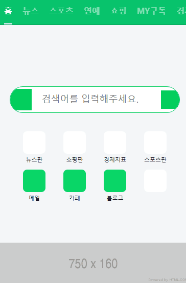
}네이버 모바일 실습 - nav, header, banner1 영역
- x축 스크롤바 생성을 위해
overflow-x: auto속성 적용, 그리고 스크롤바를 숨기기 위해서 다양한 브라우저에 맞는 속성 적용
-ms-overflow-style: none(-ms-로 시작하면 익스플로러, 엣지에 영향을 주는 속성)scrollbar-width: none(파이어폭스에 영향을 주는 속성)::-webkit-scrollbar(가상 선택자) 를display:none으로 설정
(크롬, 사파리, 오페라에 영향을 주는 속성)
HTML 문서
<body>
    <div class="wrapper">
        <nav id="main-nav">
            <ul>
                <li><a class="active" href="#">홈</a></li>
                <li><a href="#">뉴스</a></li>
                <li><a href="#">스포츠</a></li>
                <li><a href="#">연예</a></li>
                <li><a href="#">쇼핑</a></li>
                <li><a href="#">MY구독</a></li>
                <li><a href="#">경제지표</a></li>
                <li><a href="#">뭐하지</a></li>
                <li><a href="#">책방</a></li>
                <li><a href="#">리빙</a></li>
                <li><a href="#">레시피</a></li>
                <li><a href="#">장보기</a></li>
                <li><a href="#">패션뷰티</a></li>
                <li><a href="#">선물샵</a></li>
            </ul>
        </nav>

        <header id="header">
            <div class="search-wrap">
                <a class="link-logo" href="#"></a>
                <input type="text" placeholder="검색어를 입력해주세요.">
                <a class="link-voice" href="#"></a>
            </div>

            <nav class="header-nav">
                <ul>
                    <li>
                        <a href="#">
                            <i class="icon"></i>
                            <span>뉴스판</span>
                        </a>
                    </li>

                    <li>
                        <a href="#">
                            <i class="icon"></i>
                            <span>쇼핑판</span>
                        </a>
                    </li>

                    <li>
                        <a href="#">
                            <i class="icon"></i>
                            <span>경제지표</span>
                        </a>
                    </li>

                    <li>
                        <a href="#">
                            <i class="icon"></i>
                            <span>스포츠판</span>
                        </a>
                    </li>

                    <li>
                        <a href="#">
                            <i class="icon bg-green"></i>
                            <span>메일</span>
                        </a>
                    </li>

                    <li>
                        <a href="#">
                            <i class="icon bg-green"></i>
                            <span>카페</span>
                        </a>
                    </li>

                    <li>
                        <a href="#">
                            <i class="icon bg-green"></i>
                            <span>블로그</span>
                        </a>
                    </li>

                    <li>
                        <a href="#">
                            <i class="icon"></i>
                        </a>
                    </li>
                </ul>
            </nav>
        </header>

        <div id="banner-1">
            <div class="banner-wrap">
                <img src="https://via.placeholder.com/750x160" alt="">
            </div>
        </div>
	<div>
</body>
CSS 문서 1 - style.css
#main-nav {
    overflow: hidden;
    background-color: rgb(9 195 109);
    border-top: 1px solid rgba(0,0,0,.2);
    border-bottom: 1px solid rgba(0,0,0,.2);
}

#main-nav ul {
    overflow-x: auto;
    white-space: nowrap;

    display: flex;
    flex-wrap: nowrap;
    justify-content: flex-start;
    align-items: center;
}

#main-nav ul {
    -ms-overflow-style: none;
    scrollbar-width: none;
}

#main-nav ul::-webkit-scrollbar {
    display: none;
}

#main-nav ul li {
    height: 54px;
    padding: 0 10px;
    text-align: center;
}

#main-nav ul li a {
    display: block;
    height: 100%;

    border-bottom: solid 3px transparent;

    line-height: 54px;
    color: rgba(255, 255, 255, .5);
    font-weight: 700;
}

#main-nav ul li a.active {
    border-bottom: solid 3px rgba(255,255,255,.75);;
    color: rgba(255, 255, 255, 1);
}

#header {
    padding: 120px 0 80px;
    background-color: #f4f6f8;
}

#header .search-wrap {
    display: flex;
    flex-wrap: wrap;
    justify-content: flex-start;
    align-items: center;

    overflow:hidden;

    position: relative;
    width: 333px;
    height: 52px;
    margin: 0 auto 24px;
    border-radius: 26px;
    border: solid 1px #03cf5d;
    background-color: #ffffff;
}

#header .search-wrap .link-logo {
    display: block;
    width: 42px;
    height: 42px;
    background-color: #03cf5d;
}

#header .search-wrap input {
    width: calc(100% - 78px);
    height: 22px;
    padding: 0 20px;

    font-size: 18px;
}

#header .search-wrap .link-voice {
    display: block;
    width: 36px;
    height: 36px;
    background-color: #03cf5d;
}

#header .header-nav {
    width: 316px;
    margin: 0 auto;
}

#header .header-nav ul {
    display: flex;
    flex-wrap: wrap;
    justify-content: space-between;
    align-items: flex-start;

    width: 100%;
}

#header .header-nav li {
    width: 25%;
    padding-top: 12px;
}

#header .header-nav li a {
    display: block;
    width: 100%;
    text-align: center;
}

#header .header-nav li a .icon {
    display: inline-block;
    width: 44px;
    height: 44px;
    border-radius: 8px;
    /* border: solid 1px gray; */
    background-color: #ffffff;
}

#header .header-nav li a .icon.bg-green {
    background-color: #09d667;
}

#header .header-nav li a span {
    display: block;

    overflow: hidden;
    white-space: nowrap;
    text-overflow: ellipsis;

    font-size: 11px;
    color: #121223;
}

#banner-1 {
    background-color: #f4f6f8;
}

#banner-1 .banner-wrap {
    width: 100%;
    margin: 0 auto;
}

#banner-1 .banner-wrap img {
    width: 100%;
}
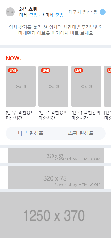
네이버 모바일 실습 - 본문(weather, now, banner2,3,4) 영역
-
온도 기호는 HTML 문서에서 특수문자
°사용 -
두 줄로 말줄임 속성 적용할 때는
display: -webkit-box,max-width: 100%,-webkit-line-clamp: 2,-webkit-box-orient: vertical속성 적용 -
세로줄을 만들 때는 가상 선택자
:before사용
HTML 문서
<body>
<div class="wrapper">
<div id="weather">
<div class="container">
<div class="weather-top">
<div class="weather-left">
<img src="https://via.placeholder.com/30" alt="">
<div class="txt-wrap">
<h3>24° 흐림</h3>
<p>미세 <span class="state">좋음</span> · 초미세 <span class="state">좋음</span></p>
</div>
</div>
<div class="weather-right">
<span>대구시 월성1동</span>
<i class="icon"></i>
</div>
</div>
<div class="weather-bottom">
<p>
위치 찾기를 눌러 현 위치의 시간대별·주간날씨와<br>
미세먼지 예보를 여기에서 바로 보세요
</p>
</div>
</div>
</div>
<div id="now">
<h2>NOW.</h2>
<ul>
<li>
<a href="#">
<div class="img-wrap">
<img src="https://via.placeholder.com/100x138" alt="">
<span>LIVE</span>
</div>
<p>[단독] 곽철용의 미술시간</p>
</a>
</li>
<li>
<a href="#">
<div class="img-wrap">
<img src="https://via.placeholder.com/100x138" alt="">
<span>LIVE</span>
</div>
<p>[단독] 곽철용의 미술시간</p>
</a>
</li>
<li>
<a href="#">
<div class="img-wrap">
<img src="https://via.placeholder.com/100x138" alt="">
<span>LIVE</span>
</div>
<p>[단독] 곽철용의 미술시간</p>
</a>
</li>
<li>
<a href="#">
<div class="img-wrap">
<img src="https://via.placeholder.com/100x138" alt="">
<span>LIVE</span>
</div>
<p>[단독] 곽철용의 미술시간</p>
</a>
</li>
<li>
<a href="#">
<div class="img-wrap">
<img src="https://via.placeholder.com/100x138" alt="">
<span>LIVE</span>
</div>
<p>[단독] 곽철용의 미술시간</p>
</a>
</li>
<li>
<a href="#">
<div class="img-wrap">
<img src="https://via.placeholder.com/100x138" alt="">
<span>LIVE</span>
</div>
<p>[단독] 곽철용의 미술시간</p>
</a>
</li>
</ul>
<div class="btn-wrap">
<a class="btn-now" href="#">나우 편성표</a>
<a class="btn-shopping" href="#">쇼핑 편성표</a>
</div>
</div>
<div id="banner-2">
<div class="banner-wrap">
<img src="https://via.placeholder.com/320x53" alt="">
</div>
</div>
<div id="banner-3">
<div class="banner-wrap">
<img src="https://via.placeholder.com/320x75" alt="">
</div>
</div>
<div id="banner-4">
<div class="banner-wrap">
<img src="https://via.placeholder.com/1250x370" alt="">
</div>
</div>
</div>
</body>CSS 문서 1 - style.css
#weather {
    background-color: #ffffff;
}

#weather .container {
    padding: 0 20px;
}

#weather .weather-top {
    display: flex;
    flex-wrap: wrap;
    justify-content: space-between;
    align-items: center;

    padding: 22px 0 16px;
}

#weather .weather-top .weather-left {
    display: flex;
    flex-wrap: wrap;
    justify-content: flex-start;
    align-items: center;
}

#weather .weather-top .weather-left img {
    width: 30px;
    height: 30px;
    border-radius: 50%;

    margin-right: 15px;
}

#weather .weather-top .weather-left .txt-wrap h3 {
    font-size: 16px;
}

#weather .weather-top .weather-left .txt-wrap p {
    font-size: 14px;
}

#weather .weather-top .weather-left .txt-wrap p .state {
    color: #00a8ff;
}

#weather .weather-top .weather-right {
    display: flex;
    flex-wrap: wrap;
    justify-content: flex-end;
    align-items: center;
}

#weather .weather-top .weather-right span {
    color: #767678;
    font-size: 14px;
    margin-right: 8px;
}

#weather .weather-top .weather-right .icon {
    display: inline-block;
    width: 20px;
    height: 20px;
    background-color: lightskyblue;
    border-radius: 50%;
}

#weather .weather-bottom {
    padding: 6px 0 30px;
}

#weather .weather-bottom p {
    color: #767678;
    font-size: 15px;
    font-weight: 400;
    line-height: 20px;
    text-align: center;
    letter-spacing: -.5px;
}

#now {
    background-color: #ffffff;
    padding: 20px 0 16px;
    margin-top: 10px;
}

#now h2 {
    margin: 0 0 14px 20px;
    font-size: 18px;
    color: #ff2c00;
    font-weight: 700;
}

#now ul {
    overflow-x: auto;

    display: flex;
    flex-wrap: nowrap;
    justify-content: flex-start;
    align-items: flex-start;
    padding: 0 20px 20px;
}

#now ul {
    -ms-overflow-style: none;
    scrollbar-width: none;
}

#now ul::-webkit-scrollbar {
    display: none;
}

#now li {
    width: 100px;
    margin-right: 10px;
}

#now li:last-child {
    margin-right: 0;
}

#now li a {
    width: 100%;
    color: #303038;
}

#now li a .img-wrap {
    position: relative;
    width: 100px;
    height: 138px;
}

#now li a .img-wrap img {
    width: 100%;
    height: 100%;
    border-radius: 5px;
}

#now li a .img-wrap span {
    position: absolute;
    width: 32px;
    height: 16px;

    background-color: #f4361e;
    border: solid 1px #f61c00;
    border-radius: 8px;
    text-align: center;

    color: #ffffff;
    font-size: 10px;
    font-weight: 700;
    line-height: 14px;

    left: 8px;
    top: 8px;
}

#now li a p {
    overflow: hidden;
    display: -webkit-box;
    max-width: 100%;
    -webkit-line-clamp: 2;
    -webkit-box-orient: vertical;

    padding-top: 10px;

    font-size: 14px;
}

#now .btn-wrap {
    overflow: hidden;

    display: flex;
    flex-wrap: wrap;
    justify-content: center;
    align-items: center;

    width: 335px;
    margin: 0 auto;

    border-radius: 25px;
    background-color: #f5f8fb;
}

#now .btn-wrap a {
    display: block;
    width: 50%;
    height: 44px;
    text-align: center;
    line-height: 44px;

    color: #767678;
}

#now .btn-wrap .btn-shopping:before {
    content: "";
    display: block;
    width: 1px;
    height: 14px;

    margin-top: 15px;
    background-color: rgba(125, 127, 133, .2);

    vertical-align: top;

    float: left;
}

#banner-2 {
    background-color: #ffffff;
    margin-top: 10px;
}

#banner-2 .banner-wrap {
    width: 320px;
    margin: 0 auto;
}

#banner-2 .banner-wrap img {
    width: 100%;
}

#banner-3 {
    background-color: #ffffff;
    margin-top: 10px;
}

#banner-3 .banner-wrap {
    width: 320px;
    margin: 0 auto;
}

#banner-3 .banner-wrap img {
    width: 100%;
}

#banner-4 {
    overflow: hidden;
    background-color: #ffffff;
    margin-top: 10px;
}

#banner-4 .banner-wrap {
    width: 100%;
    height: 155px;
}

#banner-4 .banner-wrap img {
    position: relative;
    height: 100%;

    left: 50%;
    transform: translateX(-50%);
}
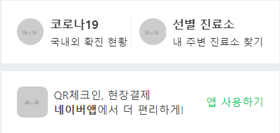
네이버 모바일 실습 - 본문(corona, naverAPP) 영역
- 가상 선택자가 3차원 속성을 지닐 때는, 가상 선택자 태그의 앞 태그에
position:relative속성을 지정해야 앞 태그 기준으로 위치가 조정됨
HTML 문서
<body>
    <div class="wrapper">
        <div id="corona">
            <div class="container">
                <div class="corona-wrap">
                    <a href="#" class="left-corona">
                        <img src="https://via.placeholder.com/35" alt="">
                        <div class="txt-wrap">
                            <h3>코로나19</h3>
                            <p>국내외 확진 현황</p>
                        </div>
                    </a>

                    <a href="#" class="right-corona">
                        <img src="https://via.placeholder.com/35" alt="">
                        <div class="txt-wrap">
                            <h3>선별 진료소</h3>
                            <p>내 주변 진료소 찾기</p>
                        </div>
                    </a>
                </div>
            </div>
        </div>

        <div id="naverAPP">
            <div class="container">
                <div class="naverAPP-wrap">
                    <div class="naverAPP-left">
                        <img src="https://via.placeholder.com/40" alt="">
                        <div class="txt-wrap">
                            <p>QR체크인, 현장결제<br>
                               <b>네이버앱</b>에서 더 편리하게!
                            </p>
                        </div>
                    </div>

                    <div class="naverAPP-right">
                        <span>앱 사용하기</span>
                    </div>
                </div>
            </div>
        </div>
    </div>
</body>
CSS 문서 1 - style.css
#corona {
    background-color: #ffffff;
    margin-top: 10px;
}

#corona .container {
    padding: 0 20px;
}

#corona .corona-wrap {
    display: flex;
    flex-wrap: wrap;
    justify-content: space-between;
    align-items: center;
}

#corona .corona-wrap a {
    position: relative;
    display: flex;
    flex-wrap: wrap;
    justify-content: space-between;
    align-items: center;

    padding: 20px 0;
}

#corona .corona-wrap a.right-corona {
    padding-left: 11px;
}

#corona .corona-wrap a.right-corona:before {
    content: "";
    display: block;
    position: absolute;
    width: 1px;
    height: 42px;
    background-color: #efeff0;

    top: 20px;
    left: 0;
}

#corona .corona-wrap a img {
    width: 35px;
    border-radius: 50%;
    margin-right: 8px;
}

#corona .corona-wrap a .txt-wrap {
    color: #303038;
}

#corona .corona-wrap a .txt-wrap h3 {
    font-size: 15px;
    font-weight: 700;
}

#corona .corona-wrap a .txt-wrap p {
    margin-top: 4px;
    font-size: 13px;
    font-weight: 400;
}

#naverAPP {
    background-color: #ffffff;
    margin-top: 10px;
}

#naverAPP .container {
    padding: 20px;
}

#naverAPP .naverAPP-wrap {
    display: flex;
    flex-wrap: wrap;
    justify-content: space-between;
    align-items: center;
}

#naverAPP .naverAPP-left {
    display: flex;
    flex-wrap: wrap;
    justify-content: flex-start;
    align-items: center;
}

#naverAPP .naverAPP-left img {
    width: 40px;
    height: 40px;
    border-radius: 8px;

    margin-right: 8px;
}

#naverAPP .naverAPP-left .txt-wrap p {
    font-size: 14px;
    color: #424242;
    font-weight: 400;
}

#naverAPP .naverAPP-right {
    display: flex;
    flex-wrap: wrap;
    justify-content: flex-end;
    align-items: center;
}

#naverAPP .naverAPP-right span {
    font-size: 14px;
    font-weight: 400;
    color: #03c95b;
}
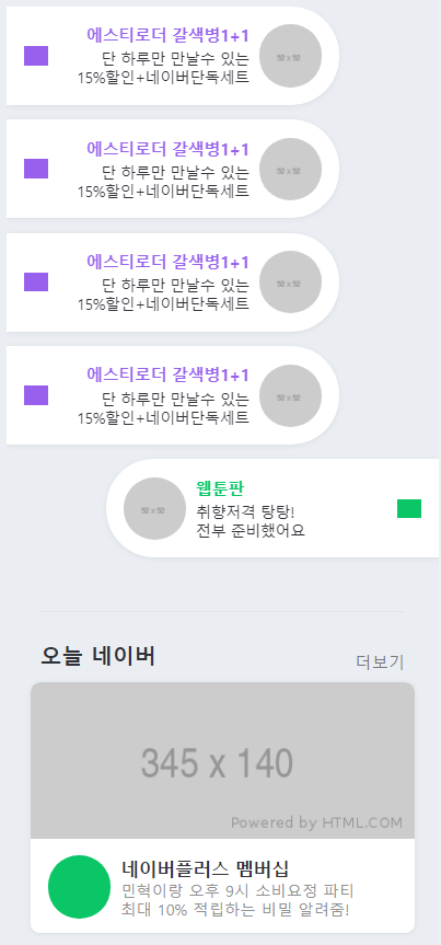
네이버 모바일 실습 - 본문(talk, today) 영역
-
li태그를 왼쪽과 오른쪽으로 붙이기 위해float속성 설정, 따라서ul태그가li태그 높이를 인식하지 못하기 때문에overflow: hidden속성 적용 -
content-body영역 자체에border-radius속성을 적용하여 모서리를 둥글게 만들고,overflow:hidden속성을 적용하여 밖으로 나가는 내용을 숨김 처리
HTML 문서
<body>
    <div class="wrapper">
        <div id="talk">
            <ul>
                <li class="left-list">
                    <a href="#">
                        <i class="icon-arrow icon-arrow-left"></i>
                        <div class="content-wrap">
                            <div class="txt-wrap">
                                <h3>에스티로더 갈색병1+1</h3>
                                <p>단 하루만 만날수 있는<br>
                                   15%할인+네이버단독세트
                                </p>
                            </div>

                            <img src="https://via.placeholder.com/52" alt="">
                        </div>
                    </a>
                </li>

                <li class="right-list">
                    <a href="#">

                        <div class="content-wrap">
                            <img src="https://via.placeholder.com/52" alt="">

                            <div class="txt-wrap">
                                <h3>웹툰판</h3>
                                <p>취향저격 탕탕!<br>
                                   전부 준비했어요
                                </p>
                            </div>
                        </div>
                        <i class="icon-arrow icon-arrow-right"></i>
                    </a>
                </li>
            </ul>
        </div>

        <div id="today">
            <div class="container">
                <div class="content-header">
                    <h2>오늘 네이버</h2>
                    <a href="#">더보기</a>
                </div>

                <div class="content-body">
                    <img class="banner" src="https://via.placeholder.com/345x140" alt="">
                    </a>

                    <div class="bottom-wrap">
                        <i class="icon"></i>
                         <div class="txt-wrap">
                            <h3>네이버플러스 멤버십</h3>
                            <p>민혁이랑 오후 9시 소비요정 파티<br>
                               최대 10% 적립하는 비밀 알려줌!
                            </p>
                        </div>
                     </div>
                </div>
            </div>
        </div>
    </div>
</body>
CSS 문서 1 - style.css
#talk {
    padding: 20px 0;
}

#talk ul {
    overflow: hidden;
}

#talk ul li {
    position: relative;
    width: 277px;
    padding: 15px 0;
    box-shadow: 0 1px 6px 0 rgb(0 0 0 / 6%), 0 1px 0 0 rgb(0 0 0 / 2%);
    background-color: #fff;

    margin-bottom: 12px;
}

#talk ul li:last-child {
    margin-bottom: 12px;
}

#talk ul li a {
    display: flex;
    flex-wrap: wrap;
    justify-content: space-between;
    align-items: center;

    padding: 0 15px;
}

#talk ul li .icon-arrow {
    display: inline-block;
    width: 20px;
    height: 16px;
    background-color: #9761ed;
}

#talk ul li .content-wrap {
    display: flex;
    flex-wrap: wrap;
    justify-content: flex-end;
    align-items: center;
}

#talk ul li .content-wrap .txt-wrap {
    width: 157px;
    text-align: right;
}

#talk ul li .content-wrap .txt-wrap h3 {
    color: #9761ed;
    font-size: 14px;
    font-weight: 600;
    line-height: 17px;
    letter-spacing: -.65px;
}

#talk ul li .content-wrap .txt-wrap p {
    margin-top: 3px;
    font-size: 13px;
    line-height: 16px;
    letter-spacing: -.61px;
}

#talk ul li .content-wrap img {
    width: 52px;
    height: 52px;
    border-radius: 50%;
    margin-left: 8px;
}

#talk ul li.left-list {
    float:left;
    border-top-right-radius: 40px;
    border-bottom-right-radius: 40px;
}

#talk ul li.right-list {
    float: right;
    border-top-left-radius: 40px;
    border-bottom-left-radius: 40px;
}

#talk ul li.right-list .content-wrap {
    display: flex;
    flex-wrap: wrap;
    justify-content: flex-start;
    align-items: center;
}

#talk ul li.right-list .icon-arrow-right {
    background-color: #0ac666;;
}

#talk ul li.right-list .content-wrap img {
    margin-left: 0;
    margin-right: 8px;
}

#talk ul li.right-list .txt-wrap {
    text-align: left;
}

#talk ul li.right-list .txt-wrap h3 {
    color: #0ac666;
}

#today .container {
    padding: 0 20px;
}

#today .content-header {
    display: flex;
    flex-wrap: wrap;
    justify-content: space-between;
    align-items: center;

    border-top: 1px solid #e0e4ea;
    margin: 12px 8px 0;
    padding-top: 24px;
}

#today .content-header h2 {
    font-size: 18px;
    font-weight: bold;
    margin-bottom: 10px;
}

#today .content-header a {
    color: #767678;
    font-size: 14px;
    font-weight: 400;
}

#today .content-body {
    overflow: hidden;

    width: 100%;
    background-color: #fff;
    border-radius: 8px;
    box-shadow: 0 1px 6px 0 rgb(0 0 0 / 6%), 0 1px 0 0 rgb(0 0 0 / 2%);
}

#today .content-body .banner {
    width: 100%;
    height: 140px;
}

#today .content-body .bottom-wrap {
    display: flex;
    flex-wrap: wrap;
    justify-content: flex-start;
    align-items: center;

    padding: 14px 13px 12px 15px;
}

#today .content-body .bottom-wrap .icon {
    display: block;
    width: 52px;
    height: 52px;
    background-color: #0ac666;
    border-radius: 50%;
    margin-right: 8px;
}

#today .content-body .bottom-wrap .txt-wrap h3 {
    font-size: 15px;
    font-weight: 600;
}

#today .content-body .bottom-wrap .txt-wrap p {
    font-size: 13px;
    font-weight: 400;
    line-height: 16px;
    color: #929294;
} 
네이버 모바일 실습 - footer 영역
- 처음에는
br태그로 줄을 나누었는데,:first-child속성 적용이 되지 않음. 그래서 각각div태그로 묶은 후에,:first-child속성을 적용하여 첫번째a태그의before속성을 제거함
HTML 문서
<body>
    <div class="wrapper">
        <footer id="footer">
            <div class="txt-wrap">
                <div class="link">
                    <a href="#">로그인</a>
                    <a href="#">전체서비스</a>
                    <a href="#">PC버전</a>
                </div>

                <div class="link">
                    <a href="#">이용약관</a>
                    <a href="#">개인정보처리방침</a>
                    <a href="#">고객센터</a>
                </div>
            </div>

            <h1><a href="#"><img src="https://via.placeholder.com/74x14" alt=""></a></h1>
        </footer>
    </div>
</body>
CSS 문서 1 - style.css
#footer {
    padding: 35px 0 80px;
}

#footer .txt-wrap {
    text-align: center;
}

#footer .txt-wrap a {
    position: relative;
    display: inline-block;
    padding: 3px 9px;
    color: #929294;
    font-size: 13px;
    font-weight: 400;

    letter-spacing: -.5px;
}

#footer .txt-wrap a:before {
    content: "";
    display: block;
    position: absolute;
    top: 7px;
    left: 0;
    width: 1px;
    height: 10px;
    background-color: #d7dfe7;
}

#footer .txt-wrap .link a:first-child:before {
    content: none;
}

#footer h1 {
    text-align: center;
}

#footer h1 img {
    width: 74px;
}
학습한 내용 중 어려웠던 점 또는 해결못한 것들
-
가상 선택자가 3차원 속성을 지닐 때는, 가상 선택자가 선택한 태그 앞의 태그가
position:relative속성을 지닐 것 -
자식 태그의 높이를 인식하는
overflow: hidden속성 -
br태그 사용시:first-child속성 사용 불가
해결방법
-
복습을 통해, 가상 선택자가 3차원 속성
absolute속성을 지닐 때는, 가상 선택자가 자식 태그 취급을 받는다고 생각하고, 부모가relative속성을 지니면 부모 기준으로 위치 설정 가능 -
앞선 개발 일지 복습을 통해,
overflow: hidden속성 적용시 약간의 편법으로 높이를 인식하게 해주는 방법이라는 것을 복습 -
검색을 통해,
br태그는 줄 넘기기 속성만을 지니기 때문에,:first-child속성을 사용하기 위해서는 따로 태그로 묶어서 사용해야된다는 것을 확인
학습 소감
-
오늘은 네이버 모바일 웹 사이트 카피캣 실습을 마무리하였음. 한번에 많은 양을 진행했어서 그런지 조금 시간이 오래 걸렸음. 오늘 진행한 내용 중에 특히 생각나는 것은 x축 스크롤 숨기기 기능인데, 각각 브라우저 마다 사용가능한 속성이 다르기 때문에 여러 속성들을 설정해줘야 한다는 것은 필수적으로 알아두어야할 것 같음.
또한, 가상 선택자를 3차원 속성(
absolute) 으로 설정할 때는, 그 앞의 부모 태그를 꼭relative속성을 지니게 해줘야 부모 태그를 기준으로 위치를 조정할 수 있다는 것 또한 알아두어야 할 내용이었음.내일부터는 자바스크립트 내용 학습이 진행될 예정인데, 새롭게 또 배운다는 마음가짐을 가지고 열심히 진행해봐야겠음.