- 준비단계
from pandas import Series,DataFrame
import pandas as pd
import matplotlib.pyplot as plt
from matplotlib import font_manager,rc
font_name = font_manager.FontProperties(fname='c:/windows/fonts/gulim.ttc').get_name()
rc('font',family=font_name)- 기초 bar 차트
x = [1,2,3]
y = [90,80,70]

plt.bar(x=x,height=y,color=['orange','green','blue'])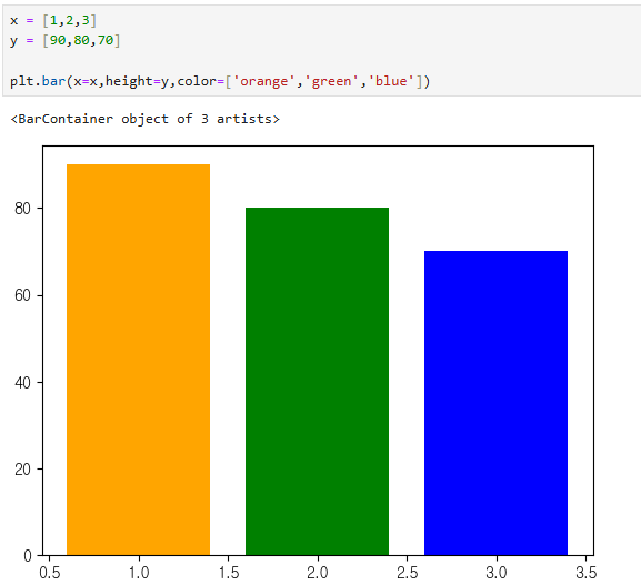
- label 이름 지정
plt.xticks(x,labels=['SQL','PL/SQL','PYTHON'])
plt.bar(x=x,height=y,color=['orange','green','blue'])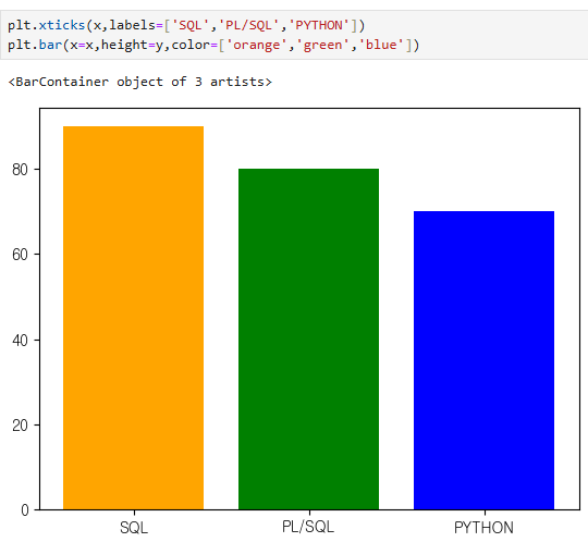
- text 이름 지정
plt.text(1,91,90)
plt.text(2,81,80)
plt.text(3,71,70)
plt.text(2,90,'My Job is an Oracle Engineer!!')
plt.xticks(x,labels=['SQL','PL/SQL','PYTHON'])
plt.bar(x=x,height=y,color=['orange','green','blue'])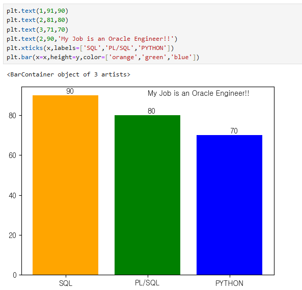
- font 및 테두리 설정
font = {'family' : 'sans-serif',
		'color' : 'darkred',
        'size' : 15}
box = {'boxstyle' : 'round',
	   'edgecolor' : 'black',
       'facecolor' : 'white'}


plt.text(1,91,90,fontdict=font)
plt.text(2,81,80, bbox=box)
plt.text(3,71,70)
plt.text(2,90,'My Job is an Oracle Engineer!!',fontdict=font,bbox=box)
plt.xticks(x,labels=['SQL','PL/SQL','PYTHON'])
plt.bar(x=x,height=y,color=['orange','green','blue'])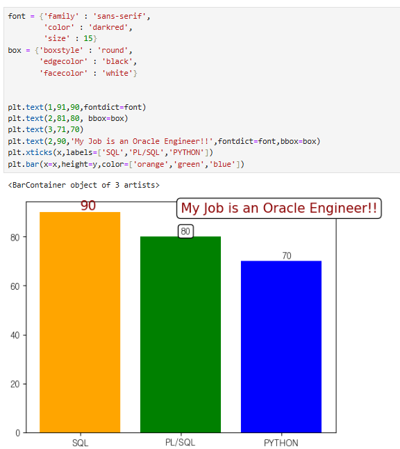
요일별 입사한 사원 수 시각화
- csv 파일 읽어오기
emp = pd.read_csv('C:/Temp/employees.csv')
emp.info()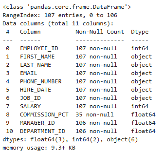
- object였던 데이터 타입을 datetime 타입으로 변경
emp['HIRE_DATE'] = pd.to_datetime(emp['HIRE_DATE'])
emp.info()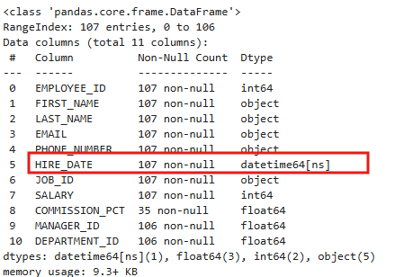
- 날짜값을 0~6까지 표현
- 0이 월요일, 6이 일요일
emp['HIRE_DATE'].dt.weekday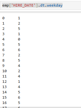
- 그룹화
emp['EMPLOYEE_ID'].groupby(emp['HIRE_DATE'].dt.weekday).count()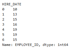
- bar 차트 만들기
plt.bar(x=week.index,height=week)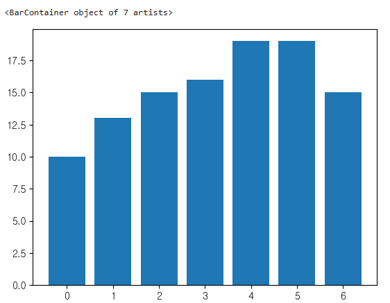
6. x축 label 설정
plt.xticks(week.index,labels=['월','화','수','목','금','토','일'])
plt.bar(x=week.index,height=week)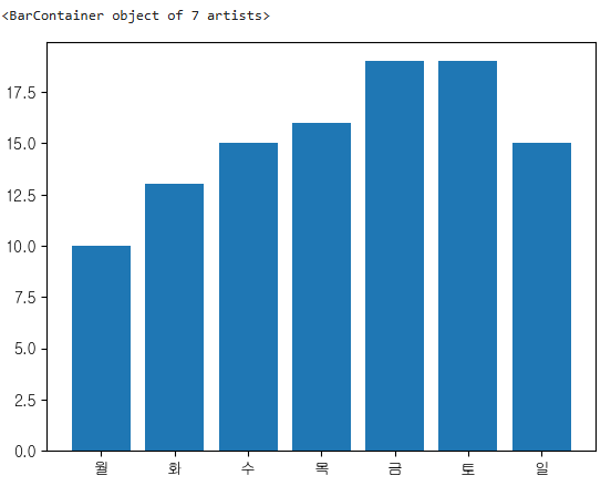
7. y축 간격 설정
plt.yticks(range(0,21,5))
plt.xticks(week.index,labels=['월','화','수','목','금','토','일'])
plt.bar(x=week.index,height=week)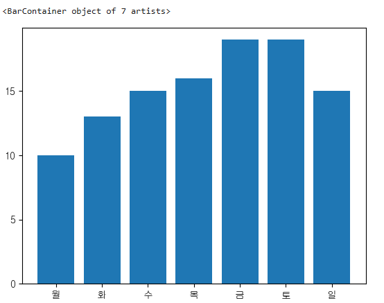
- bar 위에 값 표시
for i in week.index:
	plt.text(i-0.1,week[i]+0.2,week[i])
plt.yticks(range(0,21,5))
plt.xticks(week.index,labels=['월','화','수','목','금','토','일'])
plt.bar(x=week.index,height=week) 
quarter = emp['EMPLOYEE_ID'].groupby(emp['HIRE_DATE'].dt.quarter).count()
quarter.index

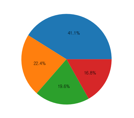
plt.pie(quarter,autopct='%1.1f%%')
plt.show()
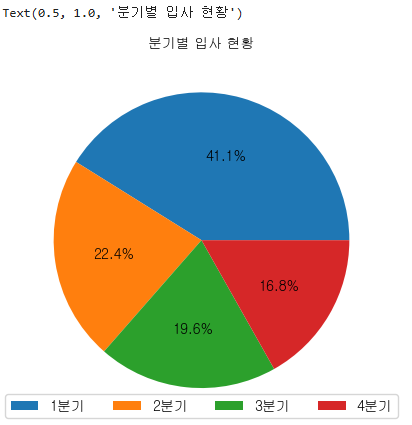
label = [str(i) + '분기' for i in quarter.index]
plt.pie(quarter,autopct='%1.1f%%')
plt.legend(labels=label, loc='lower center',ncol=4)
plt.title('분기별 입사 현황',fontsize=10)
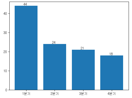
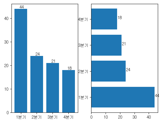
plt.bar(x=quarter.index, height=quarter)
plt.xticks(quarter.index, labels=label)
for i in quarter.index:
plt.text(i-0.1, quarter[i] + 0.2, quarter[i])
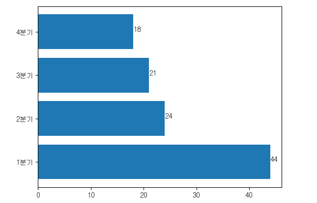
plt.barh(y=quarter.index, width=quarter)
plt.yticks(ticks=quarter.index, labels=label)
for i in quarter.index:
plt.text(quarter[i],i, quarter[i])
plt.subplot(1,2,1)
plt.bar(x=quarter.index, height=quarter)
plt.xticks(quarter.index, labels=label)
for i in quarter.index:
plt.text(i-0.1, quarter[i] + 0.2, quarter[i])
plt.subplot(1,2,2)
plt.barh(y=quarter.index, width=quarter)
plt.yticks(ticks=quarter.index, labels=label)
for i in quarter.index:
plt.text(quarter[i],i, quarter[i])
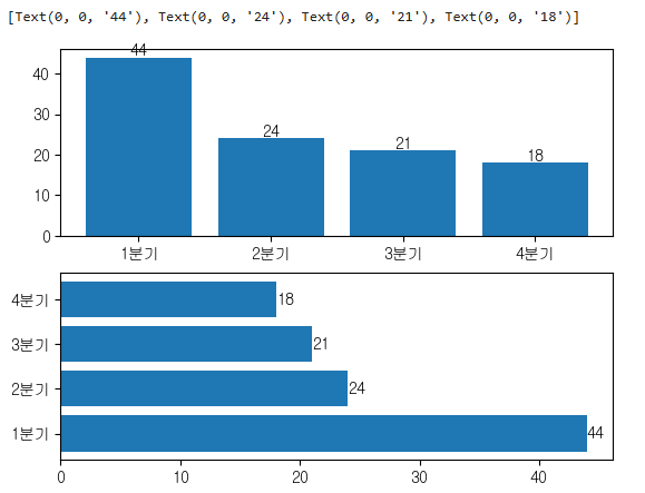
plt.subplot(2,1,1)
p = plt.bar(x=quarter.index, height=quarter)
plt.xticks(quarter.index, labels=label)
plt.bar_label(p)
plt.subplot(2,1,2)
p = plt.barh(y=quarter.index, width=quarter)
plt.yticks(ticks=quarter.index, labels=label)
plt.bar_label(p)
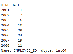
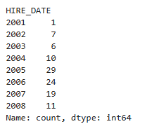
emp.EMPLOYEE_ID.groupby(emp.HIRE_DATE.dt.year).count()
emp.HIRE_DATE.dt.year.value_counts()
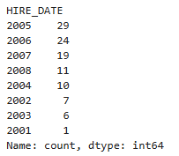
years = emp.HIRE_DATE.dt.year.value_counts()
years.index
years.sort_index(inplace=True)
years
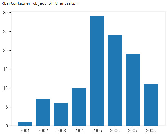
plt.bar(x=years.index, height=years)
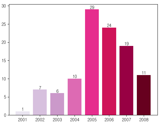
import numpy as np
cmap = plt.get_cmap('PuRd')
colors = [cmap(i) for i in np.linspace(0.1,1,8,endpoint=True)]
p = plt.bar(x=years.index, height=years, color = colors)
plt.bar_label(p)
plt.show()
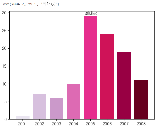
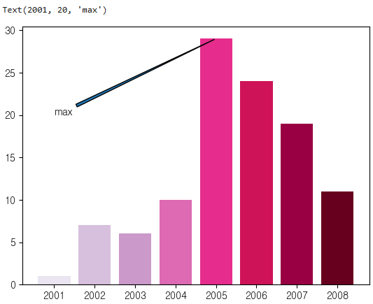
plt.bar(x=years.index, height=years, color = colors)
plt.text(2005-0.3,29.5,'최대값')
plt.bar(x=years.index, height=years, color = colors)
plt.annotate(text='max', xy=(2005,29),xytext=(2001,20),arrowprops={'arrowstyle':'wedge'})
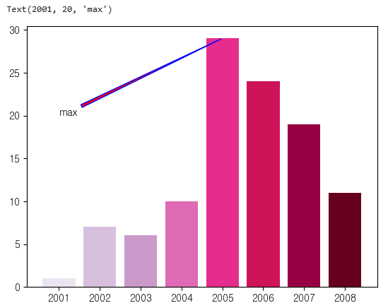
plt.bar(x=years.index, height=years, color = colors)
plt.annotate(text='max', xy=(2005,29),xytext=(2001,20),arrowprops={'arrowstyle': 'wedge',
'facecolor': 'red', # 화살표 채우기 색상
'edgecolor': 'blue'})
line plot
- 선을 그리는 그래프
- 시간, 순서등에 따라 어떻게 변하는지를 보여주는 그래프
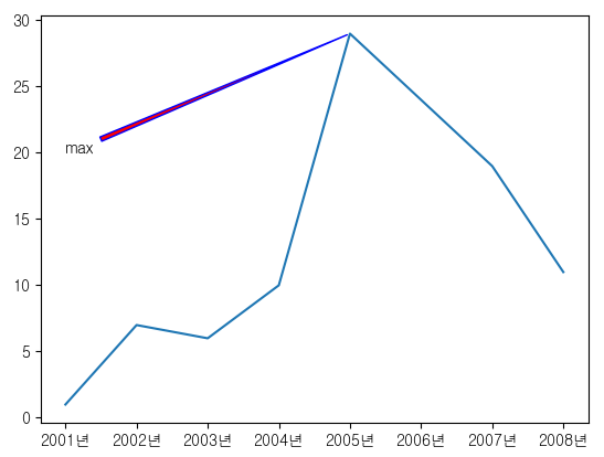
plt.plot(years.index, years)
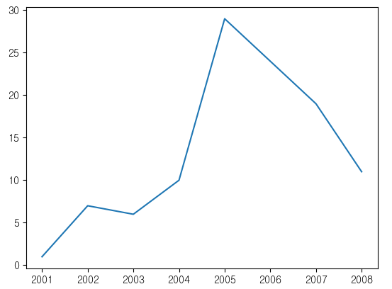
plt.plot(years.index,years)
plt.xticks(years.index,[str(i) + '년' for i in years.index])
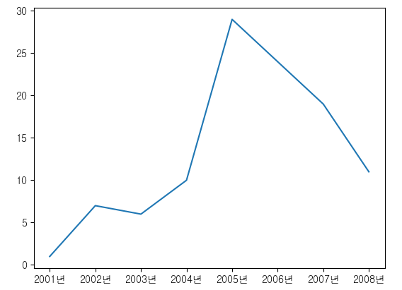
plt.plot(years.index,years)
plt.xticks(years.index,[str(i) + '년' for i in years.index])
plt.annotate(text='max', xy=(2005,29),xytext=(2001,20),arrowprops={'arrowstyle': 'wedge',
'facecolor': 'red', # 화살표 채우기 색상
'edgecolor': 'blue'})
cx_Oracle 연결
conn = cx_Oracle.connect("sys", "oracle", "localhost:1521/xe",
mode=cx_Oracle.SYSDBA, encoding='UTF-8')
cursor = conn.cursor() # 'cusor'를 'cursor'로 수정
cursor.execute("""SELECT TRUNC(first_time), COUNT(*)
FROM v$log_history
GROUP BY TRUNC(first_time)
ORDER BY 1""")
data = cursor.fetchall()
DataFrame 생성
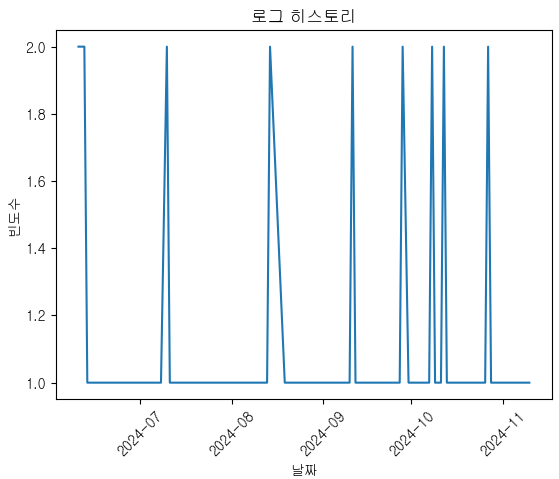
df = pd.DataFrame(data)
df.columns = ['day', 'freq']
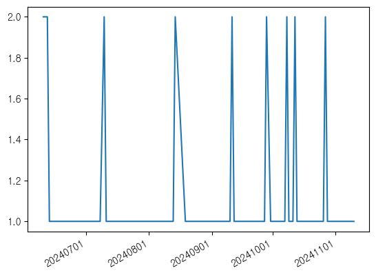
두 번째 그래프 그리기
plt.plot(df['day'], df['freq'])
plt.xticks(rotation=45)
plt.xlabel('날짜')
plt.ylabel('빈도수')
plt.title('로그 히스토리')
plt.show()
커넥션 종료
cursor.close()
conn.close()
print('---------------------------------------------------------------------------------')
import numpy as np
import matplotlib.pyplot as plt
import pandas as pd
import cx_Oracle
예시 데이터 (years)
years = emp.HIRE_DATE.dt.year.value_counts()
years.sort_index(inplace=True)
첫 번째 그래프 그리기
plt.plot(years.index, years)
plt.xticks(years.index, [str(i) + "년" for i in years.index])
plt.annotate(text="max",
xy=(2005, 29),
xytext=(2001, 28),
arrowprops={"arrowstyle": "wedge",
"facecolor": "red",
"edgecolor": "blue"},
color='black')
plt.text(2005, 29, "최대값")
#plt.show()
cx_Oracle 연결
conn = cx_Oracle.connect("sys", "oracle", "192.168.56.150:1521/ora19c",
mode=cx_Oracle.SYSDBA, encoding='UTF-8')
cursor = conn.cursor()
cursor.execute("""SELECT TRUNC(first_time), COUNT(*)
FROM v$log_history
GROUP BY TRUNC(first_time)
ORDER BY 1""")
data = cursor.fetchall()
DataFrame 생성
df = pd.DataFrame(data)
df.columns = ['day', 'freq']
두 번째 그래프 그리기
plt.plot(df['day'], df['freq'])
plt.xticks(rotation=45)
plt.xlabel('날짜')
plt.ylabel('빈도수')
plt.title('로그 히스토리')
plt.show()
커넥션 종료
cursor.close()
conn.close()
- 
```python
import matplotlib.dates as mdates
# 3일단위
fig, ax = plt.subplots()
ax.plot('day', 'freq', data=df)
ax.xaxis.set_major_locator(mdates.DayLocator(interval=3))
ax.xaxis.set_major_formatter(mdates.DateFormatter('%Y%m%d'))
plt.gcf().autofmt_xdate()
plt.show()
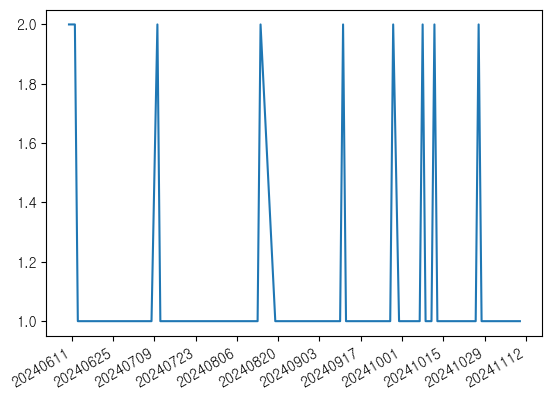
# 주단위
fig, ax = plt.subplots()
ax.plot('day', 'freq', data=df)
ax.xaxis.set_major_locator(mdates.WeekdayLocator(interval=1))
ax.xaxis.set_major_formatter(mdates.DateFormatter('%Y%m%d'))
plt.gcf().autofmt_xdate()
plt.show()
# 월단위
fig, ax = plt.subplots()
ax.plot('day', 'freq', data=df)
ax.xaxis.set_major_locator(mdates.MonthLocator(interval=1))
ax.xaxis.set_major_formatter(mdates.DateFormatter('%Y%m%d'))
plt.gcf().autofmt_xdate()
plt.show()
# 년단위 YearLocator
# 시간단위 HourLocator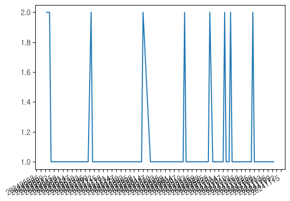
wordcloud
conda install -c conda-forge wordcloud
from wordcloud import WordCloud
word = {'떡볶이':100,'감자탕':50,'순대국밥':10,'치즈':120,'치킨':70,'김밥':40,'짜장면':300,'야끼만두':150,'볶음밥':200,'핫도그':90,'호두':60,'알감자':50,'짬뽕':200,'탕수육':400}
w = WordCloud(font_path = 'c:Windows/Fonts/gulim.ttc',
background_color = 'white',
width = 900,height=500).generate_from_frequencies(word)
plt.imshow(w)
plt.axis('off')

obama = open('C:/Users/itwill/Downloads/obama.txt',encoding='UTF-8').read()
w = WordCloud(font_path = 'c:Windows/Fonts/gulim.ttc',
background_color = 'white',
width = 900,height=500).generate(obama)
plt.imshow(w)
plt.axis('off')

도수분포표(Frequency Table)
- 미리 구간을 설정해서 각 구간의 범위안에 조사된 데이터 값들이 몇개씩 속하는지 나타내는 표
ages = [21,24,25,26,27,29,31,37,39,40,42,45,50,51,56,59,60,69]
cut
- 연속형 데이터를 범주형 데이터로 변환하는 함수
21 -> [20,30]
24 -> [20,30]
25 -> [20,30]
31 -> [30.40]
나이 데이터
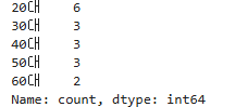
ages = [21, 24, 25, 26, 27, 29, 31, 37, 39, 40, 42, 44, 50, 56, 59, 60, 69]
구간 설정
bins = [20, 30, 40, 50, 60, 70] # 구간의 경계
labels = ['20대', '30대', '40대', '50대', '60대'] # 구간 레이블
도수 분포표 생성
age_distribution = pd.cut(ages, bins=bins, labels=labels, right=False)
frequency_table = age_distribution.value_counts().sort_index()
도수 분포표 출력
print(frequency_table)
histogram
- 자료가 모여 있는 위치나 자료의 분포에 관한 대략적인 정보를 한눈에 파악할 수 있는 그래프이다.
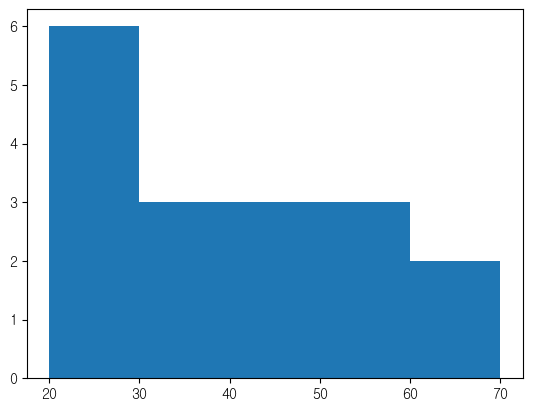
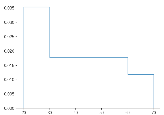
ages = [21, 24, 25, 26, 27, 29, 31, 37, 39, 40, 42, 44, 50, 56, 59, 60, 69]
bins = [20, 30, 40, 50, 60, 70]
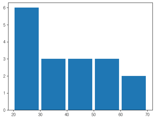
plt.hist(ages)
plt.hist(ages,bins=bins)
plt.hist(ages,bins=bins,density=True,histtype='step')
plt.hist(ages,bins=bins,rwidth=0.9)
- 이렇게 막대그래프 처럼 히스토그램을 사용해서는 안된다.
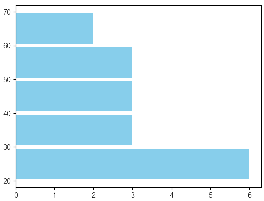
plt.hist(ages,bins=bins,rwidth=0.9,orientation='horizontal',color='skyblue')
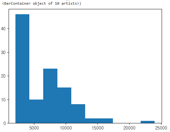
plt.hist(emp['SALARY'])
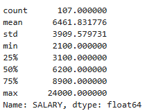
emp['SALARY'].describe()
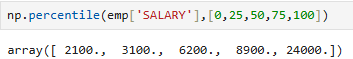
사분위수
- 데이터 표본을 동일하게 4개로 나눈 값
np.percentile(emp['SALARY'],[0,25,50,75,100])
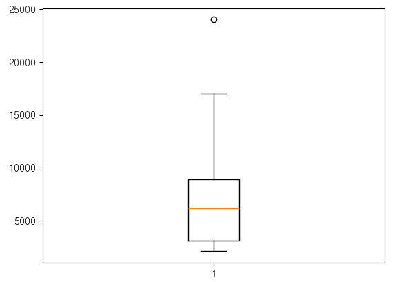
box plot
- 데이터가 어떤 범위에 걸쳐 존재하는지 분포를 체크할때 사용되는 그래프
- 다섯 수치 요약을 제공하는 그래프
- 이상치 데이터를 확인 할때 좋은 그래프
plt.boxplot(emp['SALARY'])
사분위범위(inter quartile range)
plt.boxplot(emp['SALARY'],vert=False)
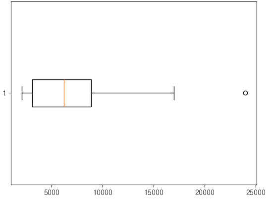
min = np.percentile(emp['SALARY'],0)
Q1 = np.percentile(emp['SALARY'],25)
Q2 = np.percentile(emp['SALARY'],50)
Q3 = np.percentile(emp['SALARY'],75)
max = np.percentile(emp['SALARY'],100)
iqr = Q3 - Q1
lower fence
lf = Q1 - 1.5 * iqr
upper fence
uf = Q3 + 1.5 * iqr
lf ~ uf 범위에 벗어나면 이상치 데이터 이다.
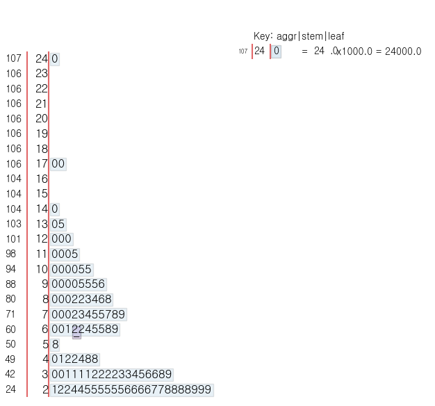
줄기잎 그림(stem and leaf diagram)
- 자료(수치형)의 특성을 나타내고자 할때 사용하는 그래프
pip install stemgraphic
import stemgraphic
stemgraphic.stem_graphic(emp['SALARY'])