Matplotlib에서의 Text
-
시각화에서의 Text 사용은 Visual representation만으로 줄 수 없는 정보를 전달해줄 수 있으며 오해를 방지할 수 있다.
-
하지만 과용을 하게 된다면 이해를 방해할 수 있으니 주의해야 한다.
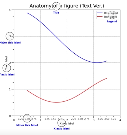
Anatomy of a Figure(Text Ver.)
-
Title : 가장 큰 주제를 설명
-
Label : 축에 해당하는 데이터 정보를 제공
-
Tick Label : 축에 눈금에 사용하여 스케일 정보 추가
-
Legend : 한 그래프에서 2개 이상의 서로 다른 데이터를 분류하기 위해서 사용하는 보조 정보
-
Annotation(Text) : 그 외의 시각화에 대한 설명을 추가
Annotation는 Text기능과 다르게 화살표 등을 사용하여 pointing효과를 줄 수 있다.
실습
| pyplot API | Objecte-oriented API | description |
|---|---|---|
suptitle | suptitle | title of figure |
title | set_title | title of subplot ax |
xlabel | set_xlabel | x-axis label |
ylabel | set_ylabel | y-axis label |
figtext | text | figure text |
text | text | Axes taext |
annoatate | annotate | Axes annotation with arrow |
fig, ax = plt.subplots()

fig.suptitle('Figure Title')

ax.plot([1, 3, 2], label='legend')
ax.legend()

ax.set_title('Ax Title')
ax.set_xlabel('X Label')
ax.set_ylabel('Y Label')

ax.text(x=1,y=2, s='Text')
fig.text(0.5, 0.6, s='Figure Text')

plt.show()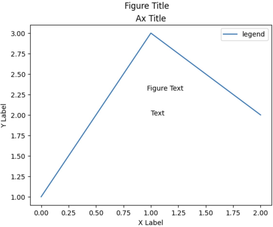
-
fig.text(): 전체 figure에서의 비율로 사용 -
ax.text(): ax에서 좌표로 사용
Text Properties
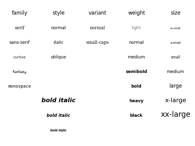
Font Components
family: 글씨체sizeorfontsize: 글씨 크기, 숫자로도 적용가능styleorfontstyle: 기울림체 적용weightorfontweight: 글씨 두께
fig, ax = plt.subplots()
ax.set_xlim(0, 1)
ax.set_ylim(0, 1)

ax.text(x=0.5, y=0.5, s='Text\nis Important',
        fontsize=20,
        fontweight='bold',
        fontfamily='serif',
       )


plt.show()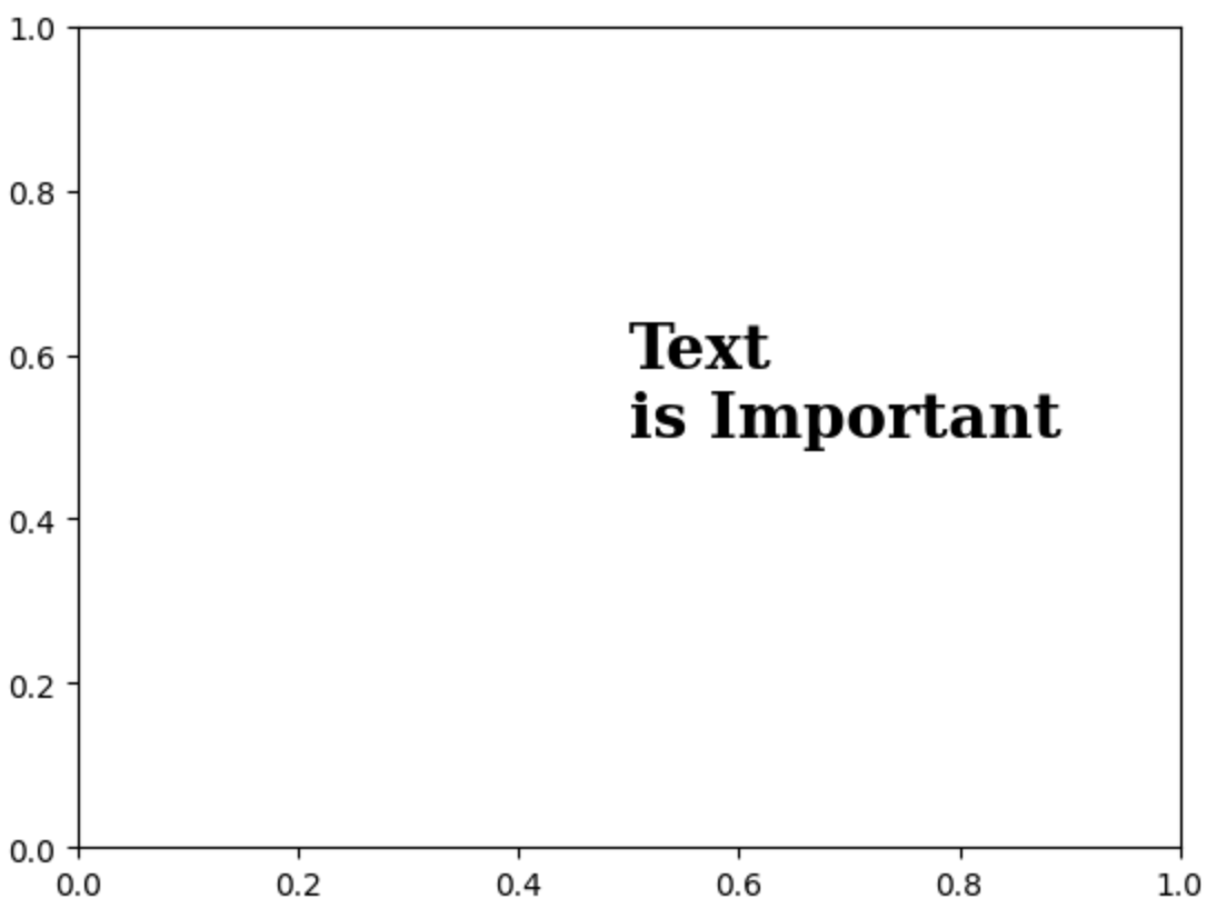
Details
color: 색상linespacing: 줄 간격 조정backgroundcolor: 배경색상alpha: 투명도zorder: z축에 대한 속성, 맨앞으로 이동 맨뒤로 이동visible: boolean값으로 텍스트가 보일지 말지 설정(굳이 사용하지 않아도 됨)
fig, ax = plt.subplots()
ax.set_xlim(0, 1)
ax.set_ylim(0, 1)

ax.text(x=0.5, y=0.5, s='Text\nis Important',
        fontsize=20,
        fontweight='bold',
        fontfamily='serif',
        color='royalblue',
        linespacing=5,
        backgroundcolor='lightgray',
        alpha=0.5
       )


plt.show()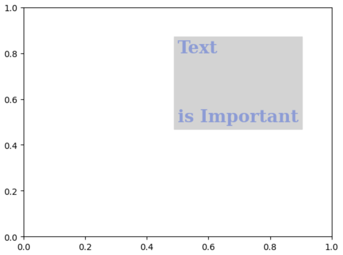
Alignment
정렬과 관련하여 이런 요소
ha: horizontal alignment ("left", "right", "center"), 오른쪽 정렬 왼쪽 정렬과 같음va: vertical alignment ("top", "bottom", "center"), 시작지점 설정rotation: 가로쓰기, 세로쓰기 ("horizontal", "vertical", 각도(degree)도 가능함)multialignment
fig, ax = plt.subplots()
ax.set_xlim(0, 1)
ax.set_ylim(0, 1)

ax.text(x=0.5, y=0.5, s='Text\nis Important',
        fontsize=20,
        fontweight='bold',
        fontfamily='serif',
        color='royalblue',
        linespacing=2,
        va='center', # top, bottom, center
        ha='center', # left, right, center
        rotation='horizontal' # vertical, 45 ...
       )


plt.show()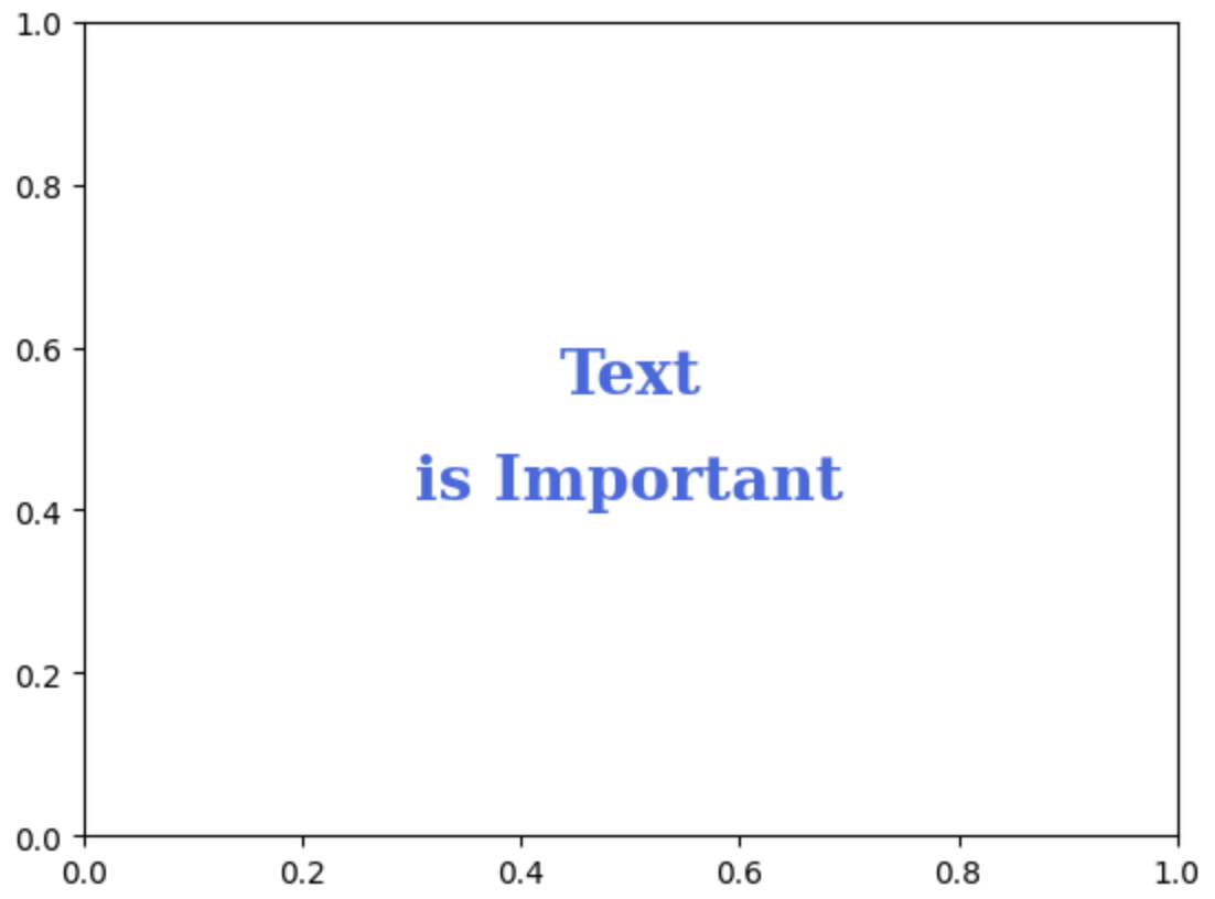
Advanced
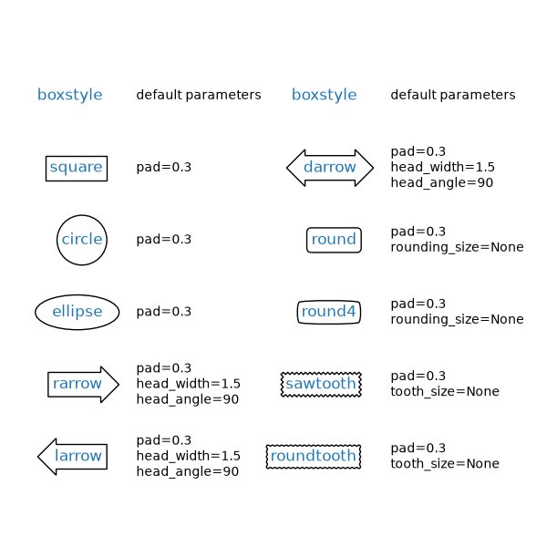
bbox
fig, ax = plt.subplots()
ax.set_xlim(0, 1)
ax.set_ylim(0, 1)

ax.text(x=0.5, y=0.5, s='Text\nis Important',
        fontsize=20,
        fontweight='bold',
        fontfamily='serif',
        color='black',
        linespacing=2,
        va='center', # top, bottom, center
        ha='center', # left, right, center
        rotation='horizontal', # vertical, degree
        bbox=dict(boxstyle='round', facecolor='wheat', alpha=0.4)
       )


plt.show()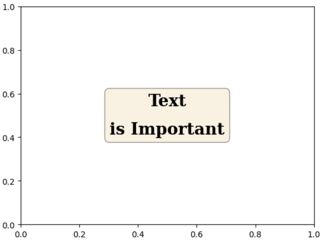
-
dict형태로 전달해야 한다. -
위의 파라미터 외에도 여러가지가 존재하므로 documentation을 찾아보는게 편하다.
ETC
ax.set_title('Score Relation',
             loc='left', va='bottom',
             fontweight='bold', fontsize=15
            )

ax.legend(
    title='Gender',
    shadow=True,
    labelspacing=1.2,
    loc='lower right',
    bbox_to_anchor=[1.2, 0.5],
    ncol=2
)-
loc: 범례나 제목의 위치 조정 -
shadow: 그림자 설정 -
bbox_to_anchor: subplot상의 비율로 조정가능 -
ncolornrow: 행과 열을 지정하여 범례의 모양을 조정
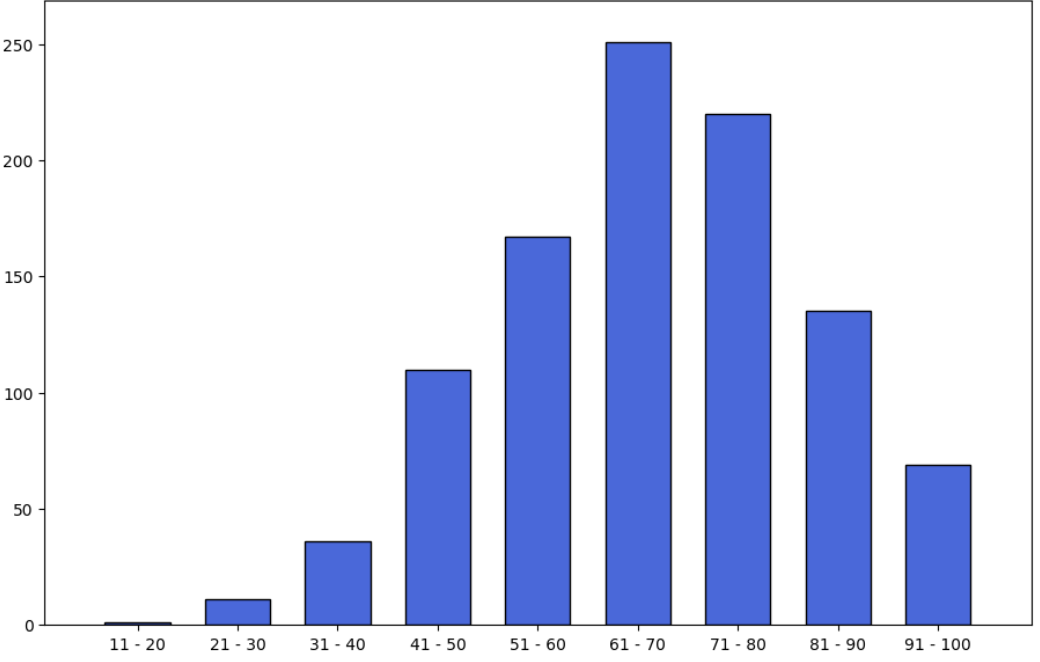
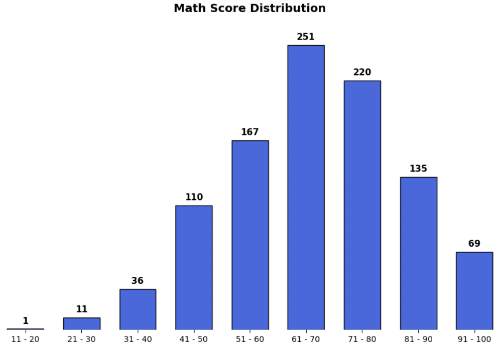
Ticks & Text
-
ax.set(frame_on=False): 4변의 축을 한번에 삭제 -
ax.set_yticks([]): y축 tick삭제 -
ax.set_xticks(np.arange(len(math_grade))): x축 tick설정 -
ax.set_xticklabels(math_grade.index): x축 tick의 label 설정 -
아래의 코드를 통해 막대그래프 상단에 text추가
# math_grade : count정보가 담긴 data

for idx, val in math_grade.iteritems():
    ax.text(x=idx, y=val+3, s=val,
            va='bottom', ha='center',
            fontsize=11, fontweight='semibold'
           )
annotate
bbox = dict(boxstyle="round", fc='wheat', pad=0.2)
arrowprops = dict(
    arrowstyle="->")

ax.annotate(text=f'This is #{i} Studnet',
            xy=(student['math score'][i], student['reading score'][i]),
            xytext=[80, 40],
            bbox=bbox,
            arrowprops=arrowprops,
            zorder=9
           )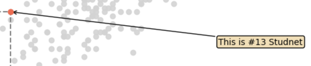
-
xy:xy만 사용할 경우 이 위치에 텍스트가 지정되며,xytext와 같이 사용하면xy는 포인트할 위치를 나타낸다. -
xytext: text의 위치 -
bbox: text에 대한 bbox제공 -
arrowprops:dict형태로 제공하며 화살표 설정
