주제 : Modern box
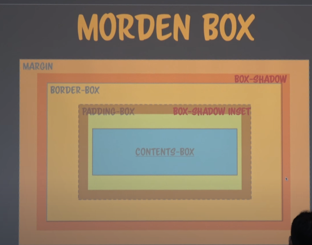
margin, padding, border
- margin : 박스의 맨 바깥 영역
- border (border-box) : 패딩 외부의 외곽선이나 직선이나 점선 혹은 이미지로 입힐 수 있음 (내부 색깔 영향에 영향받는다.)
- padding : 콘텐츠를 직접 둘러싸고 있는 내부 여백 (내부여서 색깔도 내부에 영향을 받음)
- box-shadow : border-box 바로 밖에 그리고 geometry에 영향 X
- box-shadow inset : border-box 바로 안쪽에 그린다.
Box sizing
- contents box : width를 contents 크기로 지정 ( width, height로 인한 contents의 고유한 영역 존재)
- border-box : width를 actual width로 지정 ( 모든 크기 합쳐서 width height로 지정)
example
<!DOCTYPE html>
<html lang="en">
<head>
    <style>
        div{width:100px; height:100px; padding:10px; border:10px solid #000; display:inline-block;}
    </style>
</head>
<body>
    <div style="background:red"></div>
    <div style="background:blue; box-sizing:border-box"></div>
</body>
</html>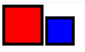
red의 경우 contents 의 가로 세로 100px에 padding 10px , border 10px로 총 가로 세로 각각 140px 140px 형태이고
blue의 경우 토탈 값이 100px 100px 형태이다.
하얀 공백이 생기는 이유는 inline으로 설정된 두 div 사이에 공백이 있기 때문이다. 첫번째 div의 닫는 태그와 두번째 div의 여는 태그를 붙여주면 없어진다.
border-box
- geometry는 contents-box부터 시작해 padding에서 border-box까지 연결된다.
<!DOCTYPE html>
<html lang="en">
<head>
    <style>
        div{width:100px; height:100px; padding:10px; border:10px dashed #000; display:inline-block;}
    </style>
</head>
<body>
    <div style="background:red"></div>
    <div style="background:blue; box-sizing:border-box"></div>
</body>
</html>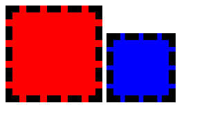
border-box인 부분도 색깔에 영향을 받는다.
box-shadow
- border-box 밖에 나타나고 이는 geometry에 영향을 받지않는다.
(아래는 빨간색 그림에 파란색에 노란테두리가 겹쳐서 영향을 주는 것을 알 수 있다.
<!DOCTYPE html>
<html lang="en">

<head>
    <style>
        div{width:100px; height:100px; padding:10px; border:10px dashed #000; display:inline-block;}
    </style>
</head>
<body>
    <div style="background:red"></div>
    <div style="background:blue; box-shadow: 0 0 0 10px #aa0"></div>
</body>
</html>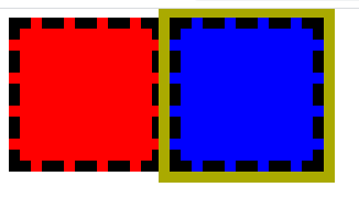
position relative
- relative는 normal flow를 그린 후 다시 상대 위치를 계산하여 relative로 그리기 때문에 위의 그림과 달라진다.
<!DOCTYPE html>
<html lang="en">

<head>
    <style>
        div{width:100px; height:100px; padding:10px; border:10px dashed #000; display:inline-block;}
    </style>
</head>
<body>
    <div style="background:red; position:relative" ></div>
    <div style="background:blue; box-shadow: 0 0 0 10px #aa0"></div>
</body>
</html>
전부 normal flow로 그린 후 빨간색 그림이 그 위에 다시 붙여지므로 빨간색이 위에 나타나보인다.
Box-shadow inset
- inset은 border 부분의 바로 안쪽에 나타나는 형태이다.
<!DOCTYPE html>
<html lang="en">

<head>
    <style>
        div{width:100px; height:100px; padding:10px; border:10px dashed #000; display:inline-block;}
    </style>
</head>
<body>
    <div style="background:red; position:relative" ></div>
    <div style="background:blue; box-shadow:inset 0 0 0 10px #aa0"></div>
</body>
</html>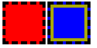
box-shadow && box-shadow inset 복합 사용하기
주의 할 점 : box-shadow를 복합적으로 사용할때 stack 개념처럼 뒤에있는 것부터 먼저 적용된다.
따라서 이를 바꿀경우 다른 결과가 나타난다.
<!DOCTYPE html>
<html lang="en">

<head>
    <style>
        div{width:100px; height:100px; padding:10px; border:10px dashed #000; display:inline-block;}
    </style>
</head>
<body>
    <div style="background:yellow"></div>
    <div style="background:blue; box-shadow:
    0 0 0 10px green,
    0 0 0 20px red,
    inset 0 0 0 10px green,
    inset 0 0 0 20px red"></div>
</body>
</html>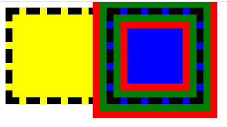
- 20px부터 채워진 후 10px이 채워지는 형태
<!DOCTYPE html>
<html lang="en">

<head>
    <style>
        div{width:100px; height:100px; padding:10px; border:10px dashed #000; display:inline-block;}
    </style>
</head>
<body>
    <div style="background:yellow"></div>
    <div style="background:blue; box-shadow:
    0 0 0 20px green,
    0 0 0 10px red,
    inset 0 0 0 20px green,
    inset 0 0 0 10px red"></div>
</body>
</html>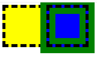
- 10px부터 채워진 후 20px이 채워지는 형태
Animation
<!DOCTYPE html>
<html lang="en">

<head>
    <style>
        @keyframes ani{
            from{box-shadow:0 0 0 0px #aa0,0 0 0 0px #0a0,inset 0 0 0 0px #aa0, inset 0 0 0 0px #0a0;}
            to{box-shadow:0 0 0 10px #aa0,0 0 0 20px #0a0,inset 0 0 0 10px #aa0, inset 0 0 0 20px #0a0;}
        }
        div{width:100px; height:100px; padding:10px; border:10px dashed #000; display:inline-block;}
    </style>
</head>
<body>
    <div style="background:yellow"></div>
    <div style="background:blue; animation:ani 0.4s linear alternate infinite; border-radius:50%"></div>
</body>
</html>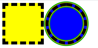

위와같이 커졌다 작아졌다를 반복한다.
box-shadow vs outline
- 둘다 같은 위치에 그려진다.
box-shadow : border radius에 영향을 받는다.
outline : border radius에 영향을 받지않는다.
border-radius:15px
<!DOCTYPE html>
<html lang="en">

<head>
    <style>
        div{width:1000px; height:1000px; padding:10px; border:10px dashed #000; display:inline-block;}
    </style>
</head>
<body>
    <div style="background:red;
                border-radius:15px;
                border:10px dashed orange;
                box-shadow:0 0 0 10px green;
                outline:10px solid blue;
                color:black;"></div>
</body>
</html>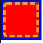
- 안쪽은 red로 채워져있다.
- 점선으로 orange로 채워져있고 다른부분은 마찬가지로 red이다.
- box-shadow는 green이나 border-radius에 의해 동그랗게 모서리가 존재한다.
- outline의 blue로 인해 다른부분들이 채워져있다.
border-radius:50%

outline빼고 전부 border-radius에 영향을 받는 것을 알 수 있다.
주요 정리
- box sizing은 width, height로 인한 contents의 고유한 영역 존재하는 contents box와 padding border등 geometry의 모든 크기 합쳐서 width height로 지정하는 border-box로 나뉜다. (margin은 영향 x)
- contents로 부터 padding-box , border , margin 순으로 나타나고
border를 기준으로 밖은 box-shadow 안은 box-shadow inset으로 나타낼수 있다.- box-shadow와 margin은 geometry에 영향을 안준다.
- box-shadow와 outline은 같은 부분을 나타내지만
border-radius에 영향을 받냐 안받냐의 차이가 있다.- relative는 normal flow가 전부 처리된 후 실행된다.
- box-shadow와 box-shadow:inset은 같이 쓰면 한개만 적용된다.
주요 정리2
- 크기에 영향을 주는 것은 contents padding border이고
border 변화에 영향을 받는 것은 box-shadow고 outline은 받지않는다.
나의 하루를 가능한 기억하고 즐기고 후회하지말자