
<빅데이터 분석 - 공공데이터포털 활용>
공공데이터포털 사이트의 데이터를 수집하여 빅데이터 분석 및 시각화하기
- 인사이트 도출을 위한 특정 주제를 선정하기
- 공공데이터포털(https://www.data.go.kr/)에서 관련 파일 데이터(.csv, .xlsx) 수집하기
- 수집한 데이터를 이용하여 데이터 분석 후 인사이트 도출하기
- 분석한 데이터를 시각화하기
코드
import pandas as pd
import numpy as np
import matplotlib.pyplot as plt
import warnings
warnings.filterwarnings("ignore")
%matplotlib inline
# 셀 분리
totalData = pd.read_csv('../csvData/한국도로공사_교통사고통계_20201231.csv', encoding='cp949')
hitandrun = pd.read_csv('../csvData/도로교통공단_부문별_뺑소니_교통사고_20181231.csv', encoding='cp949')
unlicensed = pd.read_csv('../csvData/도로교통공단_부문별_무면허_교통사고_20181231.csv', encoding='cp949')
car = pd.read_excel('../csvData/2022년_06월_자동차_등록자료_통계.xlsx')
# 셀 분리
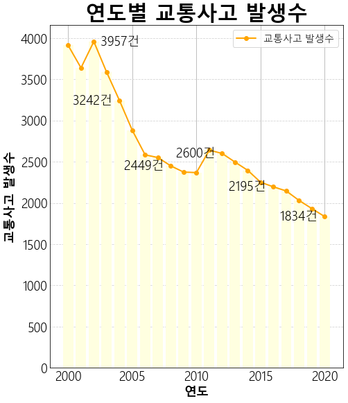
totalData_G = totalData.groupby('사고')['연도'].sum().sort_values()
totalData_ListIndex = totalData_G.values.tolist()
totalData_List = totalData_G.index.tolist()
totalData_Set = list(zip(totalData_ListIndex, totalData_List))
# 셀 분리
plt.rc("font", family="Malgun Gothic", size=18, weight='light')
plt.figure(figsize=(6, 7))
x = totalData_ListIndex
y = totalData_List
plt.grid(True, color='lightgray', axis='y', linestyle='--')
plt.bar(x, y, color='lightyellow')
plt.plot(x, y, 'bo-', color='orange', linewidth=2, solid_capstyle='round',
label='교통사고 발생수')
plt.legend(loc='best', ncol=1, fontsize=14)
plt.xlabel("연도", size=18, weight='bold')
plt.ylabel("교통사고 발생수", size=18, weight='bold')
plt.title("연도별 교통사고 발생수", size=30, weight='bold')
plt.text(x[2], y[2], " %d건 "%y[2], size=18,
horizontalalignment='left', verticalalignment='center')
for i in range(4, len(x), 4) :
plt.text(x[i], y[i], "%d건 "%y[i], size=18,
horizontalalignment='right', verticalalignment='center')
plt.show()결과
코드
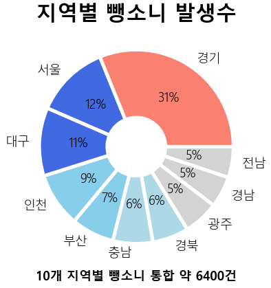
hitandrun_G = hitandrun.groupby('시도')['발생건수'].sum().sort_values()
hitandrun_ListIndex = hitandrun_G.index.tolist()[7:]
hitandrun_List = hitandrun_G.values.tolist()[7:]

# 셀 분리

hitandrun_Set = list(zip(hitandrun_ListIndex, hitandrun_List))
hitandrun_Df = pd.DataFrame(hitandrun_Set)
hitandrun_Df.columns=['시도', '사고건수']

# 셀 분리

plt.rc("font", family="Malgun Gothic", size=18, weight='light')
plt.figure(figsize=(10, 5))
colors = ['lightgray', 'lightgray', 'lightgray', 'lightblue', 'lightblue',
          'skyblue', 'skyblue', 'royalblue', 'royalblue', 'salmon']
wedgeprops = {'width': 0.7, 'edgecolor': 'w', 'linewidth': 5}
x = hitandrun_Df['시도']
y = hitandrun_Df['사고건수']
plt.pie(y, labels=x, autopct='%d%%', counterclock=False, colors=colors,
       wedgeprops=wedgeprops)
plt.xlabel("10개 지역별 뺑소니 통합 약 6400건", size=18, weight='bold')
plt.title("지역별 뺑소니 발생수", size=30, weight='bold')
plt.show()
결과
코드
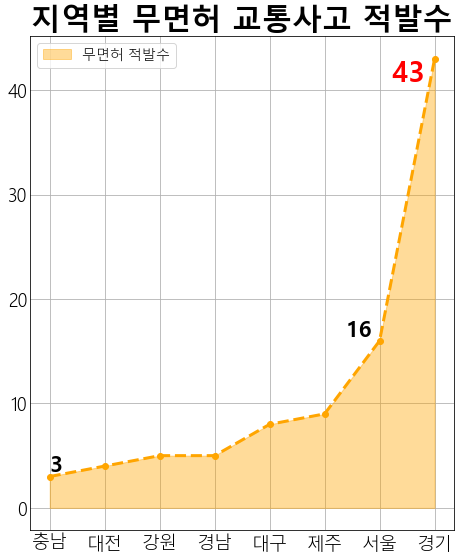
unlicensed_G = unlicensed.groupby('시도')['발생건수'].sum().sort_values()
unlicensed_ListIndex = unlicensed_G.index.tolist()[5:]
unlicensed_List = unlicensed_G.values.tolist()[5:]

# 셀 분리

unlicensed_Set = list(zip(unlicensed_ListIndex, unlicensed_List))
unlicensed_Df = pd.DataFrame(unlicensed_Set)
unlicensed_Df.columns=['시도', '사고건수']

# 셀 분리

plt.rc("font", family="Malgun Gothic", size=18, weight='light')
plt.figure(figsize=(6, 7))
x = unlicensed_Df['시도']
y = unlicensed_Df['사고건수']
plt.style.use('_mpl-gallery')
plt.fill_between(x, y, alpha=0.4, color='orange', label='무면허 적발수')
plt.plot(x, y, 'bo--', linewidth=3, color='orange')
plt.text(x[0], y[0], y[0], size=22, weight='bold',
         horizontalalignment='left', verticalalignment='bottom')
plt.text(x[6], y[6], "%d "%y[6], size=22, weight='bold',
         horizontalalignment='right', verticalalignment='bottom')
plt.text(x[7], y[7], "%d " %y[7], size=28, weight='bold', color='red',
        horizontalalignment='right', verticalalignment='top')
plt.legend(loc='upper left', ncol=1, fontsize=14)
plt.title("지역별 무면허 교통사고 적발수", size=30, weight='bold')
plt.show()
결과
코드
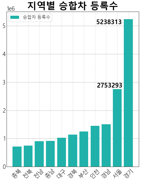
car_G = car_Pre.groupby('시도별')['계'].sum().sort_values()
car_ListIndex = car_G.index.tolist()
car_List = car_G.values.tolist()
car_Set = list(zip(car_ListIndex, car_List))

# 셀 분리

car_Set = list(zip(car_ListIndex[6:], car_List[6:]))
car_Df = pd.DataFrame(car_Set)
car_Df.columns=['시도', '승합차 수']

# 셀 분리

plt.rc("font", family="Malgun Gothic", size=18, weight='light')
plt.figure(figsize=(6, 7))
x = car_ListIndex[6:]
y = car_List[6:]
plt.grid(True, color='lightgray', axis='x',linestyle='--')
plt.bar(x, y, color='lightseagreen', label='승합차 등록수')
plt.legend(loc='best', ncol=2, fontsize=14)
plt.text(x[9], y[9], "%d       "%y[9], size=20, weight='bold',
         horizontalalignment='center', verticalalignment='bottom')
plt.text(x[10], y[10], "%d   "%y[10], size=20, weight='bold',
         horizontalalignment='right', verticalalignment='top')
plt.xticks(rotation=45)
plt.title("지역별 승합차 등록수", size=30, weight='bold')
plt.show()
결과

비전공자의 개발 공부 과정과 기록