
💻 (구)세이프홈즈 랜딩페이지 반응형 퍼블리싱
필수 과제 : (구)세이프홈즈 랜딩페이지 반응형 퍼블리싱 - css 포함
- index.html
<!DOCTYPE html>
<html lang="en">
<head>
<meta charset="UTF-8" />
<meta name="viewport" content="width=device-width, initial-scale=1.0" />
<title>SafeHomes</title>
<link rel="stylesheet" type="text/css" href="./css/styles.css" />
<link rel="stylesheet" href="./css/reponsive.css" />
<style></style>
</head>
<body>
<header class="main__header">
<div class="main__header__logo">
<img
src="./images/logo.svg"
alt="logo"
class="main__header__logo__img"
/>
<h1>세이프홈즈</h1>
</div>
<ul class="main__header__list">
<li>
<a href="#">문의하기</a>
</li>
<li class="main__header__list__start">
<a href="#">시작하기</a>
</li>
</ul>
</header>
<main>
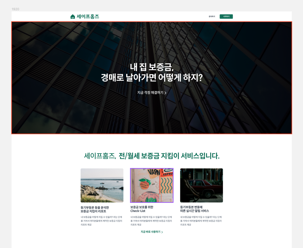
<section class="bnn main__bnn">
<h2>내 집 보증금,<br />경매로 날아가면 어떻게 하지?</h2>
<a href="#">지금 걱정 해결하기 〉</a>
</section>
<section class="introduce card">
<h3>
세이프홈즈, <strong>전/월세 보증금 지킴이 서비스입니다.</strong>
</h3>
<ul class="card__container">
<li class="card__container__box">
<img src="./images/rectangle_1.png" alt="image" />
<h4>등기부등본 등을 분석한<br />보증금 지킴이 리포트</h4>
<p>
내 보증금을 어떻게 지킬 수 있을까? 라는 단계를 거쳐서 여러분들에게
계약전 보증금 지킴이 리포트 제공
</p>
</li>
<li class="card__container__box">
<img src="./images/rectangle_2.png" alt="image" />
<h4>보증금 보호를 위한<br />Check-List</h4>
<p>
내 보증금을 어떻게 지킬 수 있을까? 라는 단계를 거쳐서 여러분들에게
계약전 보증금 지킴이 리포트 제공
</p>
</li>
<li class="card__container__box">
<img src="./images/rectangle_3.png" alt="image" />
<h4>등기부등본 변동에<br />따른 실시간 알림 서비스</h4>
<p>
내 보증금을 어떻게 지킬 수 있을까? 라는 단계를 거쳐서 여러분들에게
계약전 보증금 지킴이 리포트 제공
</p>
</li>
</ul>
<a href="#" class="section-link">지금 바로 사용하기 〉</a>
</section>
<section class="introduce card card--second">
<h3>
<strong>부동산을 찾았지만 망설이고 계시나요?</strong>
</h3>
<ul class="card__container">
<li class="card__container__box">
<img src="./images/rectangle_4.png" alt="image" />
<h4>
부동산 중개 업자는 항상 괜찮다고<br />
한다. 과연 그럴까?
</h4>
<p>
내 보증금을 어떻게 지킬 수 있을까? 라는 단계를 거쳐서 여러분들에게
계약전 보증금 지킴이 리포트 제공
</p>
</li>
<li class="card__container__box">
<img src="./images/rectangle_5.png" alt="image" />
<h4>
절차가 이것저것 너무 많은데 빠뜨<br />린 절차가 있지 않을까?
</h4>
<p>
내 보증금을 어떻게 지킬 수 있을까? 라는 단계를 거쳐서 여러분들에게
계약전 보증금 지킴이 리포트 제공
</p>
</li>
<li class="card__container__box">
<img src="./images/rectangle_6.png" alt="image" />
<h4>
평생 힘들게 모은 보증금을 나중에<br />
돌려 받지 못 하면 ..
</h4>
<p>
내 보증금을 어떻게 지킬 수 있을까? 라는 단계를 거쳐서 여러분들에게
계약전 보증금 지킴이 리포트 제공
</p>
</li>
</ul>
</section>
<section class="introduce mini-card">
<h3>
세이프홈즈, <strong>어떻게 내 보증금을 지킬 수 있을까요?</strong>
</h3>
<ul class="mini-card__container">
<li class="mini-card__container__box">
<div class="mini-card__container__box__number">#1</div>
<h4>계약 전 주소 검색</h4>
<p>
내 보증금을 어떻게 지킬 수 있을까? 라는 단계를 거쳐서 여러분들에게
계약전 보증금 지킴이 리포트 제공
</p>
</li>
<li class="mini-card__container__box">
<div class="mini-card__container__box__number">#2</div>
<h4>보증금 지킴이 리포트 확인</h4>
<p>
내 보증금을 어떻게 지킬 수 있을까? 라는 단계를 거쳐서 여러분들에게
계약전 보증금 지킴이 리포트 제공
</p>
</li>
<li class="mini-card__container__box">
<div class="mini-card__container__box__number">#3</div>
<h4>체크리스트를 따라 계약 진행</h4>
<p>
내 보증금을 어떻게 지킬 수 있을까? 라는 단계를 거쳐서 여러분들에게
계약전 보증금 지킴이 리포트 제공
</p>
</li>
<li class="mini-card__container__box">
<div class="mini-card__container__box__number">#4</div>
<h4>실시간 등기 변동 알림</h4>
<p>
내 보증금을 어떻게 지킬 수 있을까? 라는 단계를 거쳐서 여러분들에게
계약전 보증금 지킴이 리포트 제공
</p>
</li>
<li class="mini-card__container__box">
<div class="mini-card__container__box__number">#5</div>
<h4>계약 기간 안심하고 살기</h4>
<p>
내 보증금을 어떻게 지킬 수 있을까? 라는 단계를 거쳐서 여러분들에게
계약전 보증금 지킴이 리포트 제공
</p>
</li>
</ul>
<a href="#" class="section-link">조금 더 알아보기 〉</a>
</section>
<section class="phone__section">
<ul class="phone__section__container">
<li class="phone__section__container__box">
<div class="iphone__wrapper">
<div class="iphone">
<div class="iphone__head"></div>
<div
class="iphone__screen"
style="background-image: url(./images/screen_1.svg)"
></div>
</div>
</div>
<div class="iphone__column">
<div class="iphone__column__label">리포트</div>
<h4>등기부 등본 등을 분석한<br />보증금 지킴이 리포트</h4>
<p>
어려운 부동산 법률 용어가 아닌, 누구나 쉽게 이해 할 수 있는
보증금 지킴이 리포트 제공
</p>
</div>
</li>
<li class="phone__section__container__box">
<div class="iphone__column">
<div class="iphone__column__label">절차</div>
<h4>보증금 보호를 위한,<br />체크리스트</h4>
<p>
전세 사기 당하지 않기 위해 반드시 확인해야 할 체크리스트를
제공합니다.
</p>
</div>
<div class="iphone__wrapper">
<div class="iphone">
<div class="iphone__head"></div>
<div
class="iphone__screen"
style="background-image: url(./images/screen_2.svg)"
></div>
</div>
</div>
</li>
<li class="phone__section__container__box">
<div class="iphone__wrapper">
<div class="iphone">
<div class="iphone__head"></div>
<div
class="iphone__screen"
style="background-image: url(./images/screen_3.svg)"
></div>
</div>
</div>
<div class="iphone__column">
<div class="iphone__column__label">리포트</div>
<h4>등기부 등본 등을 분석한<br />보증금 지킴이 리포트</h4>
<p>
어려운 부동산 법률 용어가 아닌, 누구나 쉽게 이해 할 수 있는
보증금 지킴이 리포트 제공
</p>
<ul class="iphone__column__list">
<li class="iphone__column__list__msg">
<header class="iphone__column__list__msg__header">
<div class="naver-msg">
<img src="./images/app-icon.png" alt="icon" />
<span>세이프홈즈</span>
</div>
<div>now</div>
</header>
<div class="iphone__column__list__msg__title">
등기부 등본이 변동되었어요!
</div>
<p>
방금 전 등기부 등본이 변경되었는데, 세이프홈즈와 함께 같이
확인해보시겠어요?
</p>
</li>
<li class="iphone__column__list__msg msg--opacity">
<header class="iphone__column__list__msg__header">
<div class="naver-msg">
<img src="./images/app-icon.png" alt="icon" />
<span>세이프홈즈</span>
</div>
<div>now</div>
</header>
<div class="iphone__column__list__msg__title">
헉! 방금 무언가 변경되었는데요?
</div>
<p>
세이프홈즈가 방금 등기부 등본이 변경된 사실을 알아냈어요!
어떤 부분이 바뀌었는지 간단하게 정리해서 알려드릴게요.
</p>
</li>
</ul>
</div>
</li>
</ul>
</section>
<section class="introduce price">
<h3>세이프홈즈, <strong>서비스 가격은 어떻게 될까요?</strong></h3>
<ul class="price__container">
<li class="price__container__box">
<h4>
전/월세 보증금<br />
지킴이 리포트
</h4>
<p>
해당 플랜은 여러분을 위해 리포트를 제공합니다. 실제로 이 리포트는
언제 어디서든지 사용할 수 있고 그렇습니다.
</p>
<div class="price__container__box__tag">
<span class="normal-price">80,000 KRW</span>
<span class="plan-price">1회 50,000원 / 1주 80,000원</span>
</div>
<div class="price__container__box__btn">지금 바로 사용하기</div>
</li>
<li class="price__container__box">
<h4>
등기부 등본 변동<br />
알림 서비스
</h4>
<p>
해당 플랜은 여러분을 위해 리포트를 제공합니다. 실제로 이 리포트는
언제 어디서든지 사용할 수 있고 그렇습니다.
</p>
<div class="price__container__box__tag">
<span class="normal-price">50,000 KRW</span>
<span class="plan-price">1년 50,000원 / 2년 80,000원</span>
</div>
<div class="price__container__box__btn">지금 바로 사용하기</div>
</li>
<li class="price__container__box">
<h4>
올 패키지<br />
(지킴이 리포트 + 알림)
</h4>
<p>
해당 플랜은 여러분을 위해 리포트를 제공합니다. 실제로 이 리포트는
언제 어디서든지 사용할 수 있고 그렇습니다.
</p>
<div class="price__container__box__tag">
<span class="normal-price">100,000 KRW</span>
<span class="plan-price">1주 + 2년 100,000원</span>
</div>
<div class="price__container__box__btn">지금 바로 사용하기</div>
</li>
</ul>
<a href="#" class="section-link"
>원하시는 플랜이 없다면 문의주세요! 〉</a
>
</section>
<section class="introduce review">
<h3>세이프홈즈, <strong>없었으면 큰일 날 뻔했어요!</strong></h3>
<ul class="review__container">
<li class="review__container__box">
<header>
<img src="./images/avatar_2.png" alt="avatar" />
<div class="review__container__box__profile">
<span>홍길동님</span>
<span>전/월세 보증금 지킴이 리포트</span>
</div>
</header>
<p>
공인중개사가 계약을 너무 서두르는 느낌이 들어 불안했는데,
세이프홈즈를 통해서 리포트를 받아보니 아니나 다를까 위험요소가
너무 큰 매물이었습니다. 근저당이 너무 높게 잡혀있었고, 보증보험
적합 대상도 아니라 경매로 넘어가게 되면 보증금을 돌려받기 힘들 것
같아 해당 매물 계약을 포기하고, 더 안전한 매물을 찾아서 계약할 수
있었습니다.
</p>
</li>
<li class="review__container__box">
<header>
<img src="./images/avatar_3.png" alt="avatar" />
<div class="review__container__box__profile">
<span>홍길동님</span>
<span>등기부 등본 변동 알림 서비스</span>
</div>
</header>
<p>
첫 부동산 계약이라 확인해야할 것이 중구난방이어서 불안했어요.
인터넷과 공인중개사에게 확인을 했지만 그래도 불안했어요. 내
전재산인데... 그런데 세이프홈즈에는 확인해야 할 것이 쉽게
나와있어서 준비물 준비하듯이 착착 할 수 있었습니다. 부동산 잘 아는
친구가 생긴 것 같아 좋았습니다.
</p>
</li>
</ul>
<a href="#" class="section-link">후기 진위여부 파악하러 가기 〉</a>
</section>
<section class="bnn last-bnn">
<h2>
내 보증금, 안전하게 보호하려면<br />
지금 시작하세요
</h2>
<div class="last-bnn__btn">지금 바로 시작하기</div>
</section>
</main>
<footer>
<div class="footer__company">(주)세이프홈즈</div>
<p class="footer__info">
사업자 등록 번호 : 250-26-01109 | 대표 : 정동훈<br />
경기도 성남시 수정구 대왕판교로 815 기업지원허브 혁신기술존 260-3호<br />
문의 메일 : safehomes.kr@gmail.com
</p>
</footer>
</body>
</html>class의 이름에 BEM을 최대한 적용하여 네이밍하는데 신경썼습니다. 이는 class를 네이밍 하는데 시간을 줄여주며 class명으로 목적과 기능응 전달하는데 도움을 주었습니다. 또한 후에 CSS 수정중에도 class명을 통해 시각적으로 구조화되어 작업에 효율성이 높았습니다.
BEM (Block, Element, Modifier) : CSS 네이밍 방법론중 하나입니다.
- css/styles.css
@import "./reset.css";
@import url("https://fonts.googleapis.com/css2?family=Noto+Sans+KR:wght@100;400;500;700&display=swap");

:root {
  --green: #0e7159;
  --dark: #333d4b;
  --gray: #6b7687;
}

* {
  box-sizing: border-box;
}

body {
  font-family: "Noto Sans KR", sans-serif;
  color: var(--dark);
}

a {
  color: inherit;
  text-decoration: none;
}

p {
  word-wrap: break-word;
}

strong {
  font-weight: bold;
}

section {
  display: flex;
  flex-direction: column;
  justify-content: center;
  align-items: center;
}

.main__header {
  height: 70px;
  display: grid;
  grid-template-columns: 1fr 1fr;
  justify-items: center;
  align-items: center;
}

.main__header__logo,
.main__header__list {
  display: flex;
  align-items: center;
}

.main__header__logo {
  gap: 13px;
}

.main__header__logo .main__header__logo__img {
  width: 30px;
  height: 30px;
}

.main__header__logo h1 {
  color: var(--green);
  font-size: 28px;
  font-weight: bold;
}

.main__header__list {
  gap: 32px;
}

.main__header__list li a {
  font-size: 12px;
  font-weight: bold;
}

.main__header__list .main__header__list__start a {
  display: flex;
  justify-content: center;
  align-items: center;
  width: 90px;
  height: 30px;
  border-radius: 5px;
  color: #fff;
  background-color: var(--green);
}

.bnn {
  color: #fff;
}

.bnn h2 {
  font-size: 60px;
  font-weight: bold;
  line-height: 72px;
  text-align: center;
}

.main__bnn {
  margin-bottom: 125px;
  width: 100%;
  aspect-ratio: 5/2;
  background: linear-gradient(0deg, rgba(0, 0, 0, 0.75), rgba(0, 0, 0, 0.75)),
    url("../images/header-img.png");
}

.main__bnn a {
  margin-top: 49px;
  font-size: 24px;
  font-weight: 500;
}

.introduce h3 {
  font-size: 48px;
  font-weight: 500;
  letter-spacing: -1.8px;
  color: var(--green);
}

.introduce ul {
  display: grid;
  grid-template-columns: repeat(3, 1fr);
  gap: 48px;
}

.section-link {
  font-size: 18px;
  font-weight: bold;
  color: var(--green);
}

.card {
  margin-bottom: 192px;
}

.card .section-link {
  margin-top: 25px;
}

.card--second {
  margin-bottom: 239px;
}

.card__container {
  margin-top: 53px;
}

.card__container .card__container__box {
  display: flex;
  flex-direction: column;
  gap: 24px;
  width: 293px;
}

.card__container .card__container__box h4 {
  font-size: 21px;
  font-weight: 500;
  line-height: 25px;
}

.card__container .card__container__box p {
  font-size: 16px;
  line-height: 26px;
  color: var(--gray);
}

.mini-card {
  margin-bottom: 200px;
}

.mini-card .section-link {
  margin-top: 71px;
}

.mini-card__container {
  margin-top: 72px;
}

.mini-card__container .mini-card__container__box {
  display: flex;
  flex-direction: column;
  width: 292px;
}

.mini-card__container__box .mini-card__container__box__number {
  margin-bottom: 9px;
  font-weight: 500;
  color: var(--green);
}

.mini-card__container__box h4 {
  margin-bottom: 16px;
  font-size: 21px;
  font-weight: bold;
}

.mini-card__container__box p {
  font-size: 16px;
  line-height: 19px;
  color: var(--gray);
}

.phone__section {
  margin-bottom: 221px;
}

.phone__section .phone__section__container {
  display: flex;
  flex-direction: column;
  gap: 217px;
}

.phone__section .phone__section__container__box {
  display: flex;
  gap: 298px;
}

.iphone {
  position: relative;
  display: flex;
  justify-content: center;
  align-items: center;
  width: 334.82px;
  height: 678.98px;
  border: 1px solid rgba(196, 209, 215, 0.38);
  border-radius: 50px;
  box-shadow: inset rgba(0, 0, 0, 0.1) -1px -5px 10px 0px,
    inset rgba(0, 0, 0, 0.05) 0px -5px 10px 0px,
    rgba(0, 0, 0, 0.5) 15px 10px 16px 0px;
}
.iphone .iphone__head {
  position: absolute;
  top: 17.3px;
  width: 150px;
  height: 20px;
  border: 2px solid rgba(196, 209, 215, 0.38);
  border-top: 0;
  border-radius: 0px 0px 20px 20px;
  background-color: #fff;
}

.iphone .iphone__screen {
  width: 296px;
  height: 642px;
  border: 2px solid rgba(196, 209, 215, 0.38);
  border-radius: 35px;
  background-color: rgba(196, 209, 215, 0.38);
}

.iphone__column {
  display: flex;
  flex-direction: column;
}

.iphone__column .iphone__column__label {
  margin-bottom: 21px;
  font-size: 24px;
  font-weight: bold;
  color: var(--green);
}

.iphone__column h4 {
  margin-bottom: 34px;
  font-size: 48px;
  line-height: 57px;
  font-weight: bold;
}

.iphone__column p {
  max-width: 450px;
  font-size: 24px;
  line-height: 40px;
  color: var(--gray);
}

.iphone__column .iphone__column__list {
  display: flex;
  flex-direction: column;
  margin-top: 24px;
}

.iphone__column .iphone__column__list__msg {
  width: 451px;
  height: 105px;
  display: flex;
  flex-direction: column;
  margin-bottom: 17px;
  padding: 10px;
  background-color: rgba(245, 245, 245, 0.6);
  border-radius: 20px;
  color: #000;
}

.iphone__column__list__msg header {
  display: flex;
  justify-content: space-between;
  align-items: center;
  margin-bottom: 8px;
  font-size: 13px;
  color: #b2b2b2;
}

.naver-msg {
  display: flex;
  align-items: center;
  gap: 6px;
}

.naver-msg img {
  width: 20px;
  height: 20px;
  border-radius: 5px;
}

.iphone__column__list__msg__title {
  font-size: 15px;
  font-weight: bold;
  line-height: 20px;
  padding: 1px 2px;
}

.iphone__column__list__msg p {
  font-size: 15px;
  line-height: 18px;
  padding: 1px 2px;
}

.msg--opacity {
  opacity: 0.5;
}

.price {
  margin-bottom: 181px;
}

.price .section-link {
  margin-top: 36px;
}

.price__container {
  margin-top: 37px;
}

.price__container__box {
  display: flex;
  flex-direction: column;
  width: 340px;
  padding: 30px 24px;
  border-radius: 15px;
  background-color: #f2f3f4;
}

.price__container__box h4 {
  font-size: 24px;
  font-weight: 500;
  line-height: 28px;
  margin-bottom: 28px;
}

.price__container__box p {
  font-size: 16px;
  line-height: 19px;
  color: var(--gray);
  margin-bottom: 42px;
}

.price__container__box .price__container__box__tag {
  display: flex;
  flex-direction: column;
  gap: 15px;
  margin-bottom: 26px;
}

.price__container__box__tag .normal-price {
  font-size: 32px;
  font-weight: bold;
  color: var(--green);
}

.price__container__box__tag .plan-price {
  font-size: 16px;
  color: var(--gray);
}

.price__container__box__btn {
  padding: 23px 86px 22px 86px;
  color: #fff;
  background-color: var(--green);
  border-radius: 15px;
}

.review {
  margin-bottom: 136px;
  overflow: hidden;
}

.review .section-link {
  margin-top: 49px;
}

.review__container {
  margin-top: 37px;
}

.review__container .review__container__box {
  width: 680px;
  height: 360px;
  padding: 60px;
  border-radius: 15px;
  font-size: 18px;
  background-color: #f2f3f4;
}

.review__container__box header {
  display: flex;
  align-items: center;
  gap: 16px;
  margin-bottom: 33px;
}

.review__container__box header img {
  width: 48px;
  height: 48px;
  border-radius: 50%;
}

.review__container__box .review__container__box__profile {
  display: flex;
  flex-direction: column;
  gap: 3px;
}

.review__container__box__profile span:first-child {
  font-weight: 500;
}

.review__container__box__profile span:last-child {
  color: var(--gray);
}

.review__container__box p {
  color: var(--gray);
  line-height: 32px;
}

.last-bnn {
  width: 100%;
  height: 608px;
  background-color: var(--green);
}

.last-bnn .last-bnn__btn {
  margin-top: 62px;
  padding: 21px 25px 20px 25px;
  font-size: 16px;
  font-weight: 500;
  border-radius: 15px;
  color: var(--green);
  background-color: #fff;
}

footer {
  display: flex;
  flex-direction: column;
  gap: 18px;
  width: 100%;
  height: 159px;
  padding: 26px 0px 24px 390px;
  background-color: #f9fafb;
}

footer .footer__company {
  font-size: 16px;
  font-weight: 500;
}

footer .footer__info {
  font-size: 14px;
  line-height: 24px;
  color: var(--gray);
}
최대한 중복된 속성을 그룹화시켜 작성하였습니다. 색상과 같이 자주 쓰이는 값은 :root를 통해 CSS 변수를 생성하여 작성하였습니다.
- responsive.css
@media screen and (max-width: 1024px) {
  .main__header__list li:first-child,
  .main__bnn a,
  .card .section-link {
    display: none;
  }

  .main__bnn {
    margin-bottom: 100px;
  }

  .main__bnn h2 {
    font-size: 48px;
    line-height: 57px;
  }

  .introduce h3 {
    font-size: 32px;
  }

  .introduce ul {
    grid-template-columns: repeat(2, 1fr);
  }

  .card,
  .card--second,
  .mini-card {
    margin-bottom: 150px;
  }

  .card__container {
    margin-top: 41px;
  }

  .mini-card h3,
  .price h3,
  .review h3 {
    font-size: 36px;
  }

  .mini-card .section-link {
    margin-top: 39px;
  }

  .phone__section,
  .price {
    margin-bottom: 160px;
  }

  .phone__section .phone__section__container {
    gap: 143px;
  }

  .phone__section .phone__section__container__box {
    flex-direction: column;
    gap: 25px;
  }

  .iphone__wrapper {
    display: flex;
    justify-content: center;
  }

  .iphone__column {
    order: -1;
    align-items: center;
  }

  .iphone__column h4,
  .iphone__column p {
    text-align: center;
  }

  .iphone__column .iphone__column__list {
    display: none;
  }

  .review {
    margin-bottom: 112px;
  }

  .review ul {
    grid-template-columns: repeat(3, 1fr);
  }

  .phone__section .phone__section__container {
    gap: 127px;
  }

  footer {
    padding-left: 145px;
  }
}

@media screen and (max-width: 768px) {
  .main__header {
    padding: 0px 49px;
  }

  .main__header .main__header__logo {
    justify-self: flex-start;
  }

  .main__header .main__header__list {
    justify-self: flex-end;
  }

  .main__bnn,
  .review {
    margin-bottom: 90px;
  }

  .main__bnn h2 {
    font-size: 36px;
    line-height: 43px;
  }

  .card,
  .card--second,
  .mini-card,
  .price {
    margin-bottom: 132px;
  }

  .last-bnn h2 {
    font-size: 48px;
    line-height: 57px;
  }

  .last-bnn .last-bnn__btn {
    margin-top: 42px;
  }

  footer {
    padding-left: 44px;
  }
}

@media screen and (max-width: 480px) {
  .main__header {
    padding: 0px 24px;
  }

  .main__bnn {
    margin-bottom: 64px;
  }

  .main__bnn h2 {
    font-size: 24px;
    font-weight: 500;
    line-height: 28px;
  }

  .card,
  .card--second,
  .mini-card {
    margin-bottom: 84px;
  }

  .introduce h3 {
    font-size: 21px;
  }

  .introduce ul {
    grid-template-columns: repeat(1, 1fr);
  }

  .introduce ul {
    gap: 32px;
  }

  .card--second h3,
  .price h3,
  .review h3 {
    font-size: 24px;
  }

  .iphone__column h4 {
    font-size: 36px;
    line-height: 43px;
  }

  .iphone__column p {
    width: 339px;
    font-size: 18px;
    line-height: 28px;
  }

  .price,
  .review {
    margin-bottom: 53px;
  }

  .review ul {
    grid-template-columns: repeat(3, 1fr);
  }

  .review .section-link {
    display: none;
  }

  .review__container .review__container__box {
    width: 394px;
    padding: 33px;
  }

  .review__container__box header {
    margin-bottom: 25px;
  }

  .review__container__box p {
    overflow: hidden;
    text-overflow: ellipsis;
    display: -webkit-box;
    -webkit-line-clamp: 7;
    -webkit-box-orient: vertical;
    word-wrap: break-word;
  }

  .last-bnn h2 {
    font-size: 36px;
    line-height: 43px;
  }
}
반응형 페이지를 위한 작업중에 CSS 우선 적용 순위에 대한 오류가 발생하여 이를 해결하기 위해 해당 CSS 파일의 import 위치(Cascading) 에 대해 생각하며 제작하였습니다. 또한 크롬 브라우저의 렌더링 엔진인 webkit요소를 사용하여 원하는 디자인을 구현하였지만, 이는 타 브라우저 이용시 디자인에 오류가 생길 수 있는 요지가 발생하여 Javascript 적용시 변경 사항을 추가해야겠다고 생각했습니다.
🧾 내 프로필 만들기
선택 과제 : 내 프로필 만들기 CSS 포함
- introduce.html
<!DOCTYPE html>
<html lang="en">
<head>
<meta charset="UTF-8" />
<meta name="viewport" content="width=device-width, initial-scale=1.0" />
<title>Introduce</title>
<link rel="stylesheet" href="./css/styles.css" />
<script
src="https://kit.fontawesome.com/1e841ee03e.js"
crossorigin="anonymous"
></script>
</head>
<body>
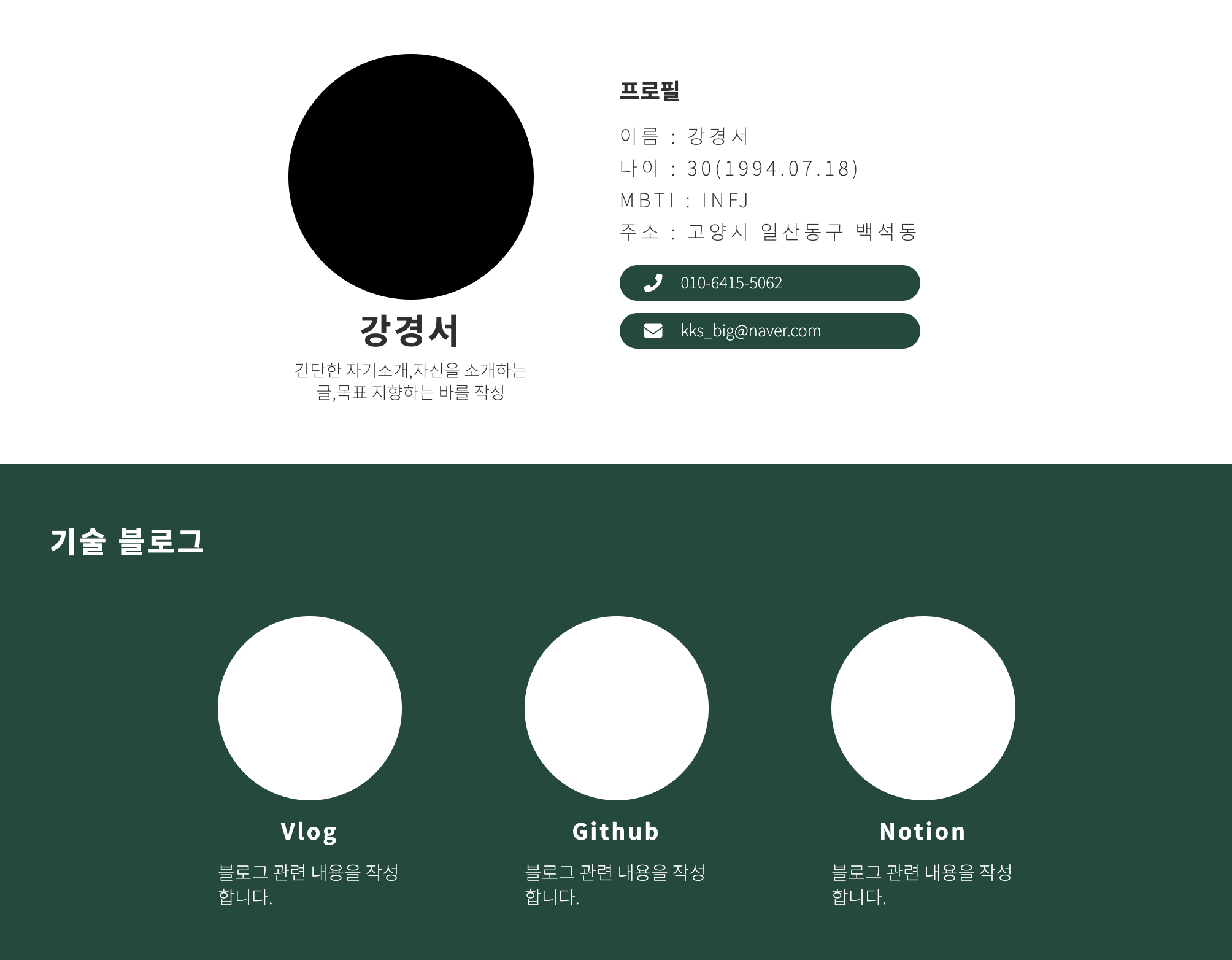
<header>
<div class="header__avatar">
<div class="header__avatar__img"></div>
<h1>강경서</h1>
<p>간단한 자기소개,자신을 소개하는 글,목표 지향하는 바를 작성</p>
</div>
<div class="header__profile">
<div class="header__profile__content">
<h2>프로필</h2>
<ul>
<li>이름 : 강경서</li>
<li>나이 : 30(1994.07.18)</li>
<li>MBTI : INFJ</li>
<li>주소 : 고양시 일산동구 백석동</li>
</ul>
<div class="header__profile__btns">
<div class="header__profile__btns__btn">
<i class="fas fa-phone"></i>
<span>010-6415-5062</span>
</div>
<div class="header__profile__btns__btn">
<i class="fas fa-envelope"></i>
<span>kks_big@naver.com</span>
</div>
</div>
</div>
</div>
</header>
<main>
<section class="blog">
<h3>기술 블로그</h3>
<ul class="blog__list">
<li class="blog__list__box">
<div class="blog__list__box__img"></div>
<span class="blog__list__box__title">Vlog</span>
<p>블로그 관련 내용을 작성합니다.</p>
</li>
<li class="blog__list__box">
<div class="blog__list__box__img"></div>
<span class="blog__list__box__title">Github</span>
<p>블로그 관련 내용을 작성합니다.</p>
</li>
<li class="blog__list__box">
<div class="blog__list__box__img"></div>
<span class="blog__list__box__title">Notion</span>
<p>블로그 관련 내용을 작성합니다.</p>
</li>
</ul>
</section>
<section class="skill">
<h3>SKill</h3>
<ul class="skill__list">
<li class="skill__list__box">HTML</li>
<li class="skill__list__box">CSS</li>
<li class="skill__list__box">SCSS</li>
<li class="skill__list__box">JS</li>
<li class="skill__list__box">React</li>
<li class="skill__list__box">Next</li>
<li class="skill__list__box">TypeScript</li>
<li class="skill__list__box">Node</li>
<li class="skill__list__box">MongoDB</li>
</ul>
</section>
<section class="portfolio">
<h3>포트폴리오</h3>
<ul class="portfolio__list">
<li class="portfolio__list__box">
<div class="portfolio__list__box__img"></div>
<div class="portfolio__list__box__content">
<h4>프로젝트명</h4>
<p>
프로젝트에 관한 간략한 설명을 적습니다. 프로젝트에 관한 간략한
설명을 적습니다. 프로젝트에 관한 간략한 설명을 적습니다.
</p>
<ul>
<li>HTML</li>
<li>CSS</li>
<li>JS</li>
<li>SCSS</li>
<li>REACT</li>
<li>Node</li>
</ul>
</div>
</li>
</ul>
</section>
<section class="photo">
<ul class="photo__list">
<li class="photo__list__box"></li>
<li class="photo__list__box"></li>
<li class="photo__list__box"></li>
<li class="photo__list__box"></li>
</ul>
</section>
</main>
<footer>
<h2>원하는 목표에 관한 한줄</h2>
</footer>
</body>
</html>위의 HTML 태그들의 class또한 BEM을 적용하여 작성했습니다.
- css/styles.css
@import "./reset.css";
@import url("https://fonts.googleapis.com/css2?family=Noto+Sans+KR:wght@100;400;700&display=swap");

@media screen and (max-width: 1024px) {
  header {
    flex-direction: column;
    align-items: center;
  }

  main section h3 {
    font-size: 24px;
    margin-bottom: 100px;
  }

  .blog .blog__list {
    display: grid;
    grid-template-columns: repeat(2, 1fr);
  }

  .portfolio .portfolio__list,
  .photo .photo__list {
    display: flex;
    flex-direction: column;
    align-items: center;
  }
}

@media screen and (max-width: 480px) {
  .blog .blog__list {
    display: grid;
    grid-template-columns: repeat(1, 1fr);
  }
}

* {
  box-sizing: border-box;
}

body {
  font-family: "Noto Sans KR", sans-serif;
  max-width: 1024px;
  margin: 0 auto;
  color: #2f2f2f;
  background-color: #e2e5ec;
}

header {
  display: flex;
  justify-content: center;
  gap: 50px;
  padding: 50px 0px;
  background-color: #fff;
}

.header__avatar {
  display: flex;
  flex-direction: column;
  align-items: center;
  gap: 10px;
}

.header__avatar .header__avatar__img {
  width: 200px;
  height: 200px;
  border-radius: 50%;
  background-color: rgba(0, 0, 0, 1);
}

.header__avatar h1 {
  font-size: 28px;
  font-weight: bold;
  letter-spacing: 2px;
}

.header__avatar p {
  width: 200px;
  font-size: 14px;
  font-weight: lighter;
  line-height: 18px;
  text-align: center;
}

.header__profile {
  padding: 20px;
}

.header__profile__content {
  display: flex;
  flex-direction: column;
  gap: 20px;
}

.header__profile__content h2 {
  font-size: 18px;
  font-weight: bold;
}

.header__profile__content ul {
  display: flex;
  flex-direction: column;
  gap: 10px;
}

.header__profile__content ul li {
  font-weight: lighter;
  letter-spacing: 3px;
}

.header__profile__btns {
  display: flex;
  flex-direction: column;
  gap: 10px;
}

.header__profile__btns__btn {
  display: flex;
  align-items: flex-start;
  gap: 15px;
  padding: 7px 20px;
  border-radius: 15px;
  font-size: 15px;
  font-weight: lighter;
  color: #fff;
  background-color: #164a3f;
  transition: all 0.2s ease-in-out;
}

.header__profile__btns__btn:hover {
  background-color: #0e3129;
}

.header__profile__btns__btn span {
  font-size: 13px;
}

main {
  background-color: #fff;
}

section {
  padding: 50px;
}

section h3 {
  font-size: 24px;
  font-weight: bold;
  letter-spacing: 2px;
  margin-bottom: 50px;
}

.blog,
.portfolio,
footer {
  color: #fff;
  background-color: #164a3f;
}

.blog__list {
  display: flex;
  justify-content: center;
  gap: 100px;
}

.blog__list__box {
  display: flex;
  flex-direction: column;
  align-items: center;
  gap: 15px;
}

.blog__list__box__img {
  width: 150px;
  height: 150px;
  border-radius: 50%;
  background-color: #fff;
}

.blog__list__box__title {
  font-size: 18px;
  font-weight: bold;
  letter-spacing: 2px;
}

.blog__list__box p {
  width: 150px;
  font-size: 15px;
  font-weight: lighter;
  line-height: 20px;
}

.skill__list {
  display: flex;
  flex-wrap: wrap;
  gap: 20px;
}

.skill__list__box {
  width: 160px;
  text-align: center;
  padding: 10px 20px;
  border-radius: 20px;
  font-weight: lighter;
  letter-spacing: 2px;
  color: #fff;
  background-color: #164a3f;
  transition: all 0.1s ease-in-out;
}

.skill__list__box:hover {
  transform: scale(1.05);
}

.portfolio__list {
  display: flex;
  justify-content: center;
  gap: 30px;
}

.portfolio__list__box {
  width: 400px;
  display: flex;
  flex-direction: column;
  gap: 10px;
  transition: all 0.2s ease-in-out;
}

.portfolio__list__box:hover {
  transform: scale(1.02);
}

.portfolio__list__box__img {
  width: 400px;
  aspect-ratio: 16/9;
  border-radius: 20px;
  background-color: #fff;
}

.portfolio__list__box__content {
  display: flex;
  flex-direction: column;
  gap: 10px;
  padding: 10px;
}

.portfolio__list__box__content h4 {
  font-size: 18px;
  font-weight: bold;
}

.portfolio__list__box__content p {
  width: 350px;
  font-weight: lighter;
}

.portfolio__list__box__content ul {
  margin-top: 15px;
  margin-bottom: 20px;
  display: flex;
  flex-wrap: wrap;
  gap: 10px;
}

.portfolio__list__box__content ul li {
  width: 80px;
  text-align: center;
  padding: 5px 10px;
  border-radius: 20px;
  font-size: 12px;
  font-weight: lighter;
  letter-spacing: 2px;
  color: black;
  background-color: #fff;
}

.photo__list {
  display: grid;
  grid-template-columns: repeat(2, 1fr);
  justify-items: center;
  margin: 50px 0px;
  gap: 20px;
}

.photo__list__box {
  width: 450px;
  aspect-ratio: 16/9;
  border-radius: 20px;
  background-color: black;
}

footer {
  height: 200px;
  display: flex;
  justify-content: center;
  align-items: center;
}

footer h2 {
  font-size: 28px;
  letter-spacing: 10px;
}
📝후기
CSS를 작성하면서 class명의 효율적인 작명의 중요성에 대해 생각했습니다. HTML 같은 경우에는 시맨틱태그를 사용하여 구조화를 명확하게 만든다면, CSS는 소스코드를 수정할 시 어떤 class명으로 작성을 했는가에 따라 효율이 올라갈거라 생각했습니다. 또한 반응형 웹을 생각하면서 속성 작성과 HTML 태그를 구분해야 작업의 효율성이 올라간다고 생각했습니다. 무엇보다도 HTML, CSS 작성 전에 먼저 어떻게 제작을 해야하는가 생각을 해야 후에 작업을 해야 효율적인 코딩이라 생각했습니다.
본 후기는 유데미-스나이퍼팩토리 10주 완성 프로젝트캠프 학습 일지 후기로 작성 되었습니다.
#프로젝트캠프 #프로젝트캠프후기 #유데미 #스나이퍼팩토리 #웅진씽크빅 #인사이드아웃 #IT개발캠프 #개발자부트캠프 #리액트 #react #부트캠프 #리액트캠프
