CSS의 배경
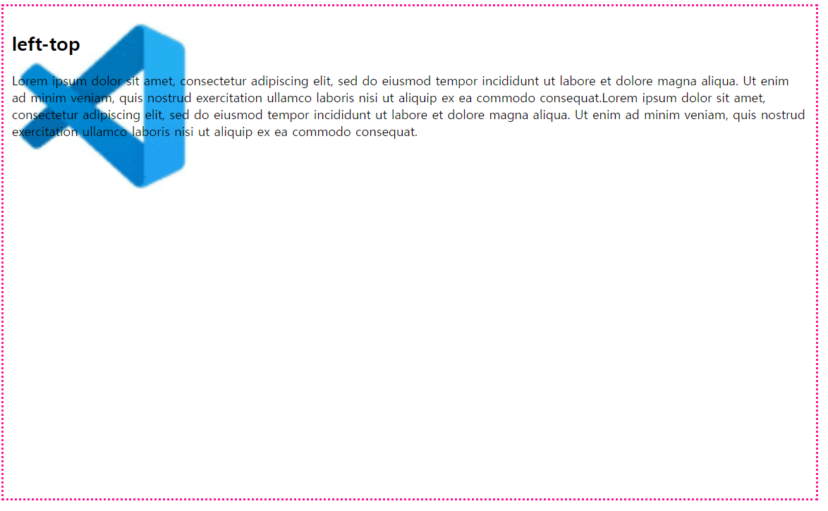
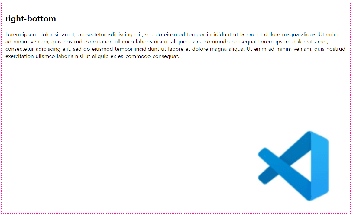
background-position
- 반복되지 않는 배경 이미지의 상대 위치를 설정
- %나 px을 사용해서 상대위치를 직접 설정할 수 있다.
- 상대 위치를 결정하는 기준은 해당 요소의 외쪽 상단
아래의 표는 각각의 그림 위치를 나타낸다.
브라우저 내부| left top | center top | right top |
|---|---|---|
| left center | center | right center |
| left bottom | center bottom | right bottom |
↓↓↓↓left-bottom을 적용한 모습↓↓↓↓
↓↓↓↓right-bottom을 적용한 모습↓↓↓↓
코드는 아래와 같다.
태그명{
/* 가로설정 세로설정 순으로 표기한다. %와 px로도 가능하다.*/
	background-position : left top
    	background-position : 20% 100px
}
background-attachment
- 위치가 설정된 배경 이미지를 원하는 위치에 고정시킬 수 있음
- 고정된 배경 이미지는 스크롤과 무관하게 화면의 위치에서 이동되지 않음
코드는 아래와 같다.
태그명{
	background-attachment : fixed

}
아래와 같이 스크롤을 올려도 그림은 움직이지 않는다.
background-size
- 배경 이미지 크기를 설정
- px, %를 사용
contain
- 배경 이미지의 가로, 세로 모두 요소보다 작다는 조건하에 가능
- 이미지의 가로, 세로 비율은 유지
- 배경 이미지의 크기는 요소의 크기보다 항상 작거나 같음.
배경 이미지를 요소보다 크게 설정할 경우
비율이 유지되며 가로, 세로 둘다 커야 배경이미지가 커짐
빨간 테두리는 div요소임
요소의 크기 150px, 150px
배경 크기 700px, 600px

요소의 크기 150px, 150px
배경 크기 700px, 100px
cover
- 배경 이미지의 가로, 세로 모두 요소보다 크다는 조건하에 가능
- 가능한 이미지를 작게 설정.
- 이미지의 가로, 세로 비율은 유지
- 배경 이미지의 크기는 요소의 크기보다 항상 크거나 같음.
배경 이미지를 요소보다 크게 설정할 경우
요소의 크기 150px, 150px
배경의 크기 width만 500px
background
- 배경 속성을 한번에 적용
- background : 파일위치 반복여부 위치 사이즈 ...
background: url("../img/bulding.jpg") no-repeat center fixed;Box Model
- 모든 HTML 요소는 박스모양으로 구성
- 박스 모델이라고 부름, 박스모델은 HTML요소를 내용, 패딩, 테두리, 마진으로 구분함'
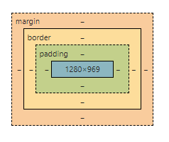
content
텍스트나 이미지가 들어있는 박스의 실질적인 내용 부분
padding
- 내용과 테두리 사이의 간격(안쪽 여백)
- padding : 모든 패딩 속성을 한꺼번에 설정, 위부터 시작해서 시계방향으로 설정
- 각 종 옵션
padding-top, padding-right, padding-bottom, padding-left
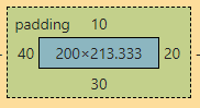
padding : a b c d;
위 a, 오른쪽 b, 아래 c, 왼쪽 d;
/*id의 pd1(id name)의 패딩 옵션 설정*/
#pd1{
      padding: 10px 20px 30px 40px;
}
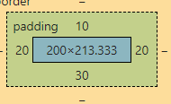
padding : a b c;
위 a, 아래 c, 양 옆 b;
/*id의 pd2(id name)의 패딩 옵션 설정*/
#pd2{
      padding: 10px 20px 30px;
}
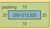
padding a b;
위 아래 a, 양 옆 b;
/*id의 pd3(id name)의 패딩 옵션 설정*/
#pd3{
      padding: 10px 20px;
}
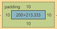
padding a;
모든 방향 a;
/*id의 pd4(id name)의 패딩 옵션 설정*/
#pd4{
      padding: 10px;
}
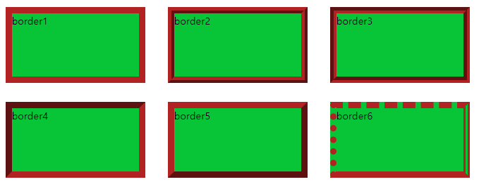
border
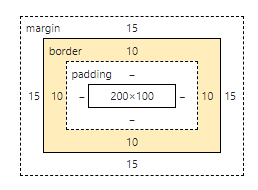
- 내용(content)과 패딩(padding) 주변을 감싸는 테두리
- 옵션
- border-style : 테두리를 다양한 모양으로 설정
- border-color : 테두리 색상을 설정
- border-width : 테두리 두께를 설정
- border : 모든 테두리 속성을 한꺼번에 설정(padding과 같음)
/* 기본 설정*/
	div{
            width: 200px;
            height: 100px;
            display: inline-block;
            margin: 15px;
            border-width: 10px;
            border-color: firebrick;
            background-color: rgb(8, 197, 55);
        }

/*각 border 설정*/
        .border1{
            border-style: solid;
        }
        .border2{
            border-style: ridge;
        }
        .border3{
            border-style: groove;
        }
        .border4{
            border-style: inset;
        }
        .border5{
            border-style: outset;
        }
        .border6{
            border-top-style: dashed;
            border-right-style: double;
            border-bottom-style: solid;
            border-left-style: dotted;
        }
결과
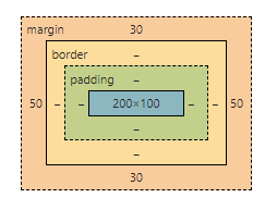
margin
- 테두리와 이웃하는 요소 사이의 간격
- 마진은 눈에 보이지 않음
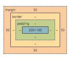
 .margin1{
            margin: 30px 50px 30px 50px;
        }
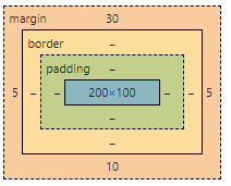
.margin2{
            margin: 30px 50px;
        }
.margin3{
            margin: 50px;
        }
 .margin3{
            margin: 50px;
        }
.margin5{
            margin: 0 auto;
        }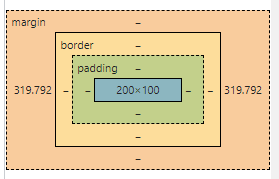
auto로 설정하면 사이트의 크기에 맞추어 설정이 된다. (중앙정렬)
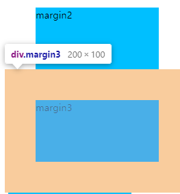
세로 겹침 현상
세로로 나열된 두 박스의 간격은 두 마진의 합이 아니라 둘 중 큰 값을 선택
아래의 margin2박스의 margin 값보다 margin3의 margin값이 더 커서 margin3의 margin값으로 적용되었다.(좌우는 겹치지 않는다!)
box-sizing
- width, height 값에 padding이나 border 영역은 포함되지 않음
- 만약 width가 100%로 설정된 요소의 경우 padding이나 border속성을 추가 할 수 없다
- box-sizing 속성을 추가 -> padding과 border를 width와 height에 포함
content-box
기존 계산법, width와 height에 둘을 포함X
content 자체의 크기를 box-sizing 한다.
 <style>
        div{
            width: 300px;
            height: 150px;
            margin: 10px;
            padding: 30px;
            border: 10px solid red;
        }
        .bs1{
        /*content의 사이즈가 300, 150이 된다.*/
            box-sizing: content-box;
        }
 </style>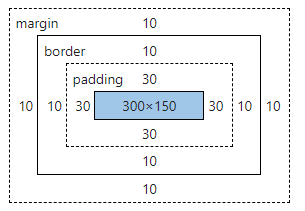
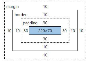
border-box
width와 height에 padding, border를 포함.
pading을 포함하여 border의 전체 사이즈가 width, height로 결정된다.
<style>
        div{
            width: 300px;
            height: 150px;
            margin: 10px;
            padding: 30px;
            border: 10px solid red;
        }
        .bs2{
        /*border의 size가 300,150이 되면서 margin에 따라 content가 계산됨*/
            box-sizing: border-box;
        }
 </style>
border와 padding을 합치면 width와 height 값이 나오는 것을 확인할 수 있다.
둥근테두리
border-radius
테두리를 둥글게 만들고 싶으면 border-radius의 값을 설정한다.
border-radius : 가로값 / 세로값
기본 설정
border-radius : top-left-x top-right-x bottom-right-x bottom-left-x /
top-left-y top-right-y bottom-right-y bottom-left-y
대각선 위치의 값이 같을 때
border-radius : top-left-x top-right-x / top-left-y top-right-y
전부다 같을 때
border-radius : xy
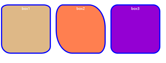
<style>
  	<!--div태그의 id를 box로 설정함-->
        #box1{
            width: 200px;
            height: 200px;
            background-color:burlywood;
            border: 5px solid blue;
            border-radius: 30px 30px 40px 40px / 20px 20px 30px 40px;
            float: left;
            margin: 10px;
        }
        #box2{
            margin: 10px;
            float: left;
            width: 200px;
            height: 200px;
            background-color:coral;
            border: 5px solid blue;
            border-radius: 30px 70px / 50px 100px;
        }
        #box3{
            margin: 10px;
            float: left;
            width: 200px;
            height: 200px;
            background-color:darkviolet;
            border: 5px solid blue;
            border-radius: 30px;
        }
 </style>
아래의 그림을 보면 테두리가 둥글게 설정된 것을 확인 할 수 있다.
테이블 테두리 설정
테이블 셀들간에 공백을 처리할지 여부를 결정하는 속성
separate
기본값, 셀들을 분리
<style>
        table{
            border-collapse: separate; //여기를 수정
            border: 3px solid red;
            width: 600px;
        }
        th,td{
            height: 40px;
            border: 3px solid red;
            text-align: center;
        }
 </style>
테두리 안에 테두리가 생긴 것을 알 수 있다.
collapse
셀들 사이를 합쳐서 공백을 없앤다.
<style>
        table{
            border-collapse: collapse; //여기를 수정
            border: 3px solid red;
            width: 600px;
        }
        th,td{
            height: 40px;
            border: 3px solid red;
            text-align: center;
        }
 </style>
테두리가 하나로 합쳐졌다!
CSS display
웹 페이지의 레이아웃을 결정하는 속성
block
새로운 라인에서 시작, 해당 라인의 모든 너비를 차지
<style>
div{
margin: 20px;
border: 1px solid deeppink;
border-radius: 20px;
padding: 10px;
display: block;
}
#block img{
display: block;
}
</style>
생략..
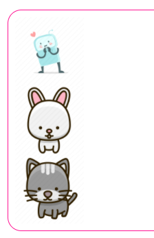
<div id="block">
<img src="./cute1.png" alt="귀요미1">
<img src="./cute2.png" alt="귀요미2">
<img src="./cute3.png" alt="귀요미3">
</div>bloc으로 설정하면 블록쌓기처럼 차곡차곡 쌓인다.
inline
새로운 라인에서 시작되지 않고 앞의 요소에 이어서 배치(기본 값)
<style>
div{
margin: 20px;
border: 1px solid deeppink;
border-radius: 20px;
padding: 10px;
display: block;
}
#inline img{
width: 100px;
/* display: inline; 생략가능 */
}
</style>
생략..
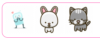
<div id="block">
<img src="./cute1.png" alt="귀요미1">
<img src="./cute2.png" alt="귀요미2">
<img src="./cute3.png" alt="귀요미3">
</div>앞의 요소 이어서 수평으로 배치되는 것을 볼 수 있다.
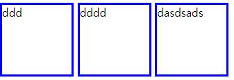
inline-block
block과 inline 속성을 모두 사용
span태그나 div 태그처럼 content를 넣어야 되는 태그에 적용시키기 좋다.
inline으로 처리 할 경우 content가 적으면 모양이 이상해 진다.
width와 height를 적용해도 마찬가지이다.
- width, height을 적용
- padding, margin을 적용
- line-height을 적용
- 요소를 가로로 나열
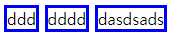
위와 같이 content가 만족하지 못하면 width나 height를 적용해도 content의 양만큼만 차지한다. inline-block을 설정하면 아래와 같다. (위 아래 모두 width 100, height 100 으로 설정함)
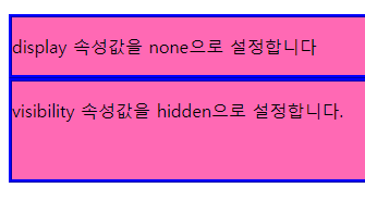
none과 hidden
- none은 웹 페이지에서 해당 요소가 나타나지 않고 레이아웃에서 사라짐
- hidden은 레이아웃은 남기면서 보이지 않음
<style>
        div{
            background-color: hotpink;
            border: 3px ridge blue;
        }
        p.none{
            /* 레이아웃도 없앰..ㅋㅋ */
            display: none;
        }
        p.hidden{
            /* 레이아웃은 남김 ㅜㅜ */
            visibility: hidden;
        }
    </style>
<body>
    <h2>디스플레이 - 2</h2>
    <div>
        <p>display 속성값을 none으로 설정합니다</p>
        <p class="none">display 속성값을 none으로 설정했습니다.</p>
    </div>
    <div>
        <p>visibility 속성값을 hidden으로 설정합니다.</p>
        <p class="hidden">visibility 속성값을 hidden으로 설정했습니다.</p>
    </div>
</body>- 결과는 다음과 같다.
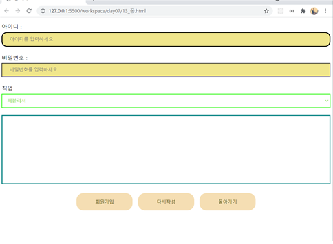
CSS 폼
- 폼요소의 스타일을 설정
- input[type="text"]:focus 폼요소가 포커싱 되어있을 때의 스타일 설정
outline:none -> 포커싱 되었을때 테두리 없애주기, 들어가는 테두리를 따로 설정해야함. - input[type="button"]
cursor:pointer -> 마우스를 올렸을 때 커서 모양을 설정 - textarea
resize:none -> textarea의 크기를 사용자가 조절하지 못하도록 설정
속성 선택자를 참고하여 작성해보자.
<!DOCTYPE html>
<html lang="en">
<head>
    <meta charset="UTF-8">
    <meta http-equiv="X-UA-Compatible" content="IE=edge">
    <meta name="viewport" content="width=device-width, initial-scale=1.0">
    <style>
        input{
            width: 100%;
            box-sizing: border-box;
            padding: 10px 20px;
            background-color: khaki;
            margin: 5px 0;
        }
        input[type="text"]{
            border-radius: 15px;
            border: 3px solid black;
        }
        input[type="text"]:focus{
            background-color: lightgoldenrodyellow;
            border: 3px dashed red;
        }
        input[type="password"]{
            border-bottom: 3px solid blue;
        }
        input[type="password"]:focus{
            outline: none;
            border-bottom: 1px solid deeppink;
        }
        select{
            width: 100%;
            box-sizing: border-box;
            padding: 10px;
            margin: 5px 0;
            border: 2px solid rgb(33, 248, 4);
            color: rgb(151, 221, 111);
            font-weight: bold;
        }
        textarea{
            width: 100%;
            height: 200px;
            box-sizing: border-box;
            font-size: 16px;
            border: 3px solid teal;
            resize: none;
        }
        input[type="button"], input[type="reset"], input[type="submit"]{
            width: 160px;
            background-color: wheat;
            color:rgb(77, 77, 2);
            padding: 16px 32px;
            margin: 5px 5px;
            border: none;
            border-radius: 20px;
            cursor:grab;
        }
    </style>
    <title>폼 예제</title>
</head>
<body>
    <form action="">
        <p>아이디 : <input type="text" maxlength="20" placeholder="아이디를 입력하세요"></p>
        <p>비밀번호 : <input type="password" maxlength="20" placeholder="비밀번호를 입력하세요"></p>
        <p>
            직업
            <select name="" id="">
                <option value="">퍼블리셔</option>
                <option value="">디자이너</option>
                <option value="">선생님</option>
                <option value="">조종사</option>
                <option value="">의사</option>
                <option value="">판사</option>
                <option value="">검사</option>
                <option value="">엔지니어</option>
                <option value="">대통령</option>
                <option value="">경찰</option>
            </select>
        </p>
        <p><textarea></textarea></p>
        <p style="text-align: center;">
            <input type="submit" value="회원가입">
            <input type="reset" value="다시작성">
            <input type="button" value="돌아가기">
        </p>
    </form>
</body>
</html>