
CSS Position
요소의 위치를 결정하는 방식을 설정
정적(static) 위치 지정 방식(기본 값)
- HTML 요소의 위치를 결정하는 기본적인 방식
- top, left, right, bottom 속성값을 사용할 수 없음
- 단순히 웹 페이지의 흐름에 따라 차례대로 요소들의 위치를 결정하는 방식
상대(relative) 위치 지정 방식
- HTML 요소의 기본 위치를 기준으로 위치를 재설정하는 방식
- 기본 위치는 정적위치 지정방식일 때 결정되는 위치를 의미
<style>
        .relative1{
            width: 200px;
            background-color: deeppink;
            /* margin-left: 50px; */
            padding: 50px;
        }
        .relative2{
            width: 400px;
            background-color: deepskyblue;
            padding: 50px;
            position: relative;
            left: 300px;
            top: 100px;
        }
</style>
<body>
    <h2>상대위치 지정방식</h2>
    <div class="relative1">상대위치 지정방식1</div>
    <div class="relative2">상대위치 지정방식2</div>
</body>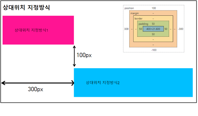
고정(fixed) 위치 지정 방식
- 뷰포트를 기준으로 위치를 설정하는 방식
- 웹 페이지가 스크롤 되어도 고정위치로 지정된 요소는 항상 같은 곳에 위치
 <style>
        #fx{
            position: fixed;
            width: 75px;
            height: 200px;
            right: 10px;
            top: 10px;
            background-color: blue;
        }
    </style>
...생략...
<div id="fx"></div>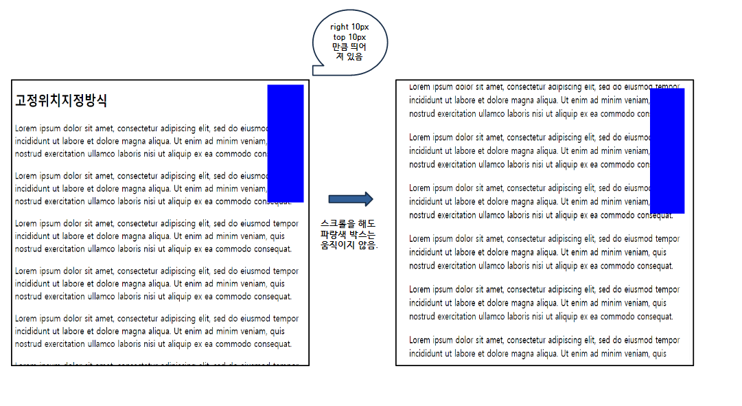
- 뷰포트
가상의 화면
화면 디스플레이 상의 표시 영역을 뜻한다.
모바일 뷰포트는 상하 좌우로 스크롤을 움직이거나
줌인, 줌아웃을 통해 뷰포트를 변경하며 사용한다.
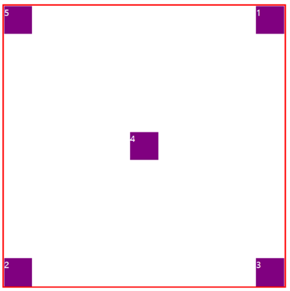
절대(absolute) 위치 지정 방식
- 뷰포트를 기준으로 위치를 설정하는 방식
- 조상요소를 기준으로 위치를 지정할 수 있음(위치가 설정된 조상요소)
- 조상요소를 가지지 않으면 body 요소를 기준으로 위치를 결정한다.
- 위치가 설정된 조상요소
정적 위치 지정방식을 제외한 방식(상대, 고정, 절대)로 위치가 설정된 조상요소를 의미
<style>
        /* 조상요소에 위치 설정 */
        #wrap{
            position: relative;
            width: 500px;
            height: 500px;
            border: 3px solid red;
        }
        /* 부모요소에 position을 절대값으로 지정 */
        .box{
            position: absolute;
            color: white;
            width: 50px;
            height: 50px;
            background-color:purple;
        }
        /* 손자요소에 절대값의 위치 지정 */
        #ab1{top: 0; right: 0;}
        #ab2{bottom: 0; left: 0;}
        #ab3{bottom: 0; right: 0;}
        #ab4{bottom: 225px; left: 225px;}
    </style>
....생략....
<div id="wrap">
        <div class="box" id="ab1">1</div>
        <div class="box" id="ab2">2</div>
        <div class="box" id="ab3">3</div>
        <div class="box" id="ab4">4</div>
        <div class="box" id="ab5">5</div>
</div>
조상요소의 위치를 설정하여 절대값이 조상의 border 안에 설정 될 수 있다.
조상요소의 위치를 설정하지 않으면 body의 절대값에 적용되어 원하는 스타일을 꾸미기 힘들어진다.
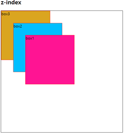
z-index
- HTML 요소의 위치를 설정하게 되면 위치 및 방식에 따라 겹칠 수 있음
- 겹쳐지는 요소들이 쌓이는 순서를 결정할 때 사용
- 순서는 음수, 양수 모두 사용 할 수 있음(실수형은 안됨.)
- 크기가 클수록 위에 위치하고, 작을 수록 아래에 위치하게 된다.
<style>
        /* 공통요소의 전체 크기와 위치를 지정하였다 */
        div#wrapper{
            width: 500px;
            height: 500px;
            position: relative;
            border: 1px solid black;
        }
        /* 공통요소의 박스들의 위치를 절대위치지정으로 하고 각 박스의 크기를 지정했다. */
        div.box{
            position: absolute;
            width: 200px;
            height: 200px;
            border: 1px solid red;
        }
        /* 박스들의 절대위치와 배경색을 지정하고 겹치는 부분에 대한 우선순위를 주었다. */
        #b1{
            left: 100px;
            top: 100px;
            background-color: deeppink;
            z-index: 3;
        }
        #b2{
            left: 50px;
            top: 50px;
            z-index: 2;
            background-color: deepskyblue;
        }
        #b3{
            background-color: goldenrod;
            z-index: 1;
        }
    </style>
...생략...
<body>
    <h2>z-index</h2>
    <div id="wrapper">
        <div id="b1" class="box">box1</div>
        <div id="b2" class="box">box2</div>
        <div id="b3" class="box">box3</div>
    </div>
</body>
float
- float 속성이 적용된 이후 나타나는 요소들의 동작을 조절
- float 속성이 적용되면 그 이후에 등장하는 모든 요소들은 정확한 위치를 설정하기 어려움
- clear 속성을 사용하여 이후에 등장하는 요소들이 더 이상
- float 속성에 영향을 받지 않도록 설정(left, right, both)
 <style>
        #cute{
            float:left;
            margin-right: 20px;
        }
 </style>
<h2>float - 2</h2>
    <img src="./cute1.png" alt="귀욤뽀짝" id="cute">
    lorem ipsum content.....생략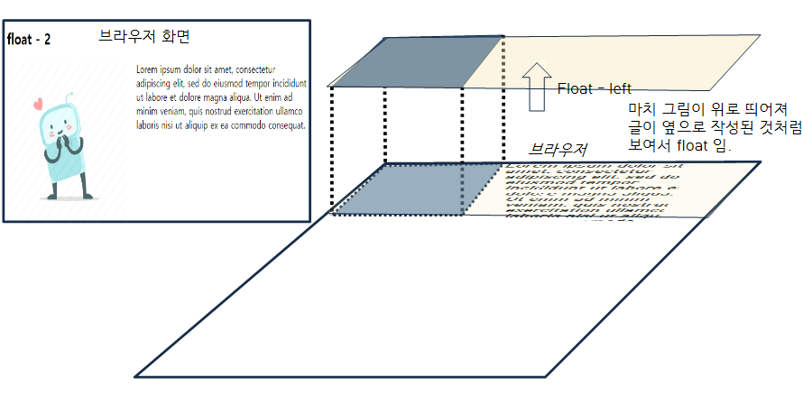
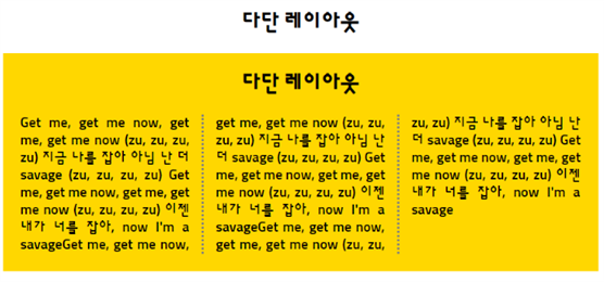
다단 레이아웃
- 텍스트 단을 column 속성으로 다단을 생성
- 다단은 레이아웃을 여러개의 컬럼으로 쪼개서 구성한다는 의미
- 단을 지정하면 긴 문장을 자동으로 넘겨준다.
옵션 설명 column-count 단의 개수를 설정 column-rule 단과 단 사이의 구분선, 구분의 모양, 두께, 색상을 설정 column-gap 단과 단 사이의 여백을 설정 column-span 단과 안의 포함된 요소를 다단편집에서 해제
<style>
        div, h2, p{margin: 0; padding: 0;}
        body{margin: 10px;}
        h2{padding: 0 0 20px; text-align: center;}
        .col{
            text-align: justify;
            padding: 20px;
            background-color: gold;

            /* 단의 갯수를 지정함 */
            column-count: 3;
            /* 단과 단사이의 거리를 지정 */
            column-gap: 30px;
            /* 단을 만들때 단의 선 속성을 지정함 */
            column-rule: 3px dotted gray;
        }
        .col > h2{
  	/* .col의 h2태그를 단 속성에서 해제한다. */
            column-span: all;
        }
    </style>
<h2>다단 레이아웃</h2>
    <div class="col">
        <h2>다단 레이아웃</h2>
        <p>
            Get me, get me now, get me, get me now (zu, zu, zu, zu)
            지금 나를 잡아 아님 난 더 savage (zu, zu, zu, zu)
            ..........생략
        </p>
    </div>
브라우저 화면은 다음과 같다.
플렉서블 레이아웃(flex)
- 대부분의 웹사이트는 수직 구성
- 레이아웃 구성할 때 가장 많이 사용하는 요소들이 대부분 블록개념으로 표기
- 수직구성은 쉽게 구성할 수 있으나, 수평 구성은 구현하기 쉽지 않음
- 과거에는 수평구성을 <table>, float, inline-block으로 구성
좀 더 쉽게 수평구성을 구현하기 위해서 flex를 사용한다.
flex-wrap
- 플렉스 라인에 더이상 여유가 없을 때 플렉스 요소의 위치를 다음줄로 넘길지 여부를 설정
| 옵션 | 설명 |
|---|---|
| nowrap | 기본설정. 플렉스 요소가 다음줄로 넘어가지 않음. 요소의 너비를 줄여 한 줄에 모두 배치 |
| wrap | 플렉스 요소가 여유 공간이 없으면 다음줄로 넘김 |
| wrap-reverse | 플렉스 요소가 여유 공간이 없으면 다음줄로 넘김. 단, 위쪽으로 넘김 |
<style>
        #container{
            width: 1000px;
            height: 500px;
            margin: 0 auto;
            border: 3px solid red;
            display: flex;
            /* box3을 밑으로가 아닌 reverse 옵션으로 위로 올렸다. */
            flex-wrap: wrap-reverse;
        }
        #container div{
            width: 400px;
            border: 1px solid black;
            background-color: gold;
        }
</style>
...생략...
<body>
    <h2>flex - 1</h2>
    <div id="container">
        <div id="box1"><h2>1</h2></div>
        <div id="box2"><h2>2</h2></div>
        <div id="box3"><h2>3</h2></div>
    </div>
</body>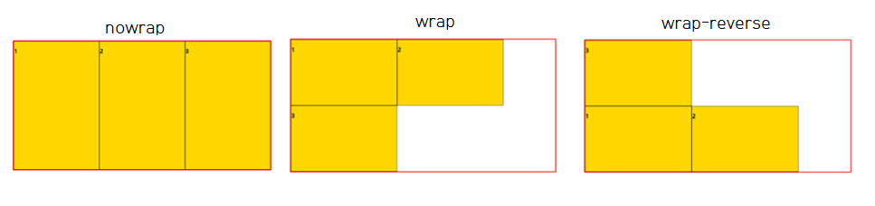
justify-content
플렉스 요소의 수평방향 정렬방식을 설정
다음 아래와 같이 정렬하고 싶을 때 해당 옵션을 사용한다.
| 옵션 | 설명 |
|---|---|
| flex-start | 기본 값, 앞쪽에서부터 배치됨 |
| flex-end | 뒤쪽에서부터 배치 |
| center | 가운데에 배치됨 |
| space-between | 앞, 뒤 그리고 요소들 사이에 모두 여유 공간을 두고 배치됨 |
| space-around | 가운데에 배치됨 |
| space-evenly | 앞, 뒤 그리고 요소들 사이의 공간을 모두 일정하게 두고 배치됨 |
<style>
 /* 생략 */
#container1{
            justify-content: flex-start;
        }
 /* 생략 */
</style>
/* 생략 */
  <h3>justify-content : flex-start</h3>
    <div class="wrapper" id="container1">
        <div><p>1</p></div>
        <div><p>2</p></div>
        <div><p>3</p></div>
    </div>
/* 생략 */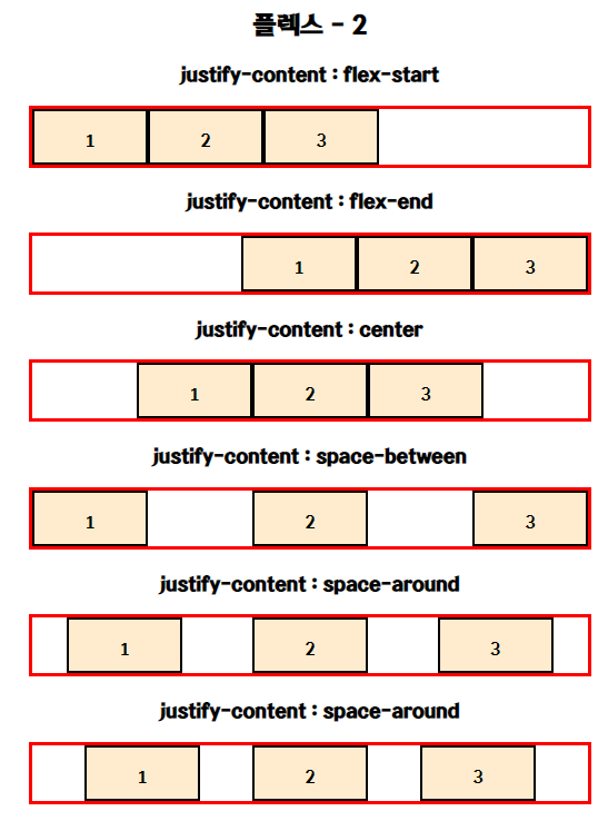
숙제.
삼단레이아웃으로 페이지 만들기
<!DOCTYPE html>
<html lang="en">
<head>
    <meta charset="UTF-8">
    <meta http-equiv="X-UA-Compatible" content="IE=edge">
    <meta name="viewport" content="width=device-width, initial-scale=1.0">
    <title>삼단 레이아웃</title>
    <link rel="stylesheet" href="./css/layout2.css">
</head>
<body>
    <div id="container">
        <div id="header"><h2>사이트 제목</h2></div>
        <div id="sidebar1">
            <h2>사이드바</h2>
            <ul>
                <li>항목1</li>
                <li>항목2</li>
                <li>항목3</li>
                <li>항목4</li>
            </ul>
        </div>
        <div id="content">
            <h2>본문</h2>
            <p>Lorem ipsum dolor sit amet, consectetur adipiscing elit, sed do eiusmod tempor incididunt ut labore et dolore magna aliqua. Ut enim ad minim veniam, quis nostrud exercitation ullamco laboris nisi ut aliquip ex ea commodo consequat.</p>
            <p>Lorem ipsum dolor sit amet, consectetur adipiscing elit, sed do eiusmod tempor incididunt ut labore et dolore magna aliqua. Ut enim ad minim veniam, quis nostrud exercitation ullamco laboris nisi ut aliquip ex ea commodo consequat.</p>
        </div>
        <div id="sidebar2">
            <h2>사이드바</h2>
            <ul>
                <li>항목1</li>
                <li>항목2</li>
                <li>항목3</li>
                <li>항목4</li>
            </ul>
        </div>
        <div id="footer">
            <h2>푸터</h2>
            <p>저작권 정보</p>
            <p>연락처 등</p>
        </div>
    </div>
</body>
</html>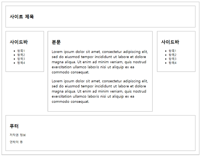

AllTimeDevelop