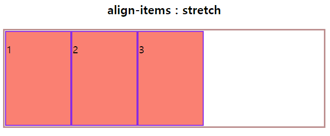
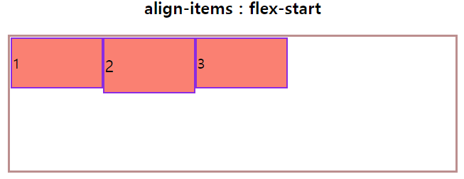
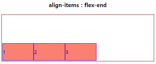
align-itmes
flex 요소들의 수직방향 정렬방식을 설정
아래의 크기는 플렉스 컨테이너는 (500px 150px), 요소들은 100px이다.
stretch
기본설정, 플렉스 요소의 높이가 컨테이너의 높이와 같게 변경된 뒤 연이어 배치된다.
flex-start
플렉스 요소는 플렉스 컨테이너의 위쪽에 배치된다.
flex-end
플렉스 요소는 플렉스 컨테이너의 아래쪽에 배치된다.
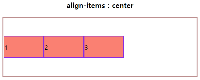
center
플렉스 요소는 플렉스 컨테이너의 가운데에 배치된다.
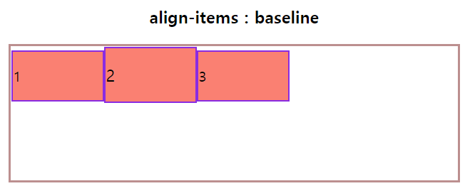
baseline
플렉스 요소는 컨테이너의 기준선에 배치된다.
alingn-self
플레스 요소마다 서로 다른 align 속성 값을 설정할 수 있다.
box1은 center, 2는 stretch, 3는 flex-end로 설정하였다.
order
플렉스 요소들의 순서를 설정
order를 적용하여 순서를 바꾸었다. 숫자가 낮을 수록 먼저임

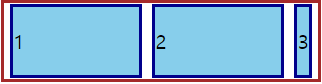
flex-grow
플렉스 아이템들이 차지할 너비들에 대한 증가형 숫자를 지정
각각 box들의 flex-grow를 설정하여 비율을 1 : 2 : 3으로 grow시킴

flex-shrink
플렉스 아이템들이 차지할 너비들에 대한 감소형 숫자를 지정
각각 box들의 flex-shrink 설정하여 비율을 2 : 2 : 1으로 shrink시킴
flex-basis
플렉스 아이템들의 길이를 지정
(max-content, min-content, fit-content, content, auto..)
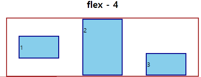
flex
플렉스의 속성을 한꺼번에 설정
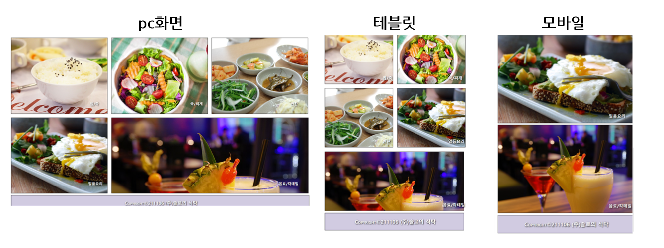
media_query
width, height, color, ... 속성과 같은 미디어 관련 표현식을 통해 스타일이 적용되는 범위를 조절(반응형 웹 개발)
컨텐츠를 별도로 변경하지 않아도 웹페이지에 접속하고 있는 기기에 따라 알맞은 형태로 스타일을 조절
- 장점 : UI 고급화, 유지관리와 업데이트
- 단점 : 구현이 어렵다, 다운로드 속도가 느려진다.
    @media 매체유형 and 조건....{
        적용할 스타일 코드
    }

    매체유형
        all     : 모든 매체
        screen  : 컴퓨터, 태블릿, 스마트폰, ...
        print   : 프린터 기기
        speech  : 스크린 리더
media_query를 적용한 과제
html
<!DOCTYPE html>
<html lang="en">
<head>
<meta charset="UTF-8">
<meta http-equiv="X-UA-Compatible" content="IE=edge">
<meta name="viewport" content="width=device-width, initial-scale=1.0">
<title>솔로의 식탁</title>
<link rel="stylesheet" href="./style.css">
</head>
<body>
<div id="container">
<header>
<h1>솔로의 식탁</h1>
</header>
<section id="menus">
<div id="menu1"><h2>밥/죽</h2></div>
<div id="menu2"><h2>국/찌개</h2></div>
<div id="menu3"><h2>반찬</h2></div>
<div id="menu4"><h2>일품요리</h2></div>
<div id="menu5"><h2>음료/칵테일</h2></div>
</section>
<footer>
<p>Copyright©211106 (주)솔로의 식탁</p>
</footer>
</div>
</body>
</html>css
/* common */

section > div {
 height: 400px;
}

header {
 text-align: center;
 font-size: 1.5em;
}

footer {
 font-size: 1.5em;
 color: white;
 text-shadow: 2px 2px 5px black;
 margin: 10px;
 background-color: rgba(104, 84, 154, 0.3);
}

footer > p {
 font-size: 1em;
 font-weight: bold;
 color: white;
 text-align: center;
 margin-left: 10px;
 font-variant: small-caps;
}

#menu1 {
 background-image: url(./images/dish1.jpg);
}
#menu2 {
 background-image: url(./images/dish2.jpg);
}
#menu3 {
 background-image: url(./images/dish3.jpg);
}
#menu4 {
 background-image: url(./images/dish4.jpg);
}
#menu5 {
 background-image: url(./images/dish5.jpg);
}

/* mobile */
@media screen and (min-width: 480px) and (max-width: 720px) {
 section > div > h2 {
   font-size: 1.2em;
   color: white;
   text-shadow: 2px 2px 5px black;
   position: relative;
   top: 85%;
   left: 82%;
 }
 #menu1,
 #menu2,
 #menu3,
 #menu4,
 #menu5 {
   width: 100%;
   margin: 10px;
   display: block;
   background-size: cover;
   background-repeat: no-repeat;
   border: 1px solid black;
 }
 footer {
   border: 1px solid black;
   width: 100%;
   clear: both;
 }
}

/* tablet */

@media screen and (min-width: 720px) {
 section > div > h2 {
   font-size: 1.2em;
   color: white;
   text-shadow: 2px 2px 5px black;
   position: relative;
   top: 80%;
   left: 75%;
 }
 #menu1 > h2,
 #menu3 > h2,
 #menu5 > h2 {
   position: relative;
   top: 80%;
   left: 85%;
 }
 #menu1,
 #menu2,
 #menu3,
 #menu4 {
   height: 280px;
   width: 45%;
   background-repeat: no-repeat;
   background-size: cover;
   border: 1px solid black;
   float: left;
   margin: 10px;
 }
 #menu5 {
   height: 280px;
   background-repeat: no-repeat;
   background-size: cover;
   border: 1px solid black;
   margin: 10px;
   width: 92%;
   float: left;
 }
 footer {
   border: 1px solid black;
   width: 92%;
   clear: both;
 }
}

/* pc */
@media screen and (min-width: 1200px) {
 section > div > h2 {
   font-size: 1.2em;
   color: white;
   text-shadow: 2px 2px 5px black;
   position: relative;
   top: 80%;
   left: 70%;
 }
 #menu1 > h2,
 #menu3 > h2,
 #menu2 > h2 {
   position: relative;
   top: 80%;
   left: 82%;
 }
 #menu4 > h2 {
   position: relative;
   top: 80%;
   left: 80%;
 }
 #menu5 > h2 {
   position: relative;
   top: 80%;
   left: 85%;
 }
 #menu1,
 #menu2,
 #menu3,
 #menu4 {
   height: 400px;
   width: 31%;
   background-repeat: no-repeat;
   background-size: cover;
   border: 1px solid black;
   float: left;
   margin: 10px;
 }
 #menu5 {
   height: 400px;
   background-repeat: no-repeat;
   background-size: cover;
   border: 1px solid black;
   margin: 10px;
   width: 63.44%;
   float: left;
 }
 footer {
   border: 1px solid black;
   width: 96%;
   clear: both;
 }
}
솔로의 식탁 홈페이지 바로가기
<무료호스팅 특성 상 홈페이지가 변경될 수 있음>
상대크기 em/rem
-
em : 단위는 상위 요소 크기의 몇 배인지를 나타내는 크기(부모-자식요소)
-
rem : 단위는 최상위 요소 크기의 몇 배인지를 나타내는 크기(손자요소)
- 아무 설정 값이 없으면 html의 단위로 적용이 된다.
상대크기를 알기위한 변환사이트를 참고하면 좋다.
변환사이트 바로가기
