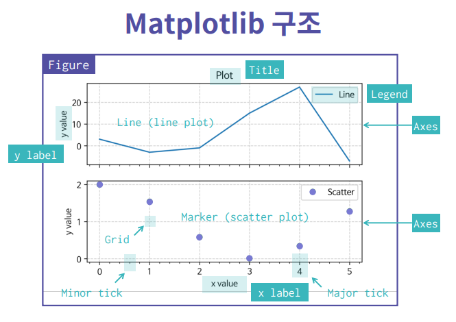
1. Matplotlib이란?

파이썬에서 데이터를 그래프나 차트로 시각화 할 수 있는 라이브러리.
1-1. 그래프 그려보기
x = [1, 2, 3, 4, 5]
y = [1, 2, 3, 4, 5]
plt.plot(x, y)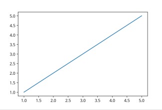
x = [1, 2, 3, 4, 5]
y = [1, 2, 3, 4, 5]
plt.plot(x, y)
plt.title("First Plot")
plt.xlabel("x")
plt.ylabel("y")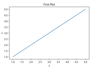
x = [1, 2, 3, 4, 5]
y = [1, 2, 3, 4, 5]
fig, ax = plt.subplots()
ax.plot(x, y)
ax.set_title("First Plot")
ax.set_xlabel("x")
ax.set_ylabel("y")
그래프 저장하기
x = [1, 2, 3, 4, 5]
y = [1, 2, 3, 4, 5]
fig, ax = plt.subplots()
ax.plot(x, y)
ax.set_title("First Plot")
ax.set_xlabel("x")
ax.set_ylabel("y")
fig.set_dip(300)
fig.savefig(”first_plot.png”)
여러개 그래프 그리기
x = np.linspace(0, np.pi*4, 100)
fig, axes = plt.subplots(2, 1)
axes[0].plot(x, np.sin(x))
axes[1].plot(x, np.cos(x))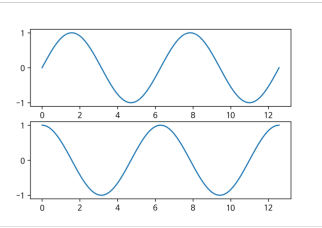
1-2. 실습 예제
import numpy as np
import pandas as pd
import matplotlib.pyplot as plt

x = [1, 2, 3, 4, 5]
y = [1, 2, 3, 4, 5]
# 그래프를 그리는 코드 작성

fig,ax =plt.subplots()
ax.plot(x,y)
2. Line plot 그리기
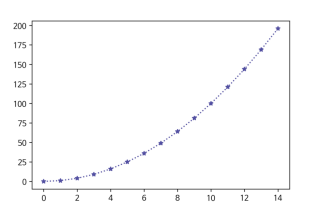
fig, ax = plt.subplots()
x = np.arange(15)
y = x ** 2
ax.plot(
	x, y,
	linestyle=":",
	marker="*",
	color="#524FA1"
)
2-1. Line plot 그리기
x = np.arange(10)
fig, ax = plt.subplots()
ax.plot(x, x, linestyle="-")
# solid
ax.plot(x, x+2, linestyle="--")
# dashed
ax.plot(x, x+4, linestyle="-.")
# dashdot
ax.plot(x, x+6, linestyle=":")
# dotted
2-2. color
x = np.arange(10)
fig, ax = plt.subplots()
ax.plot(x, x, color="r")
ax.plot(x, x+2, color="green")
ax.plot(x, x+4, color='0.8')
ax.plot(x, x+6, color="#524FA1")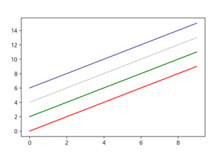
2-3. Marker
x = np.arange(10)
fig, ax = plt.subplots()
ax.plot(x, x, marker=".")
ax.plot(x, x+2, marker="o")
ax.plot(x, x+4, marker='v')
ax.plot(x, x+6, marker="s")
ax.plot(x, x+8, marker="*")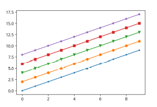
2-4. 축 경계 조정하기
x = np.linspace(0, 10, 1000)
fig, ax = plt.subplots()
ax.plot(x, np.sin(x))
ax.set_xlim(-2, 12)
ax.set_ylim(-1.5, 1.5)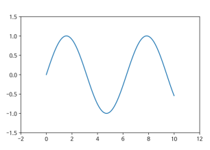
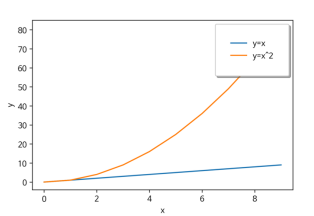
2-5. 범례
fig, ax = plt.subplots()
ax.plot(x, x, label='y=x')
ax.plot(x, x**2, label='y=x^2')
ax.set_xlabel("x")
ax.set_ylabel("y")
ax.legend(
	loc='upper right',
	shadow=True,
	fancybox=True,
	borderpad=2
)
2-6. 실습 예제
#@line graph
#이미 입력되어 있는 코드의 다양한 속성값들을 변경해 봅시다.
x = np.arange(10)
fig, ax = plt.subplots()
ax.plot(
    x, x, label='y=x',
    marker='o',
    color='blue',
    linestyle=':'
)
ax.plot(
    x, x**2, label='y=x^2',
    marker='^',
    color='red',
    linestyle='--'
)
ax.set_xlabel("x")
ax.set_ylabel("y")
ax.legend(
    loc='upper left',
    shadow=True,
    fancybox=True,
    borderpad=2
)
3. Scatter
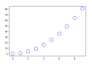
3-1. scatter graph 그리기
fig, ax = plt.subplots()
x = np.arange(10)
ax.plot(
	x, x**2, "o",
	markersize=15,
	markerfacecolor='white',
	markeredgecolor="blue"
)
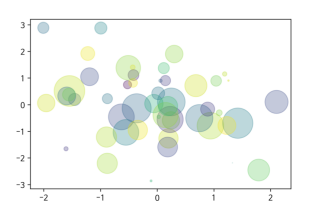
3-2. scatter graph 그리기 - (2)
fig, ax = plt.subplots()
x = np.random.randn(50)
y = np.random.randn(50)
colors = np.random.randint(0, 100, 50)
sizes = 500 * np.pi * np.random.rand(50) ** 2
	ax.scatter(
		x, y, c=colors, s=sizes, alpha=0.3
)
3-3. 실습 예제
#@@ scatter plot
fig, ax = plt.subplots()
x = np.arange(10)
ax.plot(
    x, x**2, "o",
    markersize=15,
    markerfacecolor='white',
    markeredgecolor="blue"
)
4. Bar & Histogram
4-1. Bar plot 그리기
x = np.arange(10)
fig, ax =
plt.subplots(figsize=(12, 4))
ax.bar(x, x*2)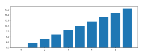
x = np.random.rand(3)
y = np.random.rand(3)
z = np.random.rand(3)
data = [x, y, z]

fig, ax = plt.subplots()
x_ax = np.arange(3)
for i in x_ax:
	ax.bar(x_ax, data[i],
	bottom=np.sum(data[:i], axis=0))
ax.set_xticks(x_ax)
ax.set_xticklabels(["A", "B", "C"])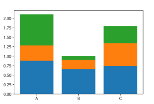
4-2. Histogram
fig, ax = plt.subplots()
data = np.random.randn(1000)
ax.hist(data, bins=50)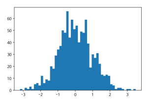
4-3.실습 예제
#@@ bar & histogram
x = np.array(["축구", "야구", "농구", "배드민턴", "탁구"])
y = np.array([18, 7, 12, 10, 8])

z = np.random.randn(1000)


fig, axes = plt.subplots(1, 2, figsize=(8, 4))

# Bar 그래프
axes[0].bar(x, y)
# 히스토그램
axes[1].hist(z, bins = 50)
5. Matplotlib with pandas
df = pd.read_csv("./president_heights.csv")
fig, ax = plt.subplots()

ax.plot(df["order"], df["height(cm)"], label="height")
ax.set_xlabel("order")
ax.set_ylabel("height(cm)")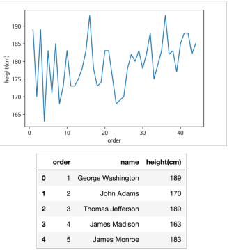
fire = df[
(df['Type 1']=='Fire') | ((df['Type 2'])=="Fire")]
water = df[(df['Type 1']=='Water') | ((df['Type 2'])=="Water")]
fig, ax = plt.subplots()

ax.scatter(fire['Attack'], fire['Defense’], color='R', label='Fire', marker="*", s=50)

ax.scatter(water['Attack'], water['Defense’],color='B', label="Water", s=25)
ax.set_xlabel("Attack")
ax.set_ylabel("Defense")
ax.legend(loc="upper right"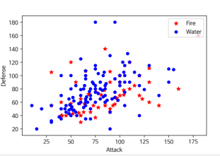
5-1.실습 예제
#@@matplotlib with pandas
df = pd.read_csv("./data/pokemon.csv")

fire = df[
    (df['Type 1']=='Fire') | ((df['Type 2'])=="Fire")
]

water = df[
    (df['Type 1']=='Water') | ((df['Type 2'])=="Water")
]

fig, ax = plt.subplots()
ax.scatter(fire['Attack'], fire['Defense'],
    color='R', label='Fire', marker="*", s=50)
ax.scatter(water['Attack'], water['Defense'],
    color='B', label="Water", s=25)
ax.set_xlabel("Attack")
ax.set_ylabel("Defense")
ax.legend(loc="upper right")

#@@ 에제
df = pd.read_csv("./data/the_hare_and_the_tortoise.csv")
df.set_index("시간",inplace=True)

fig,ax = plt.subplots()
ax.plot(df['토끼'], label = "토끼")
ax.plot(df['거북이'], label = "거북이")
ax.legend()
5-2. 월드컵 예제
#원드컵 예제
world_cups = pd.read_csv("WorldCups.csv")
world_cups = world_cups[['Year', 'Attendance']]
print(world_cups)

plt.plot(world_cups['Year'], world_cups['Attendance'], marker='o', color='black')

df['GoalsPerMatch'] = df.GoalsScored / df.MatchesPlayed
print(df)

# 첫 번째 그래프 출력
fig, axes = plt.subplots(2, 1, figsize=(4,8))

axes[0].bar(x=world_cups['Year'], height=world_cups['GoalsScored'], color='grey', label='goals')

axes[0].plot(world_cups['Year'], world_cups['MatchesPlayed'], marker='o', color='blue', label='matches')

axes[0].legend(loc='upper left')


# 두 번째 그래프 출력
axes[1].grid(True)
axes[1].plot(world_cups['Year'], world_cups['GoalsPerMatch'], marker='o', color='red', label='goals_per_matches')

axes[1].legend(loc='lower left')

#preprocess
world_cups_matches = pd.read_csv("WorldCupMatches.csv")
world_cups_matches = world_cups_matches.replace('Germany FR', 'Germany')
world_cups_matches = world_cups_matches.replace('�', 'ô')
world_cups_matches = world_cups_matches.replace('rn”>', '')
world_cups_matches = world_cups_matches.replace('Soviet Union', 'Russia')

dupli = world_cups_matches.duplicated()
print(len(dupli[dupli==True]))
world_cups_matches = world_cups_matches.drop_duplicates()

#국가별 득점 수 구하기
home = world_cups_matches.groupby(['Home Team Name'])['Home Team Goals'].sum()
away = world_cups_matches.groupby(['Away Team Name'])['Away Team Goals'].sum()

goal_per_country = pd.concat([home, away], axis=1, sort=True).fillna(0)

goal_per_country["Goals"] = goal_per_country["Home Team Goals"] + goal_per_country["Away Team Goals"]
goal_per_country = goal_per_country["Goals"].sort_values(ascending = False)
goal_per_country = goal_per_country.astype(int)
goal_per_country = pd.DataFrame(goal_per_country)
print(goal_per_country)

# x, y값 저장
x = goal_per_country.index
y = goal_per_country.values

#그래프 그리기
fig, ax = plt.subplots()

ax.bar(x, y, width = 0.5)

# x축 항목 이름 지정, 30도 회전
plt.xticks(x, rotation=30)
plt.tight_layout()


#2014 월드컵 다득점 국가순위
home_team_goal = world_cups_matches.groupby(['Home Team Name'])['Home Team Goals'].sum()
away_team_goal = world_cups_matches.groupby(['Away Team Name'])['Away Team Goals'].sum()

team_goal_2014 = pd.concat([home_team_goal, away_team_goal], axis=1).fillna(0)

team_goal_2014['goals'] = team_goal_2014['Home Team Goals'] + team_goal_2014['Away Team Goals']

team_goal_2014 = team_goal_2014.drop(['Home Team Goals', 'Away Team Goals'], axis=1)
team_goal_2014.astype('int')
team_goal_2014 = team_goal_2014['goals'].sort_values(ascending=False)
print(team_goal_2014)

#시각화
team_goal_2014.plot(x=team_goal_2014.index, y=team_goal_2014.values, kind="bar", figsize=(12, 12), fontsize=14)

# fig, ax = plt.subplots()
# ax.bar(team_goal_2014.index, team_goal_2014.values)
# plt.xticks(rotation = 90)
# plt.tight_layout()

#4강이상 집계
world_cups = pd.read_csv("WorldCups.csv")
winner = world_cups["Winner"]
runners_up = world_cups["Runners-Up"]
third = world_cups["Third"]
fourth = world_cups["Fourth"]

winner_count = pd.Series(winner.value_counts())
runners_up_count = pd.Series(runners_up.value_counts())
third_count = pd.Series(third.value_counts())
fourth_count = pd.Series(fourth.value_counts())

ranks = pd.DataFrame({
  "Winner" : winner_count,
  "Runners_Up" : runners_up_count,
  "Third" : third_count,
  "Fourth" : fourth_count
})

ranks = ranks.fillna(0).astype('int64')
ranks = ranks.sort_values(['Winner', 'Runners_Up', 'Third', 'Fourth'], ascending=False)

print(ranks)


# x축에 그려질 막대그래프들의 위치입니다.
x = np.array(list(range(0, len(ranks))))

# 그래프를 그립니다.
fig, ax = plt.subplots()

# x 위치에, 항목 이름으로 ranks.index(국가명)을 붙입니다.
plt.xticks(x, ranks.index, rotation=90)
plt.tight_layout()

# 4개의 막대를 차례대로 그립니다.
ax.bar(x - 0.3, ranks['Winner'],     color = 'gold',   width = 0.2, label = 'Winner')
ax.bar(x - 0.1, ranks['Runners_Up'], color = 'silver', width = 0.2, label = 'Runners_Up')
ax.bar(x + 0.1, ranks['Third'],      color = 'brown',  width = 0.2, label = 'Third')
ax.bar(x + 0.3, ranks['Fourth'],     color = 'black',  width = 0.2, label = 'Fourth')

AI researcher를 꿈꾸는 간호사입니다 :)