
💡 Intro
Kaggle에서 가장 유명한 Competition를 꼽으라면 Titanic - Machine Learning from Disaster를 말할 것이다. ML 학습의 바이블, Titanic Dataset을 분석해보자!
✍🏻 Import Library & Data Load
Kaggle에 업로드 된 Tatanic Dataset을 활용하여 분석을 시작한다. train과 test가 나뉘어져 있으며 sample Submission도 제공하고 있다.
# 필요한 라이브러리 설치, 데이터 확인, 시각화에 필요한 것 설치
import pandas as pd
import numpy as np
import seaborn as sns
sns.set_palette("rocket_r") # seaborn basic palette setting
import matplotlib.pyplot as plt
# train, test 데이터 check
train_df = pd.read_csv("/content/drive/MyDrive/kaggle/titanic/train.csv")
test_df = pd.read_csv("/content/drive/MyDrive/kaggle/titanic/test.csv")
print('Shape of Train Data:', train_df.shape)
print('Shape of Test Data:', test_df.shape)
>>> Shape of Train Data: (891, 12)
Shape of Test Data: (418, 11)✍🏻 Data Check!
train data 확인
train_df.info()

>>>
<class 'pandas.core.frame.DataFrame'>
RangeIndex: 891 entries, 0 to 890
Data columns (total 12 columns):
 #   Column       Non-Null Count  Dtype
---  ------       --------------  -----
 0   PassengerId  891 non-null    int64
 1   Survived     891 non-null    int64
 2   Pclass       891 non-null    int64
 3   Name         891 non-null    object
 4   Sex          891 non-null    object
 5   Age          714 non-null    float64
 6   SibSp        891 non-null    int64
 7   Parch        891 non-null    int64
 8   Ticket       891 non-null    object
 9   Fare         891 non-null    float64
 10  Cabin        204 non-null    object
 11  Embarked     889 non-null    object
dtypes: float64(2), int64(5), object(5)
memory usage: 83.7+ KB
대부분 Column에 결측치가 없지만 일부 Column("Cabin", "Age")에서 결측치가 많이 존재함.
Columns 설명
Kaggle에서 제공하고 있는 Column의 설명은 다음과 같다.
Column 설명 Survived Target Columns, 예측해야할 값 Pclass 선실의 등급(1등석, 2등석, 3등석)} Name 탑승자의 이름 Sex 탑승자의 성별 Age 탑승자의 나이 SibSp 탑승자의 형제/자매, 배우자 수 Parch 탑승자의 부모 or 자식의 수 Fare 승객 운임 Cabin 선실 이름 Embarked 탑승 항구 (C, Q, S)
Column Check
Column들을 확인해보자.
# Distribution of Columns(Class, Embarked, SibSp, Parch)
fig, ax = plt.subplots(ncols = 2, nrows = 2, constrained_layout=True, figsize = (8, 6))

sns.countplot(data = train_df, x = "Pclass", ax = ax[0, 0])
ax[0, 0].set_title("Distribution of Class")
sns.countplot(data = train_df, x = "Embarked", ax= ax[0, 1])
ax[0, 1].set_title("Distribution of Port")

sns.countplot(data = train_df, x = "SibSp", ax = ax[1, 0])
ax[1, 0].set_title("Distribution of SibSp")

sns.countplot(data = train_df, x = "Parch", ax = ax[1, 1])
ax[1, 1].set_title("Distribution of Parch")

plt.show()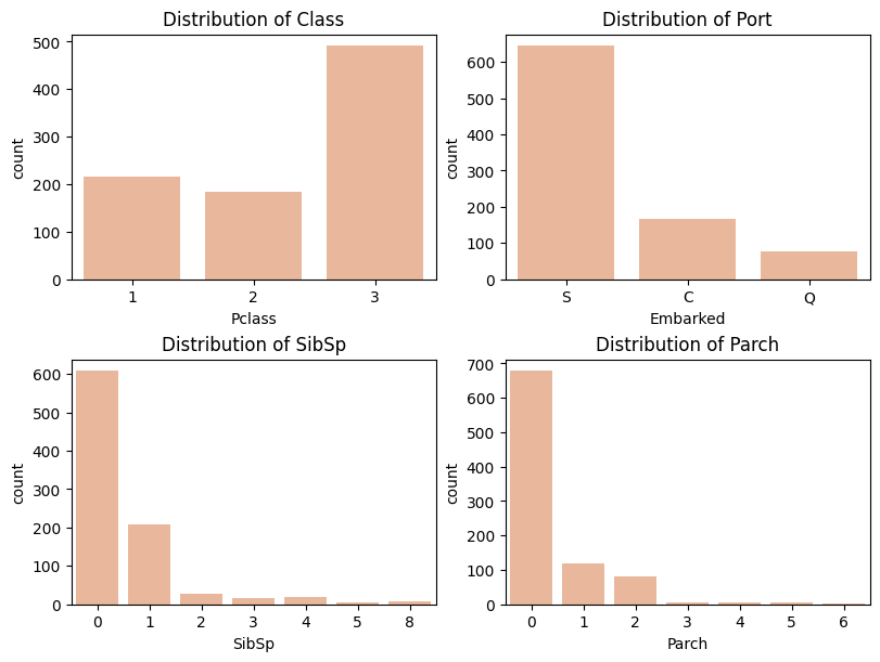
# Check Age Column
train_df["Age"].describe()

>>>
---
count    714.000000
mean      29.699118
std       14.526497
min        0.420000
25%       20.125000
50%       28.000000
75%       38.000000
max       80.000000
Name: Age, dtype: float64
---
# histplot of Age Columns
plt.figure(figsize = (12, 6))
sns.histplot(data = train_df, x = train_df["Age"], kde=True)
plt.title("Distribution of Age")
plt.show()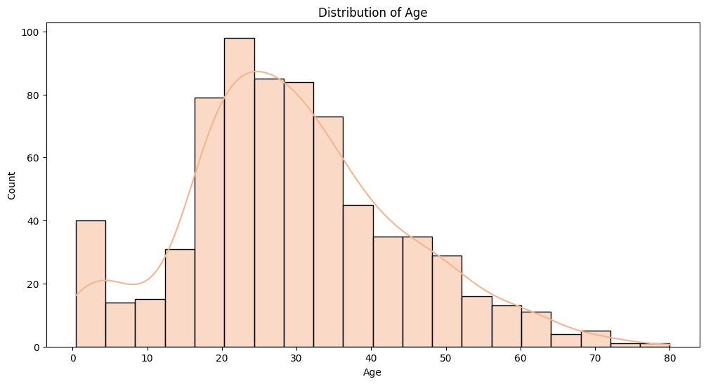
# Survival Count by Age Group
age_survival_data = train_df[['Age', 'Survived']].dropna()

bins = [0, 10, 20, 30, 40, 50, 60, 70, 80]

age_survival_data['AgeGroup'] = pd.cut(age_survival_data['Age'], bins=bins, right=True)

plt.figure(figsize=(10, 6))
sns.countplot(data=age_survival_data, x='AgeGroup', hue='Survived')
plt.title('Survival Count by Age Group')
plt.xlabel('Age Group')
plt.ylabel('Count')
plt.show()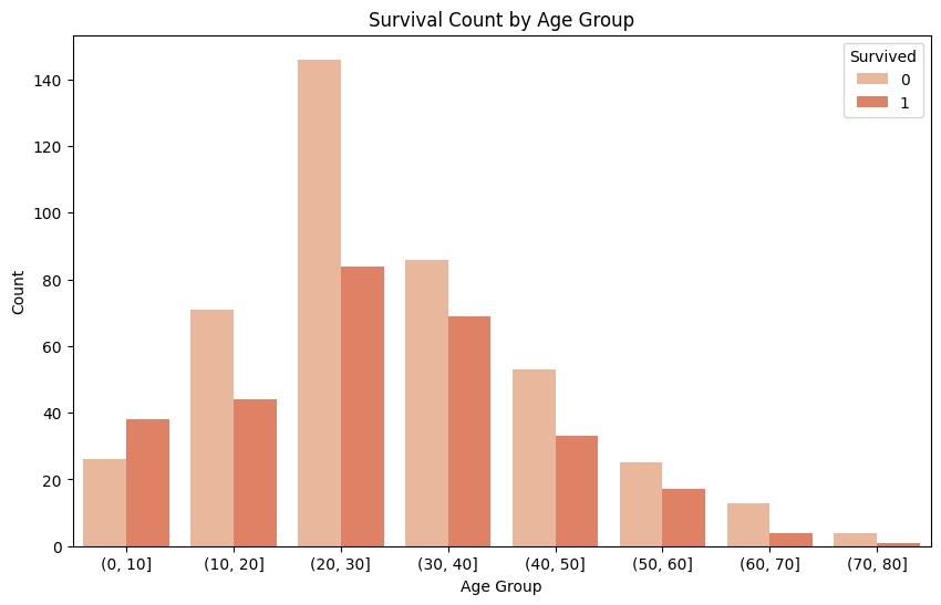
# Check Fare Column

train_df["Fare"].describe()
>>>
---
count    891.000000
mean      32.204208
std       49.693429
min        0.000000
25%        7.910400
50%       14.454200
75%       31.000000
max      512.329200
Name: Fare, dtype: float64
---
# Distribution of Fare Column
plt.figure(figsize = (12, 6))
sns.histplot(train_df["Fare"], kde = True)
plt.title("Distribution of Fare")
plt.xlabel("Fare Group")
plt.show()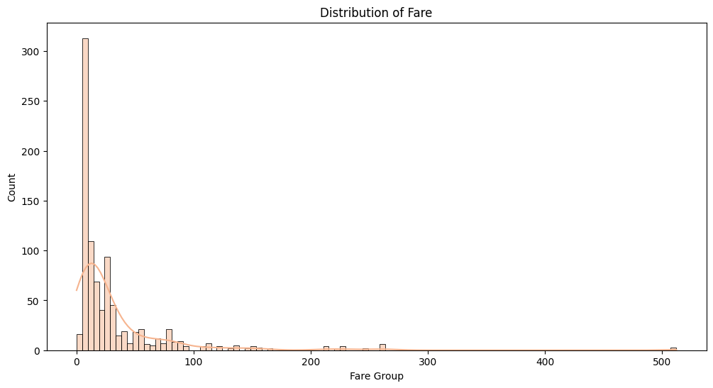
# Survival Count by Fare Group
fare_data = train_df[["Fare", "Survived"]].dropna()
bins = [0, 50, 100, 150, 200, 250, 300, 350, 400, 450, 500] # 소득 분포 나누기
fare_data["FareGroup"] = pd.cut(fare_data["Fare"],
						bins = bins, right = True) # cut()을 사용해서 "FareGroup" Column 생성

# Count by Fare Group
fig, ax = plt.subplots(nrows = 2, constrained_layout=True, figsize = (8, 8))
sns.countplot(data=fare_data, x="FareGroup", ax = ax[0])
ax[0].set_title("Count by Fare Group")
ax[0].set_xlabel("Fare Group")

# Survival Count by Fare Group
sns.countplot(data=fare_data, x='FareGroup', hue='Survived', ax = ax[1])
ax[1].set_title("Survival Count by Fare Group")
ax[1].set_xlabel("Fare Group")
plt.show()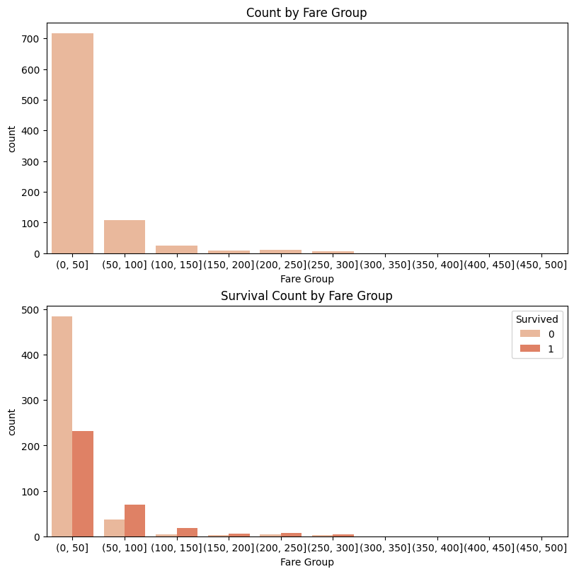
# Check Survived Columns

fig, ax = plt.subplots(ncols = 3, constrained_layout=True, figsize = (12, 4))
sns.countplot(data = train_df, x = train_df["Survived"], hue = "Sex", ax = ax[0])
ax[0].set_title("Survival Counts by Gender")

sns.countplot(data = train_df, x = train_df["Survived"], hue = "Pclass", ax = ax[1])
ax[1].set_title("Survival Counts by Class")

sns.countplot(data = train_df, x = train_df["Survived"], hue = "Embarked", ax = ax[2])
ax[2].set_title("Survival Counts by Port")

plt.show()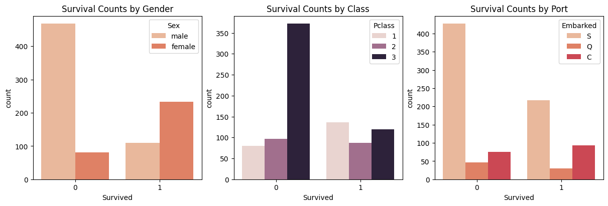
# Check the Survival Rate

def getDataFrame(column1, column2, data):
    df = data[[column1, column2]].groupby([column1], as_index = False).mean().sort_values(by = column2, ascending = False)
    return df

cols = ["Pclass", "Sex", "SibSp", "Parch", "Embarked"]

fig, ax = plt.subplots(ncols = 5, constrained_layout=True, figsize = (12, 4))
for idx, column in enumerate(cols):
    df = getDataFrame(column, "Survived", train_df)
    ax[idx].bar(df[column], df["Survived"])
    ax[idx].set_title(f"Survival Rate by {column}")
plt.show()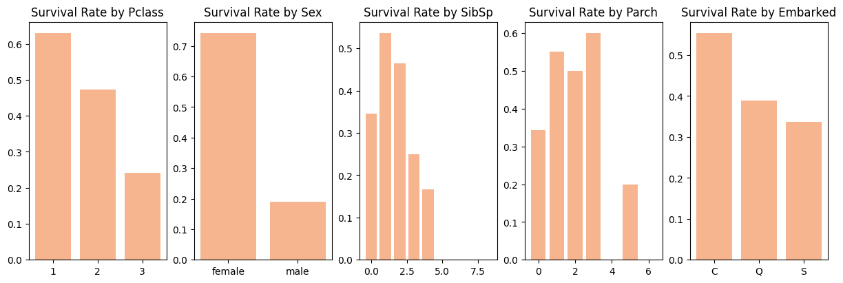
🔎 Conclusion
"SibSp" Column은 대부분의 값이 0이고 "Parch"의 경우도 0이 대부분의 값을 차지하고 있는 것을 볼 수 있음. "Embarked"는 S값, "Pclass"는 3등석이 가장 많은 비율을 차지하고 있음.
"Age" Column을 살펴본 결과, 20-40대 사이의 나이가 가장 많이 생존하지 못한 것으로 파악됨.
"Fare" Column의 분포는 오른쪽으로 길게 늘어진 형태를 보이고 있으나 일부 극단치가 존재하는 것을 볼 수 있음. 또한, 0-50의 소득을 가지고 있는 사람이 가장 많이 생존하지 못한 것으로 파악됨.
Target인 "Survived" Column에서는 남자일수록, 3등석일수록 가장 많이 생존하지 못한 것으로 보이며, 탑승 항구에 따라 차이가 보이는 것은 단순히 S항구에서 많은 사람이 탑승했기 때문인 것으로 추측됨.
✍🏻 Data Preprocessing
데이터 전처리를 시작하자. 결측치가 있다면 적절한 값으로 처리하고, 학습에 도움이 될 수 있는 새로운 Feature 생성 등을 수행하여 학습에 유용한 데이터로 만든다.
Check Missing Value
# Check Missing Data
print("Train Data Missing Value")
print(train_df.isnull().sum(), "\n", "=" * 20)
print("Test Data Missing Value")
print(test_df.isnull().sum())

>>>
Train Data Missing Value
PassengerId      0
Survived         0
Pclass           0
Name             0
Sex              0
Age            177
SibSp            0
Parch            0
Ticket           0
Fare             0
Cabin          687
Embarked         2
dtype: int64
 ====================
Test Data Missing Value
PassengerId      0
Pclass           0
Name             0
Sex              0
Age             86
SibSp            0
Parch            0
Ticket           0
Fare             1
Cabin          327
Embarked         0
dtype: int64
Drop Column
Target Feature인 "Survived"와 관련이 없거나, 결측치가 많아 적절한 값으로 처리할 수 없는 Column을 삭제한다.
"Ticket", "PassengerId", "Name" Column은 "Survived"과 유의미한 관계를 가지지 못하기 때문에 삭제한다.
"Cabin" Column은 결측치가 많이 존재하기 때문에 삭제한다.
# Drop Columns
print("Before", train_df.shape, test_df.shape)
test_id = test_df["PassengerId"] # submission을 위해 따로 저장.

train_df = train_df.drop(["Name", "PassengerId", "Cabin", "Ticket"], axis = 1)
test_df = test_df.drop(["Name", "PassengerId", "Cabin", "Ticket"], axis = 1)
all_dataset = [train_df, test_df] # 동일한 처리를 위해 합쳐둠.

print("After", train_df.shape, test_df.shape)

>>>
Before (891, 12) (418, 11)
After (891, 8) (418, 7)
Age Column float value check
"Age" Column은 float 값으로 채워져있다. 살펴본 결과 0.83세, 0.67세, 25.50세 등이 있는 것으로 확인됐다. 이러한 값을을 정수형으로 처리하자.
# check float value based on 0.5
import math
# 0.5 이상 값 확인
under_value = train_df.loc[train_df["Age"].apply(lambda x: math.modf(x)[0]) >= 0.5]

# 0.5 미만 값 확인
over_value = train_df.loc[train_df["Age"].apply(lambda x: math.modf(x)[0]) < 0.5]
print('Value of Under 0.5 :', under_value.shape[0])
print('Value of Under 0.5 :', over_value.shape[0])

>>>
Value of Under 0.5 : 24
Value of Under 0.5 : 867
0.5 값 이상인 경우는 24개, 0.5 값 미만인 경우는 데이터의 대부분을 차지하고 있는 것을 확인했다. 외국인들의 나이이기 때문에 소수점 부분을 모두 버리는 것으로 결정한다.
# Convert the 'Age' column from float to int

for data in all_dataset:
    data["Age"] = data["Age"].astype(int)

print('Data type of Age Column in Train Dataset :', train_df["Age"].dtype)
print('Data type of Age Column in Train Dataset :', test_df["Age"].dtype)

>>>
Data type of Age Column in Train Dataset : int64
Data type of Age Column in Test Dataset : int64
Create New Feature
Target Column과 관련된 새로운 Feature들을 만들자.
# Dividing into Age Segments Based on the Age Column
train_df['AgeBand'] = pd.cut(train_df['Age'], 5) # 5구간으로 나누기
train_df[['AgeBand', 'Survived']].groupby(['AgeBand'], as_index=False).mean().sort_values(by='AgeBand', ascending=True) # 구간별 생존률 확인

# Mapping values to the 'AgeBand' column.
for data in all_dataset:
    data.loc[data["Age"] <= 16, 'Age'] = 0
    data.loc[(data["Age"] > 16) & (data["Age"] <= 32), 'Age'] = 1
    data.loc[(data["Age"] > 32) & (data["Age"] <= 48), 'Age'] = 2
    data.loc[(data["Age"] > 48) & (data["Age"] <= 64), 'Age'] = 3
    data.loc[(data["Age"] > 64), 'Age'] = 4

train_df.head()
나이를 구간별로 5개로 나누고 그에 따라 숫자를 매핑했다.
# Dividing into Income Segments Based on the Fare Column

train_df['FareBand'] = pd.qcut(train_df['Fare'], 4) # 상대적인 소득 구분을 위해서 qcut() 사용
train_df[['FareBand', 'Survived']].groupby(['FareBand'], as_index=False).mean().sort_values(by='FareBand', ascending=True)

# Mapping values to the 'FareBand' column.

for data in all_dataset:
    data.loc[data["Fare"] <= 7.91, 'Fare'] = 0
    data.loc[(data["Fare"] > 7.91) & (data["Fare"] <= 14.454), 'Fare'] = 1
    data.loc[(data["Fare"] > 14.454) & (data["Fare"] <= 31), 'Fare'] = 2
    data.loc[data["Fare"] > 31, 'Fare'] = 3
    data["Fare"] = data["Fare"].astype(int)

train_df.head()
소득을 4개 구간으로 나누고 그에 따라 숫자를 매핑했다. 구간을 나눌 때는 cut()이 아니라 qcut()을 사용했는데, 소득의 경우 적은 소득을 가진 사람에게 분포가 치우쳐져 있기 때문이다.
# Create Family Size Column

for data in all_dataset:
    data["FamilySize"] = data["SibSp"] + data["Parch"] + 1

train_df[['FamilySize', 'Survived']].groupby(['FamilySize'], as_index=False).mean().sort_values(by='Survived', ascending=False)

for data in all_dataset:
    data["IsAlone"] = 0
    data.loc[data["FamilySize"] == 1, 'IsAlone'] = 1

train_df[['IsAlone', 'Survived']].groupby(['IsAlone'], as_index=False).mean()
마무리
데이터를 살펴보고 그에 따라 전처리를 하면서 학습을 위한 데이터가 준비되었다. 다음 시간에는 여러 모델을 선택하여 학습시키고 예측하여 Submission을 제출하도록 하자.
© 참고