학습내용
네이버 e스포츠 main-right, webfont 적용, 오디오 header, main-left 일부
github소스코드
e스포츠 main-right
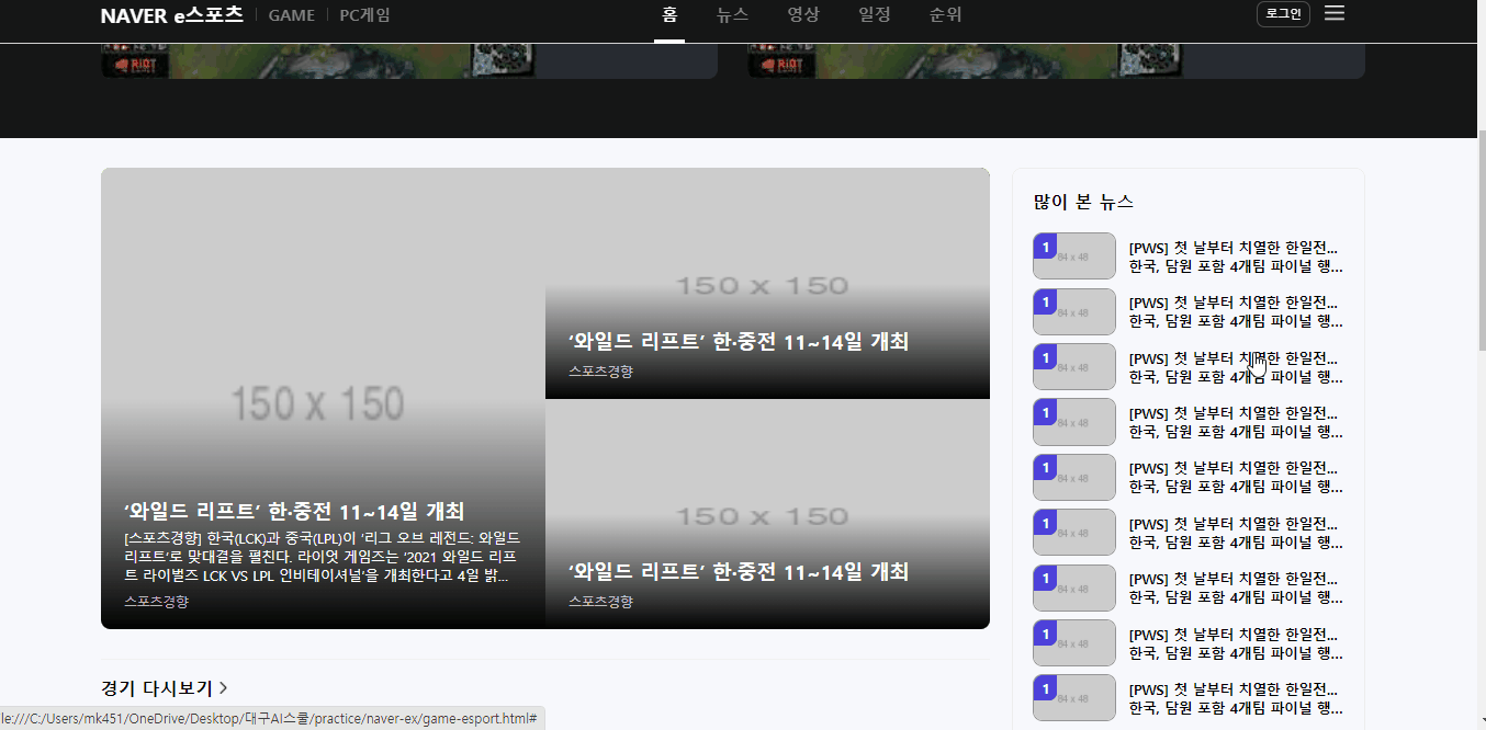
많이 본 뉴스
- border-radius: 사각형의 네 모서리 개별 설정이 가능
#esport-news-view li a .img-wrap .rank {
    border-bottom-right-radius: 8px;
    /* border-radius: 0 0 8px 0; */
}inherits속성값: 부모의 속성값 상속
경기 일정/결과
- span태그 등 글자 태그는 아래에 미세 공백있음. 없앨 수 없으므로 다른 요소를 움직여서 정렬하기
- after로 가로줄 넣기
#esport-schedule .schedule-wrap .schedule-body li::after {
content: "";
display: block;
width: calc(100% - 40px);
margin: 17px auto 0;
height: 1px;
background-color: rgba(0,0,0,.05);
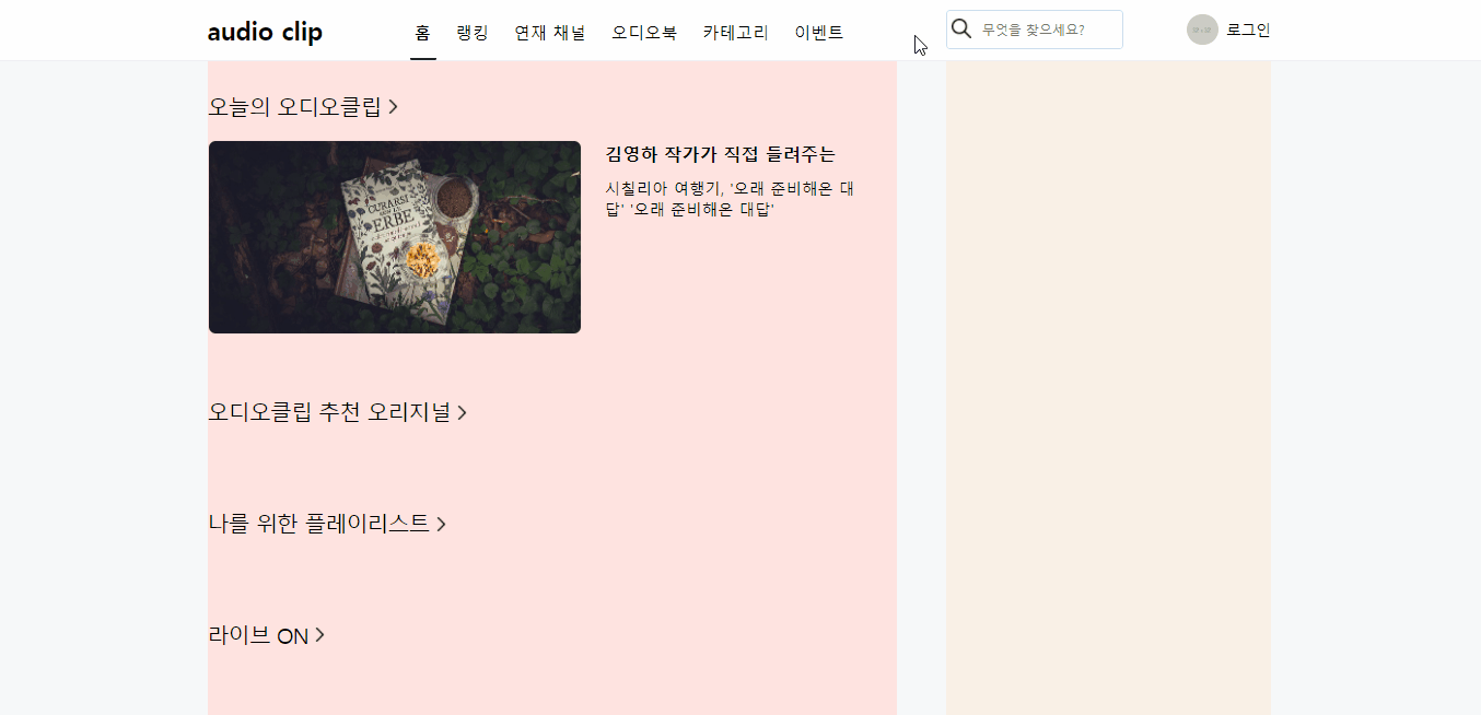
}오디오 header
span::after로 아래줄 넣기
- after의 위치이동 기준점이 span이 되게 하기 위해 position을 조절함
- 3차원 위치 속성으로 공간을 만들 수 있음
#audio-header #audio-nav .audio-nav-left li a span {
    position: relative;
    display: inline-block;
    height: 21px;
}
#audio-header #audio-nav .audio-nav-left li a.on span::after {
    position: absolute;
    display: inline-block;
    content: "";

    border-bottom: solid 3px #222;
    border-radius: 1.5px;
    z-index: 1;

    right: -5.5px;
    left: -4.5px;
    bottom: -19px;
}
input 영역 전체에 테두리 만들기
- text input태그와 button 태그를 한 영역으로 묶어서 검색바를 만드는 기존 방식은 wrap 영역 안에 두 개 요소가 각각 자리를 차지하는 방식이었다.
- 보통 input이 focus 되었을 때 테두리를 없애고 배경색을 wrap과 동일하게 해서 wrap에 테두리를 적용하는 방법을 사용했었다.
- 그런데 실제 페이지에서 input에 focus 되었을 때 전체 영역의 테두리색이 바뀌는 것을 보고 일반 div태그인 wrap에 focus를 적용해 보았더니 작동하지 않았다.
- 그래서 position을 사용해 input태그를 wrap영역 전체에 채워주고 button을 그 위에 배치해준 후 input의 테두리를 조정했다.
#audio-header #audio-nav .audio-nav-right .search-wrap {
    position: relative;
    width: 180px;
    height: 40px;
    background-color: #ffffff;
}
#audio-header #audio-nav .audio-nav-right .search-wrap .icon-search {
    position: absolute;
    width: 32px;
    height: 32px;
    background: url(../img/search.png) no-repeat;
    background-size: 20px;
    background-position: center;
    margin-top: 3px;
    left: 0;
    top: 0;
    bottom: 0;
}
#audio-header #audio-nav .audio-nav-right .search-wrap input {
    width: 100%;
    height: 100%;
    padding: 15px 8px 15px 35px;
    border: solid 2px rgba(0, 86, 201,.2);
    border-radius: 4px;
}
#audio-header #audio-nav .audio-nav-right .search-wrap input:focus {
    border: solid 3px #000000;
}
오디오 main-left
공간 나누기
- header가
position:fixed로 인해 3차원 속성을 가지게 되어 main 태그 위로 겹쳐지게 되었다. main의 내용물이 header 아래에서부터 시작하게 하기 위해padding-top사용해주었다.
#audio-header {
    position: fixed;
    width: 100%;
    background-color: #ffffff;
    border-bottom: solid 1px #efeff4;

    left: 0;
    top: 0;

    z-index: 999;
}
#audio-main {
    width: 100%;
    height: 2000px;
    padding-top: 62px;
    background-color: #f6f8fa;
}
오늘의 오디오클립
- audio-header 부분을 반복해서 사용하기 위해 다른 영역에 있는 화살표 버튼을 미리 만들어주었다.
.audio-section .audio-header .arrow {
    width: 16px;
    height: 16px;
    background: url(../img/next.png) no-repeat;
    background-size: 14px;
    margin: 3px 0 0 5px;
}- overflow, float 사용할 수 없는 경우: 보통 main의 좌우 영역을 잡아줄 때 부모에
overflow:hidden, 좌우에 float을 사용해서 배치작업을 자주 했었다. 이번엔 내부 버튼 중 main의 영역을 벗어나는 요소가 있어서 hidden을 사용할 수 없었다. 이럴 때는 flex로 배치를 할 수 있다.
#audio-main .audio-container {
    /* overflow: hidden; */
    align-items: flex-start;
    height: 100%;
}
#audio-main .audio-main-left {
    /* float: left; */
    width: 700px;
    background-color: mistyrose;
}
#audio-main .audio-main-right {
    /* float: right; */
    width: 330px;
    height: 100%;
    background-color: linen;
}- hover 시 버튼 나오는 효과를 위해
display:none을 사용해 요소를 사라지게 했다. 해당 요소는 absolute로 3차원 속성이라 사라져도 기존 레이아웃에 영향을 미치지 않는다. - 버튼 위치를 영역 내 y축 중앙 정렬했다.
#audio-today .audio-slide-wrap .btn {
    display: none;
    position: absolute;
    width: 44px;
    height: 44px;
    background-color: olive;
    border-radius: 50%;
    top: 50%;
    transform: translateY(-50%);
}
#audio-today .audio-slide-wrap:hover .btn {
    display: initial;
}- 영상을 따라 만들었는데 title의 길이가 더 길어서 레이아웃이 깨지길래 txt-wrap의 넓이를 별도로 지정해주었다. 실제 페이지를 만들 때는 다양한 문자열을 담을 수 있도록 가능하면 영역에 고정넓이값을 주는 것이 좋을 것 같다.
#audio-today .audio-slide-wrap .audio-slide .txt-wrap {
    width: calc(100% - 430px);
}
어려웠던 점
- audio header의 검색창을 만들 때, 실제 페이지를 보니 검색창에 커서를 두면 search-wrap 영역 전부에 검은색 border 생기는 것을 보고 따라 만들기로 했다. 그래서 일단 기존에 만들던 대로 search-wrap안에 input과 button이 공간을 차지하게 만들었다. 근데 일반 div인 search-wrap은 focus가 통하지 않았다.
해결방법
- 그래서 position을 변경해 input이 전체 영역을 가득 채우고 button이 그 위에 들어가도록 변경했다.
소감
강의를 보면 강의를 촬영한 날짜의 웹사이트 모습과 현재 모습이 다른 경우가 꽤 자주 있다. 네이버를 사용하면서 레이아웃의 변화를 크게 느끼지 못했는데, 보이지않는 곳에서 개발자들이 조금 더 나은 UI를 위해 계속 노력하고 있음이 느껴졌다.
문서화를 좋아하는 개발자