학습내용
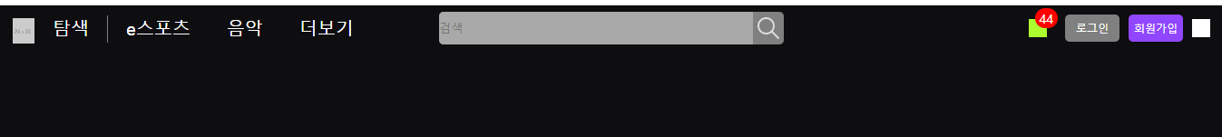
트위치 사이트 상단 네비게이션
github소스코드
css default 클래스
--color-text-base등 최신 브라우저에서만 지원되는 기술 등이 많이 사용되어 알아보기 힘들었다.- 페이지 배경 대부분 어두운 색이라 배경색과 기본 글자색을 바꾸어주었다.
body {
    background-color: #0e0e10;
}
h1, h2, h3, h4, h5, h6, p, span, input, button, a {
    color: #ffffff;
}- 자주 쓰이는 버튼 색상 조합을 미리 클래스로 만들어주었다.
.btn-purple {
    background-color: #9147ff;
    color: #ffffff;
}
.font-purple {
    color: #9147ff;
}
position:fixed 사용 시 주의점
- 강의에선 nav 태그 안의 내용물을 전부 만들어 준 다음
position:fixed를 적용했더니 nav의 넓이값이 정해져있지 않아서 내부 레이아웃이 전부 틀어지는 문제가 있었다. - 3차원 속성을 사용할 때는 적절한 곳에 고정 크기를 적용해주어야 한다.
nav {
    position: fixed;
    width: 100%;
    height: 50px;
    background-color: #0e0e10;
    padding: 0 15px;
}
nav-left
- 서로 연관있는 목록끼리만
<ul>로 묶고 더보기 부분은 따로 분리해주었다.
<ul class="flex-start">
  <li><a href="#">탐색</a></li>
  <li><a href="#">e스포츠</a></li>
  <li><a href="#">음악</a></li>
</ul>
<div class="more">
  <a href="#">더보기</a>
</div>- li 태그 안 첫 번째 자식 오른쪽에만 세로줄이 들어가는 것을
li:first-child a::after로 적용하였다.
nav .nav-wrap .nav-left ul li:first-child {
    padding-right: 0;
}
nav .nav-wrap .nav-left ul li:first-child a::after {
    display: inline-block;
    position: relative;
    content: "";
    width: 1px;
    height: 30px;
    background-color: gray;
    margin-left: 20px;

    top: 8px;
}
nav-center
- 검색창의
border-radius를 적용할 때 rem이라는 새로운 단위가 등장했다. em과 차이가 크지 않은 단위라고 해서 수치변형사이트 pxtoem을 이용해 단위를 변환해 사용하였다. em, rem 등 새로운 단위에 대해선 따로 찾아봐야 할 것 같다.
flex-between 사용 시 가운데 영역 정중앙으로 보내기
- nav 안 요소를 다 만들고 보니, 각 요소의 넓이값이 전부 달라서 사이 공백을 같은 값으로 맞추는 flex-between으로 배치하면 nav-center 요소가 정중앙에서 벗어나는 문제가 생겼다.
- 그래서 nav-center 부분을 아예 flex의 영향에서 벗어나게 한 후 배치하기 위해
position:absolute로 3차원으로 만들어 준 후 x축 중앙정렬 공식을 사용했다.
nav .nav-wrap .nav-center {
    position: absolute;
    left: 50%;
    transform: translateX(-50%);
}
background-position의 이해
- 검색창 버튼에
background-image를 이용해 아이콘을 넣어주었는데, 이때background-position의 작동 방식에 대해 조금 알게 되었다. 다른 수치 조종값처럼 4가지 값을 넣는 것이 아니고, top, left와 비슷하게 태그 위쪽 기준으로 이동, 태그 왼쪽 기준으로 이동하는 것이었다. - 이동하는 값이 같을 경우 1개 값만 전달하면 된다.
nav .nav-wrap .nav-center .search-wrap .btn-search {
    width: 34px;
    height: 100%;
    background: url(../../naver-ex/img/search-white.png) no-repeat;
    background-size: 24px;
    background-position: 5px;
}
nav-right
- 알림 아이콘과 알림 개수를 알려주는 부분이 겹쳐지게 만들었다.
nav .nav-wrap .nav-right .mark-wrap {
    position: relative;
}
nav .nav-wrap .nav-right .mark-wrap .icon-mark {
    display: block;
    width: 20px;
    height: 20px;
    background-color: greenyellow;
}
nav .nav-wrap .nav-right .mark-wrap .alarm {
    position: absolute;
    border-radius: 15px;
    background-color: red;
    padding: 2px 5px;

    color: #ffffff;
    font-size: 14px;
    top: -12px;
    right: -12px;
}- 로그인, 회원가입 부분의 디자인이 유사해서 btn이라는 클래스를 추가로 만들어 사용했다.
<div class="nav-right flex-end">
  <div class="mark-wrap">
    <i class="icon-mark"></i>
    <span class="alarm">44</span>
  </div>
  <a class="btn-login btn" href="#">로그인</a>
  <a class="btn-purple btn-sign-in btn" href="#">회원가입</a>
  <button class="btn-profile"></button>
</div>
nav .nav-wrap .nav-right .btn {
width: 60px;
height: 30px;
border-radius: 5px;
text-align: center;
line-height: 30px;
font-size: 12px;
}
nav .nav-wrap .nav-right .btn-login {
margin-left: 20px;
background-color: gray;
color: #ffffff;
}
nav .nav-wrap .nav-right .btn-purple {
margin-left: 10px;
}어려웠던 점
- 외국사이트라 네이버를 카피캣 할 때보다 훨씬 알아보기 힘들었다.
해결방법
- 영상 강의를 열심히 보는 수밖에 없었다. 나중에 프론트용 자바스크립트를 더 배우게 되면 알아볼 수 있게 될지 모르겠다.
소감
거의 한 달 이상 해오던 네이버 페이지를 떠나 새로운 사이트를 카피캣하니 신선한 느낌이 들었다. 어서 강의를 다 듣고 특이한 레이아웃의 사이트를 찾아서 따로 카피캣해보고 싶다.

문서화를 좋아하는 개발자