영화 검색하기_상세페이지 미리보기
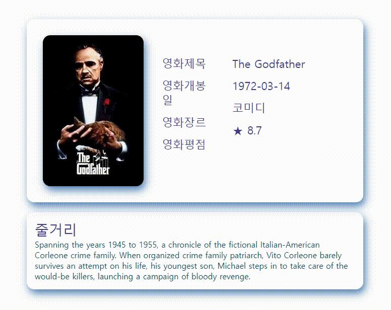
팀원과 pull requests 하는 과정에서 글씨크기가 커져 글자가 조금 어긋났지만.. 카드 이벤트는 완성 했다!
완성 코드
HTML
<!DOCTYPE html>
<html lang="en">
  <head>
    <meta charset="UTF-8" />
    <meta name="viewport" content="width=device-width, initial-scale=1.0" />
    <link rel="stylesheet" href="./css/theme/theme.css" />
    <link rel="stylesheet" href="./css/theme/theme.dark.css" />
    <link rel="stylesheet" href="./css/theme/moviedetail.css" />
    <script src="./js/moviedetail.js" defer></script>
    </head>
  <body>
  <div class="movie-cover"></div>
CSS
.movie-cover {
  width: 700px;
  border-radius: 15px;
  padding: 1rem;
  margin: 10px auto 10px auto;
}

.movie-card {
  border-radius: 15px;
  align-items: center;
  flex-direction: row;
  display: flex;
  flex-wrap: nowrap;
  gap: 20px;
  padding: 2rem;
  border-color: white;
  box-shadow: 4px 8px 16px 0 rgb(75, 127, 173);
}

.movie-img-box {
  width: 200px;
  height: 300px;
  perspective: 1000px;
}

.movie-img-box:hover .movie-img {
  transform: rotateY(-180deg);
  cursor: pointer;
}

.movie-img {
  width: 100%;
  height: 100%;
  position: relative;
  color: white;
  line-height: 400px;
  transform-style: preserve-3d;
  transform: rotateY(0deg);
  transition: 0.5s;
}

.front-card {
  border-radius: 15px;
  border-color: white;
  box-shadow: 4px 8px 16px 0 rgb(75, 127, 173);
}

.back-card {
  text-align: center;
  border-radius: 15px;
  border-color: white;
  box-shadow: 4px 8px 16px 0 rgb(75, 127, 173);
  transform: rotateY(180deg);
}

.front-card,
.back-card {
  width: 100%;
  height: 100%;
  position: absolute;
  backface-visibility: hidden;
}

.movie-img .heart {
  position: absolute;
  font-size: 40px;
  color: red;
  left: 50%;
  top: 50%;
  opacity: 0;
  transform: translate(-50%, -50%);
}

.heart.active {
  animation: animate 0.8s linear forwards;
}
@keyframes animate {
  30% {
    opacity: 1;
    font-size: 80px;
  }
  50% {
    opacity: 1;
    font-size: 60px;
  }
  70% {
    opacity: 1;
    font-size: 70px;
  }
  80% {
    opacity: 1;
    font-size: 60px;
  }
  90% {
    opacity: 1;
    font-size: 60px;
  }
}

.movie-body1 {
  height: 250px;
  width: 120px;
  padding: 1rem;
  align-items: center;
  flex-direction: row;
  vertical-align: middle;
}

.movie-body2 {
  height: 250px;
  width: 210px;
  padding: 1rem;
  align-items: center;
  flex-direction: row;
  vertical-align: middle;
}

.text-gap {
  margin-bottom: 15px;
}

.movie-summary {
  border-radius: 15px;
  margin-top: 20px;
  align-items: center;
  border-color: white;
  box-shadow: 4px 8px 16px 0 rgb(75, 127, 173);
  padding: 1rem;
}
JS
// fetch 하기 전 데이터 값을 넣기 위한 임시 코드
let movieEx = [
  {
    adult: false,
    backdrop_path: "/tmU7GeKVybMWFButWEGl2M4GeiP.jpg",
    genre_ids: [18, 80],
    id: 238,
    original_language: "en",
    original_title: "The Godfather",
    overview:
      "Spanning the years 1945 to 1955, a chronicle of the fictional Italian-American Corleone crime family. When organized crime family patriarch, Vito Corleone barely survives an attempt on his life, his youngest son, Michael steps in to take care of the would-be killers, launching a campaign of bloody revenge.",
    popularity: 110.264,
    poster_path: "/3bhkrj58Vtu7enYsRolD1fZdja1.jpg",
    release_date: "1972-03-14",
    title: "The Godfather",
    video: false,
    vote_average: 8.7,
    vote_count: 18811,
  },
];
// 데이터를 활용한 상세 페이지 카드 생성
movieEx.forEach((a) => {
  document.querySelector(".movie-cover").insertAdjacentHTML(
    "beforeend",
    `<div class="movie-cover">
<div class="movie-card">
  <div class="movie-img-box">
    <div class="movie-img">
      <img
        src="${`https://image.tmdb.org/t/p/w200` + a.poster_path}"
        class="display-medium on-primary front-card"
        art="..." />
      <div class="tertiary back-card">
        <div class="heart">♥</div>
        </div>
    </div>
  </div>
  <div class="title-large tertiary-container-text movie-body1">
    <div class="text-gap">영화제목</div>
    <div class="text-gap">영화개봉일</div>
    <div class="text-gap">영화장르</div>
    <div class="text-gap">영화평점</div>
  </div>
  <div class="title-large tertiary-container-text movie-body2">
    <div class="text-gap">${a.title}</div>
    <div class="text-gap">${a.release_date}</div>
    <div class="text-gap">코미디</div> // 불러오는 데이터 값에서 장르가 없어 임시로 넣음
    <div class="text-gap">★ ${a.vote_average}</div>
  </div>
</div>
<div class="movie-summary">
  <div class="headline-medium tertiary-container-text">줄거리</div>
  <p class="body-large secondary-container-text">${a.overview}</p>
</div>
</div>`
  );
});
// 카드 클릭 시 하트 생성
const image = document.querySelector(".back-card"),
  heartIcon = document.querySelector(".heart");

image.addEventListener("click", (e) => {
  console.log(e);

  let xValue = e.clientX - e.target.offsetParent.offsetParent.offsetLeft;
  let yValue = e.clientY - e.target.offsetParent.offsetParent.offsetTop;
  heartIcon.style.left = `${xValue}px`
  heartIcon.style.top = `${yValue}px`
  heartIcon.classList.add("active");

  setTimeout(() => {
    heartIcon.classList.remove("active");
  }, 1000);
});
마우스 오버시 카드 뒤집기
(출처: https://wmsttks.tistory.com/15)
1. 기본 레이아웃 잡기
- 뒤집을 요소와 그 요소를 감싸는 부모 요소가 있어야 한다.
  <div class="movie-img-box"> // 전체를 감싸주는 상자
    <div class="movie-img"> // 앞면과 뒷면 카드를 포함하는 상자
      <img
        src="${`https://image.tmdb.org/t/p/w200` + a.poster_path}"
        class="display-medium on-primary front-card"
        art="..." /> // 영화 포스터가 들어갈 카드 앞면
      <div class="tertiary back-card"> // 뒤집어질 카드 뒷면
        <div class="heart">♥</div>
      </div>
    </div>
</div>- movie-img-box의 css 지정
- 가로, 세로를 원하는 크기로 지정해주고 3D를 위한 속성인 perspective(투영점)을 적당히 조절한다.
.movie-img-box {
  width: 200px;
  height: 300px;
  perspective: 1000px;
}- 뒤집을 요소의 css 지정
- 앞면과 뒷면을 absolute 겹쳐주어야 하기 때문에 position을 relative를 지정해야한다.
- 3D 효과 사용 시 transform-style을 preserve-3d로 지정해주어야 사용 가능하다.
- 애니메이션 효과를 위해 transform: rotateY(0deg)로 미리 지정한다.
.movie-img {
  width: 100%;
  height: 100%;
  position: relative;
  color: white;
  line-height: 400px;
  transform-style: preserve-3d;
  transform: rotateY(0deg);
  transition: 0.5s;
}- 앞면과 뒷면의 공통 css 지정
- absolute를 사용해 두 면을 겹쳐준다.
- 겹쳤을 때 뒤집혀있는 면이 보이기 때문에 backface-visibility를 hidden으로 지정해 주어야 뒤집혀있는 면이 보이지 않는다.
.front-card,
.back-card {
  width: 100%;
  height: 100%;
  position: absolute;
  backface-visibility: hidden;
}- 앞면과 뒷면의 스타일을 지정해주고, 뒷면은 transform 설정
- 뒷면은 뒤집혀있는 상태에서 호버 시에 원상태로 돌아와야 하기 때문에 rotateY를 사용해 미리 뒤집어준다.
.front-card {
  border-radius: 15px;
  border-color: white;
  box-shadow: 4px 8px 16px 0 rgb(75, 127, 173);
}

.back-card {
  text-align: center;
  border-radius: 15px;
  border-color: white;
  box-shadow: 4px 8px 16px 0 rgb(75, 127, 173);
  transform: rotateY(180deg);
}
카드 클릭 시 클릭한 자리에 하트 뿅뿅
(출처: https://www.youtube.com/watch?v=BT-mAqleHS0)
(출처: https://developer.mozilla.org/en-US/docs/Web/CSS/animation)
1. 카드 기본 레이아웃 잡고 누르면 하트가 뜨도록 하트 모양 div 넣기
<div class="movie-img">
      <img
        src="${`https://image.tmdb.org/t/p/w200` + a.poster_path}"
        class="display-medium on-primary front-card"
        art="..." />
      <div class="tertiary back-card">
        // movie-img 안에서만 클릭 시 하트가 실행되도록 이 박스 안에 div 넣기
        <div class="heart">♥</div>
      </div>
</div>- 하트모양 잡고 겹쳐준 뒤(absolute)에 위치를 잡아주고 opacity를 0으로 맞춰서 가려준다.
.movie-img .heart {
  position: absolute;
  font-size: 40px;
  color: red;
  left: 50%;
  top: 50%;
  opacity: 0;
  transform: translate(-50%, -50%);
}- 하트 클릭 세부 애니메이션
- animation-name: animate - 애니메이션 이름을 animate로 정한다.
- animation-duration: 0.8s - 애니메이션이 한 주기를 완료하는 게 걸리는 시간으로 0.8s를 설정
- animation-timing-function: linear - 애니메이션 타이밍 기능으로 linear를 넣는다.
- keyframes에는 0.8초 동안을 0~100%로 놓고 30%,50%,70%,80%,90% 진행 시 어떻게 애니메이션이 실행될 것인지 설정한다.
.heart.active {
  animation: animate 0.8s linear;
}
@keyframes animate {
  30% {
    opacity: 1;
    font-size: 80px;
  }
  50% {
    opacity: 1;
    font-size: 60px;
  }
  70% {
    opacity: 1;
    font-size: 70px;
  }
  80% {
    opacity: 1;
    font-size: 60px;
  }
  90% {
    opacity: 1;
    font-size: 60px;
  }
}- 하트 클릭 이벤트 먹이기
// document.querySelector로 back-card를 지정해 누를 위치 지정
const image = document.querySelector(".back-card"),
  // document.querySelector로 표시될 heart를 지정해 heartIcon으로 지정
  heartIcon = document.querySelector(".heart");
// 지정해놓은 image에 addEventListener를 사용하여 클릭 이벤트 생성
image.addEventListener("click", (e) => {
  // heartIcon에 active라는 class를 넣어준다.
  heartIcon.classList.add("active");
  // setTimeout를 사용하여 1초가 지나고난 뒤에 붙였던 active라는 class를 제거한다. => 1초 후 하트가 사라짐
  setTimeout(() => {
    heartIcon.classList.remove("active");
  }, 1000);
});- 마우스 클릭한 위치에 하트 생성(커서 위치 지정이 불완전하여 최종 파일에는 주석처리함)
  let xValue = e.clientX - e.target.offsetParent.offsetParent.offsetLeft;
  let yValue = e.clientY - e.target.offsetParent.offsetParent.offsetTop;
  heartIcon.style.left = `${xValue}px`
  heartIcon.style.top = `${yValue}px`
코드 나누기(html, js, css)
html에 모두 들어가있던 코드를 나누어서 깃헙에 올리면 좋다고 해서 팀원의 도움을 받아 코드를 나누었다.
1. css폴더에 개발기능.css를 만들고
2. js폴더에는 개발기능.js를 만든 뒤
3. html에 있는 sytle과 script를 각각 넣어준다.
4. html에는 head태그 안에 개발기능.css와 개발기능.js를 link로 이어준다.
<link rel="stylesheet" href="./css/개발기능.css">
<script src="./js/개발기능.js" defer></script>
느낀 점
두 가지 기능을 처음으로 도움받지 않고 구글링과 유튜브를 보고 구현했는데 뿌듯했다. 사실 중간중간 모르는 부분은 팀원에게 살짝 물어보거나 찾아가면서 했는데 완성하고 보니 머릿속에 각인이 되는 정도는 아니었지만 같은 기능을 구현할 때 언뜻 생각나는 정도는 될 것 같았다. 100% 이해는 못해도 어느정도 이해할 수준까지는 찾아보는 것이 당연하지만 발전에 도움이 될 것이다.
멋있습니다