1. 실루엣 계수
각 데이터가 같은 군집에는 얼마나 가깝게 군집화되었는지, 다른 군집에는 얼마나 멀리 있는지 나타내는 값
-1 ~ 1 사이이다
-1 : 잘못된 군집화
0 : 경계선에 위치
1 : 데이터가 잘 군집화 되어있다.
범주형 변수에 대한 정보가 없을 경우 사용한다.
비지도 학습이다.
-
사용하는 이유
군집화 정도를 수치적으로 평가할 수 있다
클러스터 수를 결정하는데 도움을 준다
이상치나 경계선 데이터 들을 해석하기에 쉽다 -
장점
클러스터 수 비교가 쉽다
이상치를 찾을 수 있다 (실루엣 계수가 낮은 값) -
단점
거리기반 계산으로서 차원이 높아지면 계산량이 급격하게 늘어난다.
-> PCA 등을 사용하여 저차원으로 변환 후 계산
거리기반 계산으로서 적합한 거리 척도를 사용해야한다.
군집의 크기들이 다를 경우 작은 군집은 높은 실루엣 계수를 가지기 어렵다
-> DBSCAN 등 비구형 클러스터링에 적합한 알고리즘도 사용해본다
이상치가 실루엣 계수를 외곡할수 있다
-> 이상치 제거 또는 이상치에 민감하지 않은 거리척도를 사용한다
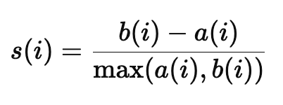
a(i) : 데이터 i 가 속한 군집 내부의 평균거리 (응집도)
b(i) : 데이터 i 와 가장 가까운 다른 군집의 평균거리 (분리도)
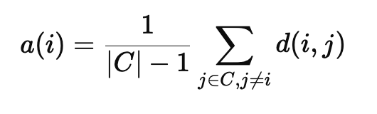
C : 데이터 i 가 속한 군집의 데이터 집합
d(i,j) : 데이터 i 와 j 간의 거리
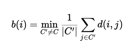
C'' : 다른 군집의 데이터 집합
( 계산 예시 )
# 특정 예시 값을 선택 (첫 번째 데이터 포인트)
example_index = 0
example_label = cluster_labels[example_index]
example_point = X[example_index]

# (1) a(i): 같은 클러스터 내 다른 점들과의 평균 거리 계산
same_cluster_points = X[cluster_labels == example_label]
a_i = np.mean([np.linalg.norm(example_point - point) for point in same_cluster_points if not np.array_equal(example_point, point)])

# (2) b(i): 다른 클러스터와의 평균 거리 중 최소값 계산
b_i = np.min([
    np.mean([np.linalg.norm(example_point - point) for point in X[cluster_labels == other_label]])
    for other_label in range(n_clusters) if other_label != example_label
])

# (3) s(i): 실루엣 계수 계산
s_i = (b_i - a_i) / max(a_i, b_i)

a_i, b_i, s_i
# (1.757937497828144, 14.090780694422593, 0.875242008519516)
s(i) 는 약 0.87 로 잘 군집화 된것을 확인할 수 있다.
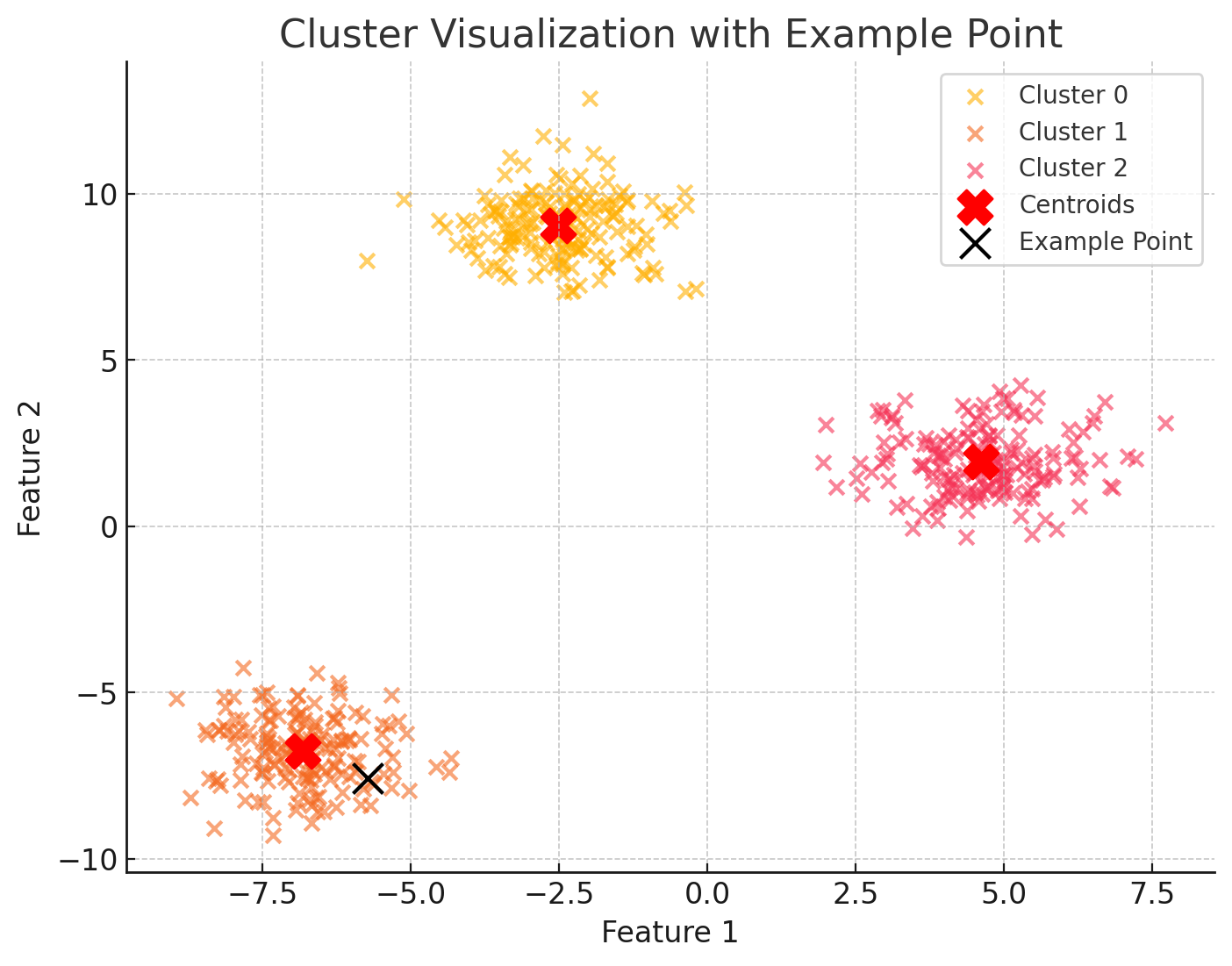
(시각화 예시)
- 데이터 포인트 시각화
# 시각화 결과 생성 (다시 실행)
fig, ax = plt.subplots(figsize=(8, 6))

# 클러스터별 데이터 포인트 시각화
for cluster_id in range(n_clusters):
    cluster_points = X[cluster_labels == cluster_id]
    ax.scatter(cluster_points[:, 0], cluster_points[:, 1], label=f"Cluster {cluster_id}", alpha=0.6)

# 군집 중심 표시
centroids = kmeans.cluster_centers_
ax.scatter(centroids[:, 0], centroids[:, 1], c='red', s=200, marker='X', label='Centroids')

# 예시 데이터 포인트 강조
example_label = cluster_labels[example_index]
ax.scatter(example_point[0], example_point[1], c='black', s=150, edgecolor='yellow', label='Example Point', zorder=10)

# 그래프 꾸미기
ax.set_title("Cluster Visualization with Example Point")
ax.set_xlabel("Feature 1")
ax.set_ylabel("Feature 2")
ax.legend()
plt.show()
- 이상치 탐지 시각화
항상 세부 정보 표시

코드 복사
# 실루엣 계수가 0 이하인 데이터 탐지
outliers = np.where(sample_silhouette_values < 0)[0]
outlier_points = X[outliers]

# 이상치 출력
len(outliers), outlier_points
이상치 없음
- 실루엣 계수 시각화
import numpy as np
import matplotlib.pyplot as plt
from sklearn.metrics import silhouette_samples, silhouette_score
from sklearn.cluster import KMeans
from sklearn.datasets import make_blobs

# 데이터 생성
n_samples = 500
n_features = 2
n_clusters = 3
random_state = 42

X, y = make_blobs(n_samples=n_samples, n_features=n_features, centers=n_clusters, random_state=random_state)

# KMeans 클러스터링
kmeans = KMeans(n_clusters=n_clusters, random_state=random_state)
cluster_labels = kmeans.fit_predict(X)

# 실루엣 점수 계산
silhouette_avg = silhouette_score(X, cluster_labels)
sample_silhouette_values = silhouette_samples(X, cluster_labels)

# 시각화
fig, ax = plt.subplots(figsize=(10, 6))

y_lower = 10
for i in range(n_clusters):
    # 각 클러스터의 실루엣 점수 추출
    ith_cluster_silhouette_values = sample_silhouette_values[cluster_labels == i]
    ith_cluster_silhouette_values.sort()

    size_cluster_i = ith_cluster_silhouette_values.shape[0]
    y_upper = y_lower + size_cluster_i

    # 클러스터별 실루엣 점수 영역 표시
    ax.fill_betweenx(np.arange(y_lower, y_upper),
                     0, ith_cluster_silhouette_values, alpha=0.7)

    # 클러스터 레이블 표시
    ax.text(-0.05, y_lower + 0.5 * size_cluster_i, str(i))

    y_lower = y_upper + 10  # 다음 클러스터로 이동

# 실루엣 평균선 표시
ax.axvline(x=silhouette_avg, color="red", linestyle="--")
ax.set_title("Silhouette plot for each cluster")
ax.set_xlabel("Silhouette coefficient values")
ax.set_ylabel("Cluster label")
ax.set_xlim([-0.1, 1])
ax.set_ylim([0, len(X) + (n_clusters + 1) * 10])
ax.set_yticks([])  # y축 제거
plt.show()
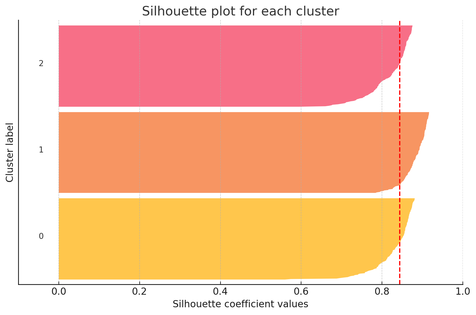
- 결과해석
빨간선 : 실루엣 계수
각 군집의 크기가 비슷하고 실루엣 계수도 0.8 이상이으로 높기에 군집화가 잘 되었음
또한 이상치도 없음

hi!