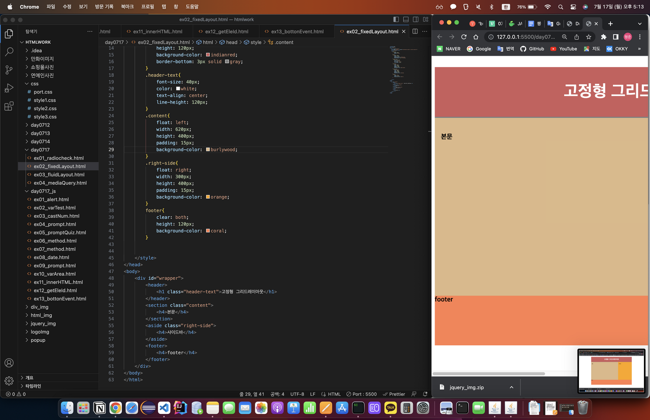
고정형 레이아웃(fixed layout)
- 고정형 layout으로 화면크기를 줄여도 화면 상태가 그대로 유지된다.
<!DOCTYPE html>
<html lang="en">
<head>
    <meta charset="UTF-8">
    <meta name="viewport" content="width=device-width, initial-scale=1.0">
    <title>Document</title>
    <style>
        #wrapper{
            width: 980px;
            margin: 0 auto;
        }
        header{
            width: 980px;
            height: 120px;
            background-color: indianred;
            border-bottom: 3px solid gray;
        }
        .header-text{
            font-size: 40px;
            color: white;
            text-align: center;
            line-height: 120px;
        }
        .content{
            float: left;
            width: 620px;
            height: 400px;
            padding: 15px;
            background-color: burlywood;
        }
        .right-side{
            float: right;
            width: 300px;
            height: 400px;
            padding: 15px;
            background-color: orange;
        }
        footer{
            clear: both;
            height: 120px;
            background-color: coral;
        }

    </style>
</head>
<body>
    <div id="wrapper">
        <header>
            <h1 class="header-text">고정형 그리드레이아웃</h1>
        </header>
        <section class="content">
            <h4>본문</h4>
        </section>
        <aside class="right-side">
            <h4>사이드바</h4>
        </aside>
        <footer>
            <h4>footer</h4>
        </footer>
    </div>
</body>
</html>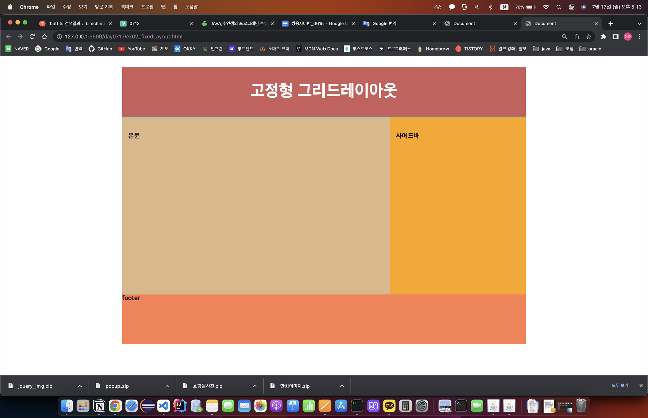
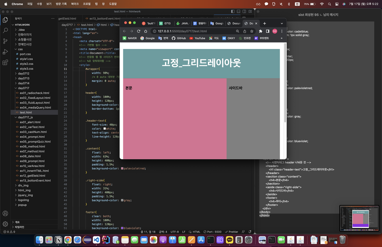
반응형 레이아웃(flexible Layout)
<!DOCTYPE html>
<html lang="en">
<head>
    <meta charset="UTF-8">
    <!-- 가변형 필수 -->
    <meta name="viewport" content="width=device-width, initial-scale=1.0">
    <title>Document</title>
    <!-- 반응형 웹 웹 사이즈가 변하면 안에 내용도 웹 사이즈에 맞추게 하는 것 -->
    <!-- %로 맞춰줘야함 -->
    <style>
        #wrapper{
            width: 98%;
            /* 0 auto 대부분 가운데 정렬 */
            margin: 0 auto;
        }

        header{
            width: 100%; /* 위에서 정한 98% 에 대한 100% */
            height: 120px;
            background-color: cadetblue;
            border-bottom: 1px solid gray;
        }

        .header-text{
            font-size: 40px;
            color: white;
            text-align: center;
            line-height: 120px;
        }

        .content{
            float: left;
            width: 63%;
            height: 400px;
            padding: 1.5%;
            background-color: palevioletred;
        }

        .right-side{
            float: right;
            width: 31%;
            height: 400px;
            padding: 1.5%;
            background-color: gray;
        }

        footer{
            clear: both;
            width: 100%;
            height: 120px;
            background-color: blueviolet;
        }
    </style>
</head>
<body>
    <div id="wrapper">
        <!-- 시멘틱태그 header 나눠둔 것 -->
        <header>
            <h1 class="header-text">고정_그리드레이아웃</h1>
        </header>
        <section class="content">
            <h4>본문</h4>
        </section>
        <aside class="right-side">
            <h4>사이드바</h4>
        </aside>
        <footer>
            <h4>푸터</h4>
        </footer>
    </div>
</body>
</html>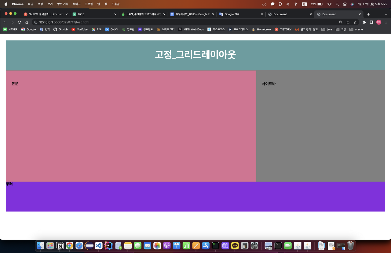
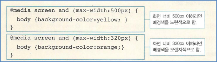
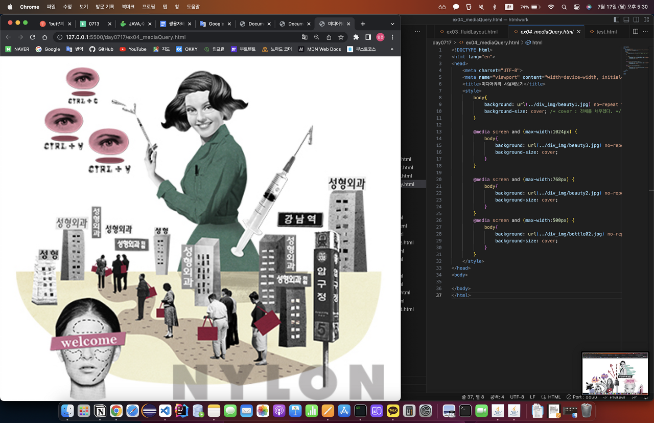
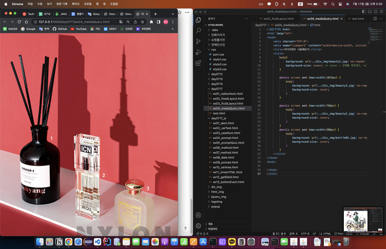
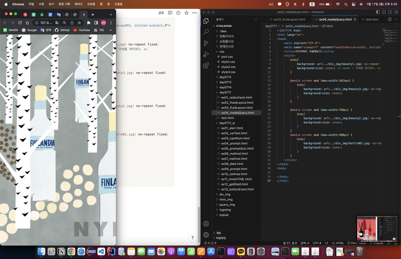
MediaQuery
- media query를 사용하면 화면 size에 따라 배경화면을 바꿀 수 있다.
<!DOCTYPE html>
<html lang="en">
<head>
    <meta charset="UTF-8">
    <meta name="viewport" content="width=device-width, initial-scale=1.0">
    <title>미디어쿼리 사용해보기</title>
    <style>
        body{
            background: url(../div_img/beauty1.jpg) no-repeat fixed;
            background-size: cover; /* cover : 전체를 채우겠다. */
        }

        @media screen and (max-width:1024px) {
            body{
                background: url(../div_img/beauty3.jpg) no-repeat fixed;
                background-size: cover;
            }
        }

        @media screen and (max-width:768px) {
            body{
                background: url(../div_img/beauty2.jpg) no-repeat fixed;
                background-size: cover;
            }
        }
        @media screen and (max-width:500px) {
            body{
                background: url(../div_img/bottle02.jpg) no-repeat fixed;
                background-size: cover;
            }
        }
    </style>
</head>
<body>

</body>
</html>

java를 잡아...... 하... 이게 맞나...