React Markdown 적용하기 (darkmode 가능)
빠르게 코드 복붙하면 사용할 수 있게 빠르게 설명하겠습니다.
toast-ui
https://ui.toast.com/tui-editor
toast-ui 마크다운 적용 코드
import React from "react";
import "@toast-ui/editor/dist/toastui-editor.css";
import "@toast-ui/editor/dist/theme/toastui-editor-dark.css";
import { Editor } from "@toast-ui/react-editor";
import { useForm, Controller, SubmitHandler } from "react-hook-form";
import theme from "../../styles/theme";
import styled from "styled-components";
import { Button } from "@mui/material";
import ArrowBackIcon from "@mui/icons-material/ArrowBack";
import { useState } from "react";
import TagsEditor from "../atoms/TagsEditor";

interface IFormInput {
  title: string;
}

const MarkdownEditor: React.FC = () => {
  const [title, setTitle] = useState("");
  const { control, handleSubmit } = useForm<IFormInput>();

  const goBack = () => {
    window.history.back();
  };
  const onSubmit: SubmitHandler<IFormInput> = (data) => {
    console.log(data);
  };

  return (
    <Container>
      <Controller
        name="title"
        control={control}
        defaultValue=""
        render={({ field }) => (
          <Editor
            height="100%"
            initialValue="# 제목을 입력하세요"
            // placeholder="당신의 이야기를 적어보세요..."
            previewStyle={window.innerWidth > 1000 ? "vertical" : "tab"}
            initialEditType="markdown"
            hideModeSwitch={true}
            toolbarItems={[
              ["heading", "bold", "italic", "strike"],
              ["hr", "quote"],
              ["table", "image", "link"],
              ["code", "codeblock"],
              ["scrollSync"],
            ]}
            theme="dark"
            usageStatistics={false}
            {...field}
          />
        )}
      />
      <TagsEditor />
      <NavBarContainer>
        <StyledOutBtn
          onClick={goBack}
          variant="contained"
          startIcon={<ArrowBackIcon />}
        >
          나가기
        </StyledOutBtn>
        <Box>
          <StyledSaveBtn variant="contained">임시저장</StyledSaveBtn>
          <StyledPostBtn variant="contained">출간하기</StyledPostBtn>
        </Box>
      </NavBarContainer>
    </Container>
  );
};

export default MarkdownEditor;

const Container = styled.div`
  width: 100%;
  height: 100vh;
  display: flex;
  background-color: ${theme.colors.background2};
  flex-direction: column;
  box-sizing: border-box;
  padding: 30px 25px;
`;

const NavBarContainer = styled.div`
  display: flex;
  align-items: center;
  box-sizing: border-box;
  justify-content: space-between;
  background-color: ${theme.colors.background3};
  padding: 8px 18px;
  height: fit-content;
  width: 100%;
  border-radius: 0 0px 8px 8px;
`;

const StyledOutBtn = styled(Button)`
  && {
    box-shadow: none;
    color: ${theme.colors.text1};
    font-weight: ${theme.fontWeights.body2};
    font-size: ${theme.fontSizes.button1};
    background-color: ${theme.colors.background3};
    border-radius: 5px;
    padding: 5px 13px;
    text-transform: none;
    &:hover {
      background-color: #434343;
    }
  }
`;

const StyledPostBtn = styled(Button)`
  && {
    box-shadow: none;
    color: ${theme.colors.background3};
    font-weight: ${theme.fontWeights.body1};
    font-size: ${theme.fontSizes.button1};
    background-color: ${theme.colors.primary1};
    border-radius: 5px;
    padding: 5px 13px;
    text-transform: none;
    &:hover {
      background-color: ${theme.colors.primary2};
    }
  }
`;

const StyledSaveBtn = styled(Button)`
  && {
    box-shadow: none;
    color: ${theme.colors.primary1};
    font-weight: ${theme.fontWeights.body1};
    font-size: ${theme.fontSizes.button1};
    background-color: ${theme.colors.background3};
    border-radius: 5px;
    padding: 5px 13px;
    text-transform: none;
    &:hover {
      background-color: #434343;
    }
  }
`;

const Box = styled.div`
  display: flex;
  flex-direction: row;
  align-items: center;
  justify-content: center;
  gap: 10px;
  border: 1px solid ${theme.colors.background3};
  box-sizing: border-box;
  border-radius: 50px;
`;
주요기능 설명
 <Editor
  height="100%" // 에디터의 높이를 설정합니다. 여기서는 부모 요소의 100% 높이를 차지하도록 설정합니다.
  initialValue="# 제목을 입력하세요" // 에디터가 처음 로드될 때 표시할 초기 값입니다. 사용자에게 제목 입력을 유도하는 텍스트입니다.
  // placeholder="당신의 이야기를 적어보세요..." // 에디터에서 사용자가 입력하기 전에 표시될 텍스트입니다. 현재는 주석 처리되어 비활성화 상태입니다.
  previewStyle={window.innerWidth > 1000 ? "vertical" : "tab"} // 에디터의 미리보기 스타일을 설정합니다. 화면 너비에 따라 수직 또는 탭 스타일로 변경됩니다.
  initialEditType="markdown" // 에디터의 초기 편집 타입을 설정합니다. 여기서는 'markdown'으로 설정되어 마크다운 문법으로 편집할 수 있습니다.
  hideModeSwitch={true} // 편집 모드 전환 스위치를 숨깁니다. 사용자가 편집 모드를 변경할 수 없도록 설정합니다.
  toolbarItems={[ // 툴바에 표시될 항목들을 배열로 정의합니다. 다양한 편집 도구와 서식 옵션이 포함됩니다.
    ["heading", "bold", "italic", "strike"], // 제목, 굵게, 기울임꼴, 취소선
    ["hr", "quote"], // 수평선, 인용문
    ["table", "image", "link"], // 표, 이미지, 링크
    ["code", "codeblock"], // 코드, 코드 블록
    ["scrollSync"], // 스크롤 동기화
  ]}
  theme="dark" // 에디터의 테마를 설정합니다. 'dark'로 설정되어 어두운 색상 테마가 적용됩니다.
  usageStatistics={false} // Toast UI의 사용 통계 수집 기능을 비활성화합니다.
  {...field} // field 객체에 정의된 추가 속성들을 에디터에 적용합니다.
/>
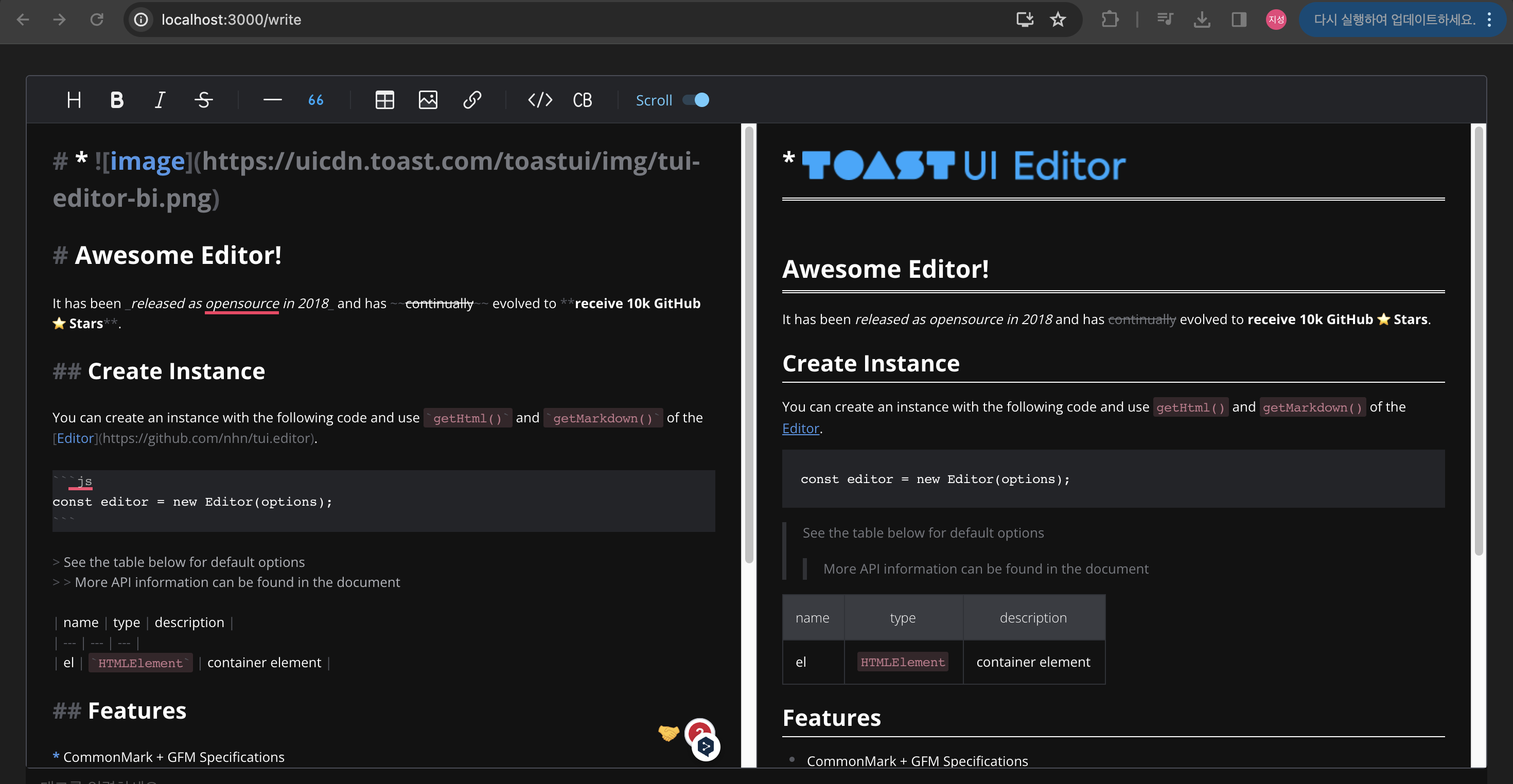
결과
미리보기 & 다크모드 적용
- 타입스크립트 사용시 x.d.ts 파일에 declare module '@toast-ui/react-editor'; 설정 필요
진짜 중요한건 이렇게 작성 후 마크다운 이 적용돼서 보여야한다!! => 애써만든 마크다운 적용되서 출력해보기 클릭!!

참 되게 살자