저번 글에서 toast-ui를 사용하여 마크다운으로 작성하는 코드를 게시하였다
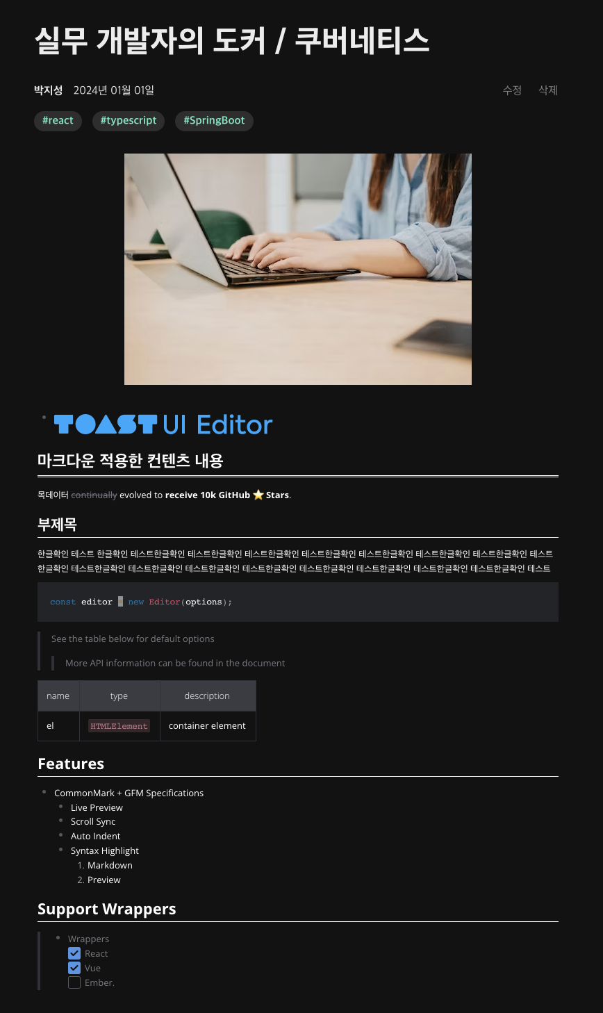
아래 사진처럼 마크다운 에디터 적용하고 싶다면 클릭
하지만 진짜 중요한건 작성 후 마크다운이 적용되어 글이 보여야 한다는 것!
이렇게 작성한것이
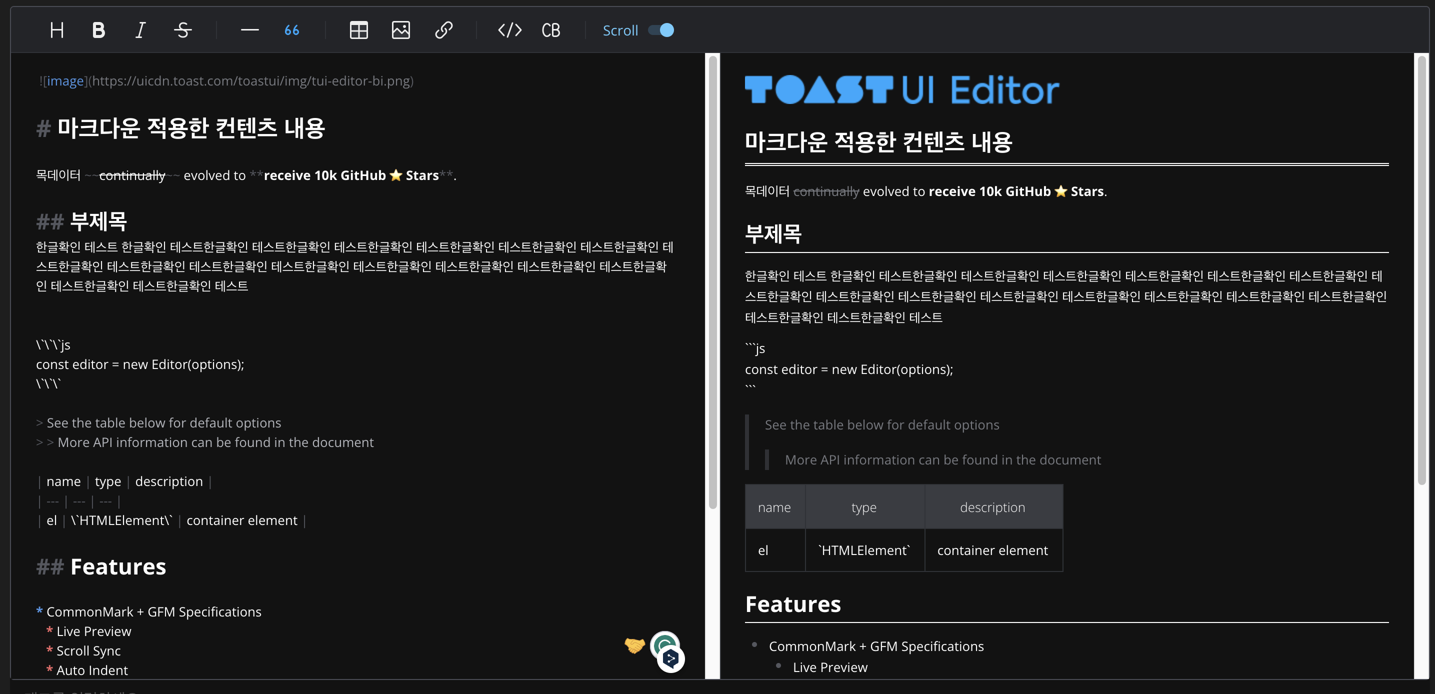
이렇게 출력되어야한다.
준비물
import { Viewer } from "@toast-ui/react-editor";
import "@toast-ui/editor/dist/toastui-editor.css";
import "tui-color-picker/dist/tui-color-picker.css";
import "@toast-ui/editor-plugin-color-syntax/dist/toastui-editor-plugin-color-syntax.css";
import "prismjs/themes/prism.css";
import codeSyntaxHighlight from "@toast-ui/editor-plugin-code-syntax-highlight";
import "@toast-ui/editor-plugin-code-syntax-highlight/dist/toastui-editor-plugin-code-syntax-highlight.css";
import Prism from "prismjs";
위 라이브러리들을 npm install 해준다.
코드
import styled from "styled-components";
import { Card } from "../../state/atoms/cardState";
import theme from "../../styles/theme";
import { Viewer } from "@toast-ui/react-editor";
import "@toast-ui/editor/dist/toastui-editor.css";
import "tui-color-picker/dist/tui-color-picker.css";
import "@toast-ui/editor-plugin-color-syntax/dist/toastui-editor-plugin-color-syntax.css";
import "prismjs/themes/prism.css";
import codeSyntaxHighlight from "@toast-ui/editor-plugin-code-syntax-highlight";
import "@toast-ui/editor-plugin-code-syntax-highlight/dist/toastui-editor-plugin-code-syntax-highlight.css";
import Prism from "prismjs";
import MyVelogProfileSection from "../atoms/MyVelogProfileSection";
interface ArticleDetailTemplateProps {
card: Card | null;
}
const markdownText = `
* 
# 마크다운 적용한 컨텐츠 내용
목데이터 ~~continually~~ evolved to **receive 10k GitHub ⭐️ Stars**.
## 부제목
한글확인 테스트 한글확인 테스트한글확인 테스트한글확인 테스트한글확인 테스트한글확인 테스트한글확인 테스트한글확인 테스트한글확인 테스트한글확인 테스트한글확인 테스트한글확인 테스트한글확인 테스트한글확인 테스트한글확인 테스트한글확인 테스트한글확인 테스트한글확인 테스트
\`\`\`js
const editor = new Editor(options);
\`\`\`
> See the table below for default options
> > More API information can be found in the document
| name | type | description |
| --- | --- | --- |
| el | \`HTMLElement\` | container element |
## Features
* CommonMark + GFM Specifications
* Live Preview
* Scroll Sync
* Auto Indent
* Syntax Highlight
1. Markdown
2. Preview
## Support Wrappers
> * Wrappers
> 1. [x] React
> 2. [x] Vue
> 3. [ ] Ember.
`;
const ArticleDetailTemplate: React.FC<ArticleDetailTemplateProps> = ({
card,
}) => {
if (!card) {
return <div>Loading...</div>;
}
return (
<Div>
<Title>{card.title}</Title>
<RowDiv>
<RowDiv2>
<UserName>{card.author}</UserName>
<Date>{formatDate(card.date)}</Date>
</RowDiv2>
<BtnDiv>
<Btn>수정</Btn>
<Btn>삭제</Btn>
</BtnDiv>
</RowDiv>
<TagContainer>
{card.tags.map((tag, index) => (
<Tag key={index}>{tag}</Tag>
))}
</TagContainer>
<Image src={card.imageUrl} alt={card.title} />
<Content>
<Viewer
width="100%"
plugins={[[codeSyntaxHighlight, { highlighter: Prism }]]}
initialValue={markdownText}
theme="dark"
/>
</Content>
<MyVelogProfileSection />
<Br />
</Div>
);
};
export default ArticleDetailTemplate;
function formatDate(date: Date) {
const year = date.getFullYear();
const month = date.getMonth() + 1;
const day = date.getDate();
return `${year}년 ${month.toString().padStart(2, "0")}월 ${day
.toString()
.padStart(2, "0")}일`;
}
const Div = styled.div`
display: flex;
flex-direction: column;
font-family: "Noto Sans KR", sans-serif;
padding-top: 60px;
width: 760px;
height: 100%;
margin: 0 auto;
align-items: center;
justify-content: center;
background-color: transparent;
`;
const RowDiv = styled.div`
display: flex;
width: 100%;
flex-direction: row;
background-color: transparent;
align-items: center;
justify-content: space-between;
padding-bottom: 18px;
`;
const RowDiv2 = styled.div`
display: flex;
flex-direction: row;
background-color: transparent;
gap: 15px;
align-items: center;
justify-content: flex-start;
`;
const UserName = styled.div`
display: flex;
flex-direction: row;
justify-content: center;
align-items: center;
font-size: ${theme.fontSizes.body1};
font-weight: ${theme.fontWeights.body1};
color: ${theme.colors.text1};
`;
const Title = styled.div`
display: flex;
flex-direction: row;
justify-content: baseline;
align-items: center;
font-size: ${theme.fontSizes.header1};
font-weight: ${theme.fontWeights.header0};
color: ${theme.colors.text1};
width: 100%;
padding-bottom: 32px;
`;
const Date = styled.div`
display: flex;
flex-direction: row;
justify-content: center;
align-items: center;
font-size: ${theme.fontSizes.body1};
font-weight: ${theme.fontWeights.body2};
color: ${theme.colors.text4};
`;
const Content = styled.div`
display: flex;
flex-direction: row;
width: 750px;
min-width: 750px;
justify-content: center;
align-items: center;
font-size: ${theme.fontSizes.body1};
font-weight: ${theme.fontWeights.body2};
color: ${theme.colors.text1};
padding-top: 32px;
padding-bottom: 150px;
`;
const Image = styled.img`
width: auto;
height: auto;
`;
const Btn = styled.button`
width: fit-content;
height: fit-content;
font-size: ${theme.fontSizes.body1};
font-weight: ${theme.fontWeights.body2};
color: ${theme.colors.text2};
background-color: transparent;
border: none;
cursor: pointer;
`;
const BtnDiv = styled.div`
display: flex;
flex-direction: row;
justify-content: center;
align-items: center;
gap: 12px;
`;
const TagContainer = styled.div`
display: flex;
width: 100%;
flex-direction: row;
justify-content: flex-start;
align-items: center;
gap: 15px;
padding-bottom: 32px;
`;
const Tag = styled.div`
display: flex;
flex-direction: row;
justify-content: center;
align-items: center;
width: fit-content;
height: fit-content;
padding: 5px 12px;
font-size: ${theme.fontSizes.body1};
font-weight: ${theme.fontWeights.body1};
color: ${theme.colors.primary2};
background-color: ${theme.colors.background3};
border: none;
border-radius: 15px;
`;
const Br = styled.br`
width: 100%;
height: 1px;
background-color: ${theme.colors.secondary};
`;
React프레임워크 사용, 타입스크립트로 작성되었으며 css는 style-component와 Mui를 사용하였다.
주요기능 설명
Toast UI Editor의 뷰어 컴포넌트를 사용하여 마크다운 콘텐츠를 렌더링하는 데 필요한 라이브러리와 스타일을 임포트하고, 뷰어 컴포넌트를 설정하였다.
각 임포트와 뷰어 컴포넌트의 기능
@toast-ui/react-editor: Toast UI Editor의 React 버전을 제공. Viewer 컴포넌트는 마크다운 형식의 텍스트를 HTML로 렌더링하여 보여주는 역할을 함
@toast-ui/editor/dist/toastui-editor.css: Toast UI Editor의 기본 스타일을 제공한다. 이 CSS 파일은 에디터의 기본적인 레이아웃과 스타일을 설정한다.
tui-color-picker/dist/tui-color-picker.css: Toast UI 에디터에서 사용하는 색상 선택 도구의 스타일을 제공. 색상 선택과 관련된 UI 구성 요소의 스타일을 설정한다.
@toast-ui/editor-plugin-color-syntax/dist/toastui-editor-plugin-color-syntax.css: 색상 문법 플러그인의 스타일을 제공. 이 플러그인을 통해 사용자는 마크다운 문서 내에서 텍스트 색상을 쉽게 설정할 수 있다.
prismjs/themes/prism.css: PrismJS 라이브러리의 기본 테마 스타일. 코드 블록에 대한 시각적 스타일링을 제공! 기술블로그 제작 시 많이 사용.
@toast-ui/editor-plugin-code-syntax-highlight: 코드 문법 강조 표시를 위한 플러그인. 이 플러그인은 마크다운 내의 코드 블록에 대해 구문 강조 기능을 추가한다.
@toast-ui/editor-plugin-code-syntax-highlight/dist/toastui-editor-plugin-code-syntax-highlight.css: 코드 문법 강조 표시 플러그인의 스타일을 제공.
Prism: PrismJS는 코드 문법 강조에 사용되는 라이브러리이다. 여러 프로그래밍 언어에 대한 구문 강조를 지원한다. Velog클론 코딩 중이라 코드작성이 꼭 필요하여 이걸 사용하였다.
중요!!
Viewer 컴포넌트:
width: 뷰어 컴포넌트의 너비를 설정. 여기서는 "100%"로 설정되어 부모 요소의 전체 너비를 차지.
plugins: 뷰어에 적용할 플러그인 배열. 여기서는 codeSyntaxHighlight 플러그인을 사용하며, highlighter 옵션으로 Prism을 지정하였다. 이를 통해 코드 블록에 구문 강조 기능이 추가.
initialValue: 뷰어에 표시될 초기 값입니다. 이 값은 마크다운 형식의 텍스트가 된다. 이 코드에서는 여기서 적용되는 마크다운 기능을 모두 보여주기 위해 미리 마크다운 텍스트를 삽입함
theme: 뷰어의 테마를 설정합니다. 다크모드 사용하고 싶다면 "dark" 적용. 디폴트는 흰색.

.