Chapter 16 얼굴 변화 관찰
-
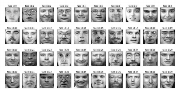
olivetti_faces.npy/olivetti_faces_target.npy 파일
-
400개의 이미지와 40개의 label로 구성
-
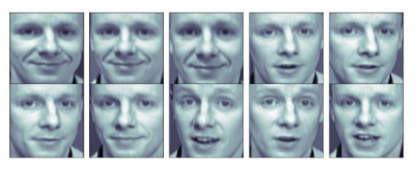
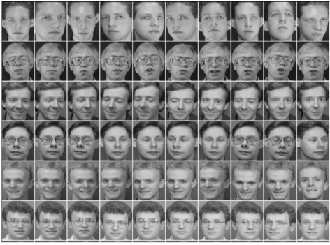
얼굴 인식용으로 사용가능한 데이터지만 특정 인물의 데이터(10장)만 사용해서 PCA 실습 진행
-
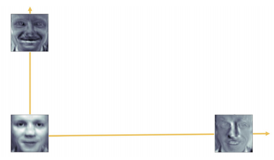
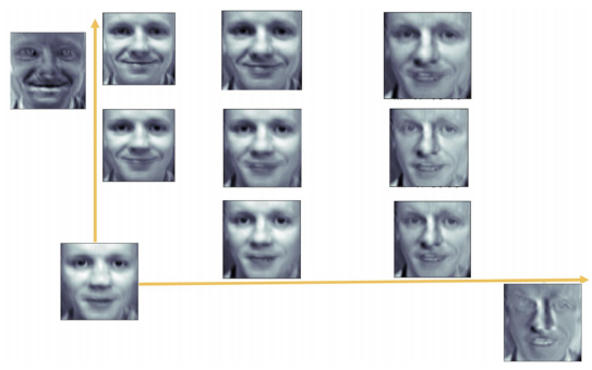
주성분분석을 하면 원점과 두개의 eigen face가 나옴
-
결론적으로는 아래 사진과 같은 느낌으로 구성된다고 말할 수 있음
import numpy as np

data=np.load("./olivetti_faces.npy")
target=np.load("./olivetti_faces_target.npy")
def show_40_distinct_people(images, unique_ids):
fig, axarr=plt.subplots(nrows=4, ncols=10, figsize=(18, 9))
axarr=axarr.flatten()
#iterating over user ids
for unique_id in unique_ids:
image_index=unique_id*10
axarr[unique_id].imshow(images[image_index], cmap='gray')
axarr[unique_id].set_xticks([])
axarr[unique_id].set_yticks([])
axarr[unique_id].set_title("face id:{}".format(unique_id))
plt.suptitle("There are 40 distinct people in the dataset")import matplotlib.pyplot as plt
show_40_distinct_people(data, np.unique(target))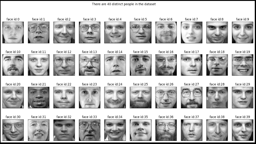
K = 20
faces = data[target == K]

faces
import matplotlib.pyplot as plt

N = 2
M = 5

fig = plt.figure(figsize = (10, 5))
plt.subplots_adjust(top = 1, bottom = 0, hspace = 0 , wspace = 0.05)
for n in range(N * M):
    ax = fig.add_subplot(N, M, n+1)
    ax.imshow(faces[n], cmap = plt.cm.bone)
    ax.grid(False)
    ax.xaxis.set_ticks([])
    ax.yaxis.set_ticks([])

plt.suptitle("Olivetti")
plt.tight_layout()
plt.show()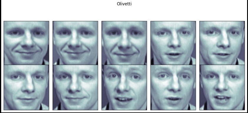
from sklearn.decomposition import PCA

pca = PCA(n_components= 2)

X = data[target == K]
n_samples, n_rows, n_columns = X.shape
X_flat = X.reshape(n_samples, n_rows * n_columns)
W = pca.fit_transform(X_flat)

X_inv = pca.inverse_transform(W)
import matplotlib.pyplot as plt
N = 2
M = 5
fig = plt.figure(figsize = (10, 5))
plt.subplots_adjust(top = 1, bottom = 0, hspace = 0 , wspace = 0.05)
for n in range(N * M):
ax = fig.add_subplot(N, M, n+1)
ax.imshow(faces[n], cmap = plt.cm.bone)
ax.grid(False)
ax.xaxis.set_ticks([])
ax.yaxis.set_ticks([])
plt.suptitle("PCA result")
plt.tight_layout()
plt.show()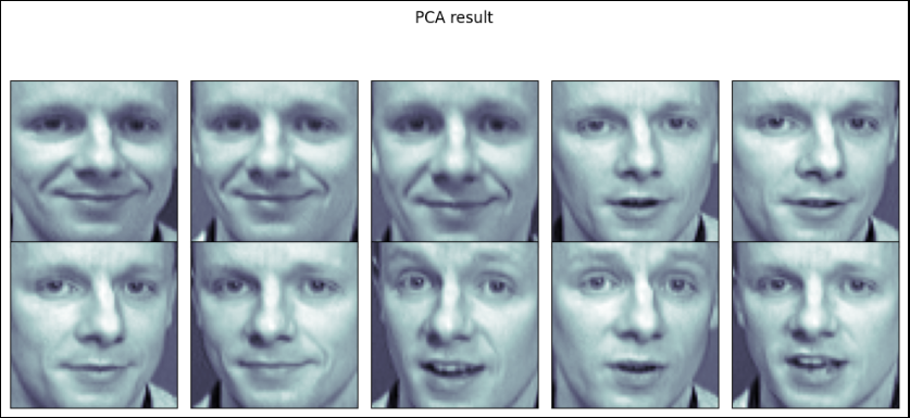
face_mean = pca.mean_.reshape(64, 64)

face_p1 = pca.components_[0].reshape(64, 64)
face_p2 = pca.components_[1].reshape(64, 64)


plt.figure(figsize = (12, 7))
plt.subplot(131)
plt.imshow(face_mean, plt.cm.bone)
plt.grid(False); plt.xticks([]); plt.yticks([]); plt.title("mean")
plt.subplot(132)
plt.imshow(face_p1, cmap = plt.cm.bone)
plt.grid(False); plt.xticks([]); plt.yticks([]); plt.title("face_p1")
plt.subplot(133)
plt.imshow(face_p2, plt.cm.bone)
plt.grid(False); plt.xticks([]); plt.yticks([]); plt.title("face_p2")

plt.show()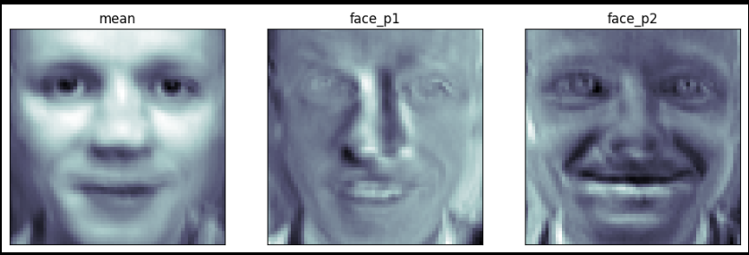
import numpy as np

N = 2
M = 5
w = np.linspace(-5, 10, N*M)
w
fig = plt.figure(figsize = (10, 5))
plt.subplots_adjust(top = 1, bottom = 0, hspace = 0 , wspace = 0.05)
for n in range(N * M):
    ax = fig.add_subplot(N, M, n+1)
    ax.imshow(face_mean + w[n] * face_p1, cmap = plt.cm.bone)
    ax.grid(False); plt.xticks([]); plt.yticks([])
    plt.title("Weight : " + str(round(w[n])))


plt.tight_layout()
plt.show()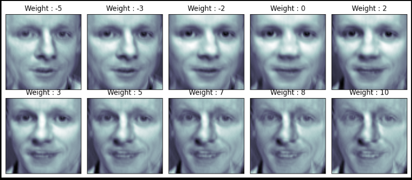
fig = plt.figure(figsize = (10, 5))
plt.subplots_adjust(top = 1, bottom = 0, hspace = 0 , wspace = 0.05)
for n in range(N * M):
    ax = fig.add_subplot(N, M, n+1)
    ax.imshow(face_mean + w[n] * face_p2, cmap = plt.cm.bone)
    ax.grid(False); plt.xticks([]); plt.yticks([])
    plt.title("Weight : " + str(round(w[n])))


plt.tight_layout()
plt.show()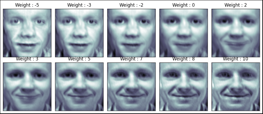
nx, ny = (5, 5)

x = np.linspace(-5, 8, nx)
y = np.linspace(-5, 8, ny)
w1, w2 = np.meshgrid(x, y)
w1 , w2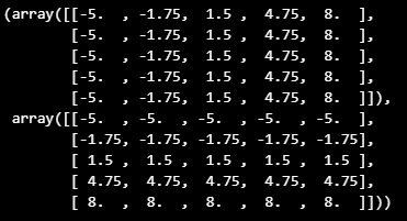
w1 = w1.reshape(-1,)
w2 = w2.reshape(-1,)
w1.shape
(25,)
fig = plt.figure(figsize = (12, 10))
plt.subplots_adjust(top = 1, bottom = 0, hspace = 0 , wspace = 0.05)

N = 5
M = 5

for n in range(N * M):
    ax = fig.add_subplot(N, M, n+1)
    ax.imshow(face_mean + w1[n] * face_p1 + w2[n] * face_p2, cmap = plt.cm.bone)
    ax.grid(False); plt.xticks([]); plt.yticks([])
    plt.title("Weight : " + str(round(w1[n], 1)) + ", " + str(round(w2[n], 1)))


plt.tight_layout()
plt.show()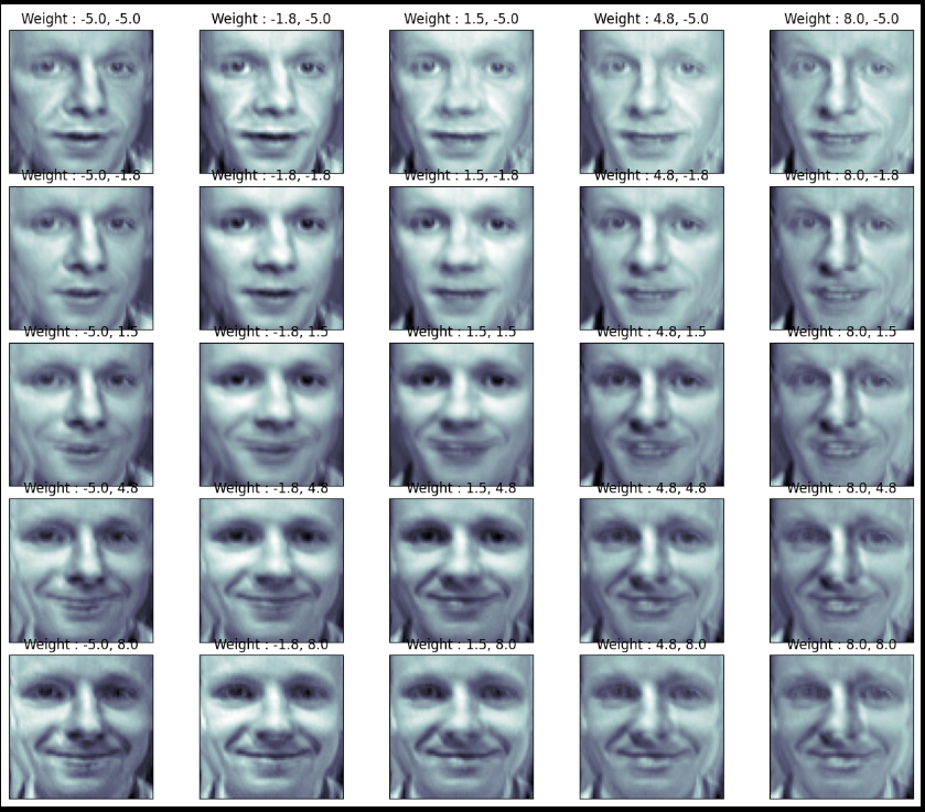
Chapter 17 비지도 학습
Clustering
- 군집 Clustering: 비슷한 샘플을 모음
- 이상치 탐지 Outier detection: 정상 데이터가 어떻게 보이는지 학습, 비정상 샘플 감지
- 밀도 추정: 데이터셋의 확률밀도함수 PDF 추정, 이상치 탐지 등에 사용
- K-means (대표적인 비지도 학습)
-> 군집화에서 가장 일반적인 알고리즘
-> 군집 중심이라는 임의의 지점을 선택해서 해당 중심에 가장 가까운 포인트들을 선택하는 군집화
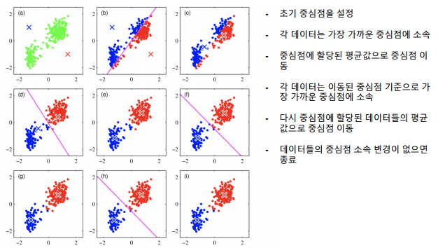
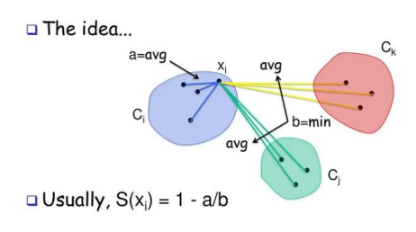
군집 평가
-
군집은 분류와 다르게 평가 기준(정답)을 가지고 있지 않음
-
군집 결과 평가를 위해 실루엣 분석을 많이 활용
-
실루엣 분석: 다른 군집과는 떨어져 있고, 동일 군집간은 잘 뭉쳐 있는지 확인
-
실루엣 계수: 개별 데이터가 가지는 군집화 지표
-
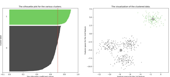
n=2 인 경우
-
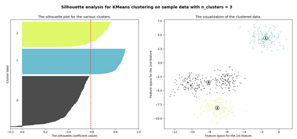
n=3 인 경우
-
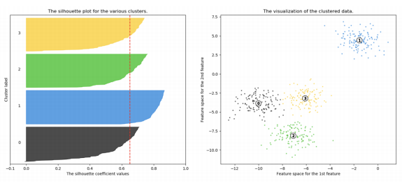
n=4 인 경우
Iris data 군집화 실습
from sklearn.preprocessing import scale
from sklearn.datasets import load_iris
from sklearn.cluster import KMeans
import matplotlib.pyplot as plt
import numpy as np
import pandas as pd
%matplotlib inline

iris = load_iris()
cols = [each[:-5] for each in iris.feature_names]
cols['sepal length', 'sepal width', 'petal length', 'petal width']
iris_df = pd.DataFrame(data=iris.data, columns=cols)

feature = iris_df[['petal length', 'petal width']]
model = KMeans(n_clusters=3)
model.fit(feature)model.labels_ # 번호 자체에는 의미가 없고, 군집이 되었다는 사실이 중요함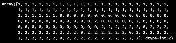
model.cluster_centers_array([[4.26923077, 1.34230769],
[1.462 , 0.246 ],
[5.59583333, 2.0375 ]])
predict = pd.DataFrame(model.predict(feature), columns=['cluster'])
feature = pd.concat([feature, predict], axis=1)
centers = pd.DataFrame(model.cluster_centers_, columns=['petal length', 'petal width'])
center_x = centers['petal length']
center_y = centers['petal width']
plt.figure(figsize=(12, 8))
plt.scatter(feature['petal length'], feature['petal width'],
c=feature['cluster'], alpha=0.5)
plt.scatter(center_x, center_y, s=50, marker='D', c='r')
plt.show()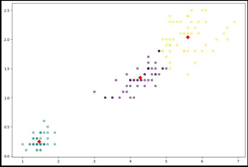
from sklearn.datasets import load_iris
from sklearn.cluster import KMeans
import pandas as pd

iris = load_iris()
feature_names = ['sepal length', 'sepal width', 'petal length', 'petal width']
iris_df = pd.DataFrame(data=iris.data, columns=feature_names)
kmeans=KMeans(n_clusters=3, init='k-means++', max_iter=300,
             random_state=0).fit(iris_df)

iris_df['cluster'] = kmeans.labels_
from sklearn.metrics import silhouette_samples, silhouette_score
avg_value = silhouette_score(iris.data, iris_df['cluster'])
score_values = silhouette_samples(iris.data, iris_df['cluster'])
print('avg_value', avg_value)
print('silhouette_samples() return 값의 shape ', score_values.shape)avg_value 0.5528190123564095
silhouette_samples() return 값의 shape (150,)
def visualize_silhouette(cluster_lists, X_features):

    from sklearn.datasets import make_blobs
    from sklearn.cluster import KMeans
    from sklearn.metrics import silhouette_samples, silhouette_score

    import matplotlib.pyplot as plt
    import matplotlib.cm as cm
    import math

    # 입력값으로 클러스터링 갯수들을 리스트로 받아서, 각 갯수별로 클러스터링을 적용하고 실루엣 개수를 구함
    n_cols = len(cluster_lists)

    # plt.subplots()으로 리스트에 기재된 클러스터링 수만큼의 sub figures를 가지는 axs 생성
    fig, axs = plt.subplots(figsize=(4*n_cols, 4), nrows=1, ncols=n_cols)

    # 리스트에 기재된 클러스터링 갯수들을 차례로 iteration 수행하면서 실루엣 개수 시각화
    for ind, n_cluster in enumerate(cluster_lists):

        # KMeans 클러스터링 수행하고, 실루엣 스코어와 개별 데이터의 실루엣 값 계산.
        clusterer = KMeans(n_clusters = n_cluster, max_iter=500, random_state=0)
        cluster_labels = clusterer.fit_predict(X_features)

        sil_avg = silhouette_score(X_features, cluster_labels)
        sil_values = silhouette_samples(X_features, cluster_labels)

        y_lower = 10
        axs[ind].set_title('Number of Cluster : '+ str(n_cluster)+'\n' \
                          'Silhouette Score :' + str(round(sil_avg,3)) )
        axs[ind].set_xlabel("The silhouette coefficient values")
        axs[ind].set_ylabel("Cluster label")
        axs[ind].set_xlim([-0.1, 1])
        axs[ind].set_ylim([0, len(X_features) + (n_cluster + 1) * 10])
        axs[ind].set_yticks([])  # Clear the yaxis labels / ticks
        axs[ind].set_xticks([0, 0.2, 0.4, 0.6, 0.8, 1])

        # 클러스터링 갯수별로 fill_betweenx( )형태의 막대 그래프 표현.
        for i in range(n_cluster):
            ith_cluster_sil_values = sil_values[cluster_labels==i]
            ith_cluster_sil_values.sort()

            size_cluster_i = ith_cluster_sil_values.shape[0]
            y_upper = y_lower + size_cluster_i

            color = cm.nipy_spectral(float(i) / n_cluster)
            axs[ind].fill_betweenx(np.arange(y_lower, y_upper), 0, ith_cluster_sil_values, \
                                facecolor=color, edgecolor=color, alpha=0.7)
            axs[ind].text(-0.05, y_lower + 0.5 * size_cluster_i, str(i))
            y_lower = y_upper + 10

        axs[ind].axvline(x=sil_avg, color="red", linestyle="--")
visualize_silhouette([2, 3, 4], iris.data)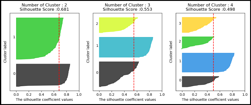
이 글은 제로베이스 데이터 취업 스쿨의 강의 자료 일부를 발췌하여 작성되었습니다
