1. 설치방법
# with npm
npm install --save styled-components
typescript를 사용할 때는 아래도 추가하여 styled-components의 type들을 가지고 와야한다.
# with npm
npm i --save-dev @types/styled-components
2. styled component 생성
styled 컴포넌트를 생성하기 위해서는 styled를 import해야 한다.
그 다음 생성할 document element를 선택한다. css 작성부분은 기존 css형식이랑 동일하다.
예시코드(input과 button부분)
//loginStyled.tsx
import styled from "styled-components";
export const CreateStyledInput = styled.input`
  width: 180px;
  height: 25px;
  font-weight: 300;
  font-size: 12px;
  line-height: 14px;
  background-color: transparent;
  border: 0.5px solid;
  border-color: transparent transparent #989898 transparent;
`;

export const CreateStyledInputButton = styled.button`
  width: 75px;
  height: 25px;
  background-color: transparent;
  border-radius: 20px;
  border: 0.5px solid;
  border-color: #ef9f9f;
  font-size: 10px;
  font-weight: 400;
  line-height: 12px;
  text-align: center;
  color: #ef9f9f;
`;
3. styled component 적용
위와 같이 만든 styled component를 import하여 적용할 document element에 맞게 사용하면 된다.
예시코드
//create.tsx
import {
CreateStyledInput,
CreateStyledInputButton,
//.....
} from "./loginStyled";
//.....
function CreatePage() {
//.....
return (
<>
//.....
<LoginInputDiv>
<CreateStyledInput
placeholder="이메일을 입력해주세요"
type="email"
id="userEmail"
required
{...register("email", { required: true, pattern: regExpEm })}
/>
<CreateStyledInputButton onClick={emailCheck}>
인증번호 전송
</CreateStyledInputButton>
</LoginInputDiv>
</>
)
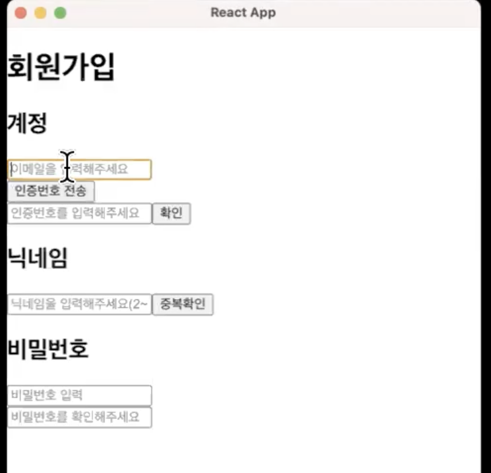
}적용되기 전 모습
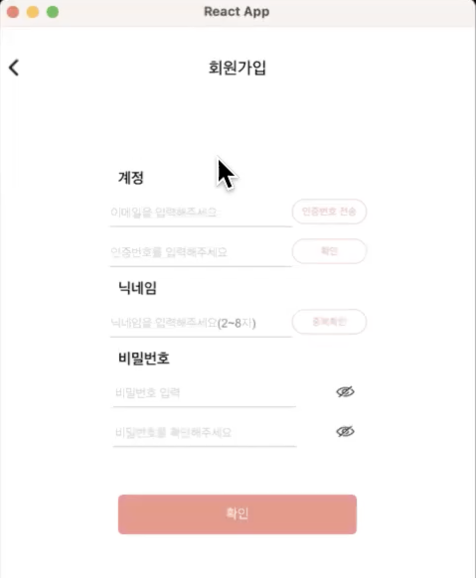
적용된 뒤의 모습
4. styled component에 props 넘기기
props를 넘겨서 입력값에 따라 스타일을 바꿔주고 싶은 경우, ${(props) => props.name} 형태로 prop를 받아 올 수 있다. 예시는 아래 코드와 같다.
//home.tsx
interface IBtn {
  submit: boolean;
  pay: string;
}

const BUTTON = styled.button<IBtn>`
  border: 1px ${(props) => (props.submit ? "solid" : "dotted")} yellow;
  background: blue;
  color: white;
  font-weight: ${(props) => (props.pay === "shopping" ? "bold" : 500)};
`;
//....
  return (
    <div>
      <section>
        <BUTTON submit={true} onClick={onImage} pay="nothing">
          First Button
        </BUTTON>
        <BUTTON submit={false} onClick={onClick} pay="shopping">
          Second Button
        </BUTTON>
//...
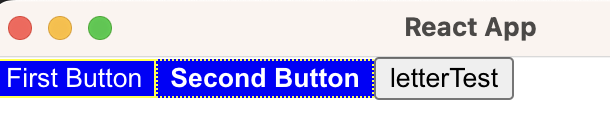
적용된 모습은 다음과 같다 submit이 true냐 false에 따라 border선 종류가 달라진다. pay라는 값을 통해서도 font-weight이 달라진다.
참고자료(도움이 되었던 선생님들)
https://styled-components.com
https://memostack.tistory.com/334

예비 초보 개발자의 기록일지