이번 프로젝트를 진행하며, 쉽게 구현할 수 있거나 구현할 줄은 아는데 시간이 걸리는 UI들은 MUI를 통해서 넣어 주고 싶었다. 또한, 외부 라이브러리도 공식 문서를 보면서 사용할 줄 알게 되는 경험도 가지고 싶었다. 그래서 styled-components에서 mui를 사용해보기 위해 열심히 구글을 검색해 보았지만 내가 원하는 명확한 답변을 찾을 수 없었다.😭 그렇게 새벽 2시까지 구글링을 하고 또 하다가 점점 힌트를 얻어 styled-components 방식으로 자유롭게 mui를 쓸 수 있게 되어 나와 같은 누군가를 위해 기록으로 남겨보고자 한다!
MUI 공식문서
MUI: The React component library you always wanted
설치해야 할 사항
MUI는 기본적으로 emotion이라는 자체 engine을 사용하는 하지만, styled-components와 함께 쓰려면 별도로 styled-component engine을 install 해줘야 한다.
아래 설명때문에 처음에는 styled-components용 engine을 install 했었는데, 아래 적어놓은 방식으로 사용하면 별도로 styled-components용 engine 설치 없이 공식문서 첫 번째 화면에 나오는 일반적인 설치 방법을 통해 mui를 설치해 주면 된다.
MUI is using emotion as a styling engine by default. If you want to use
[styled-components](https://styled-components.com/)
instead, run:
// with npm
npm install @mui/material @emotion/react @emotion/styled
Styled Component 문법으로 사용하는 법!
🍉 <StyledEngineProvider injectFirst>로 감싸줘야 styled-components 문법을 사용할 수 있으며, styled-components 문법이 override 되어 자유롭게 사용할 수 있다!!
컴포넌트 안에서 다음과 같이 작성해주면 된다.
import React from 'react';
import styled from 'styled-components'; // styled는 그대로 넣어줌
import Button from '@mui/material/Button';  // mui에서 import한 버튼 컴포넌트
import { StyledEngineProvider } from '@mui/styled-engine'; // 본문을 감싸줘야함

const Component = () => {
	return(
		<StyledEngineProvider injectFirst>
			<MyButton>MUI에서 가져온 내 버튼!</MyButton>
			// 다른 버튼들, 내 styled components들
		</StyledEngineProvider>
	)
}

// 다음과 같이 styled component 문법으로 넣어줌
const MyButton = styled(Button)`
  background: linear-gradient(45deg, #fe6b8b 30%, #ff8e53 90%);
  border: 0;
  border-radius: 3px;
  box-shadow: 0 3px 5px 2px rgba(255, 105, 135, 0.3);
  color: white;
  height: 48px;
  padding: 0 20px;
`;

export default Component;
🧐 전체 파일에서 공통으로 사용하고 싶다면?
아래와 같이 index.js에서 최상단을 감싸주면 된다!
import React from 'react';
import Router from './Router';
import GlobalStyle from './styles/GlobalStyle';

import { ThemeProvider } from 'styled-components';
import { theme, mixins } from './styles/theme';
import { createRoot } from 'react-dom/client';
import { StyledEngineProvider } from '@mui/styled-engine';

const rootElement = document.getElementById('root');
const root = createRoot(rootElement);
root.render(
  <StyledEngineProvider injectFirst>
    <GlobalStyle />
    <ThemeProvider theme={{ ...theme, ...mixins }}>
      <Router />
    </ThemeProvider>
  </StyledEngineProvider>
);
Material Icon 사용법
To use an icon simply wrap the icon name (font ligature) with the Icon component
, for example: import Icon from '@mui/material/Icon'; star; By default, an Icon will inherit the current text color.
// 다음과 같이 import 하고
import AccessAlarmsTwoToneIcon from '@mui/icons-material/AccessAlarmsTwoTone';
// 아래와 같이 사용한다
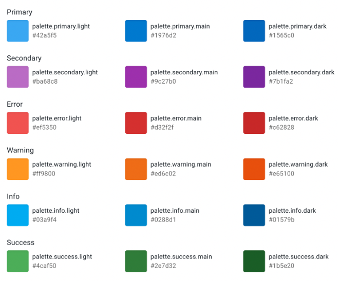
<AccessAlarmsTwoToneIcon color="warning" />참고한 글
아래 글에서 사용된 <StylesProvider>는 공식문서를 살펴보면 legacy로 남아있음을 알 수 있다.
React에서 Material-UI + styled-components 조합 사용하기
stackoverflow 글처럼 이제는 <StyledEngineProvider>가 사용되는 것을 알 수 있음
material ui 'new' v5.0.0 injectFirst fails to set specificity


진짜 갓민주님 최고,,,,