구현 과정
최근 개인 프로젝트에서 좋아요 기능이 필요했다.
그래서 인스타그램처럼 사진을 두번 클릭하거나 하트 아이콘을 누르면 하트가 떴다가 사라지는 효과를 구현했고, 이를 정리해보려 한다.
간단한 기능 구현이지만 만들면서 만약 내가 SNS를 만든다면..? 하는 질문을 해보게 되었고 만약 만든다면 '필름 사진을 공유 플랫폼' 을 만들지 않을까 하는 생각으로.. 엉성하지만 재밌게 개발했다ㅎㅎ
+오늘도 사진은 저작권 필요없는 photo by 나!
화면 구성하기
//App.js
import React from "react";
import { StyleSheet, View, Text, SafeAreaView, ImageBackground } from 'react-native';
import Icon from 'react-native-vector-icons/AntDesign';
function App() {
return (
<SafeAreaView style={styles.container}>
{/* 제목과 좋아요 버튼 */}
<View style={[styles.section, {flex: 1}]}>
<View style={styles.title}>
<Text style={styles.titleText}>The Garden of The Royal Library</Text>
<Icon name="hearto" size={23} color={'#3D3D3D'}></Icon>
</View>
</View>
{/* 사진 */}
<View style={[styles.section, {flex: 6, padding: 15}]}>
<ImageBackground
resizeMode='contain'
source={require('./denmark.jpg')}
style={{
width: '100%',
height: '100%',
}}
/>
<View style={{position: 'absolute'}}>
<Icon name="heart" size={50} color={'white'}></Icon>
</View>
</View>
{/* 설명과 해시태그 */}
<View style={[styles.section, {flex: 2, borderBottomWidth: 0.8}]}>
<View style={{width: '90%', }}>
<View style={styles.user}>
<View style={styles.userimage} />
<Text style={styles.username}> Username </Text>
</View>
<Text style={styles.text}>똑딱이 필름카메라와 함께</Text>
<Text style={styles.text}>덴마크 여행중</Text>
<Text style={styles.tags}>#fuji200 #copenhagen</Text>
</View>
</View>
</SafeAreaView>
);
}
const styles = StyleSheet.create({
container: {
flex: 1,
marginHorizontal: 17,
},
section: {
borderTopWidth: 0.8,
borderColor: 'gray',
justifyContent: 'center',
alignItems: 'center',
},
title: {
width: '90%',
flexDirection: 'row',
justifyContent: 'space-between',
alignItems: 'center',
},
titleText: {
fontSize: 17,
fontFamily: 'SpoqaHanSansNeo-Regular',
},
user: {
flexDirection: 'row',
alignItems: 'center',
marginVertical: 5,
},
userimage: {
width: 32,
height: 32,
borderRadius: 32/2,
backgroundColor: 'black',
marginHorizontal: 5,
},
username: {
fontSize: 15,
fontWeight: '500',
fontFamily: 'SpoqaHanSansNeo-Regular',
},
text: {
fontSize: 15,
marginVertical: 5,
fontFamily: 'SpoqaHanSansNeo-Light',
},
tags: {
fontSize: 15,
color: 'green',
marginVertical: 5,
},
}
);
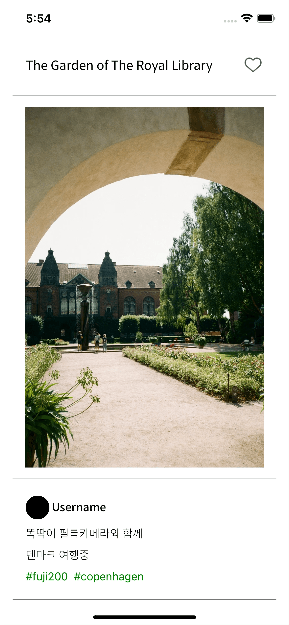
export default App;간단하게 제목, 사진, 설명으로 나눠진 임시 레이아웃을 구성했다.
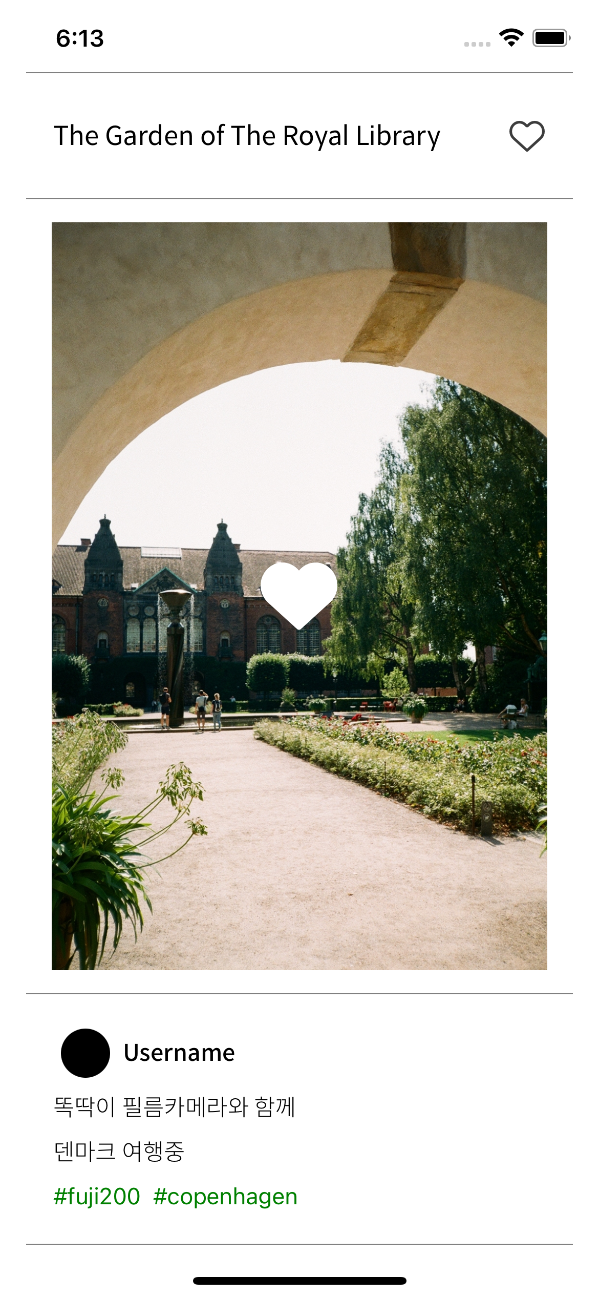
제목 옆의 하트 아이콘을 누르거나 사진을 더블 탭 하면 사진 중간의 하트 아이콘이 서서히 떴다가 사라지는 효과를 구현할 것이다.
Double Tap 구현
우선 사진에다가 더블 탭을 해야 하니,
이미지를 TouchableWithoutFeedback으로 감싸서 터치가 가능하게 만든다.
TouchableWithoutFeedback은 말 그대로 터치를 했을 때 opacity가 바뀌거나 하는 효과를 보여주지 않는 것이다.
...
<TouchableWithoutFeedback
  onPress={handleDoubleTap}
>
  <ImageBackground
    resizeMode='contain'
    source={require('./denmark.jpg')}
    style={{
      width: '100%',
      height: '100%',
    }}
  />
</TouchableWithoutFeedback>
...
이제 사진을 터치하면 handleDoubleTap 이라는 함수를 실행하게 되고 그 안에서 터치가 그냥 터치인지, 더블 탭인지 구별해야 한다.
//App.js
...
  var lastTap = null;

  const handleDoubleTap = () => {
    const now = Date.now();
    const DOUBLE_PRESS_DELAY = 300;
    //두번째 tap이 지난 tap을 한지 0.03초 이내에 이뤄졌을 때 -> Double tap
    if (lastTap && (now - lastTap) < DOUBLE_PRESS_DELAY) {
      toggleHeart();
    }
    else {
      lastTap = now;
    }
  }
  ...
빠르게 두번의 터치가 들어오면(여기선 0.03초 이내) 이를 더블탭으로 인식하게 되고,
하트 Animation을 보여줄 toggleHeart 함수를 실행한다.
//App.js
...
const [heart, setHeart] = useState(false);

const toggleHeart = () => {
    setHeart(previousState => !previousState);
    fillHeart();
  }
...
fillHeart 애니메이션
Animation을 위한 코드 수정
우선 애니메이션 코드를 작성하기 전에 heart의 값이 true이면 채워진 하트를, false면 테두리만 있는 하트 아이콘을 보여주도록 코드를 수정한다.
제목 옆의 하트 아이콘은 클릭 했을 때 Animation을 보여줘야 하니 TouchableOpacity로 감싸서 터치 시 toggleHeart 함수가 실행되게 한다.
//App.js
...
<View style={styles.title}>
  <Text style={styles.titleText}>The Garden of The Royal Library</Text>

  {/* Touchable로 감싸기 */}
  <TouchableOpacity
    onPress={toggleHeart}
    style={{
      width: 25,
      height: 25,
    }}
  >
    {/* heart값에 따른 아이콘 변경 */}
    {heart ? <Icon name="heart" size={23} color={'#3D3D3D'}></Icon> : <Icon name="hearto" size={23} color={'#595959'}></Icon>}
  </TouchableOpacity>
</View>
...
아래의 아이콘은 하트가 보여졌다가 사라지는 효과를 만들고 보여주기 위해,
View를 Animated.View로 변경한 뒤 style에 opacity 값을 추가한다.
//App.js
...
{/* Animated View로 변경, opacity 추가 */}
<Animated.View style={{position: 'absolute', opacity: opacity}}>
  {/* heart값에 따른 아이콘 변경 */}
  {heart ? <Icon name="heart" size={50} color={'white'}></Icon> : <Icon name="hearto" size={50} color={'white'}></Icon>}
</Animated.View>
</View>
...
이제 Animated 함수를 활용해서 하트가 떴다가 사라지는 효과를 구현할 수 있다.
fillHeart Animation 구현하기
//App.js
...
const opacity = useRef(new Animated.Value(0)).current;

const fillHeart = () => {
    Animated.sequence([
      Animated.timing(opacity, {
        toValue: 1,
        duration: 400,
        easing: Easing.quad,
        useNativeDriver: true,
      }),
      Animated.delay(600),
      Animated.timing(opacity, {
        toValue: 0,
        duration: 500,
        useNativeDriver: true,
      }),
    ]).start();
  }
...
이렇게 구현한 하트 애니메이션을 크게 세 가지로 생각할 수 있다.
하트 아이콘이 부드럽게 떠오르고,
잠깐 동안 떠 있다가,
다시 부드럽게 사라진다.
Animated.timing을 사용해 400ms 동안 0이었던 opacity를 1(toValue)로 만들고,
Animated.delay를 사용해 600ms 동안 하트 아이콘을 보여주고,
다시 Animated.timing을 사용해 1이 된 opacity를 다시 0(toValue)로 만들어 하트 이모티콘을 사라지게 만든다.
그리고 마지막으로 Animated.sequence를 사용해 위의 세 애니메이션을 연속적으로 실행한다.
여기서 바뀌는 opacity 값은 아까 추가한 Animated.View의 opacity 값에 바로 반영되게 된다.
끝!
전체 코드 보기👀
//App.js
import React,
{ useRef, useState }
from "react";
import { StyleSheet, View, Text, SafeAreaView, ImageBackground,
        Animated, TouchableWithoutFeedback, TouchableOpacity, Easing,
} from 'react-native';

import Icon from 'react-native-vector-icons/AntDesign';

function App() {

  const [heart, setHeart] = useState(false);
  const opacity = useRef(new Animated.Value(0)).current;

  var lastTap = null;

  const handleDoubleTap = () => {
    const now = Date.now();
    const DOUBLE_PRESS_DELAY = 300;
    //두번째 tap이 지난 tap을 한지 0.03초 이내에 이뤄졌을 때 -> Double tap
    if (lastTap && (now - lastTap) < DOUBLE_PRESS_DELAY) {
      toggleHeart();
    }
    else {
      lastTap = now;
    }
  }

  const toggleHeart = () => {
    setHeart(previousState => !previousState);
    fillHeart();
  }

  const fillHeart = () => {
    Animated.sequence([
      Animated.timing(opacity, {
        toValue: 1,
        duration: 400,
        easing: Easing.quad,
        useNativeDriver: true,
      }),
      Animated.delay(600),
      Animated.timing(opacity, {
        toValue: 0,
        duration: 500,
        useNativeDriver: true,
      }),
    ]).start();
  }

  return (
    <SafeAreaView style={styles.container}>
      <View style={[styles.section, {flex: 1}]}>
        <View style={styles.title}>
          <Text style={styles.titleText}>The Garden of The Royal Library</Text>
          <TouchableOpacity
            onPress={toggleHeart}
            style={{
              width: 25,
              height: 25,
            }}
          >
            {heart ? <Icon name="heart" size={23} color={'#3D3D3D'}></Icon> : <Icon name="hearto" size={23} color={'#595959'}></Icon>}
          </TouchableOpacity>
        </View>
      </View>
      <View style={[styles.section, {flex: 6, padding: 15}]}>
        <TouchableWithoutFeedback
          onPress={handleDoubleTap}
        >
          <ImageBackground
            resizeMode='contain'
            source={require('./denmark.jpg')}
            style={{
              width: '100%',
              height: '100%',
            }}
          />
        </TouchableWithoutFeedback>
        {/* Animated로 변경, opacity 값 */}
        <Animated.View style={{position: 'absolute', opacity: opacity}}>
          {heart ? <Icon name="heart" size={50} color={'white'}></Icon> : <Icon name="hearto" size={50} color={'white'}></Icon>}
        </Animated.View>
      </View>
      <View style={[styles.section, {flex: 2, borderBottomWidth: 0.8}]}>
        <View style={{width: '90%', }}>
          <View style={styles.user}>
            <View style={styles.userimage} />
            <Text style={styles.username}> Username </Text>
          </View>
          <Text style={styles.text}>똑딱이 필름카메라와 함께</Text>
          <Text style={styles.text}>덴마크 여행중</Text>
          <Text style={styles.tags}>#fuji200  #copenhagen</Text>
        </View>
      </View>
    </SafeAreaView>
  );

}

const styles = StyleSheet.create({
  container: {
    flex: 1,
    marginHorizontal: 17,
  },
  section: {
    borderTopWidth: 0.8,
    borderColor: 'gray',
    justifyContent: 'center',
    alignItems: 'center',
  },
  title: {
    width: '90%',
    flexDirection: 'row',
    justifyContent: 'space-between',
    alignItems: 'center',
  },
  titleText: {
    fontSize: 17,
    fontFamily: 'SpoqaHanSansNeo-Regular',
  },

  user: {
    flexDirection: 'row',
    alignItems: 'center',
    marginVertical: 5,
  },
  userimage: {
    width: 32,
    height: 32,
    borderRadius: 32/2,
    backgroundColor: 'black',
    marginHorizontal: 5,
  },
  username: {
    fontSize: 15,
    fontWeight: '500',
    fontFamily: 'SpoqaHanSansNeo-Regular',
  },
  text: {
      fontSize: 15,
      marginVertical: 5,
      fontFamily: 'SpoqaHanSansNeo-Light',
  },
  tags: {
    fontSize: 15,
    color: 'green',
    marginVertical: 5,
  },
}
);

export default App;