삶의 만족도 분석 프로젝트 — 2024년 한국인의 삶 파악하기 (KOWEPS)
"사람들의 삶은 무엇에 의해 달라질까?" 데이터로 확인해보고 싶어서 시작한 프로젝트.
데이터 소개
한국복지패널조사(KOWEPS) 데이터를 사용했다. 한국보건사회연구원과 서울대학교 사회복지연구소가 공동 구축한 설문 데이터로, 개인·가구 단위의 사회·경제·건강·노동·복지 상태를 장기간 추적한다. 삶의 만족도, 소득, 학력, 결혼 상태, 건강 인식 등 주관·객관 지표를 모두 포함하고 있어 삶의 질을 다각도로 분석하기에 적합하다.
전체 분석 흐름
크게 두 파트로 구성했다.
EDA — 질문 기반 탐색
1. 학력에 따른 임금
2. 결혼 여부에 따른 삶의 만족도
3. 인터넷 사용시간과 우울감
4. 음주 습관과 건강상태
5. 대학 전공(인문/공학)별 연령에 따른 직업만족도
ML — 예측으로 확장
- 삶의 만족도(satisfaction)를 타깃으로 선형회귀(해석 중심)와 랜덤포레스트(비선형 반영) 비교
패키지 설치 및 데이터 불러오기
# pip install pyreadstat

import pandas as pd
import numpy as np
import seaborn as sns

raw_welfare = pd.read_spss('koweps_hpc19_2024_beta1.sav')
welfare = raw_welfare.copy()
EDA
1. 학력에 따른 임금, 얼마나 차이날까?
welfare1 = welfare.rename(columns={
    'p1907_3aq1': 'educated',
    'p1902_8aq1': 'income'
})

# 결측/이상치 처리
welfare1['educated'] = np.where(welfare1['educated'] == 9, np.nan, welfare1['educated'])
welfare1 = welfare1.dropna(subset=['educated'])

welfare1['income'] = np.where(welfare1['income'] == 9999, np.nan, welfare1['income'])
welfare1 = welfare1.dropna(subset=['income'])

# 학력별 평균 임금
educated_income = welfare1.groupby('educated', as_index=False).agg(
    mean_income=('income', 'mean')
)plt.figure(figsize=(12, 6))
index = np.arange(5)
sns.barplot(
data=educated_income,
x='educated',
y='mean_income',
hue='educated',
legend=False
)
plt.xlabel('최종 학력')
plt.ylabel('평균 임금(단위: 만원)')
plt.title('최종 학력별 평균 임금')
plt.xticks(index, ['중학교 졸업 이하', '고등학교 중퇴·졸업', '전문대학 재학·졸업', '대학교(4년제) 재학·졸업', '대학원 이상'])
plt.xticks(rotation=40)
plt.grid(axis='y', linestyle='--', alpha=0.5)
plt.show()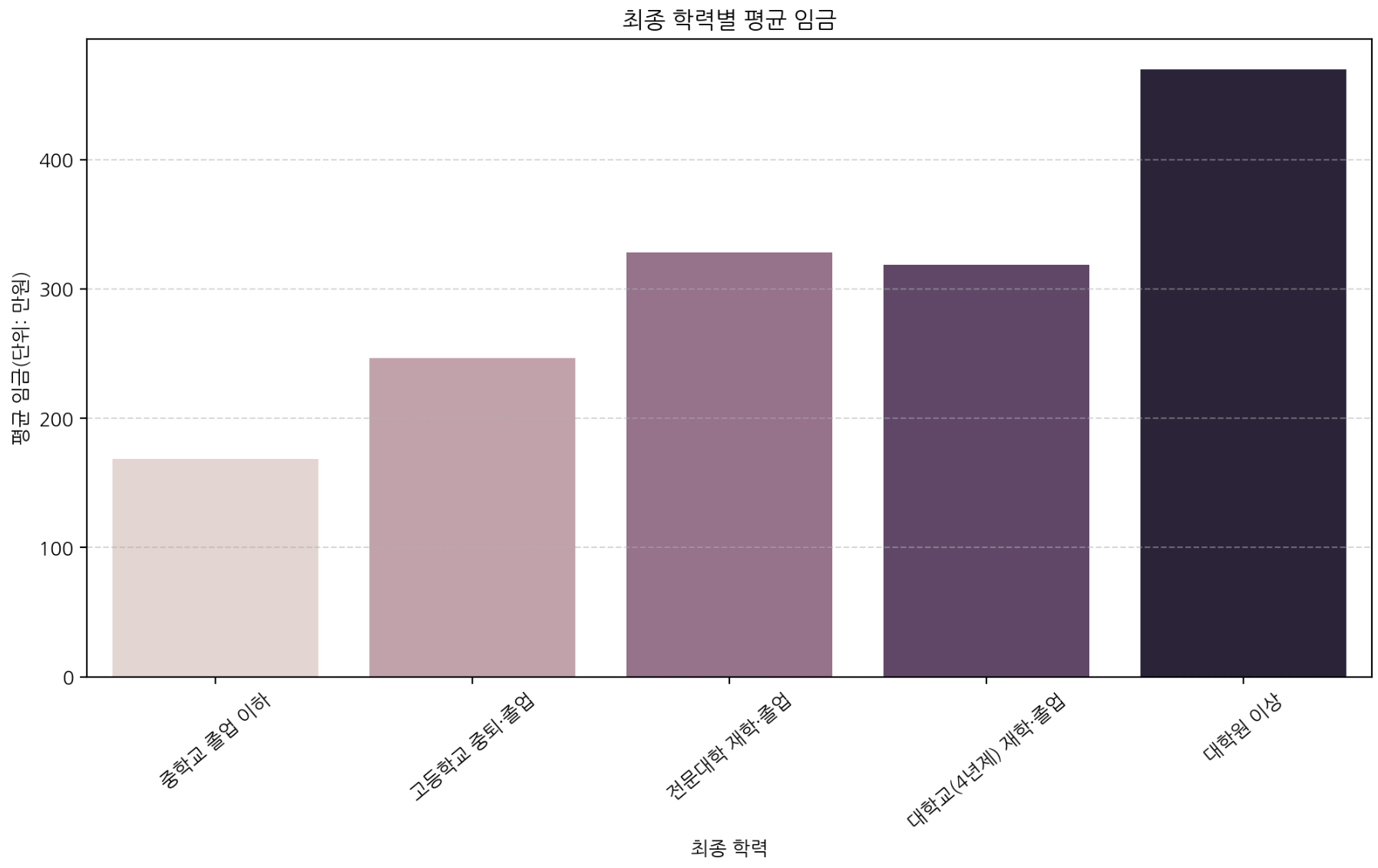
학력이 높아질수록 평균 임금이 전반적으로 증가하며, 특히 대학원 이상에서 상승 폭이 두드러진다. 학력은 노동시장 기회와 직무 숙련도와 연결되며 임금과 양(+)의 관계를 보인다.
2. 결혼 여부가 삶의 만족도에 미치는 영향
welfare2 = welfare.rename(columns={
    'h19_g10': 'marriage_type',
    'p1903_12': 'satisfaction'
})

welfare2['marriage'] = np.where(welfare2['marriage_type'] == 1, '결혼', '미혼/비혼 등')
welfare2 = welfare2.dropna(subset=['satisfaction'])

marriage_satisfaction = welfare2.groupby('marriage', as_index=False).agg(
    mean_satisfaction=('satisfaction', 'mean')
)plt.figure(figsize=(12, 6))
sns.barplot(
data=marriage_satisfaction,
x='marriage',
y='mean_satisfaction',
hue='marriage'
)
plt.title('결혼 상태별 평균 삶 만족도', fontsize=16)
plt.xlabel('결혼 상태', fontsize=13)
plt.ylabel('평균 삶 만족도', fontsize=13)
plt.grid(axis='y', linestyle='--', alpha=0.5)
plt.show()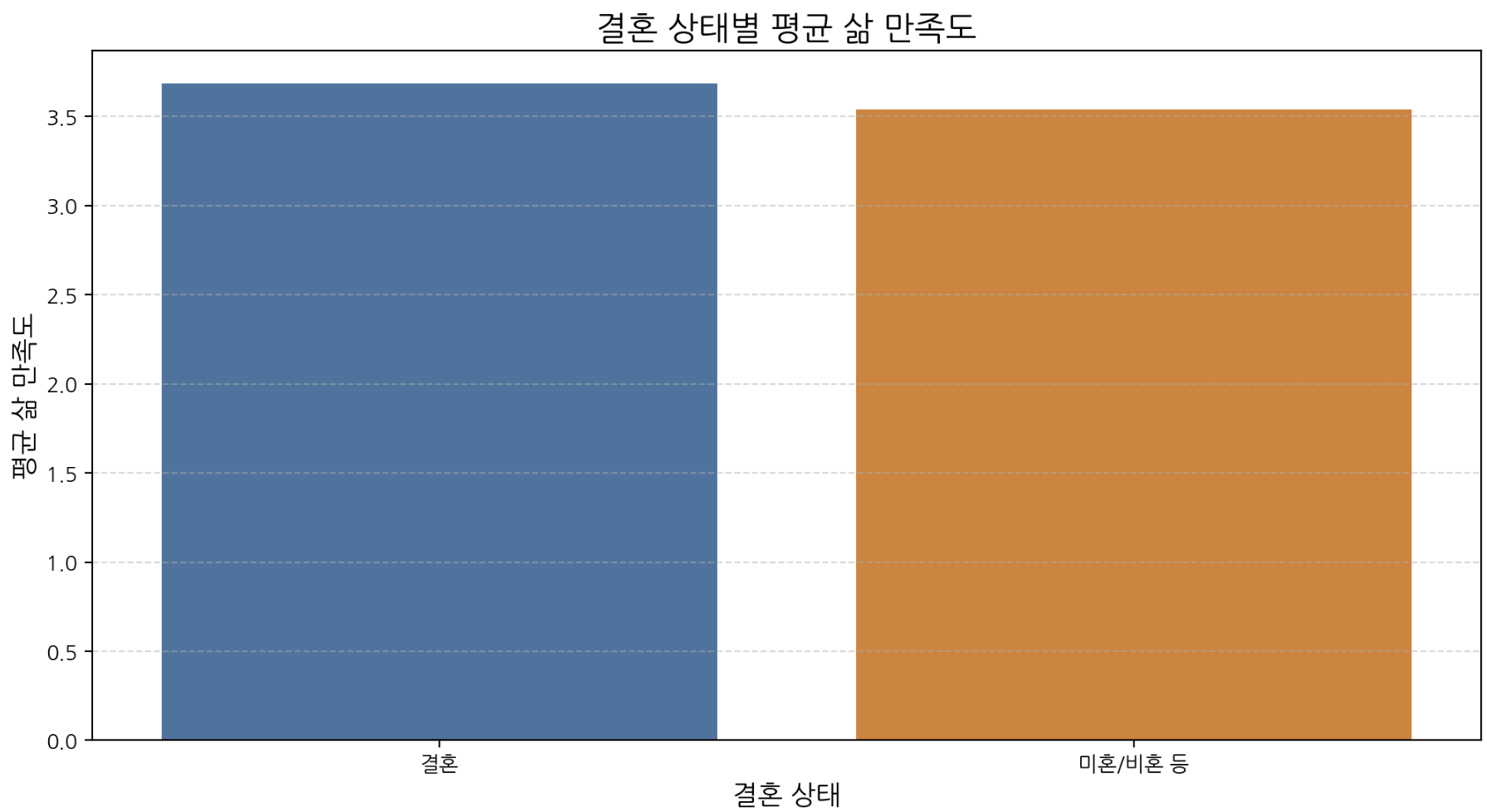
결혼 집단의 평균 만족도가 약간 더 높지만 격차가 크지 않아 결혼 여부만으로 만족도를 설명하긴 어렵다. 만족도는 경제·건강·관계 등 복합 요인의 영향을 받는다.
3. 인터넷 사용 시간과 우울감의 관계
welfare3 = welfare.rename(columns={
    'c1905_19': 'internet_time',
    'c1902_25': 'depression'
})

welfare3['internet_time'] = np.where(welfare3['internet_time'] == 999, np.nan, welfare3['internet_time'])
welfare3 = welfare3.dropna(subset=['internet_time'])

# 사용시간 그룹화
welfare3['grp'] = np.where(
    welfare3['internet_time'] == 0, 0,
    np.where(
        (welfare3['internet_time'] >= 1) & (welfare3['internet_time'] <= 60), 1,
        np.where(
            (welfare3['internet_time'] >= 61) & (welfare3['internet_time'] <= 180), 2,
            3
        )
    )
)

internet_depression = welfare3.groupby('grp', as_index=False).agg(
    mean_depression=('depression', 'mean')
)plt.figure(figsize=(12, 6))
index = np.arange(4)
sns.barplot(
data=internet_depression,
x='grp',
y='mean_depression',
hue='grp',
legend=False,
errorbar=None
)
plt.title('인터넷 사용 시간 그룹별 평균 우울감', fontsize=16)
plt.xlabel('일일 평균 인터넷 사용 시간', fontsize=13)
plt.ylabel('평균 우울감 수준(1: 전혀 아니다 ~ 3: 자주 그렇다)', fontsize=13)
plt.xticks(index, ['0분', '1-60분', '61-180분', '180분 초과'])
plt.ylim(0, 1.3)
plt.grid(axis='y', linestyle='--', alpha=0.2)
plt.show()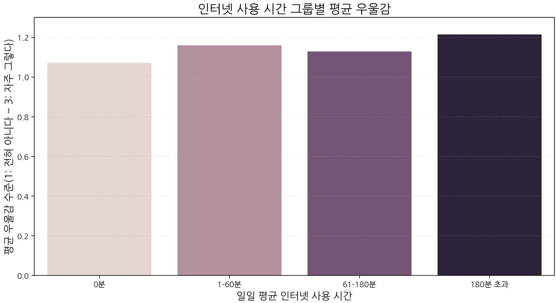
장시간 사용(180분 초과) 그룹에서 평균 우울감이 가장 높게 나타난다. 과도한 인터넷 사용이 사회적 고립이나 수면 패턴 교란 등과 연관될 가능성을 시사한다.
4. 음주 습관과 건강 상태의 관계
welfare4 = welfare.rename(columns={
    'p1905_2': 'drinking',
    'h19_med2': 'health'
})

welfare4['drinking'] = np.where(welfare4['drinking'] == 9, np.nan, welfare4['drinking'])
welfare4 = welfare4.dropna(subset=['drinking'])

welfare4['health'] = np.where(welfare4['health'] == 9, np.nan, welfare4['health'])
welfare4 = welfare4.dropna(subset=['health'])

drinking_health = welfare4.groupby('drinking', as_index=False).agg(
    mean_health=('health', 'mean')
)plt.figure(figsize=(12, 6))
sns.barplot(
data=drinking_health,
x='drinking',
y='mean_health',
hue='drinking',
errorbar=None,
legend=False
)
index = np.arange(len(drinking_health))
plt.title('음주 빈도별 평균 건강 상태', fontsize=16)
plt.xlabel('1년간 평균 음주 빈도', fontsize=13)
plt.ylabel('평균 건강 상태(1: 매우 좋다 ~ 5: 매우 나쁘다)', fontsize=13)
plt.xticks(index, ['전혀 마시지 않는다', '월 1회 이하', '월 2~4회', '주 2~3회', '주 4회 이상'])
plt.xticks(rotation=40)
plt.grid(axis='y', linestyle='--', alpha=0.5)
plt.show()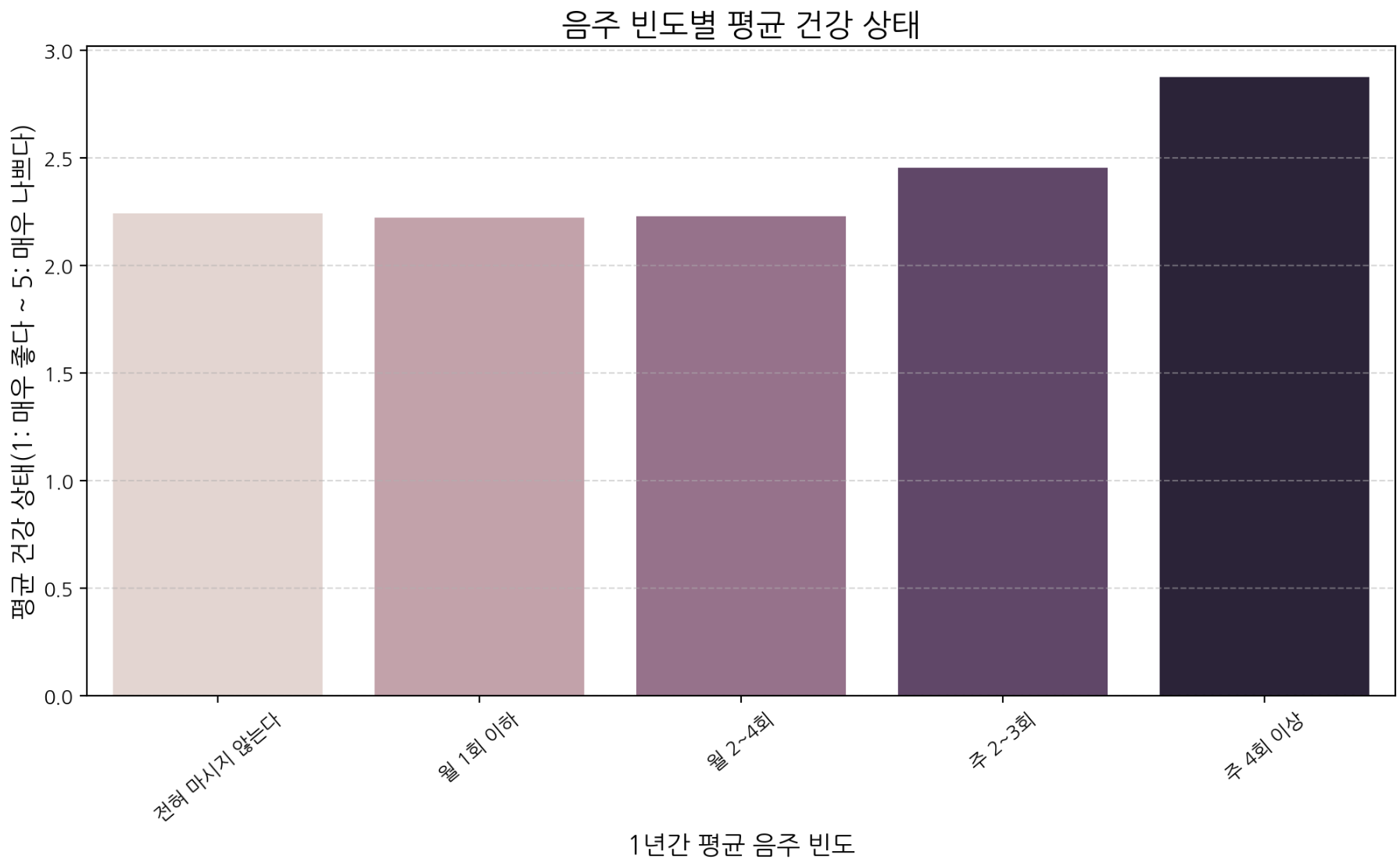
음주 빈도가 높아질수록 건강 상태 점수(나쁨)가 증가하는 경향이 있으며, 주 4회 이상 음주 집단에서 건강 상태가 가장 나쁘게 나타난다. 고빈도 음주는 건강 악화와 연관될 가능성이 크다.
5. 대학 전공(인문/공학)별 연령에 따른 직업만족도
welfare6 = welfare.rename(columns={
    'p1903_9': 'job_satisfaction',
    'p1907_3aq5': 'major',
    'h19_g4': 'birth'
})

welfare6['job_satisfaction'] = np.where(welfare6['job_satisfaction'] == 9, np.nan, welfare6['job_satisfaction'])
welfare6 = welfare6.dropna(subset=['job_satisfaction'])

welfare6 = welfare6.assign(age=2014 - welfare6['birth'] + 1)

welfare6['major'] = np.where(welfare6['major'] == 99, np.nan, welfare6['major'])
welfare6 = welfare6.dropna(subset=['major'])

# 인문(1) / 공학(6)만 추출
target = welfare6[(welfare6['major'] == 1) | (welfare6['major'] == 6)]
grouped = target.groupby(['major', 'age'])['job_satisfaction'].mean().reset_index()

hum = grouped[grouped['major'] == 1]
eng = grouped[grouped['major'] == 6]plt.figure(figsize=(18, 6))
ax1 = plt.subplot(1, 2, 1)
ax1.plot(hum['age'], hum['job_satisfaction'], color='steelblue', label='Humanities')
ax1.set_title('연령별 직업만족도 (인문계열)')
ax1.set_xlabel('연령')
ax1.set_ylabel('직업만족도 평균')
ax1.set_ylim(0, 5)
ax1.grid(True, alpha=0.3)
ax1.legend()
ax2 = plt.subplot(1, 2, 2)
ax2.plot(eng['age'], eng['job_satisfaction'], color='salmon', label='Engineering')
ax2.set_title('연령별 직업만족도 (공학계열)')
ax2.set_xlabel('연령')
ax2.set_ylabel('직업만족도 평균')
ax2.set_ylim(0, 5)
ax2.grid(True, alpha=0.3)
ax2.legend()
plt.tight_layout()
plt.show()인문계열은 20대 초반 만족도가 높지만 30대 이후 변동과 하락이 비교적 크게 나타난다. 공학계열은 전반적으로 4점 근처에서 안정적인 패턴을 보인다. 직업 구조와 수요 안정성 차이가 만족도 패턴에 영향을 줄 가능성을 시사한다.
ML — 삶의 만족도 예측 (Regression)
EDA를 통해 변수 간 관계를 살펴본 뒤, "그럼 이 변수들로 만족도를 예측할 수 있을까?"라는 질문으로 확장했다.
변수 정리 및 전처리
df = welfare.rename(columns={
    'p1903_9': 'job_satisfaction',
    'h19_g10': 'marriage_type',
    'h19_med2': 'health',
    'p1902_8aq1': 'income',
    'p1907_3aq1': 'educated',
    'p1903_12': 'satisfaction'
})

df['job_satisfaction'] = np.where(df['job_satisfaction'] == 9, np.nan, df['job_satisfaction'])
df['health'] = np.where(df['health'] == 9, np.nan, df['health'])
df['income'] = np.where(df['income'] == 9999, np.nan, df['income'])

df['marriage'] = np.where(df['marriage_type'] == 1, '결혼', '미혼/비혼 등')

df = df[['job_satisfaction', 'marriage', 'health', 'income', 'educated', 'satisfaction']]

df_new = pd.get_dummies(df, columns=['marriage'], drop_first=False)
df_new = df_new.dropna()
모델 1 — 선형회귀 (Linear Regression)
변수 영향 방향과 크기를 해석 가능한 baseline 모델로 선택했다.
from sklearn.model_selection import train_test_split
from sklearn.linear_model import LinearRegression
from sklearn.metrics import mean_squared_error, r2_score

X = df_new.drop('satisfaction', axis=1)
y = df_new['satisfaction']

X_train, X_test, y_train, y_test = train_test_split(X, y, test_size=0.2, random_state=42)

lr = LinearRegression(fit_intercept=False)
lr.fit(X, y)

y_pred = lr.predict(X_test)

rmse = np.sqrt(mean_squared_error(y_test, y_pred))
r2 = r2_score(y_test, y_pred)

print(f"RMSE: {rmse:.3f}")
print(f"R²: {r2:.3f}")

coef_df = pd.DataFrame({
    'variable': X.columns,
    'coefficient': lr.coef_
}).sort_values(by='coefficient', ascending=False)plt.figure(figsize=(6, 6))
plt.scatter(y_test, y_pred, alpha=0.5)
plt.plot([y_test.min(), y_test.max()], [y_test.min(), y_test.max()], linestyle='--')
plt.xlabel('Actual Satisfaction')
plt.ylabel('Predicted Satisfaction')
plt.title('Actual vs Predicted (Linear Regression)')
plt.show()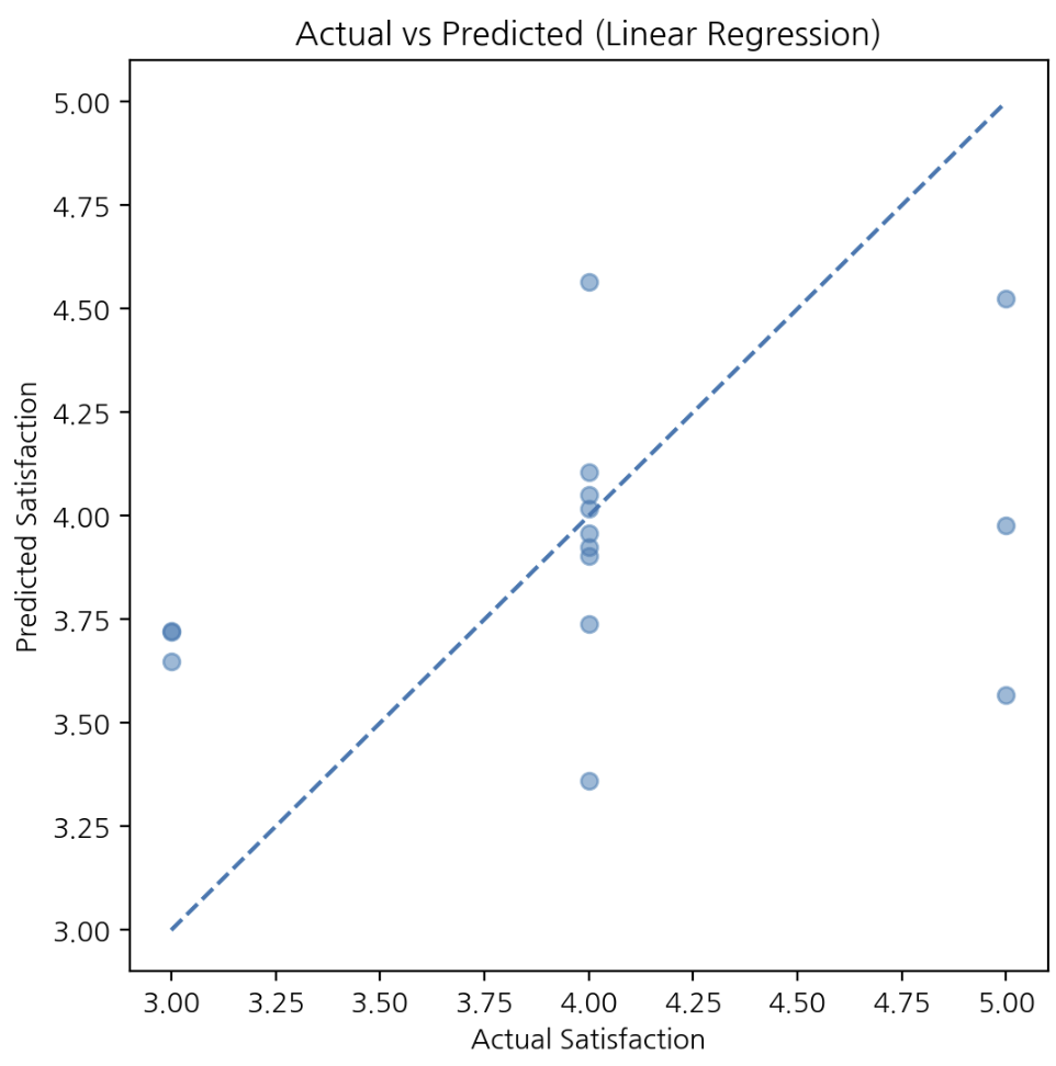
만족도가 평균 근처에 몰린 분포를 반영해 예측값이 평균으로 수렴하는 경향이 있다. 전체 구조 파악에는 유리하지만 극단값 구분에는 한계가 있다.
모델 2 — 랜덤포레스트 (Random Forest)
비선형 관계와 변수 상호작용을 반영하기 위해 선택했다.
from sklearn.ensemble import RandomForestRegressor

X_train, X_test, y_train, y_test = train_test_split(X, y, test_size=0.2, random_state=42)

rf = RandomForestRegressor(n_estimators=300, random_state=42)
rf.fit(X_train, y_train)

y_pred_rf = rf.predict(X_test)

rmse_rf = np.sqrt(mean_squared_error(y_test, y_pred_rf))
r2_rf = r2_score(y_test, y_pred_rf)

print(f"RF RMSE: {rmse_rf:.3f}")
print(f"RF R²: {r2_rf:.3f}")

importance_df = pd.DataFrame({
    'variable': X.columns,
    'importance': rf.feature_importances_
}).sort_values(by='importance', ascending=False)plt.figure(figsize=(6, 6))
plt.scatter(y_test, y_pred_rf, alpha=0.5)
plt.plot([y_test.min(), y_test.max()], [y_test.min(), y_test.max()], linestyle='--')
plt.xlabel('Actual Satisfaction')
plt.ylabel('Predicted Satisfaction')
plt.title('Actual vs Predicted (Random Forest)')
plt.show()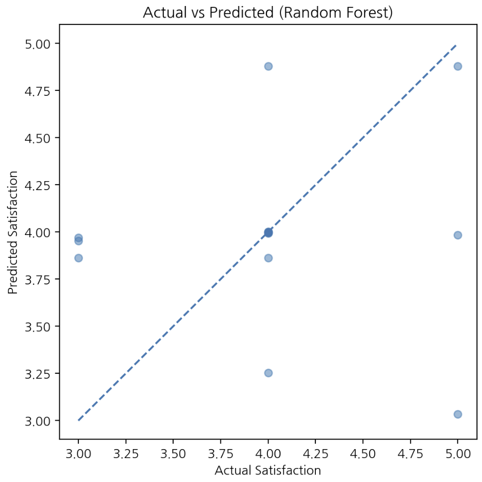
선형회귀보다 예측 분산이 크고 조건 조합에 따라 더 다양한 예측을 시도한다. 비선형 관계와 상호작용을 반영하지만 일부 구간 변동성이 커질 수 있다.
모델 비교
| 모델 | 특징 | 역할 |
|---|---|---|
| 선형회귀 | 계수 해석 가능, 평균 수렴 경향 | 구조 파악 baseline |
| 랜덤포레스트 | 비선형 관계 반영, 예측 분산 큼 | 보완적 검증 |
결론 및 느낀 점
한국인의 삶이라는 현실적인 주제를 데이터로 들여다보며, EDA로 관계를 탐색하고 ML로 예측까지 확장해본 경험이었다. 가장 크게 느낀 점은 만족도는 단일 변수로 설명되지 않는다는 것이다. 사회·경제·건강 요인의 복합적인 상호작용이 크게 작용한다.
이번 프로젝트를 통해 데이터 분석과 간단한 예측 모델링을 직접 경험해보면서, 다른 도메인의 데이터에도 머신러닝을 적용해보고 싶다는 생각이 들었다. 앞으로는 다양한 도메인의 데이터를 다루며 문제를 정의하고, 그에 맞는 모델을 선택하고 비교하는 방식으로 분석 범위를 점차 넓혀가고자 한다.