웹사이트 기본 구조
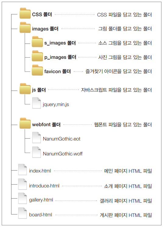
폴더 및 파일 생성
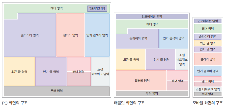
메인페이지와 서브페이지 기본 구조
- 메인페이지( index.html )
<!DOCTYPE html>
<html lang="en">
  <head>
    <meta charset="UTF-8" />
    <meta http-equiv="X-UA-Compatible" content="IE=edge" />
    <meta
      name="viewport"
      content="width=device-width, initial-scale=1.0, minimum-scale=1, maximum-scale=1, user-scalable=no"
    />
    <title>FLAT DESIGN</title>
    <link rel="stylesheet" type="text/css" href="" />
    <link rel="stylesheet" type="text/css" href="" />
    <link rel="chorcut icon" href="images/favicon/favicon.ico" />
    <link
      rel="apple-touch-icon-precomposed"
      href="images/favicon/flat=design-touch.png"
    />
    <script src="js/query.min.js"></script>
  </head>
  <body></body>
</html>- 서브 페이지
<!DOCTYPE html>
<html lang="en">
  <head>
    <meta charset="UTF-8" />
    <meta http-equiv="X-UA-Compatible" content="IE=edge" />
    <meta
      name="viewport"
      content="width=device-width, initial-scale=1.0, minimum-scale=1, maximum-scale=1, user-scalable=no"
    />
    <title>FLAT DESIGN-소개</title>
    <link rel="stylesheet" type="text/css" href="" />
    <link rel="stylesheet" type="text/css" href="" />
    <link rel="stylesheet" href="images/favicon/favicon.ico" />
    <link rel="stylesheet" href="images/favicon/flat-design-touch.png" />
    <script src="js/jquery.min.js" ></script>
  </head>
  <body>
      <div id="wrap">
  </body>
</html>
css초기화하기 + 웹폰트 속성 추가
- reset.css
@charset utf-8;
/* CSS 초기화 */
html, body, div, span, object, iframe, h1, h2, h3, h4, h5, h6, p, blockquote, pre, abbr, address, cite, code, del, dfn, em, img, ins, kbd, q, samp, small, strong, sub, sup, var, b, i, dl, dt, dd, ol, ul, li, fieldset, form, label, legend, table, caption, tbody, tfoot, thead, tr, th, td, article, aside, canvas, details, figcaption, figure,
footer, header, hgroup, menu, nav, section, summary, time, mark, audio, video{
margin:0;
padding:0;
border:0;
font-size:100%;
vertical-align:baseline;
background:transparent;
}
body{
font-family:NanumGothic,나눔고딕,'Nanum Gothic','맑은 고딕',HelveticaNeue,DroidSans,Sans-serif,Helvetica;
background:url(../images/s_images/body_bg.png);
line-height:1;
}
article,aside,details,figcaption,figure,footer,header,hgroup,menu,nav,section{
display:block;
}
nav ul, li{
list-style:none;
}
a{
margin:0;
padding:0;
font-size:100%;
text-decoration:none;
vertical-align:baseline;
color:#fff;
background:transparent;
}
img{
vertical-align:top;
}
table{
border-collapse:collapse;
border-spacing:0;
}
input{
margin:0;
padding:0;
box-sizing:content-box;
vertical-align:top;
appearance:none;
border:1px solid #e65d5d;
color:#e65d5d;
border-radius:0;
font-family:NanumGothic,나눔고딕,'Nanum Gothic','맑은 고딕',HelveticaNeue,DroidSans,Sans-serif,Helvetica;
}
input::-moz-input-placeholder{
color:#e65d5d;
}
input::-webkit-input-placeholder {
color:#e65d5d;
}
/* 웹폰트 CSS */
@font-face{font-family:'Nanum Gothic'; src:url(webfont/NanumGothic.eot)}
@font-face{font-family:'Nanum Gothic'; src:url(webfont/NanumGothic.woff)}
미디어 쿼리 작성하기
- 반응형 웹을 제작시 주의사항
- 모바일용 미디어 쿼리는 별도로 작성하지 않은 상태로
- 모바일용에 적용될 구조 css 코드와
- 모든 해상도에서 공통적으로 적용될 css코드를 함께 작성
- 기기별로 구분 주석문을 작성
- 기기의 크기 대신 '문제가 될 수 있는 해상도 크기'를 고려
(대개 모바일 320px, 태블릿용 768px, pc용 960px 혹은 1024px)
<style>
      /* 모바일용 css*/

      /* 태블릿용 css*/
      @media all and (min-width: 768px) {
      }

      /* pc용 css*/
      @media all and (min-width: 960px) {
      }
</style>- 메인 페이지& 서브페이지 기본틀 작성
    <style>
      /* 모바일용 css*/
      /* 기본 CSS*/
      #wrap {
        display: flex;
        flex-flow: column nowrap;
        width: 80%;
        margin: 0 auto;
        max-width: 1200px;
      }
      #wrap section {
        box-sizing: border-box; /*선값과 패딩값을 너비값에 포함*/
      }
      /* 태블릿용 css*/
      @media all and (min-width: 768px) {
        /* 기본 CSS*/
        #wrap {
          display: flex;
          flex-flow: row wrap;
        }
      }

      /* pc용 css*/
      @media all and (min-width: 960px) {
        #wrap {
          position: relative;
          width: 90%;
        }
      }
    </style>
개발자지망생