스타일링
자바스크립트를 통해서 스타일링 가능
인라인 스타일링
- 컴포넌트에 직접 스타일을 입력하는 방식
- 객체 형태로 전달
- 어떤 스타일이 적용되는지 잘 보인다
- 비슷한 코드가 반복될 수 있다
import React from 'react'
import { View, Text } from 'react-native';

const App = () => {
    return (
        <View
            style={{
                flex: 1,
                backgroundColor: '#fff',
                alignItems: 'center',
                justifyContent: 'center',
            }}
        >
            <Text
                style={{
                    padding: 10,
                    fontSize: 26,
                    fontWeight: '600',
                    color: 'black',
                }}
            >
                React Native
            </Text>
        </View>
    )
}

export default App
클래스 스타일링
- 컴포넌트의 태그에 직접 입력 x
- 스타일시트에 스타일을 정의하고 정의된 스타일을 사용
import React from 'react'
import { StyleSheet, View, Text } from 'react-native';

const App = () => {
    return (
        <View style={styles.container}>
            <Text style={styles.text}>React Native</Text>
        </View>
    )
}

const styles = StyleSheet.create({
    container: {
        flex: 1,
        backgroundColor: '#fff',
        alignItems: 'center',
        justifyContent: 'center',
    },
    text: {
        padding: 10,
        fontSize: 26,
        fontWeight: '600',
        color: 'black'
    }
})
export default App
여러 개의 스타일 적용
- 여러 개의 스타일을 적용할 때는 배열을 사용
- 뒤에 오는 스타일의 우선 순위가 더 높음
- 인라인 스타일과 클래스 스타일 같이 사용 가능
import React from 'react'
import { StyleSheet, View, Text } from 'react-native';
5
const App = () => {
    return (
        <View style={styles.container}>
            <Text style={styles.text}>React Native</Text>
            <Text style={[styles.text, styles.error]}>Error</Text>
        </View>
    )
}

const styles = StyleSheet.create({
    container: {
        flex: 1,
        backgroundColor: '#fff',
        alignItems: 'center',
        justifyContent: 'center',
    },
    text: {
        padding: 10,
        fontSize: 26,
        fontWeight: '600',
        color: 'black'
    },
    error: {
        fontWeight: '400',
        color: 'red'
    }
})
export default App
외부 스타일 이용하기
- 외부 파일에 스타일 작성
- 여러 개의 파일에서 스타일을 공통으로 사용 가능
import React from 'react'
import { View, Text } from 'react-native';
import { viewStyle, textStyle } from './style';
5
const App = () => {
    return (
        <View style={viewStyle.container}>
            <Text style={textStyle.text}>React Native</Text>
            <Text style={textStyle.error}>Error</Text>
        </View>
    )
}

export default App
// style.js
import { StyleSheet } from 'react-native';
export const viewStyle = StyleSheet.create({
container: {
flex: 1,
backgroundColor: '#fff',
alignItems: 'center',
justifyContent: 'center',
},
});
export const textStyle = StyleSheet.create({
text: {
padding: 10,
fontSize: 26,
fontWeight: '600',
color: 'black',
},
error: {
fontWeight: '400',
color: 'red',
},
});리액트 네이티브 스타일
flex와 범위
- flex가 0일 때: 설정된 width와 height값에 따라 크기 결정
- flex가 양수일 때: flex값에 비례하여 크기 조정됨
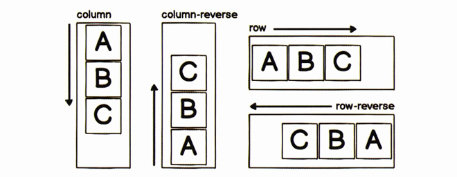
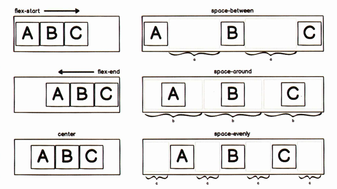
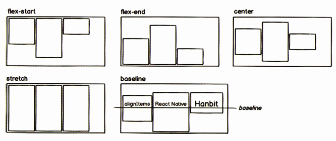
정렬
flexDirection
justifyContent
alignItems
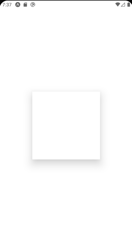
그림자
iOS에만 적용되는 속성
- shadowColor: 그림자 색상
- shadowOffset: width와 height값을 지정해서 그림자 거리 설정
- shadowOpacity: 그림자의 불투명도 설정
- shadowRadius: 그림자의 흐림 반경 설정
안드로이드
- elevation 속성
Platform
Platform 모듈을 사용하면 각 플랫폼마다 다른 코드가 적용되도록 코드 작성 가능
import React from 'react';
import { StyleSheet, View, Platform } from 'react-native';

export default () => {
    return <View style={styles.shadow}></View>;
};

const styles = StyleSheet.create({
    shadow: {
        backgroundColor: '#fff',
        width: 200,
        height: 200,
        ...Platform.select({
        ios: {
            shadowColor: '#000',
            shadowOffset: {
                width: 10,
                height: 10
            },
            shadowOpacity: 0.5,
            shadowRadius: 10,
        },
        android: {
            elevation: 20,
            },
        }),
    },
});
스타일드 컴포넌트
- 자바스크립트 파일 안에 스타일을 작성하는 CSS-in-JS 라이브러리
// 설치
npm install styled-components
import React from 'react'
import Button from './components/Button'
import styled from 'styled-components/native'
const Container = styled.View`
flex: 1;
background-color: #ffffff;
align-items: center;
justify-content: center;
`
const App = () => {
return (
<Container>
<Button title="Hanbit"/>
<Button title="React Native"/>
</Container>
)
}
export default App// Button.js
import React from 'react'
import styled from 'styled-components/native'
const ButtonContainer = styled.TouchableOpacity`
background-color: #9b59b6;
border-radius: 15px;
padding: 15px 40px;
margin: 10px 0px;
justify-content: center;
`
const Title = styled.Text`
font-size: 20px;
font-weight: 600;
color: #fff;
`
const Button = props => {
return (
<ButtonContainer>
<Title>{props.title}</Title>
</ButtonContainer>
)
}
export default Button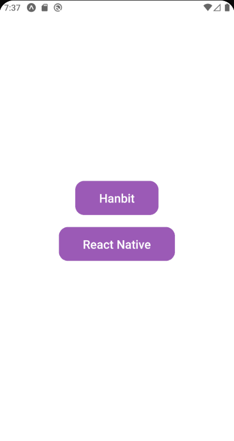
props 사용하기
- 스타일 컴포넌트에서는 백틱 안에서 props에 접근 가능
import React from 'react'
import styled from 'styled-components/native'

const ButtonContainer = styled.TouchableOpacity`
    background-color: ${props =>
        props.title === 'Hanbit' ? '#3498db' : '#9b59b6'};
    border-radius: 15px;
    padding: 15px 40px;
    margin: 10px 0px;
    justify-content: center;
`

const Title = styled.Text`
    font-size: 20px;
    font-weight: 600;
    color: #fff;
`

const Button = props => {
    return (
        <ButtonContainer title={props.title}>
            <Title>{props.title}</Title>
        </ButtonContainer>
    )
}

export default Button

export default Button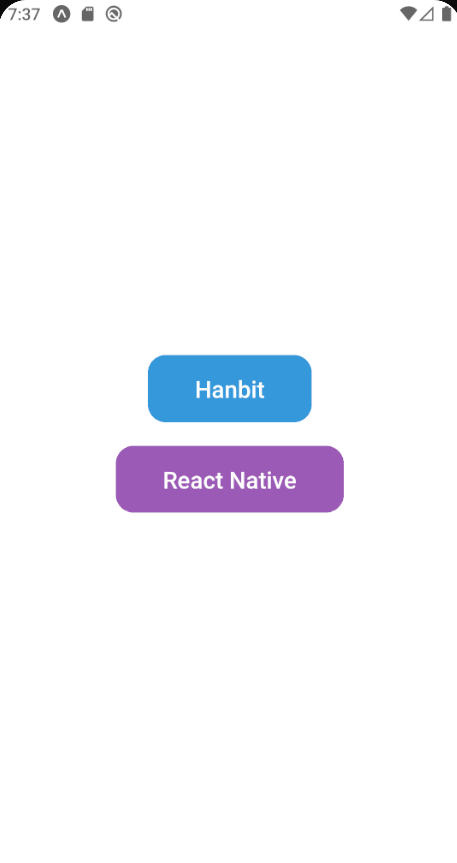
attrs 사용하기
- props의 값에 따라 컴포넌트의 속성을 다르게 적용 가능
import React from 'react'
import styled from 'styled-components/native'

const StyledInput = styled.TextInput`
    width: 200px;
    height: 60px;
    margin: 5px;
    padding: 10px;
    border-radius: 10px;
    border: 2px;
    border-color: #3498db;
    font-size: 24px;
`

const Input = () => {
    return <StyledInput placeholder="Enter a text..." placeholderTextColor="#3498db"/>;
}

export default Input
위의 코드를 아래처럼 변경해서 사용할 수 있다
import React from 'react'
import styled from 'styled-components/native'

const StyledInput = styled.TextInput.attrs(props => ({
    placeholder: 'Enter a text...',
    placeholderTextColor: props.borderColor,
}))`
    width: 200px;
    height: 60px;
    margin: 5px;
    padding: 10px;
    border-radius: 10px;
    border: 2px;
    border-color: ${props => props.borderColor};
    font-size: 24px;
`

const Input = props => {
    return <StyledInput borderColor={props.borderColor} />;
}

export default Input
import React from 'react'
import Button from './components/Button'
import styled from 'styled-components/native'
import Input from './components/Input';

const Container = styled.View`
    flex: 1;
    background-color: #ffffff;
    align-items: center;
    justify-content: center;
`

const App = () => {
    return (
        <Container>
            <Button title="Hanbit"/>
            <Button title="React Native"/>
            <Input borderColor="#3498db"/>
            <Input borderColor="#9b59b6" />
        </Container>
    )
}

export default App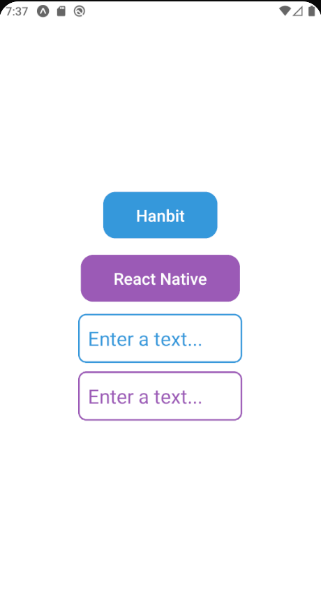
ThemeProvider
- Context API 활용
- 스타일드 컴포넌트 사용할 때 미리 정의한 값을 사용하도록 props로 전달해서 하위 컴포넌트에서도 사용 가능
- 유지보수에 유용
import React, { useState } from 'react'
import Button from './components/Button'
import styled, { ThemeProvider } from 'styled-components/native'
import Input from './components/Input';
import { darkTheme, lightTheme } from './theme';
import { Switch } from 'react-native';

const Container = styled.View`
    flex: 1;
    background-color: ${props => props.theme.background};
    align-items: center;
    justify-content: center;
`

const App = () => {
    const [isDark, setIsDark] = useState(false);
    const _toggleSwitch = () => setIsDark(!isDark);

    return (
        <ThemeProvider theme={isDark ? darkTheme : lightTheme}>
            <Container>
                <Switch value={isDark} onValueChange={_toggleSwitch}/>
                <Button title="Hanbit"/>
                <Button title="React Native"/>
                <Input borderColor="#3498db"/>
                <Input borderColor="#9b59b6" />
            </Container>
        </ThemeProvider>
    )
}

export default App
// theme.js
export const lightTheme = {
background: '#ffffff',
text: '#ffffff',
purple: '#9b59b6',
blue: '#3498db',
};
export const darkTheme = {
background: '#34495e',
text: '#34495e',
purple: '#9b59b6',
blue: '#3498db',
}// Button.js
import React from 'react'
import styled from 'styled-components/native'
const ButtonContainer = styled.TouchableOpacity`
background-color: ${props =>
props.title === 'Hanbit' ? props.theme.blue : props.theme.purple};
border-radius: 15px;
padding: 15px 40px;
margin: 10px 0px;
justify-content: center;
`
const Title = styled.Text`
font-size: 20px;
font-weight: 600;
color: ${props => props.theme.text};
`
const Button = props => {
return (
<ButtonContainer title={props.title}>
<Title>{props.title}</Title>
</ButtonContainer>
)
}
export default Button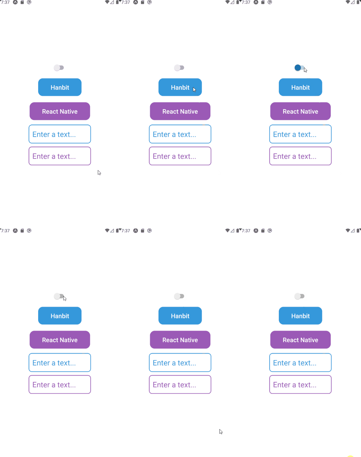
참고
처음 배우는 리액트 네이티브