파이어베이스
- 인증, 데이터베이스 등의 기능을 제공하는 개발 플랫폼
- 장점: 서버와 데이터베이스 구축 없이 개발 가능
https://console.firebase.google.com/
// 설치
npm install firebase
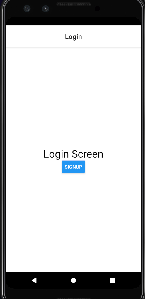
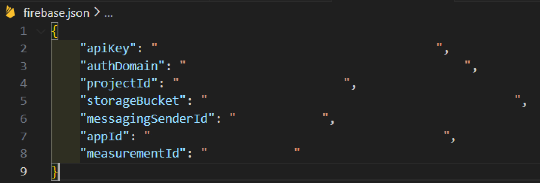
내 앱을 추가하면 아래 사진처럼 파이어베이스를 사용하기 위한 설정값을 얻을 수 있다
이 값들은 노출되면 안 되기 때문에 .gitignore 파일에 firebase.json을 추가한다
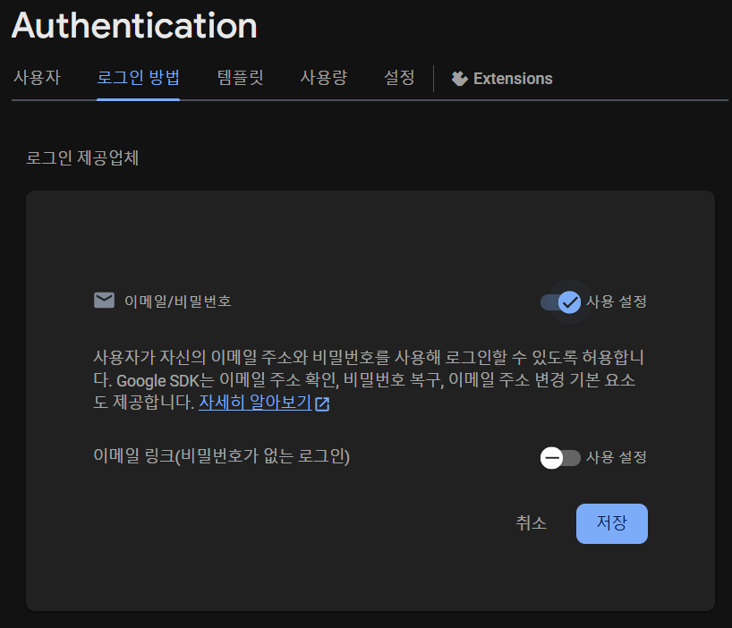
인증
이메일/비밀번호를 통해서 인증하는 기능을 만들 것이다
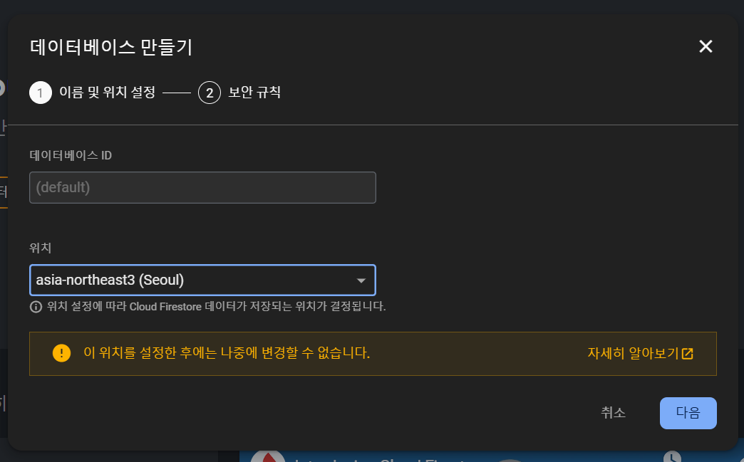
데이터베이스
생성되는 채널과 각 채널에서 발생하는 메시지를 관리할 것이다
- 파이어스토어 (Cloud Firestore)
- 실시간 데이터베이스 (Realtime Database)
데이터베이스는 두 가지가 있고 파이어스토어를 사용할 것이다
스토리지
서버 코드 없이 사용자의 사진, 동영상 등을 저장할 수 있다 (유료 서비스이다)
라이브러리
// 설치
npx expo install firebase
// src/utils/firebase.js
import * as firebase from 'firebase';
import config from '../../firebase.json';
const app = firebase.initializeApp(config);앱 아이콘과 로딩 화면
로딩 상태 관리해주는 컴포넌트 설치
npx expo install expo-app-loadingexpo-asset 설치: 이미지 로딩할 때 사용
npx expo install expo-assetexpo-font 설치: 폰트
npx expo install expo-font이미지와 폰트가 다 불러와진 상태에서 화면이 렌더링되도록 코드 구현
// src/App.js

import React, { useState } from 'react'
import { StatusBar, Image } from 'react-native'
import { Asset } from 'expo-asset'
import * as Font from 'expo-font'
import { ThemeProvider } from 'styled-components/native'
import { theme } from './theme'
import { Text } from 'react-native'
import AppLoading from 'expo-app-loading'

const cacheImages = images => {
    return images.map(image => {
        if (typeof image === 'string') {
            return Image.prefetch(image);
        } else {
            return Asset.fromModule(image).downloadAsync();
        }
    })
}

const cacheFonts = fonts => {
    return fonts.map(font => Font.loadAsync(font));
}

const App = () => {
    const [isReady, setIsReady] = useState(false);
    const _loadAssets = async () => {
        const imageAssets = cacheImages([require('../assets/splash-icon.png')]);
        const fontAssets = cacheFonts([]);
        await Promise.all([...imageAssets, ...fontAssets]);
    }

    return isReady ? (
        <ThemeProvider theme={theme}>
            <StatusBar barStyle="dark-content" />
        </ThemeProvider>
    ) : (
        <AppLoading
            startAsync={_loadAssets} // AppLoading 동작할 동안 실행
            onFinish={() => setIsReady(true)} // startAsync가 완료되면 실행
            onError={console.warn} // 오류 발생하면 실행
        />
    )
}

export default App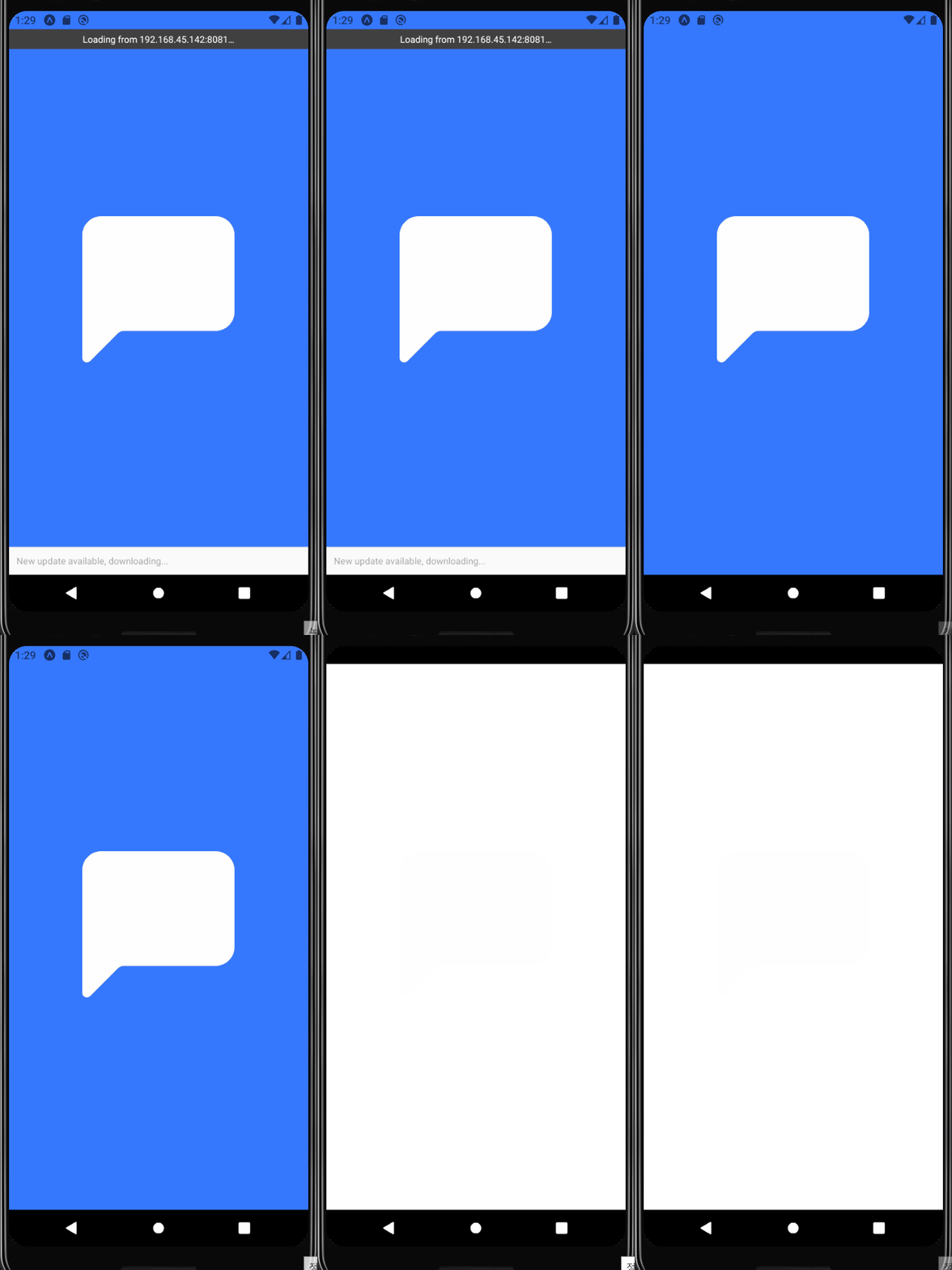
실행은 잘 되는데 콘솔에 경고 문구가 뜬다
(NOBRIDGE) WARN expo-app-loading is deprecated in favor of expo-splash-screen: use SplashScreen.preventAutoHideAsync() and SplashScreen.hideAsync() instead. https://docs.expo.dev/versions/latest/sdk/splash-screen/ [Component Stack]
expo-app-loading를 더 이상 지원하지 않기 때문에 expo-splash-screen를 사용해서 다시 구현해본다
npm install expo-splash-screenSplashScreen.preventAutoHideAsync(): 스플래시 화면을 자동으로 숨기지 않게 설정SplashScreen.hideAsync(): 원하는 시점에 스프래시 화면 숨기기
import React, { useState } from 'react'
import { StatusBar, Image } from 'react-native'
import { Asset } from 'expo-asset'
import * as Font from 'expo-font'
import { ThemeProvider } from 'styled-components/native'
import { theme } from './theme'
import SplashScreen from 'expo-splash-screen' // 변경됨

const cacheImages = images => {
    return images.map(image => {
        if (typeof image === 'string') {
            return Image.prefetch(image);
        } else {
            return Asset.fromModule(image).downloadAsync();
        }
    })
}

const cacheFonts = fonts => {
    return fonts.map(font => Font.loadAsync(font));
}

const App = () => {
    const [isReady, setIsReady] = useState(false);
    const _loadAssets = async () => {
        await SplashScreen.preventAutoHideAsync();
        const imageAssets = cacheImages([require('../assets/splash-icon.png')]);
        const fontAssets = cacheFonts([]);
        await Promise.all([...imageAssets, ...fontAssets]);

        setIsReady(true);
        await SplashScreen.hideAsync()
    }

    useEffect(() => {
        _loadAssets();
    })

    return isReady ? (
        <ThemeProvider theme={theme}>
            <StatusBar barStyle="dark-content" />
        </ThemeProvider>
    ) : null;
}

export default App
인증 화면
내비게이션
로그인 화면
// src/screens/Login.js

import React from 'react'
import styled from 'styled-components'
import { Button, Text } from 'react-native/native'

const Container = styled.View`
    flex: 1;
    justify-content: center;
    align-items: center;
    background-color: ${({theme}) => theme.background};
`

const Login = ({ navigation }) => {
    return (
        <Container>
            <Text style={{ fontSize: 30}}>Login Screen</Text>
            <Button title="Signup" onPress={() => navigation.navigate('Signup')}/>
        </Container>
    )
}

export default Login
회원가입 화면
// src/screens/Signup.js

import React from 'react'
import { Text } from 'react-native'
import styled from 'styled-components/native'

const Container = styled.View`
    flex: 1;
    justify-content: center;
    align-items: center;
    background-color: ${({theme}) => theme.background};
`

const Signup = () => {
    return (
        <Container>
            <Text style={{ fontSize: 30 }}>Signup Screen</Text>
        </Container>
    )
}

export default Signup
내비게이션 파일 (스택 내비게이션)
// src/navigations/AuthStack.js

import React, { useContext } from 'react'
import { createStackNavigator } from '@react-navigation/stack'
import { ThemeContext } from 'styled-components/native'
import { Login, Signup } from '../screens'

const Stack = createStackNavigator();

const AuthStack = () => {
    const theme = useContext(ThemeContext);
    return (
        <Stack.Navigator
            initialRouteName='Login' // 첫 화면은 로그인
            screenOptions={{
                headerTitleAlign: 'center',
                cardStyle: {backgroundColor: theme.background},
            }}
        >
            <Stack.Screen name="Login" component={Login}/>
            <Stack.Screen name="Signup" component={Signup}/>
        </Stack.Navigator>
    )
}

export default AuthStack
// src/navigations/index.js
import React from "react";
import { NavigationContainer } from "@react-navigation/native";
import AuthStack from "./AuthStack";
const Navigation = () => {
return (
<NavigationContainer>
<AuthStack />
</NavigationContainer>
)
}
export default Navigation;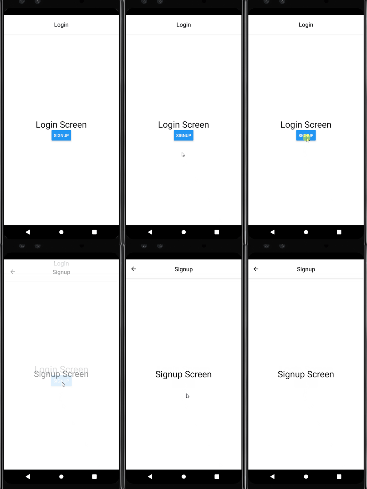
로그인 화면
Image 컴포넌트
import React from 'react'
import styled from 'styled-components/native'
import PropTypes from 'prop-types'
const Container = styled.View`
    align-self: center;
    margin-bottom: 30px;
`

const StyledImage = styled.Image`
    background-color: ${({theme}) => theme.imageBackground};
    width: 100px;
    height: 100px;
`

const Image = ({ imageStyle }) => {
    return (
        <Container>
            <StyledImage source={require('../../assets/splash-icon.png')} style={imageStyle}/>
        </Container>
    )
}

Image.prototype = {
    imageStyle: PropTypes.object,
}

export default Image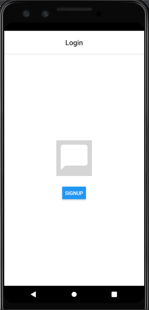
Input 컴포넌트
secureTextEntry: true로 설정하면 TextInput 컴포넌트에 입력된 텍스트를 별표로 대체해서 민감한 정보를 보호할 수 있다
// src/components/Input.js

import React, { useState } from 'react'
import styled from 'styled-components/native'
import PropTypes from 'prop-types'

const Container = styled.View`
    flex-direction: column;
    width: 100%;
    margin: 10px 0;
`

const Label = styled.Text`
    font-size: 14px;
    font-weight: 600;
    margin-bottom: 6px;
    color: ${({theme, isFocused}) => (isFocused ? theme.text : theme.label)};
`

const StyledTextInput = styled.TextInput.attrs(({theme}) => ({
    placeholderTextColor: theme.inputPlaceholder,
}))`
    background-color: ${({theme}) => theme.background};
    color: ${({theme}) => theme.text};
    padding: 20px 10px;
    font-size: 16px;
    border: 1px solid
        ${({theme, isFocused}) => (isFocused ? theme.text : theme.inputBorder)};
    border-radius: 4px;
`

const Input = ({
    label,
    value,
    onChangeText,
    onSubmitEditing,
    onBlur,
    placeholder,
    isPassword,
    returnKeyType,
    maxLength,
}) => {
    const [isFocused, setIsFocused] = useState(false);

    return (
        <Container>
            <Label isFocused={isFocused}>{label}</Label>
            <StyledTextInput
                isFocused={isFocused}
                value={value}
                onChangeText={onChangeText}
                onSubmitEditing={onSubmitEditing}
                onFocus={() => setIsFocused(true)}
                onBlur={() => {
                    setIsFocused(false);
                    onBlur();
                }}
                placeholder={placeholder}
                secureTextEntry={isPassword}
                returnKeyType={returnKeyType}
                maxLength={maxLength}
                autoCapitalize="none"
                autoCorrect={false}
                textContentType="none" // iOS only
                underlineColorAndroid="transparent" // Android only
            />
        </Container>
    )
}

Input.defaultProps = {
    onBlur: () => {},
};

Input.propTypes = {
    label: PropTypes.string.isRequired,
    value: PropTypes.string.isRequired,
    onChangeText: PropTypes.func.isRequired,
    onSubmitEditing: PropTypes.func.isRequired,
    onBlur: PropTypes.func,
    placeholder: PropTypes.string,
    isPassword: PropTypes.bool,
    returnKeyType: PropTypes.oneOf(['done', 'next']),
    maxLength: PropTypes.number,
}

export default Input
// src/screens/Login.js
const Login = ({ navigation }) => {
const [email, setEmail] = useState('');
const [password, setPassword] = useState('');
return (
<Container>
<Image imageStyle={{ borderRadius: 8}} />
<Input
label="Email"
value={email}
onChangeText={text => setEmail(text)}
onSubmitEditing={() => {}}
placeholder="Email"
returnKeyType="next"
/>
<Input
label="Password"
value={password}
onChangeText={text => setPassword(text)}
onSubmitEditing={() => {}}
placeholder="Password"
returnKeyType="done"
isPassword
/>
</Container>
)
}
export default Login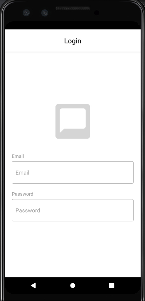
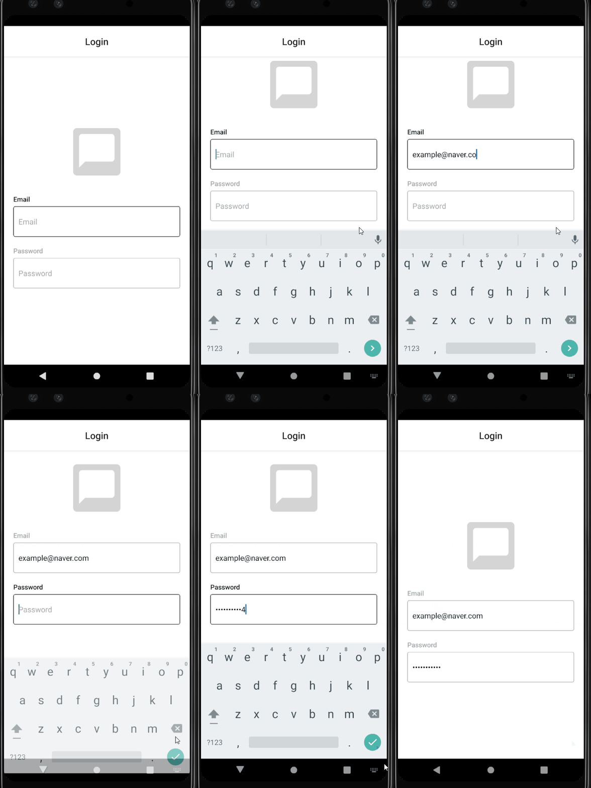
이메일 Input 컴포넌트에서 비밀번호 Input 컴포넌트로 포커스가 이동되게 하기 위해선 useRef를 사용해야 한다
// src/screens/Login.js

const Login = ({ navigation }) => {
    const [email, setEmail] = useState('');
    const [password, setPassword] = useState('');
    const passwordRef = useRef();

    return (
        <Container>
            <Image imageStyle={{ borderRadius: 8}} />
            <Input
                label="Email"
                value={email}
                onChangeText={text => setEmail(text)}
                onSubmitEditing={() => passwordRef.current.focus()}
                placeholder="Email"
                returnKeyType="next"
            />
            <Input
                ref={passwordRef}
                label="Password"
                value={password}
                onChangeText={text => setPassword(text)}
                onSubmitEditing={() => {}}
                placeholder="Password"
                returnKeyType="done"
                isPassword
            />
        </Container>
    )
}
// src/components/Input.js
const Input = forwardRef(
(
{
label,
value,
onChangeText,
onSubmitEditing,
onBlur,
placeholder,
isPassword,
returnKeyType,
maxLength,
},
ref
) => {
const [isFocused, setIsFocused] = useState(false);
return (
<Container>
<Label isFocused={isFocused}>{label}</Label>
<StyledTextInput
ref={ref}
isFocused={isFocused}
value={value}
onChangeText={onChangeText}
onSubmitEditing={onSubmitEditing}
onFocus={() => setIsFocused(true)}
onBlur={() => {
setIsFocused(false);
onBlur();
}}
placeholder={placeholder}
secureTextEntry={isPassword}
returnKeyType={returnKeyType}
maxLength={maxLength}
autoCapitalize="none"
autoCorrect={false}
textContentType="none" // iOS only
underlineColorAndroid="transparent" // Android only
/>
</Container>
)
}
)
키보드 감추기
사용자 편의를 위해 입력 중 다른 곳을 터치하면 키보드를 사라지게 하는 것이 일반적인 애플리케이션의 동작 방식이다
TouchableWithoutFeedback- 클릭에 대해 상호 작용 가능
- 스타일 속성 x
- 반드시 하나의 자식 컴포넌트 필요
Keyboar API- 키보드 상태에 따른 이벤트 등록할 때 많이 사용
- dismiss 함수: 활성화된 키보드 닫는 기능
import { TouchableWithoutFeedback, Keyboard } from 'react-native'

const Login = ({ navigation }) => {

    return (
        <TouchableWithoutFeedback onPress={Keyboard.dismiss}>
            <Container>

     		...

            </Container>
        </TouchableWithoutFeedback>
    )
}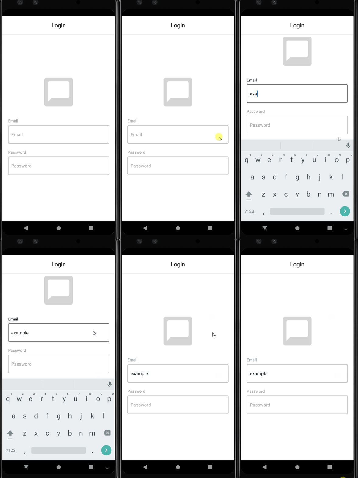
react-native-keyboard-aware-scroll-view 라이브러리를 사용하면 위치에 따라 키보드가 Inuput 컴포넌트를 가리는 문제를 해결할 수 있다
npm install react-native-keyboard-aware-scroll-viewimport { KeyboardAwareScrollView } from 'react-native-keyboard-aware-scroll-view'
const Login = ({ navigation }) => {
return (
<KeyboardAwareScrollView
contentContainerStyle={{flex: 1}}
extraScrollHeight={20}
>
<Container>
...
</Container>
</KeyboardAwareScrollView>
)
}오류 메시지
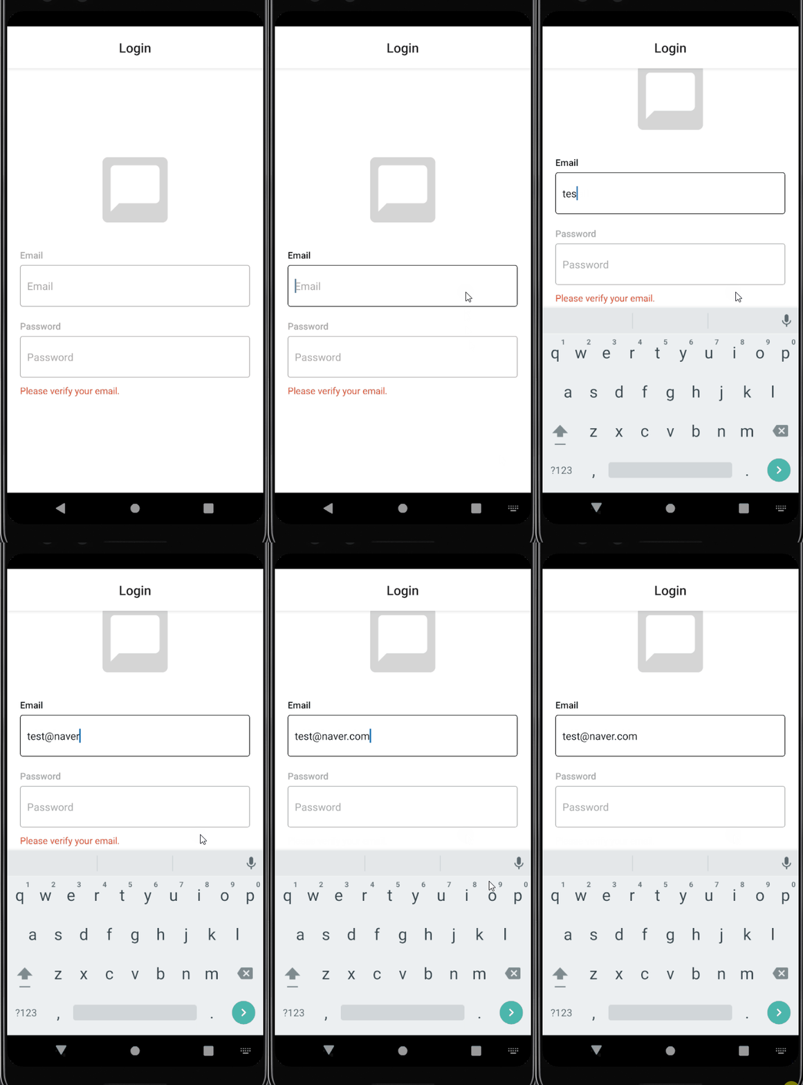
Input 컴포넌트에 잘못된 값이 입력되면 오류 메시지를 보여줄 수 있다
// src/utils/common.js

export const validateEmail = email => {
    const regex = /^[0-9?A-z0-9?]+(\.)?[0-9?A-z0-9?]+@[0-9?A-z]+\.[A-z]{2}.?[A-z]{0,3}$/;
    return regex.test(email);
};

export const removeWhitespace = text => {
    const regex = /\s/g;
    return text.replace(regex, '');
}
validateEmail 함수는 유효한 이메일 형식인지를 확인하고
removeWhitespace 함수는 공백 문자를 빈 문자열로 바꾼다
import { validateEmail, removeWhitespace } from '../utils/common';

const Login = ({ navigation }) => {
    const [email, setEmail] = useState('');
    const [password, setPassword] = useState('');
    const passwordRef = useRef();
    const [errorMessage, setErrorMessage] = useState('');

    const _handleEmailChange = email => {
        const changeEmail = removeWhitespace(email);
        setEmail(changeEmail);
        setErrorMessage(
            validateEmail(changeEmail) ? '' : 'Please verify your email.'
        )
    }
    const _handlePasswordChange = password => {
        setPassword(removeWhitespace(password));
    }
}

export default Login
Button 컴포넌트
이메일과 비밀번호가 올바른 형태로 입력되고 경고 문구가 나타나지 않은 경우에만 버튼이 클릭 가능하도록 한다
// src/components/Button.js

import React from 'react'
import styled from 'styled-components/native'
import PropTypes from 'prop-types'

const TRANSPARENT = 'transparent';

const Container = styled.TouchableOpacity`
    background-color: ${({theme, isFilled}) =>
        isFilled ? theme.buttonBackground : TRANSPARENT};
    align-items: center;
    border-radius: 4px;
    width: 100%;
    padding: 10px;
    opacity: ${({disabled}) => (disabled ? 0.5 : 1)};
`

const Title = styled.Text`
    height: 30px;
    line-height: 30px;
    font-size: 16px;
    color: ${({theme, isFilled}) =>
        isFilled ? theme.buttonTitle : theme.buttonUnfilledTitle};
`

const Button = ({containerStyle, title, onPress, isFilled, disabled}) => {
    return (
        <Container
            style={containerStyle}
            onPress={onPress}
            isFilled={isFilled}
            disabled={disabled}

        >
            <Title isFilled={isFilled}>{title}</Title>
        </Container>
    )
}

Button.defaultProps = {
    isFilled: true,
}

Button.propTypes = {
    containerStyle: PropTypes.object,
    title: PropTypes.string,
    onPress: PropTypes.func.isRequired,
    isFilled: PropTypes.bool,
    disabled: PropTypes.bool,
}

export default Button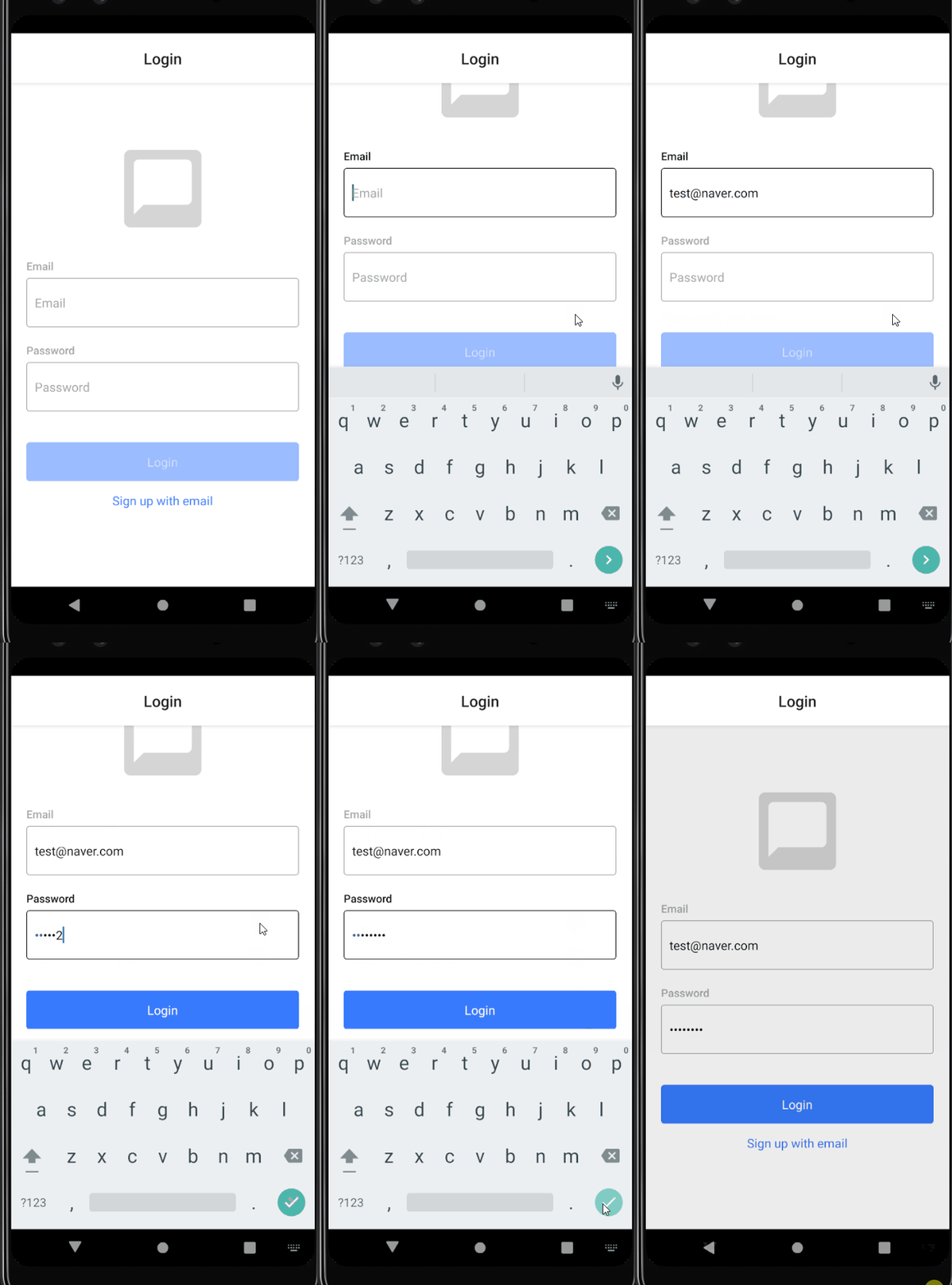
헤더 수정하기
불필요한 헤더는 나타나지 않게 설정한다
<Stack.Screen name="Login" component={Login} options={{headerShown: false}}/>노치 디자인 대응
SafeAreaView컴포넌트 사용하기- react-native-safe-area-context 라이브러리의 useSafeArealnsets Hook 사용하기 -> padding으로 해결 가능
import { useSafeAreaInsets } from 'react-native-safe-area-context'

const Container = styled.View`
    padding: 0 20px;
    padding-top: ${({ insets: {top} }) => top}px;
    padding-bottom: ${({ insets: {bottom} }) => bottom}px;
`

const Login = ({ navigation }) => {
    const inserts = useSafeAreaInsets();

    return (
        <KeyboardAwareScrollView>
            <Container inserts={inserts}>
			...
            </Container>
        </KeyboardAwareScrollView>
    )
}
회원가입 화면
// src/screens/Signup.js

import React, { useEffect, useRef, useState } from 'react'
import styled from 'styled-components/native'
import { Image, Input, Button } from '../components'
import { KeyboardAwareScrollView } from 'react-native-keyboard-aware-scroll-view'
import { validateEmail, removeWhitespace } from '../utils/common';

const Container = styled.View`
    flex: 1;
    justify-content: center;
    align-items: center;
    background-color: ${({theme}) => theme.background};
    padding: 0 20px;
`
const ErrorText = styled.Text`
    align-items: flex-start;
    width: 100%;
    height: 20px;
    margin-bottom: 10px;
    line-height: 20px;
    color: ${({theme}) => theme.errorText};
`

const Signup = () => {
    const [name, setName] = useState('');
    const [email, setEmail] = useState('');
    const [password, setPassword] = useState('');
    const [passwordConfirm, setPasswordConfirm] = useState('');
    const [errorMessage, setErrorMessage] = useState('');
    const [disabled, setDisabled] = useState(true);

    const emailRef = useRef();
    const passwordRef = useRef();
    const passwordConfirmRef = useRef();

    useEffect(() => {
        let _errorMessage = '';
        if (!name) {
            _errorMessage = 'Please enter your name';
        } else if (!validateEmail(email)) {
            _errorMessage = 'Please verify your email';
        } else if (password.length < 6) {
            _errorMessage = 'The password must contain 6 characters at least';
        } else if (password !== passwordConfirm) {
            _errorMessage = 'Passwords need to match';
        } else {
            _errorMessage = '';
        }
        setErrorMessage(_errorMessage);
    }, [name, email, password, passwordConfirm]);

    useEffect(() => {
        setDisabled(
            !(name && email && password && passwordConfirm && !errorMessage)
        );
    }, [name, email, password, passwordConfirm, errorMessage])

    const _handleSignupButtonPress = () => {};

    return (
        <KeyboardAwareScrollView
            contentContainerStyle={{flex: 1}}
            extraScrollHeight={20}
        >
            <Container>
                <Image rounded/>
                <Input
                    label="Name"
                    value={name}
                    onChangeText={text => setName(text)}
                    onSubmitEditing={() => {
                        setName(name.trim());
                        emailRef.current.focus();
                    }}
                    onBlur={() => setName(name.trim())}
                    placeholder="Name"
                    returnKeyType="next"
                />
                <Input
                    ref={emailRef}
                    label="Email"
                    value={email}
                    onChangeText={text => setEmail(removeWhitespace(text))}
                    onSubmitEditing={() => passwordRef.current.focus()}
                    placeholder="Email"
                    returnKeyType="next"
                />
                <Input
                    ref={passwordConfirmRef}
                    label="Password Confirm"
                    value={passwordConfirm}
                    onChangeText={text => setPasswordConfirm(removeWhitespace(text))}
                    onSubmitEditing={_handleSignupButtonPress}
                    placeholder="Password"
                    returnKeyType="done"
                    isPassword
                />
                <ErrorText>{errorMessage}</ErrorText>
                <Button
                    title="Signup"
                    onPress={_handleSignupButtonPress}
                    disabled={disabled}
                />
            </Container>
        </KeyboardAwareScrollView>
    )
}

export default Signup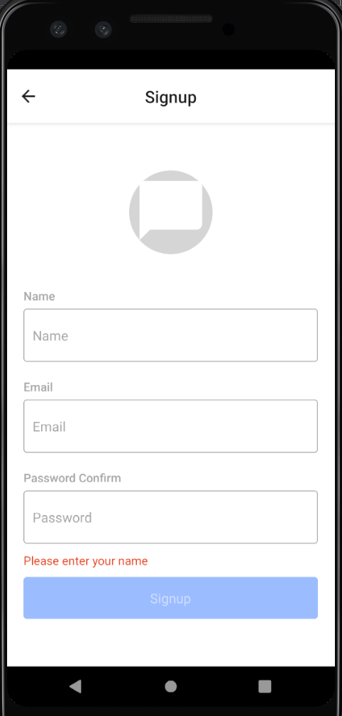
오류 메시지
회원가입 화면이 처음 렌더링될 때는 오류 메시지가 나타나지 않도록 해야 한다
const didMountRef = useRef();

useEffect(() => {
    if (didMountRef.current) {
        let _errorMessage = '';
        if (!name) {
            _errorMessage = 'Please enter your name';
        } else if (!validateEmail(email)) {
            _errorMessage = 'Please verify your email';
        } else if (password.length < 6) {
            _errorMessage = 'The password must contain 6 characters at least';
        } else if (password !== passwordConfirm) {
            _errorMessage = 'Passwords need to match';
        } else {
            _errorMessage = '';
        }
        setErrorMessage(_errorMessage);
    } else {
        didMountRef.current=true;
    }
}, [name, email, password, passwordConfirm]);
따라서 useRef 함수를 이용해서 didMountRef에 어떤 값도 대입하지 않았다가 컴포넌트가 마운트되었을 때 didMountRefdp 값을 대입하도록한다
사진 입력받기
expo-image-picker 라이브러리를 사용하면 사진첩 접근 기능 구현이 가능하다
npx expo install expo-image-pickerexpo-permissions 패키지는 이제 expo-image-picker를 통해 권한 처리를 하기 때문에 사용하지 않는다
mediaType: 조회하는 자료의 타입allowEditing: 이미지 선택 후 편집 단계 진행 여부aspect: 안드로이드 전용 옵션으로 이미지 편집 시 사각형의 비율([x,y])quality: 0~1 사이의 값을 받으며 압축 품질을 미
// src/components/image.js

import React, { useEffect } from 'react'
...

useEffect(() => {
    (async () => {
        try {
            if (Platform.OS === 'ios') {
                const {status} = await ImagePicker.requestMediaLibraryPermissionsAsync();
                if (status !== 'granted') {
                    Alert.alert(
                        'Photo Permission',
                        'Please turn on the camera roll permissions'
                    )
                }
            }
        } catch(e) {
            Alert.alert('Photo Permission Error', e.message)
        }
    })();
},[]);

const _handleEditButton = async () => {
    try {
        const result = await ImagePicker.launchImageLibraryAsync({
            mediaTypes: ImagePicker.MediaTypeOptions.Images,
            allowsEditing: true,
            aspect: [1,1],
            quality: 1,
        })
        if (!result.canceled) {
            onChangeImage(result.url);
        }
    } catch (e) {
            Alert.alert('Photo Error', e.message);
    }
}
로그인과 회원가입
로그인
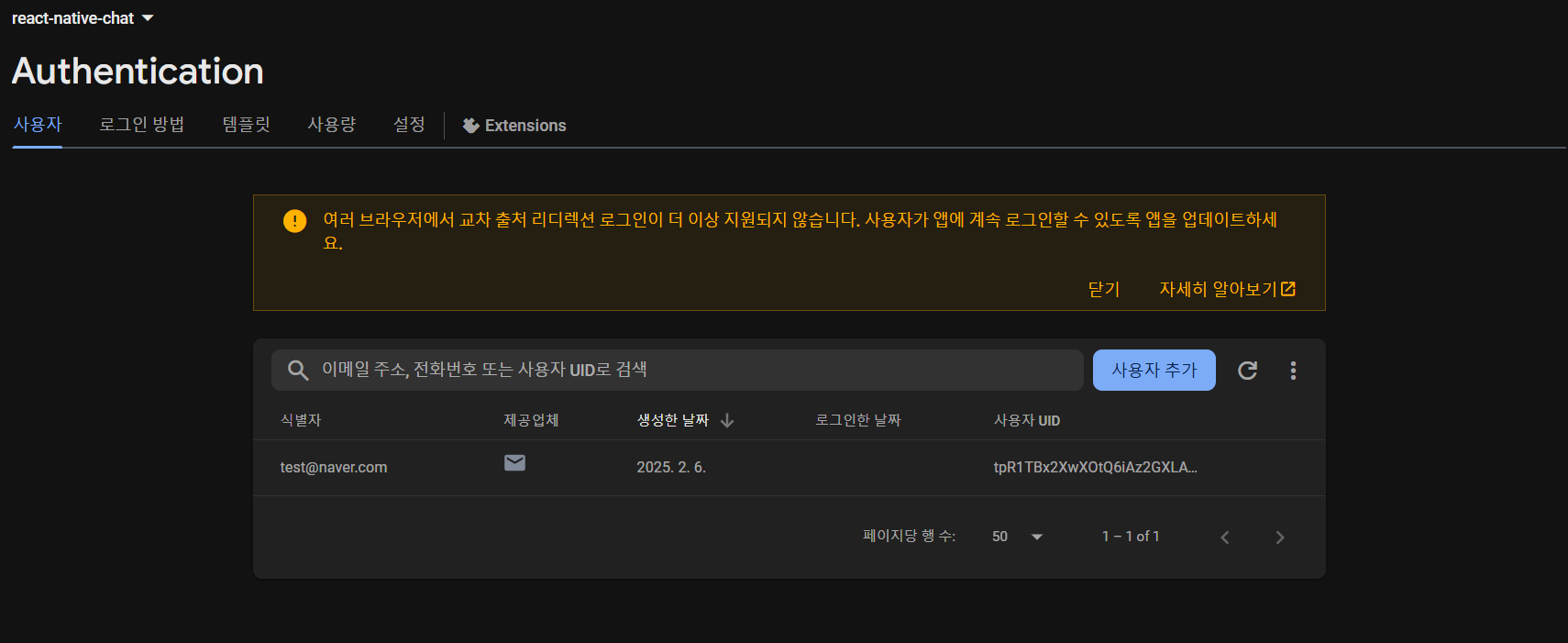
파이어베이서 콘솔에서 사용자 추가가 가능하다
signWithEmailAndPassword: 이메일과 비밀번호를 이용해서 인증받는 함수
// src/utils/firebase.js

import * as firebase from 'firebase/app';
import config from '../../firebase.json';
import { getAuth, signInWithEmailAndPassword } from 'firebase/auth';

const app = firebase.initializeApp(config);

const Auth = getAuth();

export const login = async({email, password}) => {
    const { user } = await signInWithEmailAndPassword(Auth, email, password);
    return user;
}
회원가입
export const signup = async({email, password}) => {
    const { user } = await createUserWithEmailAndPassword(Auth, email, password);
    return user;
}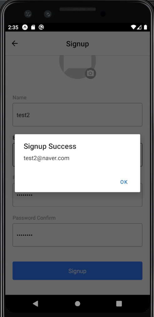
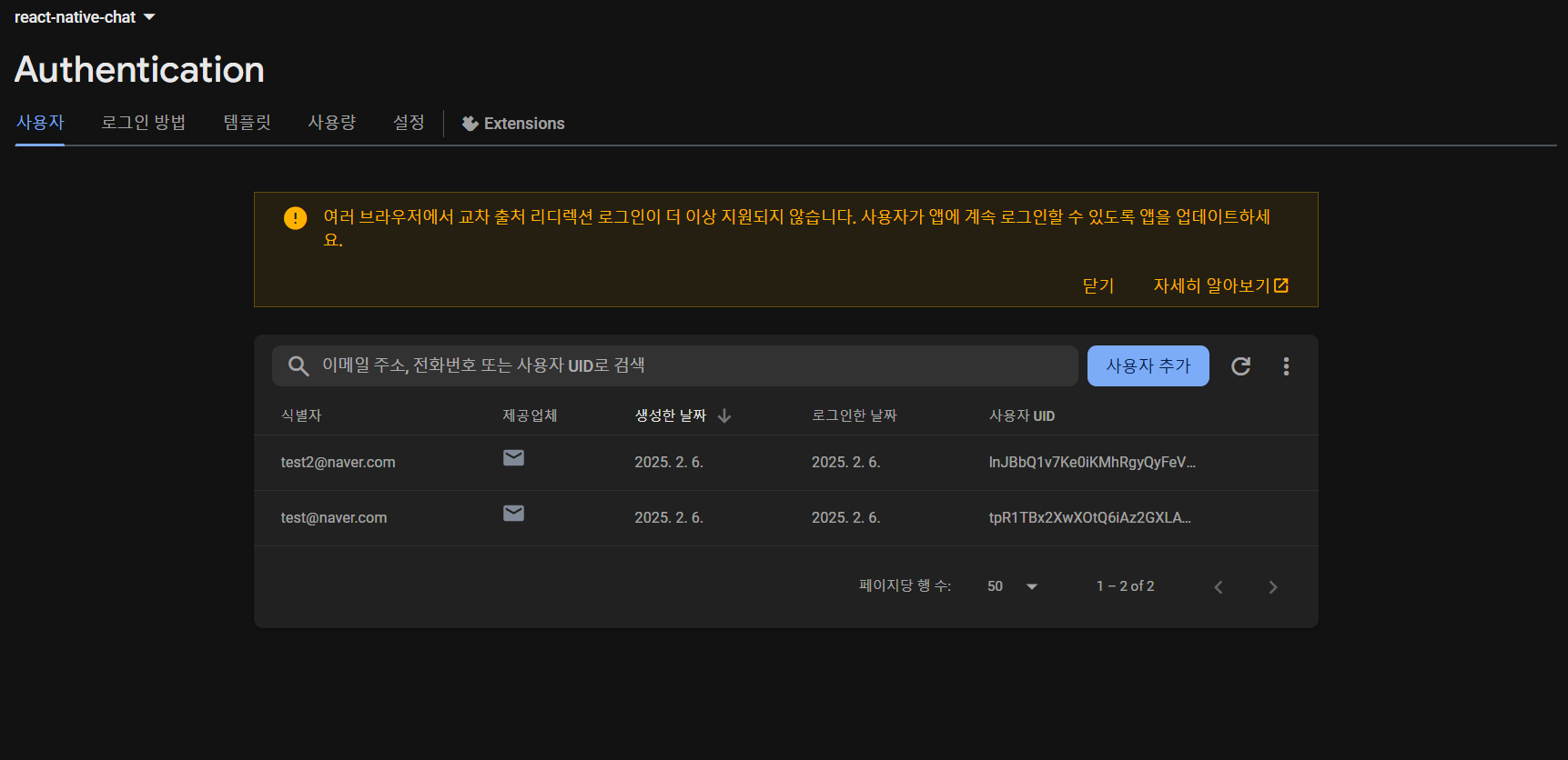
잘 추가된 것을 확인할 수 있다
Spinner 컴포넌트
Spinner 컴포넌트를 사용해서
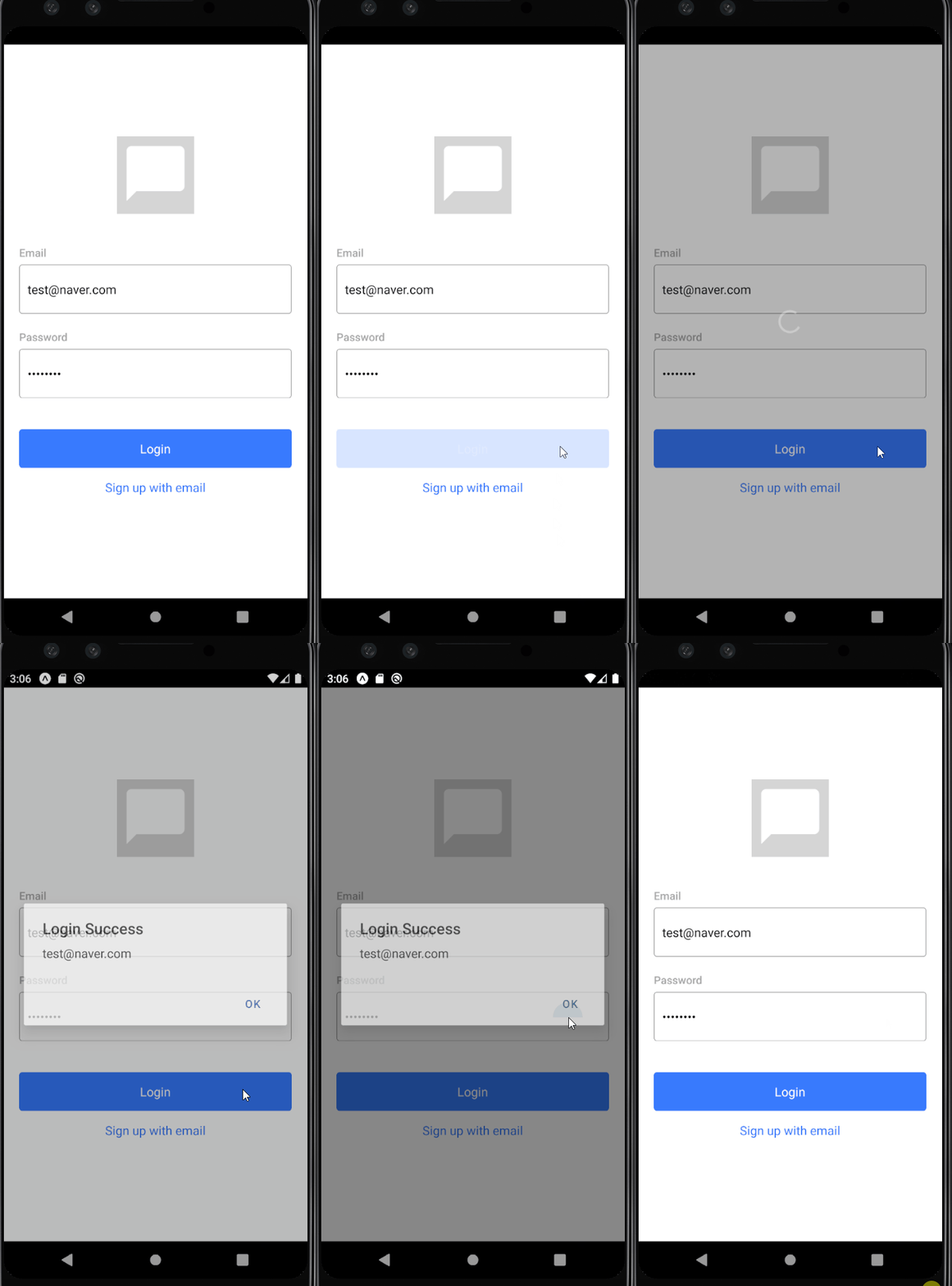
로그인과 회원가입 때 데이터 수정하거나 버튼 추가로 클릭할 일 발생하지 않게 한다
Context API를 통해 Spinner 컴포넌트의 렌더링 상태를 전역적으로 관리한다
// src/components/Spinner.js

import React, { useContext } from 'react'
import { ActivityIndicator } from 'react-native'
import styled, { ThemeContext } from 'styled-components/native';

const Container = styled.View`
    position: absolute;
    z-index: 2;
    opacity: 0.3;
    width: 100%;
    justify-content: center;
    background-color: ${({theme}) => theme.spinnerBackground};
`

const Spinner = () => {
    const theme = useContext(ThemeContext)
    return (
        <Container>
            <ActivityIndicator size={'large'} color={theme.spinnerIndicator} />
        </Container>
    )
}

export default Spinner
// src/contexts/Progress.js
import React, { useState, createContext } from 'react'
const ProgressContext = createContext({
inProgress: false,
spinner: () => {},
})
const ProgressProvider = ({children}) => {
const [inProgress, setInProgress] = useState(false);
const spinner = {
start: () => setInProgress(true),
stop: () => setInProgress(false),
}
const value = {inProgress, spinner};
return (
<ProgressContext.Provider value={value}>
{children}
</ProgressContext.Provider>
)
}
export {ProgressContext, ProgressProvider};
login함수 호출 전에 Spinner 컴포넌트 렌더링하고 작업이 끝나면 렌더링되지 않도록 상태를변경한다
// src/screens/Login.js

...
const { spinner } = useContext(ProgressContext);

const _handleLoginButtonPress = async () => {
    try {
        spinner.start();
        const user = await login({email, password});
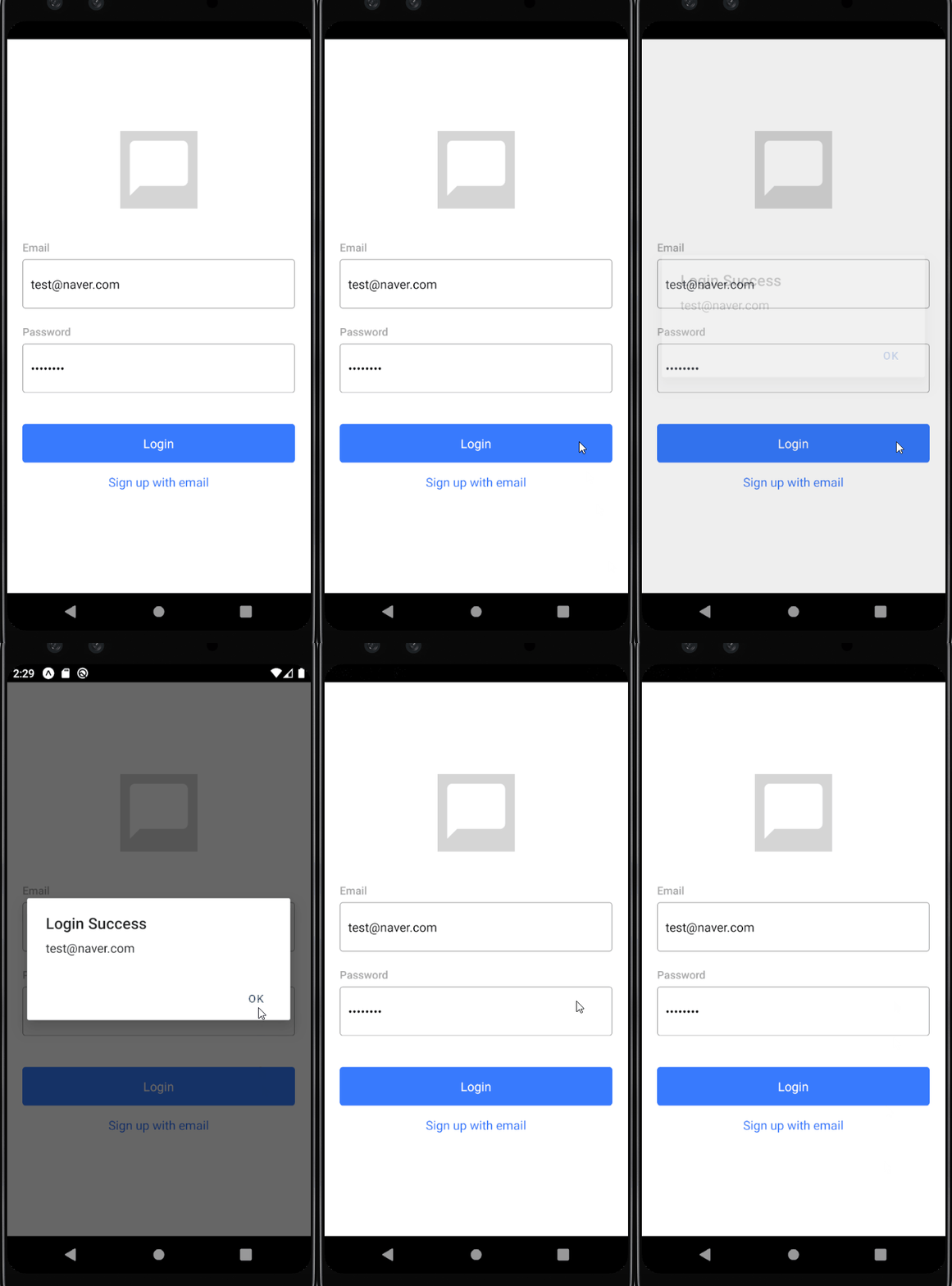
        Alert.alert('Login Success', user.email);
    } catch(e) {
        Alert.alert('Login Error', e.message);
    } finally {
        spinner.stop();
    }
}
참고
처음 배우는 리액트 네이티브