
seaborn import
import matplotlib.pyplot as plt
import seaborn as sns
import pandas as pd
import numpy as np
from matplotlib import rc

plt.rcParams["axes.unicode_minus"] = False
rc("font", family = "Malgun Gothic")
get_ipython().run_line_magic("matplotlib", "inline")
예제1 : seaborn 기초
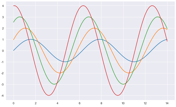
x = np.linspace(0,14,100)
y1 = np.sin(x)
y2 = 2 * np.sin(x + 0.5)
y3 = 3 * np.sin(x + 1.0)
y4 = 4 * np.sin(x + 1.5)
plt.figure(figsize=(10,6))
plt.plot(x, y1, x, y2, x, y3, x, y4) #seaborn은 연속적인 변수기입이 가능
plt.grid(True)
plt.show()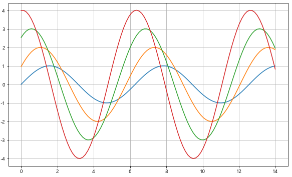
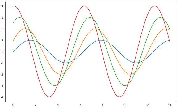
- sns.set_style()
- 'white', 'whitegird, 'dark', 'darkgrid'
sns.set_style("white")
plt.figure(figsize=(10,6))
plt.plot(x, y1, x, y2, x, y3, x, y4)
plt.show()- white
- dark
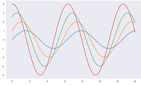
- whitegrid
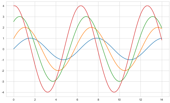
-darkgrid
예제2: seaborn tips data
- boxplot
- swarmplot
- implot
tips = sns.load_dataset('tips')
tips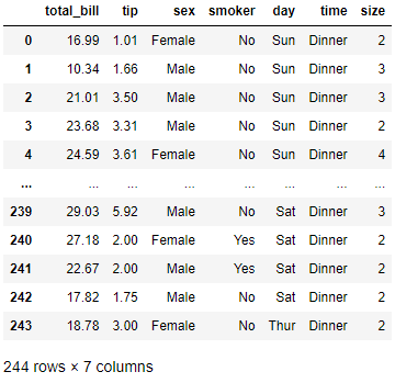
tips.info()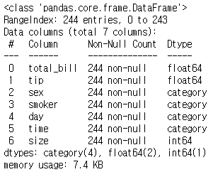
- boxplot
plt.figure(figsize=(8,6))
sns.boxplot(x=tips["total_bill"])
plt.show()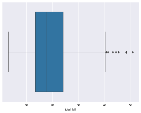
plt.figure(figsize=(8,6))
sns.boxplot(x = "day", y="total_bill", data=tips)
plt.show()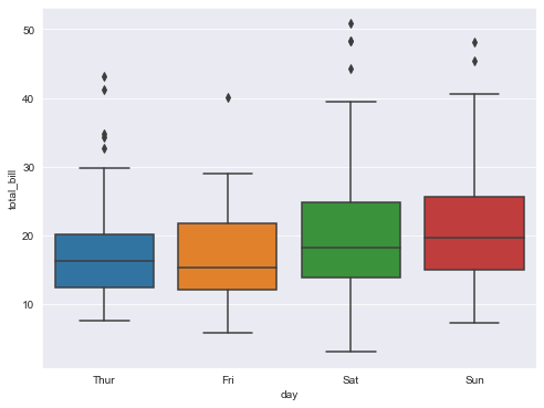
- boxplot hue, palette option
- hue : 카테고리 데이터를 표현하는 option
plt.figure(figsize=(8,6))
sns.boxplot(x = "day", y="total_bill", data=tips, hue ='smoker', palette='Set3') # set 1~3
plt.show()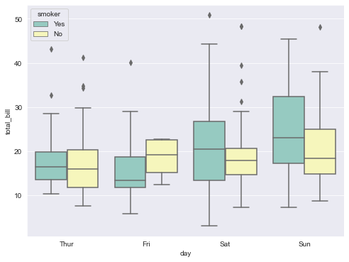
- swarmplot
plt.figure(figsize=(8,6))
sns.swarmplot(x='day', y='total_bill', data=tips, color='0') # color : 0~1 사이 검은색부터 흰색 사이 값을 조절
plt.show()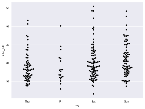
- boxplot with swarmplot
plt.figure(figsize=(8,6))
sns.boxplot(x='day', y='total_bill', data=tips)
sns.swarmplot(x='day', y='total_bill', data=tips, color='0.25')
plt.show()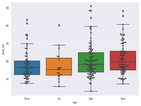
- lmplot : total_bill과 tip 사이의 관계 파악
sns.set_style('darkgrid')
sns.lmplot(x='total_bill', y='tip', data=tips, height=7)
plt.show()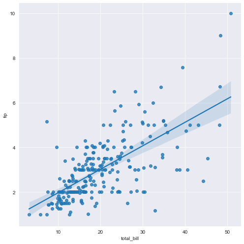
- hue option
sns.set_style('darkgrid')
sns.lmplot(x='total_bill', y='tip', data=tips, height = 7, hue='smoker')
plt.show()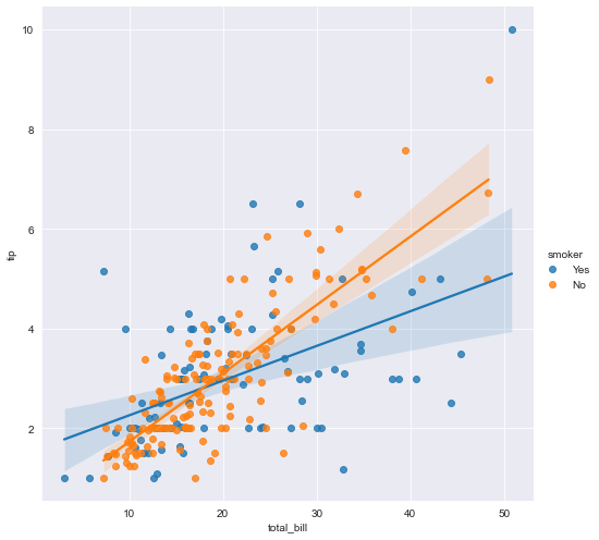
예제 3 : flight data
- flight
flights = sns.load_dataset('flights')
flights.head()
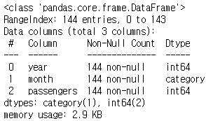
flights.info()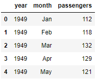
- pivot
- pivot 구성 3요소 index, columns, values
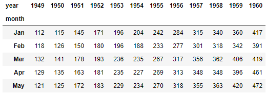
flights = flights.pivot(index='month', columns='year',values='passengers')
flights.head()
- heatmap
plt.figure(figsize=(10,8))
sns.heatmap(data=flights, annot=True, fmt='d') #annot : 숫자를 표현할지말지, fmt는 표현형식(정수,실수 등)
plt.show()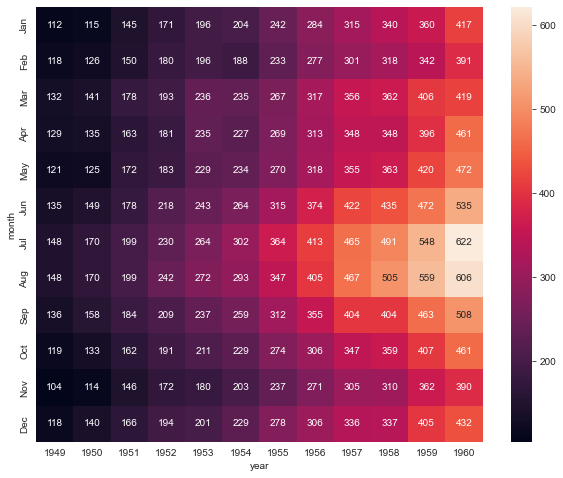
-colormap
plt.figure(figsize=(10,8))
sns.heatmap(flights, annot=True, fmt='d', cmap='YlGnBu')
plt.show()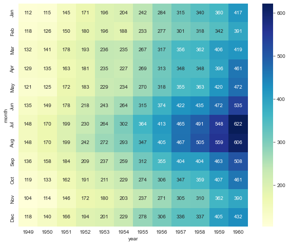
예제3 : Iris data
- iris data
iris = sns.load_dataset('iris')
iris.tail()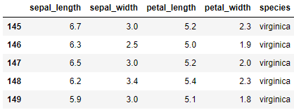
- pairplot : 모든 데이터의 경우의 수를 그래프로 보여줌, 각 columns간의 상관관계를 보여줌
sns.set_style('ticks')
sns.pairplot(iris) # data=iris, iris 둘 다 가능
plt.show()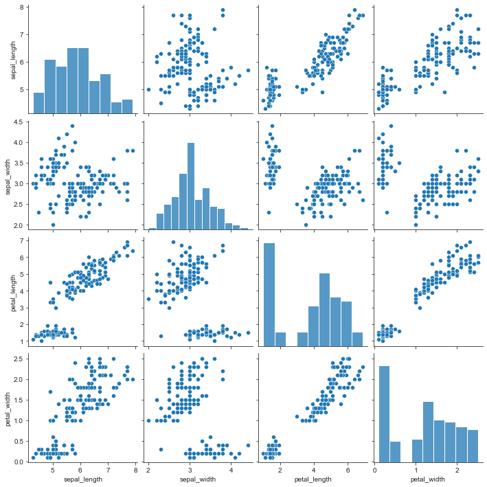
- hue option
sns.pairplot(iris, hue='species')
plt.show()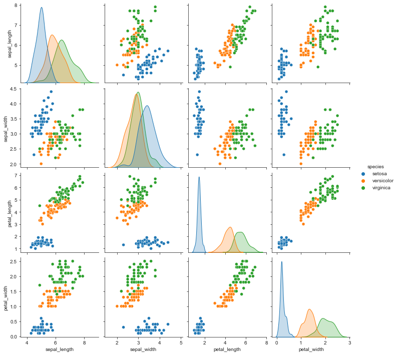
-원하는 컬럼만 pairplot
sns.pairplot(iris,
             x_vars=['sepal_width','sepal_length'],
             y_vars=['petal_width','sepal_length'])
plt.show()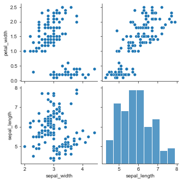
예제5 : anscombe data
- anscombe data
anscombe = sns.load_dataset('anscombe')
anscombe.tail()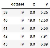
- lmplot
sns.set_style('darkgrid')
sns.lmplot(x='x', y='y', data=anscombe.query('dataset == "I"'), ci=None, height=7) # ci : 신뢰구간 선택
plt.show()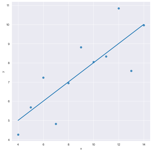
- scatters_kws(마커 크기)
sns.lmplot(x='x', y='y', data=anscombe.query('dataset == "I"'), ci=None, height=7,
          scatter_kws={'s':100}) # ci : 신뢰구간 선택, scatter_kws는 마커 크기
plt.show()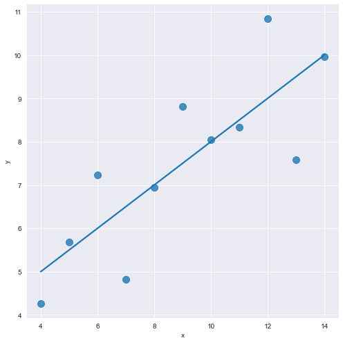
- order option
sns.lmplot(x='x',
           y='y',
           data=anscombe.query('dataset == "II"'),
           order=2,
           ci=None,
           height=7,
          scatter_kws={'s':100}) # ci : 신뢰구간 선택, scatter_kws는 마커 크기
plt.show()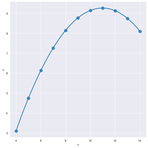
- outlier
sns.lmplot(x='x',
           y='y',
           data=anscombe.query('dataset == "III"'),
           ci=None,
           height=7,
          scatter_kws={'s':100}) # ci : 신뢰구간 선택, scatter_kws는 마커 크기
plt.show()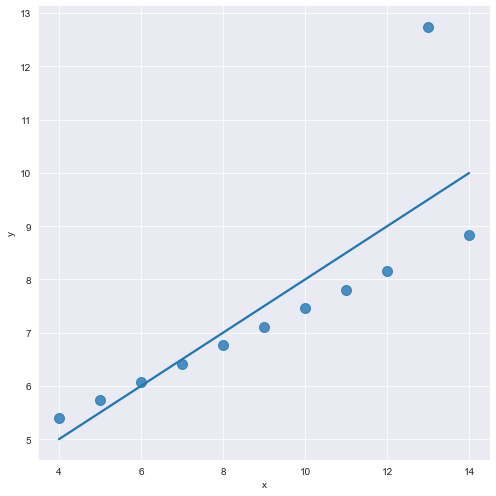
- robust
sns.lmplot(x='x',
           y='y',
           data=anscombe.query('dataset == "III"'),
           ci=None,
           robust=True,
           height=7,
          scatter_kws={'s':100}) # ci : 신뢰구간 선택, scatter_kws는 마커 크기
plt.show()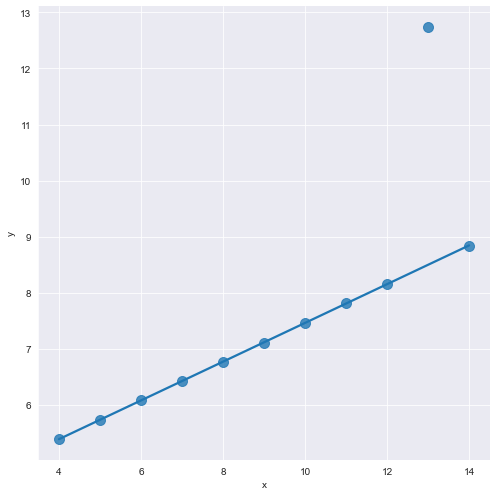

개발도상인 냄비짱