
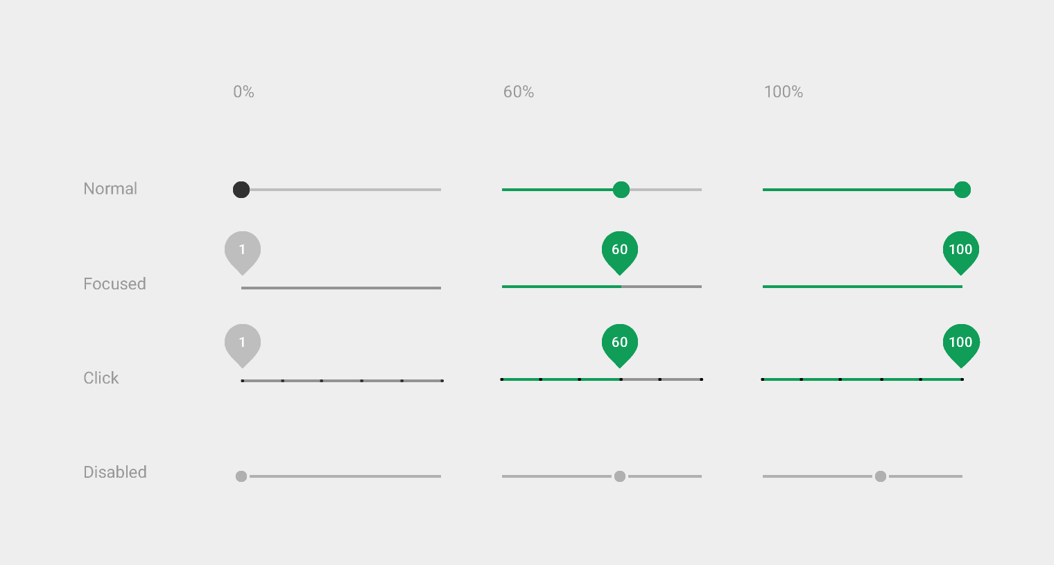
Seekbar는 볼륨조절처럼 동그라미(thumb)를 터치해서 이동이 가능하다.
iOS에서는 Slider라 한다.
Seekbar Custom
Seekbar를 커스텀하기 위해서는 drawable 폴더에 thumb의 색과 모양 등 그리고 bar의 색과 두께 등을 설정할 수 있는 두 개의 파일이 필요하다.
Seekbar의 bar custom
<?xml version="1.0" encoding="utf-8"?>

<layer-list xmlns:android="http://schemas.android.com/apk/res/android">
    <!-- seekbar 배경 1 -->
    <item android:id="@android:id/background">
    	<!-- 선 : 길이 -->
        <shape android:shape="line">
            <stroke android:width="5dp" android:color="@color/colorLightGray" />
        </shape>
    </item>

    <!-- seekbar 프로그래스 바 -->
    <item android:id="@android:id/progressbar" >
        <clip>
            <shape android:shape="line">
                <stroke android:width="6dp" android:color="@color/colorBlue" />
            </shape>
        </clip>
    </item>

</layer-list>
Seekbar의 thumb custom
<?xml version="1.0" encoding="utf-8"?>
<!-- 원모양의 seekbar thumb -->
<shape xmlns:android="http://schemas.android.com/apk/res/android"
    android:shape="oval"
    android:useLevel="false"  >
    <!-- 배경 색상 -->
    <solid
        android:color="@color/colorBlue"/>
    <!-- 테두리 색상 (생략 가능) -->
    <stroke
        android:width="2dp"
        android:color="@color/colorWhite" />
    <!-- 크기 -->
    <size
        android:width="13dp"
        android:height="13dp"/>
</shape>
custom Seekbar 사용하기
thumb와 progressDrawable 각각에 custom한 drawable 파일을 넣어준다.
<SeekBar
    android:id="@+id/range"
    android:layout_width="350dp"
    android:layout_height="wrap_content"
    android:thumb="@drawable/seekbar_thumb"
    android:progressDrawable="@drawable/seekbar_bar"
    android:max="100"
    android:layout_below="@+id/percent"
    android:layout_marginTop="30dp"
    android:layout_centerHorizontal="true" />