# In[1]
import matplotlib.pyplot as plt
plt.style.use('classic')
import numpy as np

%matplotlib inline
Plot Customization by Hand
- You've seen how it is possible to tweak(변경하다) individual plot settings to end up with something that looks a little nicer than the default.
- It's also possible to do these customizations for each individual plot.
# In[2]
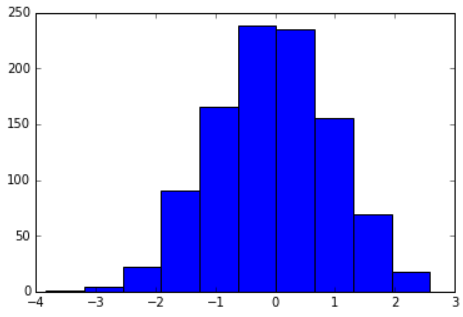
x=np.random.randn(1000)
plt.hist(x);

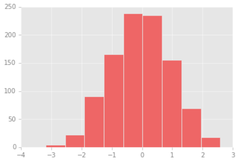
- We can adjust this by hand to make it a much more visually pleasing plot.
# In[3]
# use a gray background
fig=plt.figure(facecolor='white')
ax=plt.axes(facecolor='#E6E6E6')
ax.set_axisbelow(True)

# draw solid white gridlines
plt.grid(color='w',linestyle='solid')

# hide axis spines
for spine in ax.spines.values():
    spine.set_visible(False)

# hide top and right ticks
ax.xaxis.tick_bottom()
ax.yaxis.tick_left()

# lighten ticks and labels
ax.tick_params(colors='gray',direction='out')
for tick in ax.get_xticklabels():
    tick.set_color('gray')
for tick in ax.get_yticklabels():
    tick.set_color('gray')

# control face and edge color of histogram
ax.hist(x,edgecolor='#E6E6E6',color='#EE6666');

- You may recognize the look as inspired by that of the R language's
ggplot visualization package.
Changing the Defaults: rcParams
- Each time Matplotlib loads, it defines a runtime configuration containing the default styles for every plot element you create.
- This configuration can be adjusted at any time using the
plt.rc convenience routine.
# In[4]
from matplotlib import cycler
colors=cycler('color',
['#EE6666','#3388BB','#9988DD',
'#EECC55','#88BB44','#FFBBBB'])
plt.rc('figure',facecolor='white')
plt.rc('axes',facecolor='#E6E6E6',edgecolor='none',
axisbelow=True,grid=True,prop_cycle=colors)
plt.rc('grid',color='w',linestyle='solid')
plt.rc('xtick',direction='out',color='gray')
plt.rc('ytick',direction='out',color='gray')
plt.rc('patch',edgecolor='#E6E6E6')
plt.rc('lines',linewidth=2)
# In[5]
plt.hist(x);

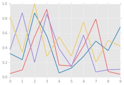
- Let's see what simple line plots look like with these rc parameters
# In[6]
for i in range(4):
    plt.plot(np.random.rand(10))

Stylesheets
- A newer mechanism for adjusting overall chart styles is via Matplotlib's
style module, which includes a number of default stylesheets, as well as the ability to create and package your own styles.
- These stylesheets are formatted similarly to the
.matplotlibrc, but must be named with a .mplstyle extension.
- Even if you don't go as far as creating your own style, you may find what you're looking for in the built-in stylesheets.
plt.style.available contains a list of the available styles.
# In[7]
plt.style.available[:5]
# Out[7]
['Solarize_Light2',
 '_classic_test_patch',
 '_mpl-gallery',
 '_mpl-gallery-nogrid',
 'bmh']
- The standard way to switch to a stylesheet is to call
style.use : plt.style.use('stylename')
- But, this will change the style for the rest of the Python session. Alternatively, you can use the style context manager, which sets a style temporarily.
with plt.style.context('stylename'):
	make_a_plot()
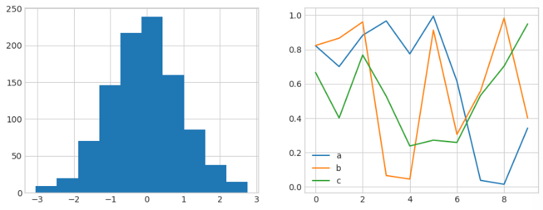
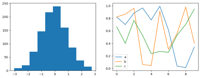
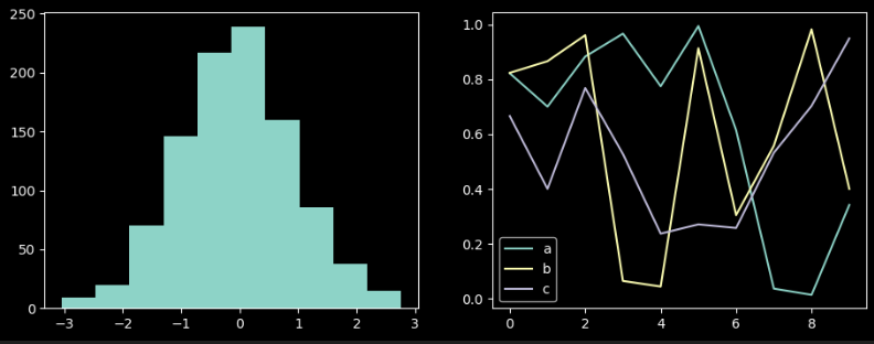
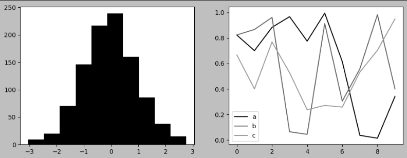
- To demonstrate these styles, let's create a function that will make two basic types of plot
# In[8]
def hist_and_lines():
    np.random.seed(0)
    fig,ax=plt.subplots(1,2,figsize=(11,4))
    ax[0].hist(np.random.randn(1000))
    for i in range(3):
        ax[1].plot(np.random.rand(10))
    ax[1].legend(['a','b','c'],loc='lower left')
Default Style
- Matplotlib's
default style was updated in the version 2.0 release.
# In[9]
with plt.style.context('default'):
    hist_and_lines()

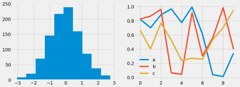
FiveThirtyEight Style
- The
fivethirtyeight style mimics the graphics found on the popular FiveThirtyEight website.
- It is typified by bold colors, thick lines, and transparent axes.
# In[10]
with plt.style.context('fivethirtyeight'):
    hist_and_lines()

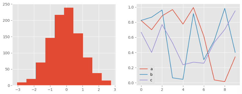
ggplot Style
- The
ggplot package in the R language is a popular visualization tool among data scientists.
- Matplotlib's
ggplot style mimics the default styles from that package.
# In[11]
with plt.style.context('ggplot'):
    hist_and_lines()

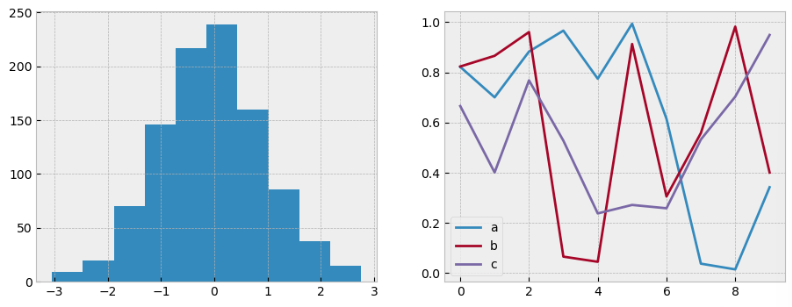
Bayesian Methods for Hackers Style
- There is an online book called Probabilistic Programming and Bayesian Methods for Hackers by Cameron Davidson-Pilon that features figures created with Matplotlib, and uses a nice set of rc parameters to create a consistent and visually appealing style throughout the book.
- This style is reproduced in the
bmh stylesheet.
# In[12]
with plt.style.context('bmh'):
    hist_and_lines()

Dark Background Style
- For figures used within presentations, it is often useful to have a dark rather than light background.
# In[13]
with plt.style.context('dark_background'):
    hist_and_lines()

Grayscale Style
- You might find yourself preparing figures for a print publication that does not accept color figures.
- For this, the
grayscale style can be useful.
# In[14]
with plt.style.context('grayscale'):
    hist_and_lines()

Seaborn Style
- Matplotlib also has several stylesheets inspired by the Seaborn library.
# In[15]
with plt.style.context('seaborn-whitegrid'):
    hist_and_lines()
