Front-end 국비지원 #019일
HTML / CSS
수평정렬(Horizontal Align)
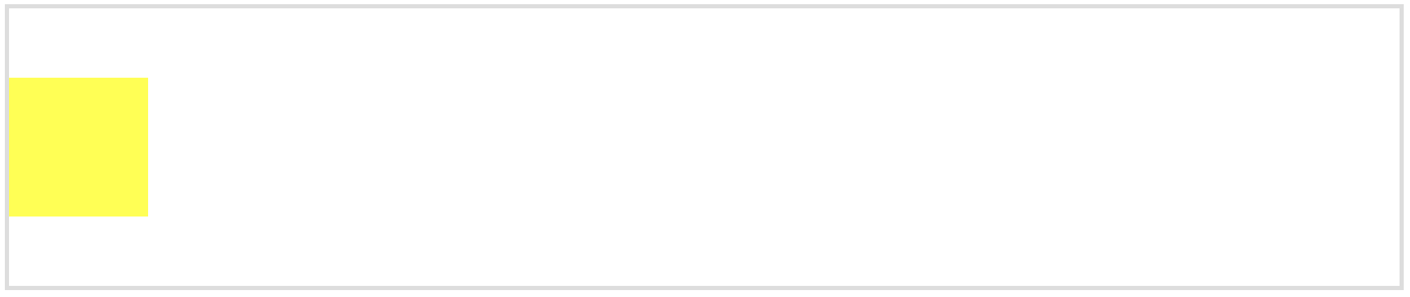
1. inline/inline-block요소
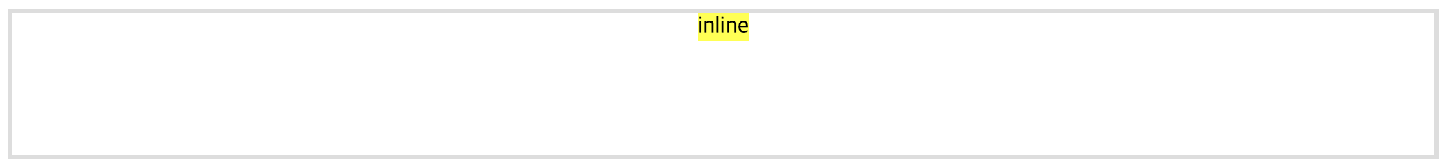
---> 정렬 대상요소(텍스트 또는 링크 등의 인라인 레벨 요소 또는 인라인블록요소)의 부모 요소에 text-align:center; 지정
HTML 구성
<div id="boxWrap" class="box-wrap">
        <h1>수평정렬(Horizontal Align)</h1>
        <h2>1. inline/inline-block요소</h2>
        <div class="container1">
            <span class="box1">inline</span>
        </div>
        <p>---> 정렬 대상요소(텍스트 또는 링크 등의 인라인 레벨 요소 또는 인라인블록요소)의 부모 요소에 text-align:center; 지정</p>
        <hr>
CSS 구성
.container1{width: 100%; height: 100px; border: 3px solid #ddd; text-align: center;}
.box1{background: yellow; display: inline-block;}
2. block요소
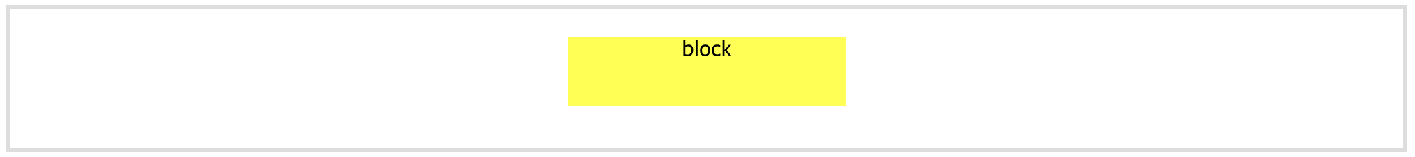
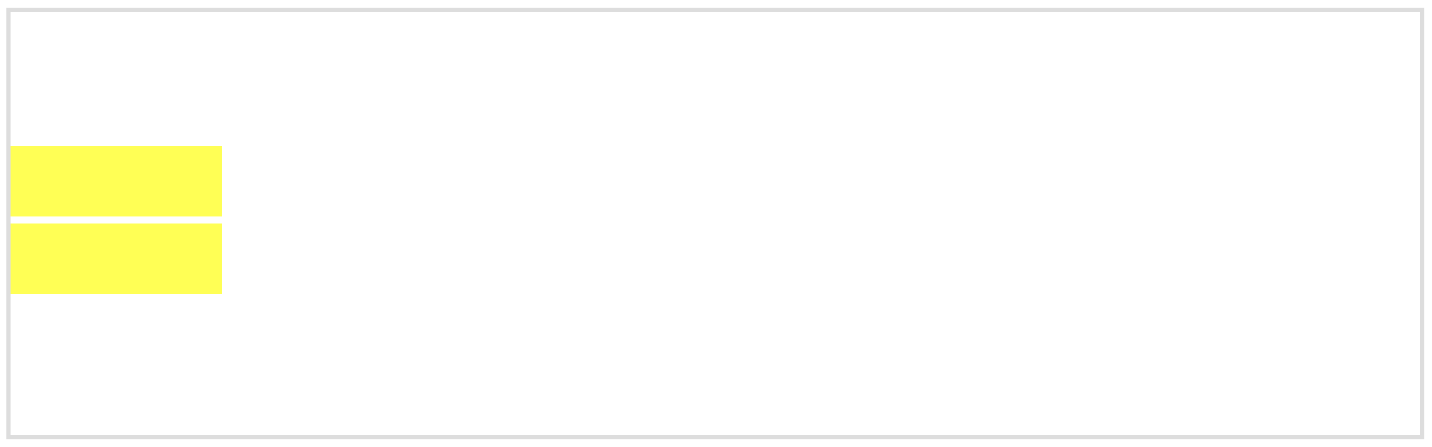
---> 블록요소에 너비를 명시하고 자기자신이 margin: 0 auto; 지정
HTML 구성
<div class="container2">
            <div class="box2">
                block
            </div>
        </div>
CSS 구성
.container2{width: 100%; height: 100px; border: 3px solid #ddd; text-align: center;}
.box2{background: yellow; width: 20%; height: 50px; margin: 20px auto; }
2-1 복수의 block 요소
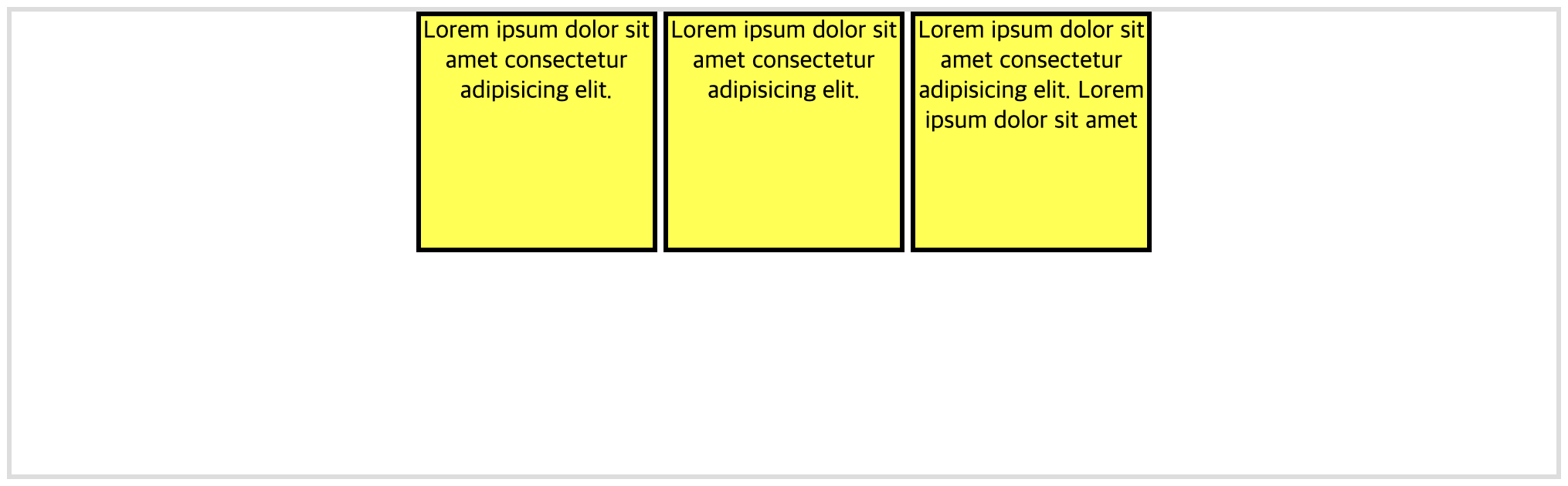
---> 복수의 블록요소에 너비를 명시하고 display:inline-block; 부모요소에 text-align:center; 지정
HTML 구성
<div class="container3">
            <div class="box3">Lorem ipsum dolor sit amet consectetur adipisicing elit. </div>
            <div class="box3">Lorem ipsum dolor sit amet consectetur adipisicing elit. </div>
            <div class="box3">Lorem ipsum dolor sit amet consectetur adipisicing elit. Lorem ipsum dolor sit amet </div>
        </div>
CSS 구성
.container3{width: 100%; height: 300px; border: 3px solid #ddd; text-align: center;}
.box3{background: yellow; width: 150px; height: 150px; border: 3px solid #000; display: inline-block; vertical-align: middle;}
2-2 복수의 block 요소
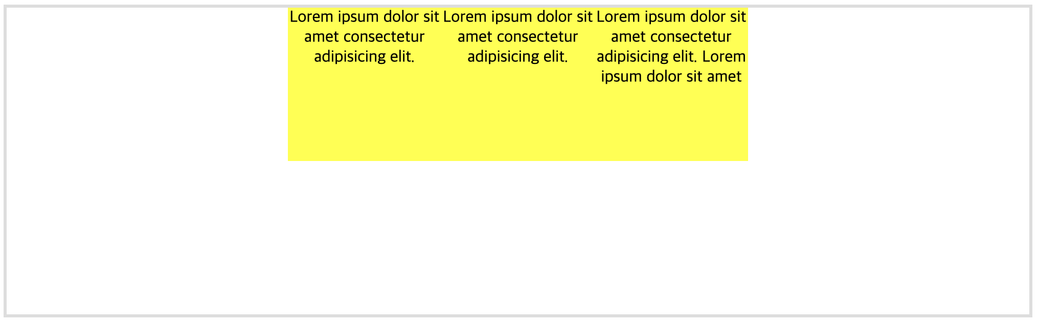
---> 정렬대상에 float:left;와 너비 지정하면 정렬대상에 감싸는 부모요소를 추가하고 정렬대상의 너비의 합 만큼
부모요소에 너비 지정하고 margin:0 auto; 지정
HTML 구성
<div class="container4">
            <div class="float">
                <div class="box4">Lorem ipsum dolor sit amet consectetur adipisicing elit. </div>
                <div class="box4">Lorem ipsum dolor sit amet consectetur adipisicing elit. </div>
                <div class="box4">Lorem ipsum dolor sit amet consectetur adipisicing elit. Lorem ipsum dolor sit amet </div>
            </div>
        </div>
CSS 구성
.container4{width: 100%; height: 300px; border: 3px solid #ddd; text-align: center;}
.box4{background: yellow; width: 150px; height: 150px; float: left; vertical-align: middle;}
.float{width: 450px; height: 150px; margin: 0 auto;}
3. flexbox
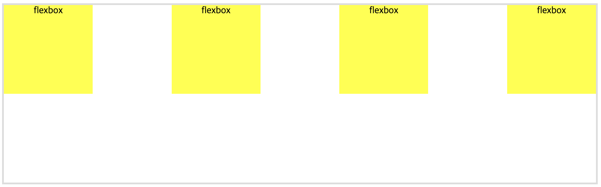
HTML 구성
<div class="container5">
            <div class="box5">flexbox</div>
            <div class="box5">flexbox</div>
            <div class="box5">flexbox</div>
            <div class="box5">flexbox</div>
        </div>
CSS 구성
.container5{width: 100%; height: 300px; border: 3px solid #ddd; text-align: center; display: flex; justify-content: space-between;수직정렬(Vertical Align)
1. single line 높이가 없을때
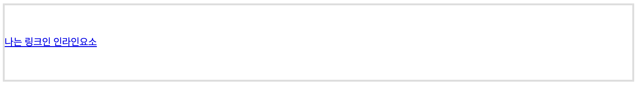
HTML 구성
<div class="container6">
            <a href="#">나는 링크인 인라인요소</a>
        </div>
CSS 구성
.container6{width: 100%; border: 3px solid #ddd; padding: 50px 0;}2. single line 높이가 있을때
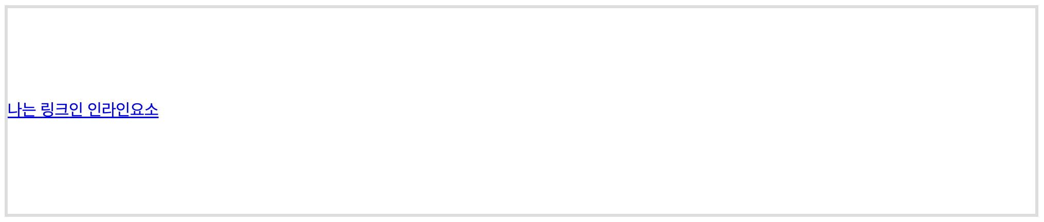
HTML 구성
<div class="container7">
            <a href="#">나는 링크인 인라인요소</a>
        </div>
CSS 구성
.container7{width: 100%; height: 200px; border: 3px solid #ddd; display: table; line-height: 200px;}3. Multiple line
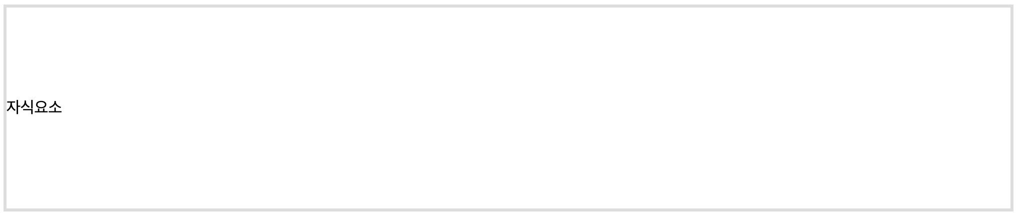
HTML 구성
<div class="container8">
            <span class="child">자식요소</span>
        </div>
CSS 구성
.container8{width: 100%; height: 200px; border: 3px solid #ddd; display: table;}
.child{display: table-cell; vertical-align: middle;}
4. flexbox

HTML 구성
<div class="container9">
            <span class="child1">자식요소1</span>
            <span class="child1">자식요소1</span>
        </div>
CSS 구성
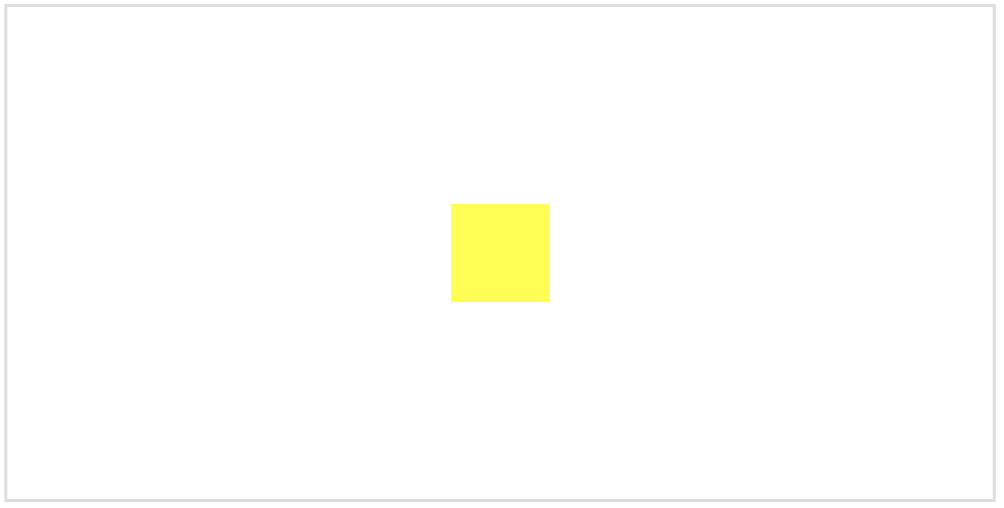
.container9{width: 100%; border: 3px solid #ddd; height: 200px; display: flex; justify-content: center; flex-direction: column;}5. block요소 높이가 고정되어 있는 경우
HTML 구성
<div class="container10">
            <div class="box6"></div>
        </div>
CSS 구성
.container10{width: 100%; border: 3px solid #ddd; height: 200px; position: relative;}6. flexbox block 가운데 보내기
HTML 구성
<div class="container11">
            <div class="box7"></div>
            <div class="box7"></div>
        </div>
CSS 구성
.container11{width: 100%; height: 300px; border: 3px solid #ddd; display: flex; flex-direction: column; justify-content: center;}
.box7{width: 150px; height: 50px; background: yellow; margin-bottom: 5px;}
수직+수평 정렬
HTML 구성
<div class="container12">
            <div class="box8"></div>
        </div>
CSS 구성
.container12{width: 100%; border: 3px solid #ddd; height: 500px; position: relative;}
.box8{width: 100px; height: 100px; background: yellow; position: absolute; top: 50%; left: 50%; transform: translate(-50% , -50%);}
SVG / Animation
1. svg line animation
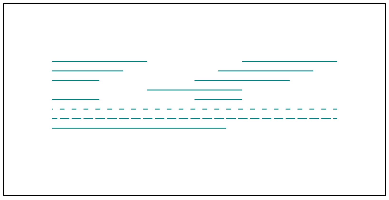
HTML 구성
<svg width="600" height="200" viewBox="0 0 600 200" version="1.1">
        <line stroke-dasharray="200" stroke-dashoffset="0" x1="0" y1="20" x2='600' y2="20"/>
        <line stroke-dasharray="200" stroke-dashoffset="50" x1="0" y1="40" x2='600' y2="40"/>
        <line stroke-dasharray="200" stroke-dashoffset="100" x1="0" y1="60" x2='600' y2="60"/>
        <line stroke-dasharray="200" stroke-dashoffset="200" x1="0" y1="80" x2='600' y2="80"/>
        <line stroke-dasharray="100, 200" stroke-dashoffset="0" x1="0" y1="100" x2='600' y2="100"/>
        <line class="line" stroke-dasharray="10, 15" stroke-dashoffset="0" x1="0" y1="120" x2='600' y2="120"/>
        <line class="line" stroke-dasharray="20, 5" stroke-dashoffset="0" x1="0" y1="140" x2='600' y2="140"/>
        <!-- animation -->
        <line class="line" stroke-dasharray="600" stroke-dashoffset="600" x1="0" y1="160" x2='600' y2="160"/>
        <style><!-- animation -->
            line{stroke:teal; stroke-width: 2;}
            .line{animation: dash 3s linear infinite;}
            @keyframes dash{
                from{stroke-dashoffset:600}
                to{stroke-dashoffset:0}
            }

        </style>
    </svg>
CSS 구성
svg{margin: 400px 400px; border: 2px solid #000; padding: 100px;}2. svg circle animation
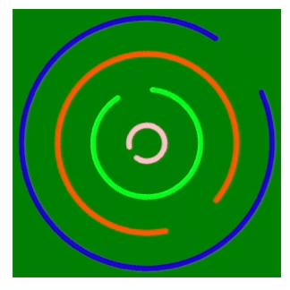
HTML 구성
<svg id="page">
        <circle cx="75" cy="75" r="10"/>
        <circle cx="75" cy="75" r="30"/>
        <circle cx="75" cy="75" r="50"/>
        <circle cx="75" cy="75" r="70"/>
</svg>
CSS 구성
#page{width: 150px; height: 150px; margin: 100px 500px; background: green;}
        #page circle{stroke-width: 3px; fill: none; stroke-linecap: round; animation: loader 4s linear infinite; transform-origin: 50% 50%;}
        #page circle:nth-child(1){stroke: pink; stroke-dasharray: 55; animation-delay: .4s;}
        #page circle:nth-child(2){stroke: rgb(0, 253, 21); stroke-dasharray: 168; animation-delay: -.2s;}
        #page circle:nth-child(3){stroke: rgb(255, 90, 1); stroke-dasharray: 280; animation-delay: .9s;}
        #page circle:nth-child(4){stroke: rgb(35, 3, 214); stroke-dasharray: 400; animation-delay: -.8s;}
        @keyframes loader{
            0%{transform: rotate(0deg);}
            50%{transform: rotate(360deg);}
            100%{transform: rotate(0deg);}
        }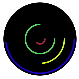
HTML 구성
<svg id="page">
        <circle cx="75" cy="75" r="10"/>
        <circle cx="75" cy="75" r="30"/>
        <circle cx="75" cy="75" r="50"/>
        <circle cx="75" cy="75" r="70"/>
</svg>
CSS 구성
#page{width: 150px; height: 150px; margin: 100px 500px; background: rgb(0, 0, 0); border-radius: 50%;}
        #page circle{stroke-width: 3px; fill: none; stroke-linecap: round;}
        #page circle:nth-child(1){stroke: rgb(184, 41, 65); stroke-dasharray: 63; stroke-dashoffset: 63; animation-delay: .4s; animation: loader1 4s 1s linear infinite; transform-origin: 50% 50%;}
        #page circle:nth-child(2){stroke: rgb(82, 215, 93); stroke-dasharray: 189; stroke-dashoffset: 189;animation-delay: -.2s; animation: loader2 3s 1.2s linear infinite; transform-origin: 50% 50%;}
        #page circle:nth-child(3){stroke: rgb(209, 255, 6); stroke-dasharray: 315; stroke-dashoffset: 315; animation-delay: .9s; animation: loader3 4s 1.5s linear infinite; transform-origin: 50% 50%;}
        #page circle:nth-child(4){stroke: rgb(35, 3, 214); stroke-dasharray: 440; stroke-dashoffset: 440; animation-delay: -.8s; animation: loader4 4s 0.5s linear infinite; transform-origin: 50% 50%;}
        @keyframes loader1{
            0%{stroke-dashoffset: 63;}
            100%{stroke-dashoffset: 0;}
        }
        @keyframes loader2{
            0%{stroke-dashoffset: 189;}
            100%{stroke-dashoffset: 0;}
        }
        @keyframes loader3{
            0%{stroke-dashoffset: 315;}
            100%{stroke-dashoffset: 0;}
        }
        @keyframes loader4{
            0%{stroke-dashoffset: 440;}
            100%{stroke-dashoffset: 0;}
        }
3. svg circle animation
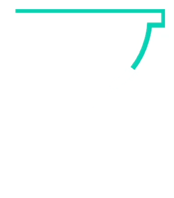
HTML 구성
<?xml version="1.0" encoding="utf-8"?>
    <!-- Generator: Adobe Illustrator 24.0.1, SVG Export Plug-In . SVG Version: 6.00 Build 0)  -->
    <div class="box">
        <svg version="1.1" id="Layer_1" xmlns="http://www.w3.org/2000/svg" xmlns:xlink="http://www.w3.org/1999/xlink" x="0px" y="0px"
             viewBox="0 0 59.3 71.7" style="enable-background:new 0 0 59.3 71.7;" xml:space="preserve">
        <style type="text/css">
            .st0{fill:none;stroke:#0ed2b5; stroke-miterlimit:10; stroke-width: 2; stroke-dasharray: 320; stroke-dashoffset: 320; animation: line 2s linear forwards, bg .5s 2s linear forwards;}
            @keyframes line{
                0%{stroke-dashoffset: 320;}
                100%{stroke-dashoffset: 0;}
            }
            @keyframes bg{
                0%{fill:none;}
                100%{fill:rgb(30, 231, 150);}
            }
        </style>
        <path class="st0" d="M0.5,0.5h58.3v5.74H53.2c0,0-0.78,19.7-20.22,26.35v4.57c0,0,16.83,5.09,20.09,26.09h5.74v7.96H1.15v-7.3h5.74
            c0,0,0.13-19.04,20.48-26.35v-4.17c0,0-20.61-11.22-20.61-25.17H0.5V0.5z"/>
        </svg>
	</div>
CSS 구성
.box{width: 150px; height: 200px; margin: 100px 300px;}

동글빼이가 돌아가는 모습이 마치 우리의 삶 같군요.
잘 만드셨습니다 화이팅입니다