
한글 깨짐 방지 (Windows)
import matplotlib.pyplot as plt
from matplotlib import font_manager as fm, rc

for font_path in fm.findSystemFonts(fontpaths=None, fontext='ttf'):
    if 'D2Coding' in font_path:
        font = fm.FontProperties(fname=font_path).get_name()
        rc('font', family=font)
        break
📈 기본 그래프 그리기
import numpy as np
import matplotlib.pyplot as plt
◽ 하나의 도화지에 하나의 그래프
# 그래프 그리기 위한 틀 준비
plt.figure(figsize=[4, 2])

# 그래프 그리기
plt.plot(np.array([4, 5, 6]))

# 화면에 표시
plt.show()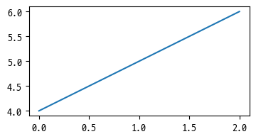
◽ 하나의 도화지에 여러 그래프
plt.figure(figsize=[5, 3])

# 그래프 3개
plt.plot(np.arange(5))
plt.plot(np.arange(2, 7))
plt.plot(np.random.randint(0, 20, 5))

plt.show()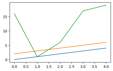
◽ 여러 도화지
# 2x2 도화지
fig, ax = plt.subplots(2, 2, figsize=[5, 5])
# fig : 전체 subplot
# ax : 낱개 도화지

# ax[n, m] : n행 m열에 그래프 그리기
ax[0, 0].plot(np.arange(5))
ax[0, 1].plot(np.arange(5))
ax[0, 1].plot(np.arange(2, 6))
ax[1, 0].plot(np.arange(5))
ax[1, 0].plot(np.arange(5))

plt.show()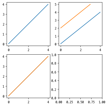
✅ 사용 가능한 함수
◽ 제목
suptitle: (super title) 전체 틀의 제목set_title: 각 도화지의 제목set_xlabel: x축 제목set_ylabel: y축 제목
fig, ax = plt.subplots(1, 2, figsize=[10, 3])
fig.suptitle('지수함수와 로그함수')

x = range(0, 100)
y = np.exp(x)
ax[0].plot(x, y)
ax[0].set_title('지수함수')
ax[0].set_xlabel("X 축")
ax[0].set_ylabel("Y 축")

x = range(1, 1000)
y = np.log(x)
ax[1].plot(x, y)
ax[1].set_title('로그함수')
ax[1].set_xlabel("X 축")
ax[1].set_ylabel("Y 축")

plt.show()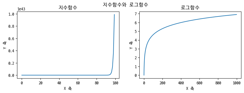
◽ 눈금
ax지정tick_params: 눈금 회전
x = range(1, 1000)
y = np.log(x)

fig, ax = plt.subplots(figsize=[2, 2])
ax.plot(x, y)

# 눈금 회전
ax.tick_params(axis='x', labelrotation=40)
ax.tick_params(axis='y', labelrotation=20)

plt.show()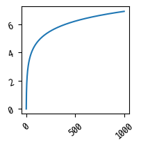
◽ 범례
legend: 그래프 범례, 위치 (x, y) 지정
plt.figure(figsize=[3, 3])

x = np.arange(10)
plt.plot(x)
plt.plot(x**2, alpha=0.5)

plt.legend(["X", "X²"], loc=[0.01, 0.8])

plt.show()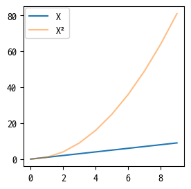
◽ 그래프 형식
수평선
axhline(y, xmin, xmax): 0과 1을 기준으로hlines(y, xmin, xmax): xmin과 xmax를 기준으로
plt.axhline(y=4, xmin=0.2, xmax=0.9)
plt.hlines(y=4, xmin=0.2, xmax=0.9)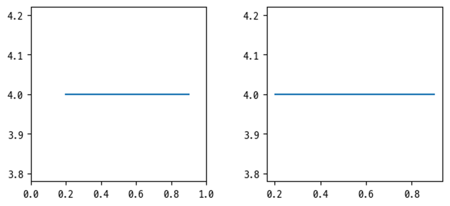
수직선
axhline(x, ymin, ymax): 0과 1을 기준으로hlines(x, ymin, ymax): ymin과 ymax를 기준으로
plt.axvline(x=4, ymin=0.2, ymax=0.9)
plt.vlines(x=4, ymin=0.2, ymax=0.9)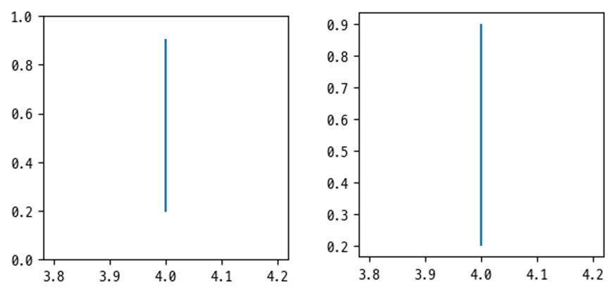
🎀 그래프 스타일
◽ marker
plt.figure(figsize=[3, 3])
plt.plot([4, 4, 4, 4, 4], marker='*')
plt.plot([3, 3, 3, 3, 3], marker='v')
plt.plot([2, 2, 2, 2, 2], marker='^')
plt.plot([1, 1, 1, 1, 1], marker='x')
plt.plot([0, 0, 0, 0, 0], marker='o')
plt.show()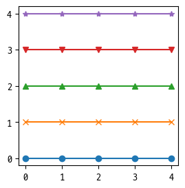
◽ line style
plt.figure(figsize=[3, 3])
plt.plot([4, 4, 4, 4, 4], linestyle=':')
plt.plot([3, 3, 3, 3, 3], linestyle='-.')
plt.plot([2, 2, 2, 2, 2], linestyle='--')
plt.plot([1, 1, 1, 1, 1], linestyle='-')
plt.plot([0, 0, 0, 0, 0], marker='*', linestyle='')
plt.show()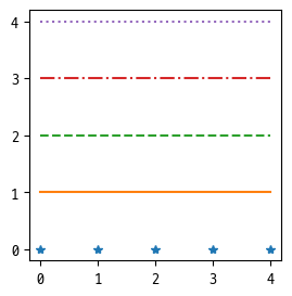
◽ color
plt.figure(figsize=[3, 3])
plt.plot([4, 4, 4, 4, 4], color='r')
plt.plot([3, 3, 3, 3, 3], color='y')
plt.plot([2, 2, 2, 2, 2], color='b')
plt.plot([1, 1, 1, 1, 1], color='skyblue')
plt.plot([0, 0, 0, 0, 0], color='#8041D9')
plt.show()
◽ 줄임 버전
plt.figure(figsize=[3, 3])

x = np.arange(0, 10)
plt.plot(x, x+2, 'b^')
plt.plot(x, x*2, 'g*--')
plt.plot(x, -x, 'r:')

plt.show()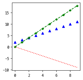

울레일라