
📊 막대그래프
- 범주가 있는 데이터 값을 막대로 표현하는 그래프
bar(x, height): 수직 막대 그래프barh(y, width): 수평 막대 그래프
colors = ['pink', 'yellow', 'skyblue']

years = [str(i) for i in range(2018, 2021)]
values = [100, 400, 900]

plt.figure(figsize=[3, 3])
plt.bar(x=years, height=values, color=colors, width=0.4)
plt.xticks(years)

plt.show()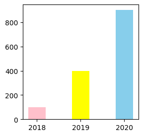
colors = ['pink', 'yellow', 'skyblue']

years = [str(i) for i in range(2018, 2021)]
values = [100, 400, 900]

plt.figure(figsize=[3, 3])
plt.barh(y=years, width=values, color=colors, height=0.4)
plt.yticks(years)

plt.show()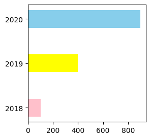
🎲 산점도 그래프
- 두 변수의 상관 관계를 직교 좌표계의 평면에 점으로 표현하는 그래프
scatter(x, y)
n = 50
x = np.random.rand(n)
y = np.random.rand(n)
area = (30 * np.random.rand(n)) ** 2
colors = np.random.rand(n)

plt.scatter(x, y, s=area, c=colors, alpha=0.5, cmap='Spectral')
# s : size
# c : colors
# alpha : 투명도
# cmap : color map (스타일)
plt.colorbar() # 오른쪽에 표시되는 지표
plt.show()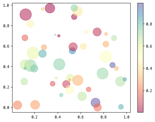
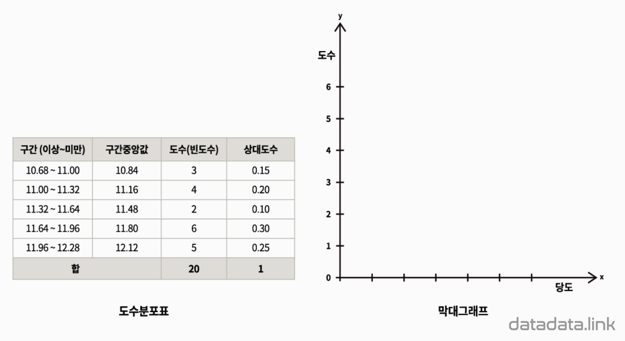
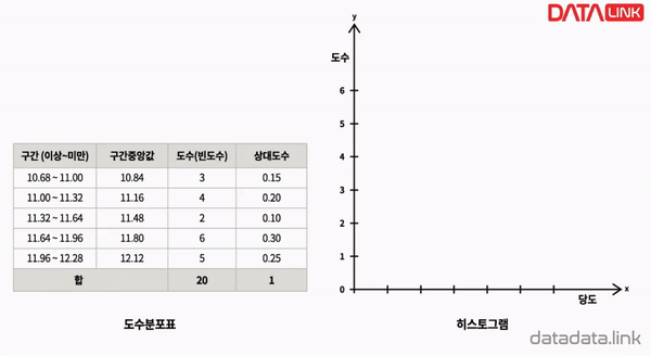
📶 히스토그램
- 도수분포표를 그래프로 나타낸 것
- 가로축: 계급/구간, 세로축: 도수/횟수/개수
hist(x, bins, range, density, cumulative, histtype, etc)- 반환값
① 각 bin에 해당하는 값의 개수 (그래프의 y축)
② 각 bin을 나누는 기준이 되는 값
③ 각 bin의 그래프에 대한 세부 정보 (높이, 너비 등)
- 반환값
◽ 기본 히스토그램
ages = [10, 20, 30, 31, 32, 33, 40, 45, 46, 47, 48, 50, 51, 52, 53]

plt.figure(figsize=[5, 3])
n, bins, patches = plt.hist(ages)
plt.show()

for i in range(len(bins) - 1):
    bin1 = round(bins[i], 2)
    bin2 = round(bins[i+1], 2)
    print(f'{bin1} ~ {bin2} → {int(n[i])}개의 값 존재')
10.0 ~ 14.3 → 1개의 값 존재
14.3 ~ 18.6 → 0개의 값 존재
18.6 ~ 22.9 → 1개의 값 존재
22.9 ~ 27.2 → 0개의 값 존재
27.2 ~ 31.5 → 2개의 값 존재
31.5 ~ 35.8 → 2개의 값 존재
35.8 ~ 40.1 → 1개의 값 존재
40.1 ~ 44.4 → 0개의 값 존재
44.4 ~ 48.7 → 4개의 값 존재
48.7 ~ 53.0 → 4개의 값 존재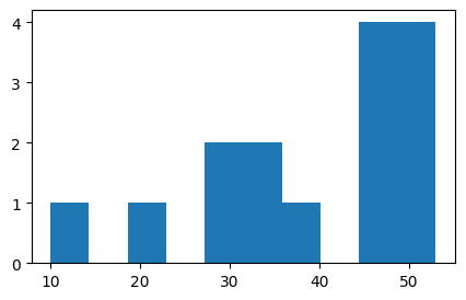
◽ 구간 개수 지정
...
n, bins, patches = plt.hist(ages, bins=[10, 20, 30, 40, 50, 60])
...
# bins=5처럼 그냥 숫자만 지정해도 됨
10.0 ~ 20.0 → 1개의 값 존재
20.0 ~ 30.0 → 1개의 값 존재
30.0 ~ 40.0 → 4개의 값 존재
40.0 ~ 50.0 → 5개의 값 존재
50.0 ~ 60.0 → 4개의 값 존재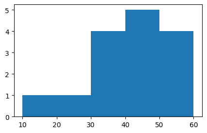
◽ 누적 히스토그램
plt.figure(figsize=[5, 3])
plt.hist(ages, cumulative=True, label='cumulative=True')
plt.hist(ages, cumulative=False, label='cumulative=False')

plt.legend(loc='upper left')
plt.show()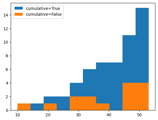
◽ 히스토그램 스타일
ages1 = [10, 20, 30, 31, 32, 33, 40, 45, 46, 47, 48, 50, 51, 52, 53]
ages2 = [10, 14, 15, 20, 24, 25, 26, 27, 28, 30, 34, 40, 45, 46, 50]
bins = [10, 20, 30, 40, 50, 60]
bar_types = ['bar', 'barstacked', 'step', 'stepfilled']

plt.figure(figsize=[4, 3])
fig, _ = plt.subplots(2, 2, figsize=(15,10))

for (i, ax), bar_type in zip(enumerate(fig.axes), bar_types):
    ax.hist((ages1, ages2), bins=bins, histtype=bar_type)
    ax.set_title(bar_type)

plt.show()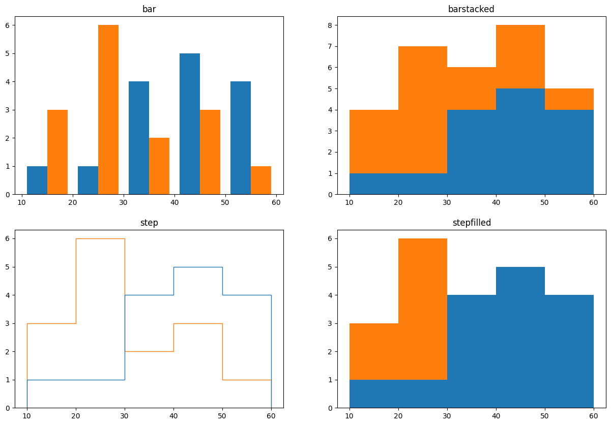
◽ 막대그래프 VS 히스토그램
- 막대그래프
- 히스토그램
❌ 에러바 (오차막대)
- 데이터의 편차를 표시하기 위한 그래프
xerr: x축 방향으로 ±α 표시yerr: y축 방향으로 ±α 표시
x = [1, 2, 3, 4]
y = [1, 4, 9, 16]
◽ 대칭 편차
yerr = [2.3, 3.1, 1.7, 2.5]
plt.figure(figsize=[4, 4])
plt.errorbar(x, y, yerr=yerr)
plt.show()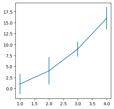
xerr = [2.3, 3.1, 1.7, 2.5]
plt.figure(figsize=[4, 4])
plt.errorbar(x, y, xerr=xerr)
plt.show()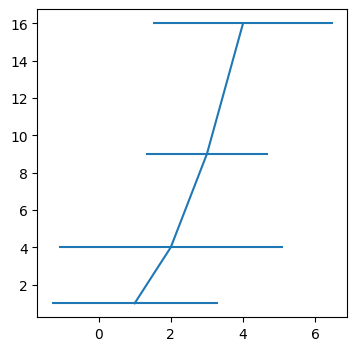
◽ 비대칭 편차
yerr = [(2.3, 3.1, 1.7, 2.5), (1.1, 2.5, 0.9, 3.9)]
plt.figure(figsize=[4, 4])
plt.errorbar(x, y, yerr=yerr)
plt.show()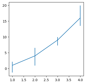
🥧 파이차트
- 범주별 구성 비율을 원형으로 표현한 그래프
pie(x, labels, autopct)
ratio = [34, 32, 16, 18]
labels = ['Apple', 'Banana', 'Melon', 'Grapes']

plt.pie(ratio, labels=labels, autopct='%.1f%%')
plt.show()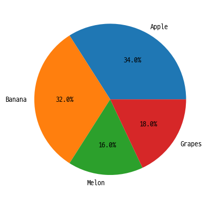
◽ 그 외 파라미터
explode: 중심에서 벗어나는 정도shadow: 그림자colors: 색상wedgeprops: 부채꼴 스타일
ratio = [34, 32, 16, 18]
labels = ['Apple', 'Banana', 'Melon', 'Grapes']
explode = [0, .5, 0, .2]
colors = ['lightcoral', 'yellow', 'limegreen', 'slateblue']
wedgeprops = {'width': 0.7}

plt.pie(
    ratio, labels=labels, autopct='%.1f%%',
    explode=explode, shadow=True,
    colors=colors, wedgeprops=wedgeprops
)
plt.show()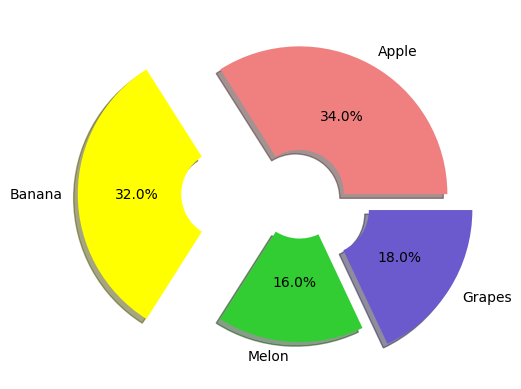
🔥 히트맵
- 다양한 값을 갖는 숫자 데이터를 색상을 이용하여 시각화한 그래프
matshow()
arr = np.random.standard_normal((30, 40))
plt.figure(figsize=[2, 2])

plt.matshow(arr)
plt.colorbar()

plt.show()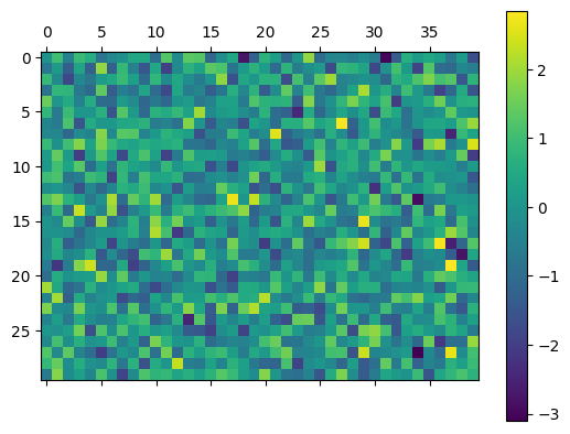
fig, axes = plt.subplots(2, 2, figsize=(8, 6))
cmaps = ['PiYG', 'BuGn', 'Greys', 'bwr']

for ax, cmap in zip(axes.flat, cmaps):
    img = ax.matshow(arr, cmap=cmap)
    ax.set_title(cmap)

    fig.colorbar(img, ax=ax, shrink=0.8, aspect=10)
    # shrink : 컬러바 세로 길이
    # aspect : (긴 변 : 짧은 변) 비율

    img.set_clim(-1, 1)
    # color limit

plt.show()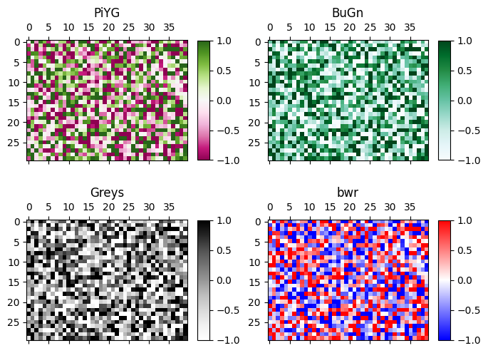
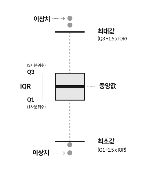
📦 박스 플롯
- 수치 데이터를 표현하는 그래프
- 요약 수치
① 최솟값
② 제 1사분위 수 (Q1)
③ 제 2사분위 수 (Q2: 중앙값)
④ 제 3사분위 수 (Q3)
⑤ 최댓값
plt.figure(figsize=[5, 4])
np.random.seed(0)
data_a = np.random.normal(0, 2.0, 1000)
data_b = np.random.normal(-3.0, 1.5, 500)
data_c = np.random.normal(1.2, 1.5, 1500)

plt.boxplot([data_a, data_b, data_c])
plt.ylim(-10, 10)
plt.xlabel('Data Type')
plt.ylabel('Value')

plt.show()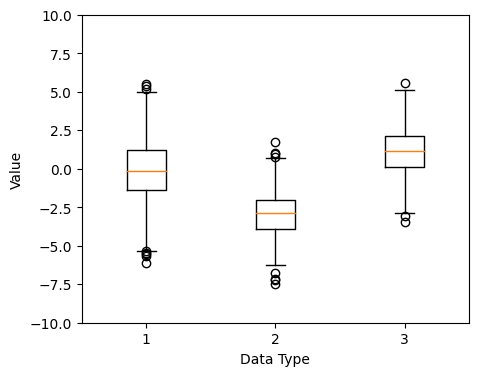

울레일라