
🧾 그래프 유형

- Relational Plots
- 두 변수의 관계를 볼 때 사용
- scatterplot (산점도)
- lineplot (선 그래프)
- Distribution Plot
- 변수의 데이터 분포를 볼 때 사용
- histplot (히스토그램)
- kdeplot (Kernel Density Estimate)
- ecdfplot (Empirical Cumulative Distribution Functions)
- rugplot
- Categorical Plots
- 범주형 변수의 집계, 또는 범주형 변수와 수치형 변수 간의 관계를 볼 때 사용
- stripplot
- swarmplot
- boxplot
- violinplot
- pointplot
- barplot
🔎 데이터 조회
◽ tips 데이터셋
import seaborn as sns
tips = sns.load_dataset('tips')
tips.head()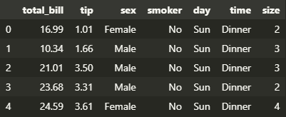
| 컬럼명 | 의미 | 인자 |
|---|---|---|
| total_bill | 총 계산 요금 | 3.07 ~ 50.81 |
| tip | 팁 | 1.0 ~ 10.0 |
| sex | 성별 | Male ; Female ; |
| smoker | 흡연 여부 | Yes ; No ; |
| day | 요일 | Thur ; Fri ; Sat ; Sun ; |
| time | 식사 시간 | Lunch ; Dinner ; |
| size | 식사 인원 | 1 ~ 6 |
◽ fMRI 데이터셋
※ fMRI : 혈류와 관련된 변화를 감지하여 뇌 활동을 측정하는 기술
import seaborn as sns
fmri = sns.load_dataset('fmri')
fmri.head()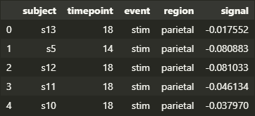
| 컬럼명 | 의미 | 인자 |
|---|---|---|
| subject | 실험 참가자 | s0 ~ s13 |
| timepoint | 신호 발생 시점 | 0 ~ 18 |
| event | 실험 조건 | stim (시각적 자극) ; cue (언어적/비언어적 신호) ; |
| region | 신호가 발생한 뇌의 영역 | parietal (두정엽) ; frontal (전두엽) ; |
| signal | 뇌 활동 신호 | -0.255 ~ 0.565 |
◽ penguins 데이터셋
import seaborn as sns
penguins = sns.load_dataset('penguins')
penguins.head()
| 컬럼명 | 의미 | 인자 |
|---|---|---|
| species | 펭귄 종 | Adelie ; Chinstrap ; Gentoo ; |
| island | 펭귄이 발견된 섬 | Torgersen ; Biscoe ; Dream ; |
| bill_length_mm | 부리 길이 (mm) | 32.1 ~ 59.6 |
| bill_depth_mm | 부리 높이 (mm) | 13.1 ~ 21.5 |
| flipper_length_mm | 날개 길이 (mm) | 172.0 ~ 231.0 |
| body_mass_g | 몸무게 (g) | 2700.0 ~ 6300.0 |
| sex | 성별 | Male ; Female ; |
♋ Relational Plots
relplot(data = [데이터프레임], x, y, kind)kind디폴트 인자는scatter
◽ Scatter Plot
- 데이터의 분포와 특성을 확인하기 위함
ex 1 ) 색상이나 모양으로는 범주형 데이터를 표현하기 좋음
sns.relplot(
    data=tips, x='total_bill', y='tip',
    kind='scatter', hue='smoker', style='time'
)
# hue : 색으로 구별
# style : 모양으로 구별
# total_bill과 tip간의 관계를 흡연자 여부와 식사 시간에 따라 표현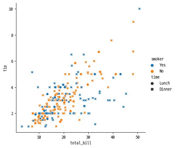
ex 2 ) 색상의 농도나 크기로 수치형 데이터를 표현할 수 있음
sns.relplot(
    data=tips, x='total_bill', y='tip',
    hue='size', size='size', sizes=(15, 100)
)
# total_bill과 tip간의 관계를 식사 인원 수에 따라 표현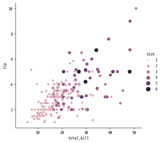
◽ Line Plot
- 시간의 흐름에 따른 데이터의 변화나 추세를 시각적으로 파악하기 위함
- 한 변수의 변화를 연속적인 형태로 이해해야 할 경우 사용
sns.relplot(data=fmri, x='timepoint', y='signal', kind='line')
# 신뢰구간을 비활성화 하고 싶다면 `errorbar=None` 추가
# 추정회귀선을 비활성화 하고 싶다면 `estimator=None` 추가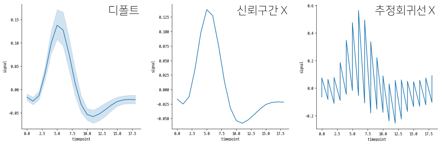
sns.relplot(
    data=fmri, x='timepoint', y='signal',
    kind='line', hue='region', style='event',
    errorbar=None
)
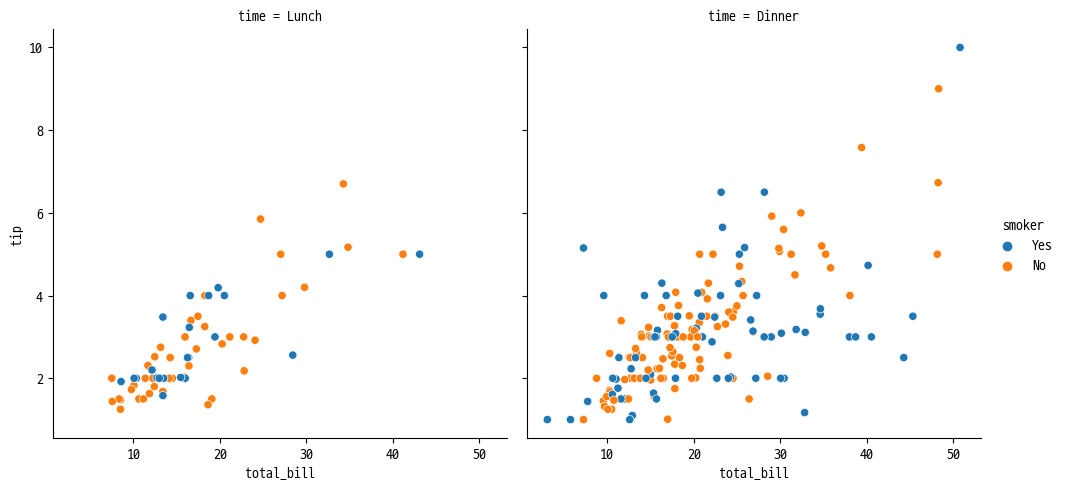
◽ 여러 관계 그래프
ex 1 ) 식사 시간에 따라 각 열에 표현
sns.relplot(
    data=tips, x='total_bill', y='tip',
    hue='smoker', col='time'
)
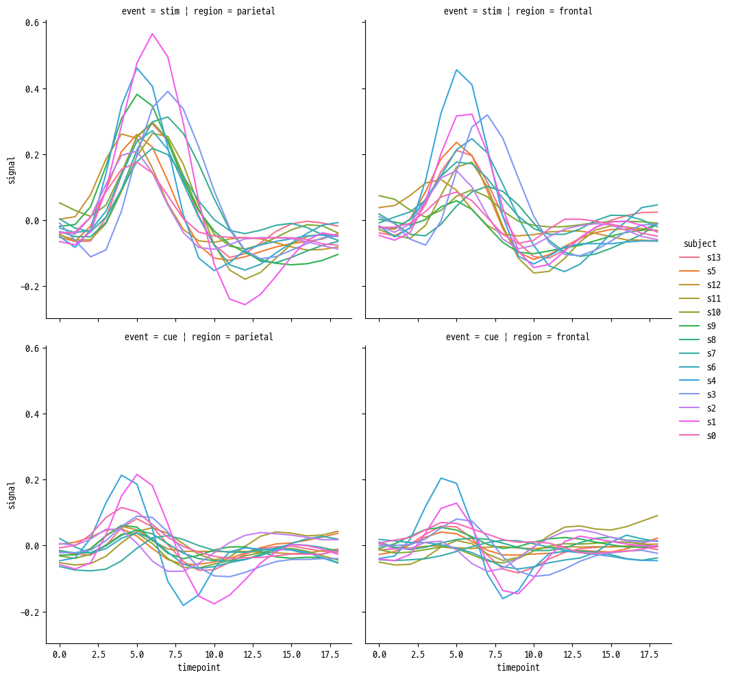
ex 2 ) 실험 조건에 따라 각 행에, 뇌 영역에 따라 각 열에 표현
sns.relplot(
    data=fmri, kind='line',
    x='timepoint', y='signal',
    hue='subject',
    row='event', col='region',
)
🎡 Distribution Plots
displot(data, x, kind)kind디폴트 인자는hist
◽ Histogram
- 히스토그램
sns.displot(
    data=penguins, x='flipper_length_mm',
    bins=range(170, 230, 10),
    hue='species', multiple='dodge', kind='hist'
)
# 정규화를 하기 위해서는 stat 인자 사용
# stat = 'count' : 디폴트
# stat = 'density' : 영역의 합이 1
# stat = 'probability' : 높이의 합이 1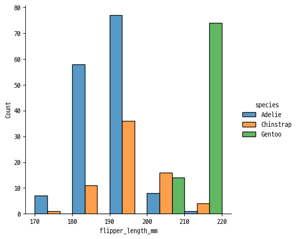
◽ KDE Plot
- Kernel Density Estimation Plot
- 가우시안 커널로 값을 평활화하여 연속 밀도 추정치 제공
sns.displot(
    data=penguins, x='flipper_length_mm',
    bw_adjust=.5,   # bins와 비슷한 역할, 작을수록 잘게 쪼개어짐
    hue='species', fill=True, kind='kde'
)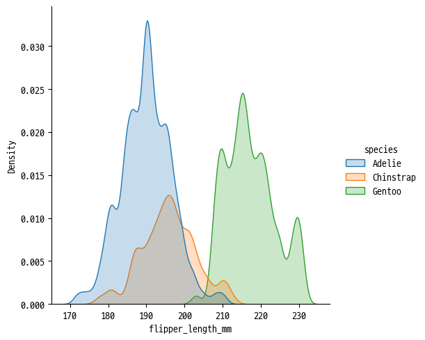
KDE Plot 사용 시 주의할 점
- 데이터 자체가 매끄럽지 않은 경우에도 곡선을 부드럽게 표시
diamonds = sns.load_dataset("diamonds")| 원본 형태 | KDE 형태 | 결합 (추천) |
|---|---|---|
sns.displot(diamonds,x="carat", kind="hist") | sns.displot(diamonds,x="carat", kind="kde") | sns.displot(diamonds,x="carat", kde=True) |
 |  | 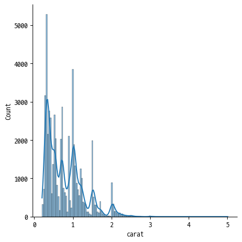 |
◽ ECDF Plot
- Empirical Cumulative Distribution Function (경험정 누적 분포 함수)
sns.displot(penguins, x="flipper_length_mm", hue="species", kind="ecdf")
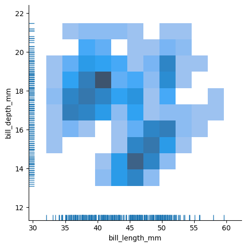
◽ Rug Plot
- 1차원 실수 분포 플롯
sns.displot(
	data=penguins,
    x='bill_length_mm',
    y='bill_depth_mm',
    rug=True
)
🔱 Categorical Plot
catplot(data, x, y, kind)kind디폴트 인자는strip
◽ Strip Plot
- 데이터가 서로 겹쳐있어 정확한 분석이 어려울 수 있음
sns.catplot(data=tips, x="day", y="total_bill", kind='strip')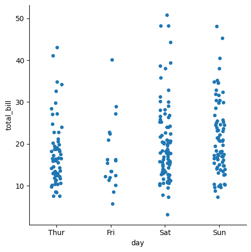
◽ Swarm Plot
- strip plot의 단점 보완
- 어느 곳에 데이터가 많이 분포되었는지 알 수 있음
sns.catplot(
	data=tips, x="day", y="total_bill",
    hue="sex", kind="swarm"
)
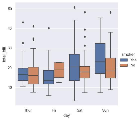
◽ Box Plot (분포 비교)
sns.catplot(
    data=tips, x="day", y="total_bill",
    hue="smoker", kind="box"
)
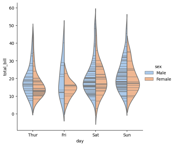
◽ Violin Plot (분포 비교)
sns.catplot(
    data=tips, x="day", y="total_bill",
    hue="sex", inner="stick", palette="pastel",
    kind="violin", split=True
)
◽ Point Plot (중심 경향 추정)
sns.catplot(
    data=titanic, x="sex", y="survived",
    hue="class", kind="point"
)
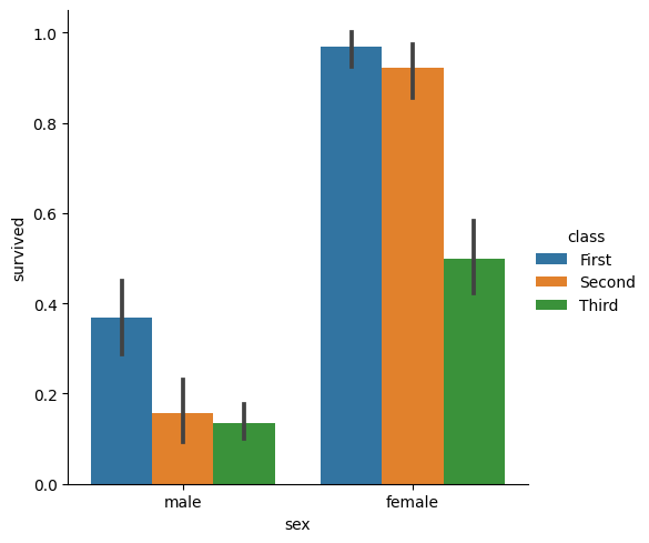
◽ Bar Plot (중심 경향 추정)
sns.catplot(
    data=titanic, x="sex", y="survived",
    hue="class", kind="bar"
)

울레일라