이번 튜토리얼에선 사용자 정의 스타일 클래스를 컨트롤에 추가해서 CSS를 사용해본다.
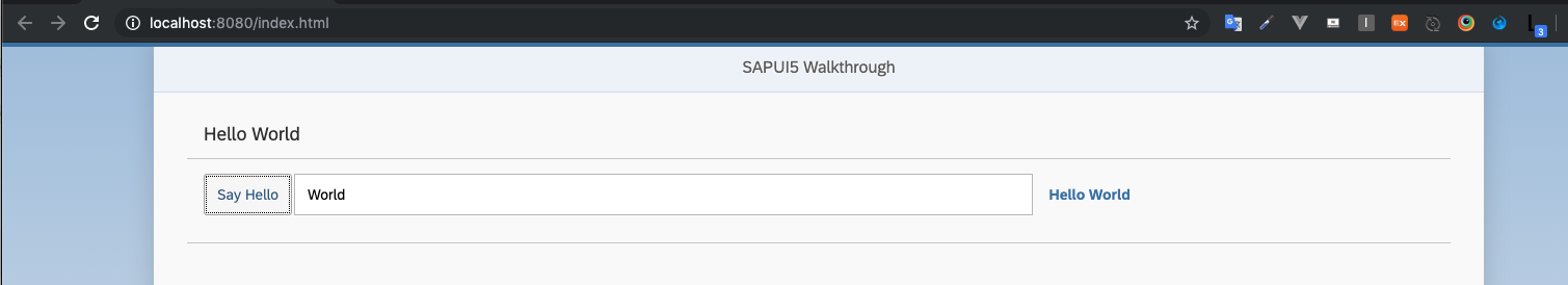
Preview
Caution: SAPUI5에서 스타일을 재정의하려면 SAPUI5가 업데이트 될 때마다 수정 사항을 테스트하고 업데이트 해야한다.
만약 SAPUI5가 모든 응용 프로그램에 대해 중앙집중식으로 로드되는SAP Fiori launchpad에서 스타일을 덮어 써서는 안된다.
Coding
webapp/css/style.css (New)
html[dir="ltr"] .myAppDemoWT .myCustomButton.sapMBtn {
   margin-right: 0.125rem
}

html[dir="rtl"] .myAppDemoWT .myCustomButton.sapMBtn {
   margin-left: 0.125rem
}

.myAppDemoWT .myCustomText {
   display: inline-block;
   font-weight: bold;
}
CSS 파일을 저장할 폴더 css를 하고 클래스를 custom namespace class와 결합하여 만든다. 이렇게 하면 App 안에 Control에만 적용된다.
webapp/manifest.json
...
  "sap.ui5": {
	...
	"models": {
	  ...
	},
	"resources": {
	  "css": [
		{
		  "uri": "css/style.css"
		}
	  ]
	}

  }
sap.ui5 네임 스페이스의 resources 섹션에서 앱의 추가 리소스를 로드 할 수 있다.
component를 기준으로 URI를 정의하여 CSS 스타일을 로드 한다.
OpenUI5는 일반 웹 페이지처럼 HTML 페이지의 헤더에 이 파일을 태그로 추가하고 브라우저는 자동으로 이 파일을 로드 한다.
webapp/view/App.view.xml
<mvc:View
	controllerName="sap.ui.demo.walkthrough.controller.App"
	xmlns="sap.m"
	xmlns:mvc="sap.ui.core.mvc"
	displayBlock="true">
	<Shell>
		<App class="myAppDemoWT">
			<pages>
				<Page title="{i18n>homePageTitle}">
					<content>
						<Panel
							headerText="{i18n>helloPanelTitle}"
							class="sapUiResponsiveMargin"
							width="auto">
							<content>
								<Button
									text="{i18n>showHelloButtonText}"
									press=".onShowHello"
									class="myCustomButton"/>
								<Input
									value="{/recipient/name}"
									valueLiveUpdate="true"
									width="60%"/>
								<FormattedText
									htmlText="Hello {/recipient/name}"
									class="sapUiSmallMargin sapThemeHighlight-asColor myCustomText"/>
							</content>
						</Panel>
					</content>
				</Page>
			</pages>
		</App>
	</Shell>
</mvc:View>
app 컨트롤은 myAppDemoWT라는 custom namespace class로 구성 된다.
이 클래스는 <App>에만 유효한 CSS selectors를 정의하는 CSS definition으로 사용된다.
버튼에 CSS 클래스를 추가하여 버튼과 인풋 필드 사이의 공간을 정확하게 정의한다.
출력 텍스트를 강조 표시하기 위해 사용자 정의 CSS 또는 HTML 코드를 사용하여 개별적으로 스타일을 지정할 수 있는 FormattedText 컨트롤을 사용한다.
CSS 클래스 (myCustomText)를 추가하고 theme-dependent CSS 클래스를 추가하여 테마에 정의 된 강조 색상을 설정한다.
Conventions
- 사용자 정의 CSS에는 색상을 지정하는 대신 표준 테마 종속 클래스를 사용하는걸 권장한다.
Related Information
Descriptor for Applications, Components, and Libraries
CSS Classes for Theme Parameters
Creating Themable User Interfaces