Anaconda 설치하기
아나콘다를 설치해줍니다.
그리고 Anaconda Prompt를 실행하고
- Anaconda 프로젝트 만들기
conda create -n chanyoung- 모든 환경 목록을 보려면
conda info --envs- 기본 환경 변경 및 나만의 환경 설정
conda activateconda activate 내이름- Jupyter를 설치합니다.
conda install jupyter- Jupyter notebook을 실행합니다.
jupyter notebook라이브러리 설치하기
- plotly을 설치합니다.
conda install plotly- Kaleido 설치합니다.
pip install kaleido- Statsmodels 설치하기
pip install statsmodels주피터 노트북 실행하기
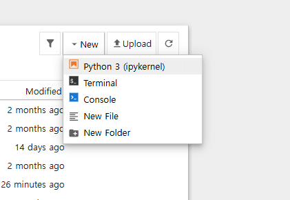
python3을 만들고 이름을 변경해줍니다.
이제 모든 준비가 끝났습니다.
기초 그래프 만들어보기
한번 코딩을 실행해보면
shift + enter : 출력
enter : 줄바꿈
이제부터 진짜 시작해보겠다.
graph_objects 모듈을 활용한 생성
# graph_objects 패키지를 go 로 불러옵니다.
import plotly.graph_objects as go
# go.Figure() 함수를 활용하여 기본 그래프를 생성합니다.
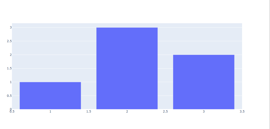
fig = go.Figure(
# Data 입력
data=[go.Bar(x=[1, 2, 3], y=[1, 3, 2])],
# layout을 입력합니다.
layout=go.Layout(
title=go.layout.Title(text="A Figure Specified By A Graph Object")
)
)
#show하면 주피터 노트북에 그래프가 나타남.
fig.show()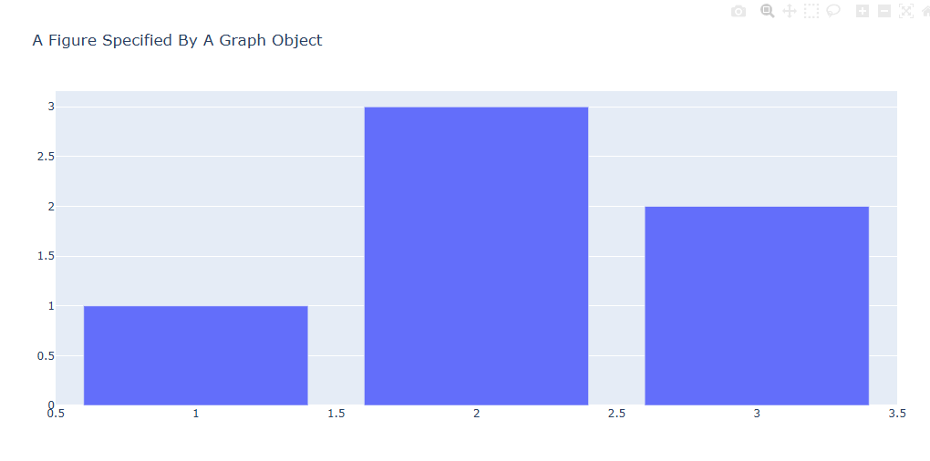
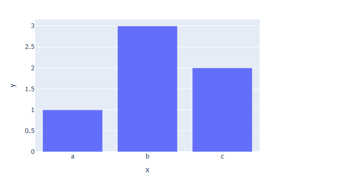
express 모듈을 활용한 그래프 생성
말 그대로 빠르고 짧은 코드로 양질의 그래프를 생성하는 코드
# express 패키지를 px로 불러옴
import plotly.express as px
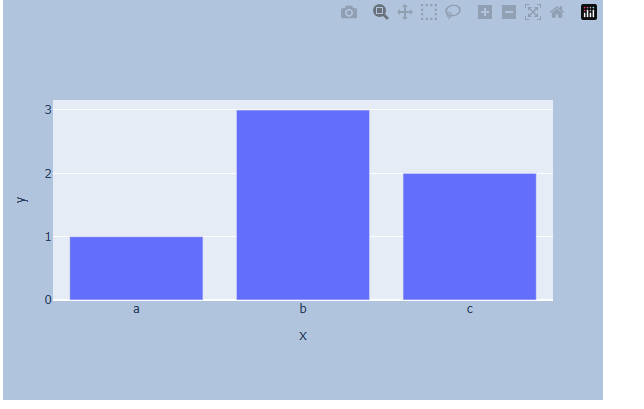
# px.bar() 함수를 활용해서 bar chart 생성과 동시에 Data, Layout 값 입력
fig = px.bar(x=["a", "b", "c"], y=[1, 3, 2],title="A Figure Specified By express")
#show하면 내 노트북 (주피터 노트북 등)에 그래프가 나타남.
fig.show()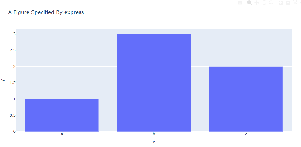
그래프 업데이트 기초 문법
Plotly 그래프 튜닝 과정이라고 볼 수 있다.
add_trace()
fig.add_trace(추가할 Trace 입력)import plotly.graph_objects as go
fig = go.Figure()
fig.add_trace(go.Bar(x=[1, 2, 3], y=[1, 3, 2]))
fig.show()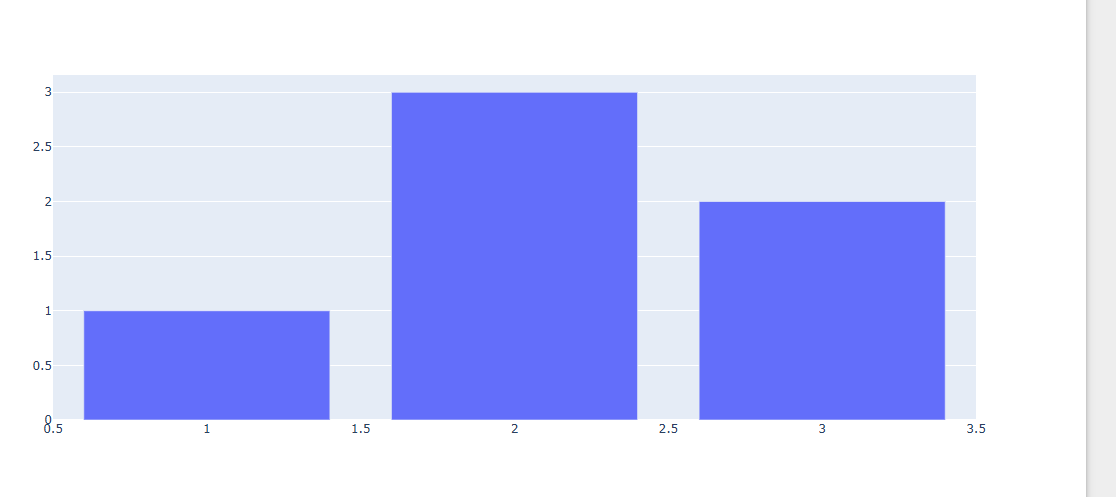
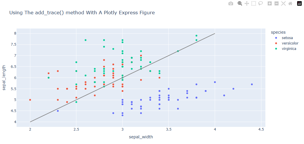
응용 버전 : 이미 생성된 scatterplot 위에 직선의 그래프를 add_trace()를 활용해서 추가합니다.
(이미 생성된 Trace 위에 Trace를 겹쳐 생성)
import plotly.express as px

# 데이터 불러오기
df = px.data.iris()

# express를 활용한 scatter plot 생성
fig = px.scatter(df, x="sepal_width", y="sepal_length", color="species",
                 title="Using The add_trace() method With A Plotly Express Figure")

fig.add_trace(
    go.Scatter(
        x=[2, 4],
        y=[4, 8],
        mode="lines",
        line=go.scatter.Line(color="gray"),
        showlegend=False)
)

fig.show()
여기서 species의 자세한 데이터는 기본 제공 데이터다.
update_trace()
update_trace() 함수를 사용하면 이미 생성된 trace의 type, 색, 스타일, 템플릿 등 추가 편집이 가능합니다.
fig.update_traces(업데이트 내용)말 그래도 이미 만들어진 trace를 업데이트 하는 함수 입니다.
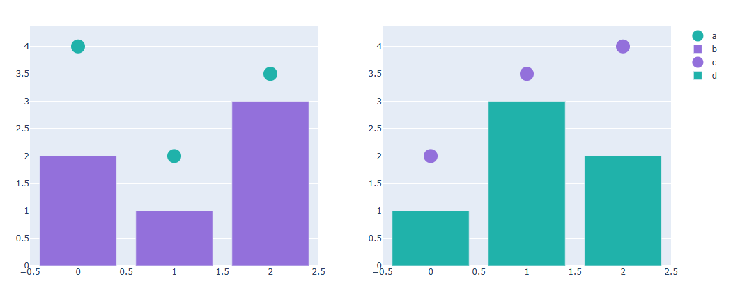
from plotly.subplots import make_subplots

# subplot 생성
fig = make_subplots(rows=1, cols=2) # 행은 1개 열은 2개짜리 그래프 틀을 생성

# Trace 추가하기
fig.add_scatter(y=[4, 2, 3.5], mode="markers",
                marker=dict(size=20, color="LightSeaGreen"),
                name="a", row=1, col=1) # (1,1)에 위치시킴

fig.add_bar(y=[2, 1, 3],
            marker=dict(color="MediumPurple"),
            name="b", row=1, col=1)

fig.add_scatter(y=[2, 3.5, 4], mode="markers",
                marker=dict(size=20, color="MediumPurple"),
                name="c", row=1, col=2) # (1, 2)에 위치시킴

fig.add_bar(y=[1, 3, 2],
            marker=dict(color="LightSeaGreen"),
            name="d", row=1, col=2)
이미 이러한 그래프를 만들어 놓는다.
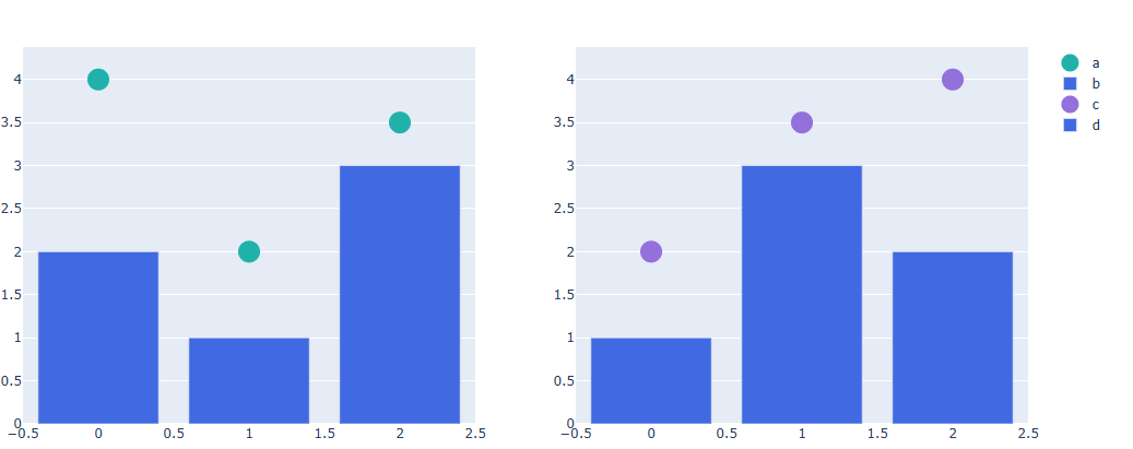
update_trace()를 통해 그래프를 업데이트 해보겠다.
# 한번에 Bar plot 만 파란색으로 바꾸기
fig.update_traces(marker=dict(color="RoyalBlue"), # 그래프의 컬러를 RoyalBlue로 설정
                  selector=dict(type="bar"))
fig.show()
전에 만들었던 막대그래프의 보라, 초록색의 색깔이 파란색으로 바뀌었다.
update_layout()
update_layout() 함수를 사용하면 그래프 사이즈, 제목 및 텍스트, 글꼴크기 와 같은 Trace 외적인 그래프 요소를 업데이트 가능합니다.
fig.update_layout(업데이트 내용)말 그대로 Layout과 관련있는 내용을 update하는 함수입니다.
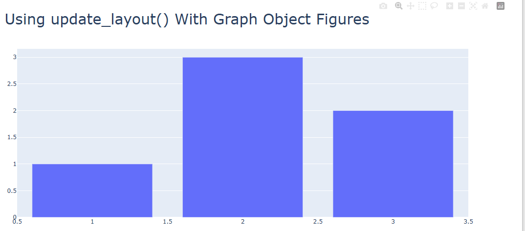
import plotly.graph_objects as go

#그래프 생성
fig = go.Figure(data=go.Bar(x=[1, 2, 3], y=[1, 3, 2]))
fig.show()
이미 만들어진 Layout에
# 타이틀 추가하기
fig.update_layout(title_text="Using update_layout() With Graph Object Figures",title_font_size=30)

fig.show()
제목을 추가하는 함수를 써봤습니다.
update_xaxes() / update_yaxes()
fig.update_xaxes(업데이트 내용)
fig.update_yaxes(업데이트 내용
update_xaxes(), update_yaxes() 함수를 사용하면 각각 X축, Y축에 관한 다양한 편집이 가능합니다.
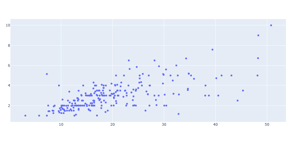
import plotly.graph_objects as go
import plotly.express as px

#데이터 생성
df = px.data.tips()
x = df["total_bill"]
y = df["tip"]

# 그래프 그리기
fig = go.Figure(data=go.Scatter(x=x, y=y, mode='markers'))
fig.show()
이런식으로 축 이름이 없는 산포도 그래프를
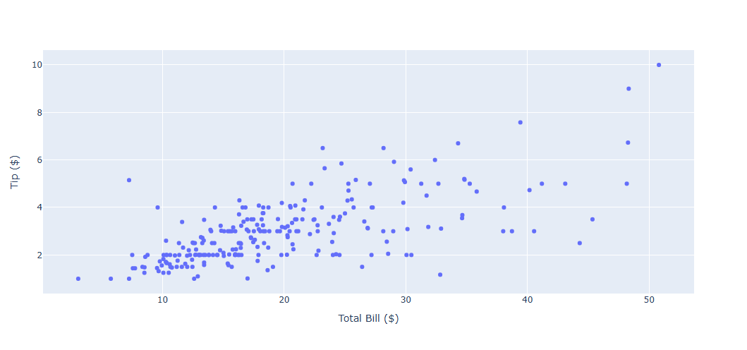
# 축 타이틀 추가하기
fig.update_xaxes(title_text='Total Bill ($)')
fig.update_yaxes(title_text='Tip ($)')

fig.show()
x축, y축의 이름을 설정할 수 있다.
그래프 사이즈 설정하기
그래프 생성방법에(express, graph_object ) 따라 그래프 사이즈 및 Margin 설정 방법에 대해 알아봅니다.
express 그래프
import plotly.express as px

fig = px.bar(x=["a", "b", "c"], y=[1, 3, 2],width=600, height=400)

fig.show()
그래프 함수 안에 width= , height= 를 통해 픽셀 단위의 크기를 지정할 수 있습니다.
graph_object 그래프
import plotly.graph_objects as go

fig = go.Figure(data=[go.Bar(x=[1, 2, 3], y=[1, 3, 2])])

fig.update_layout(width=600,height=400)

fig.show()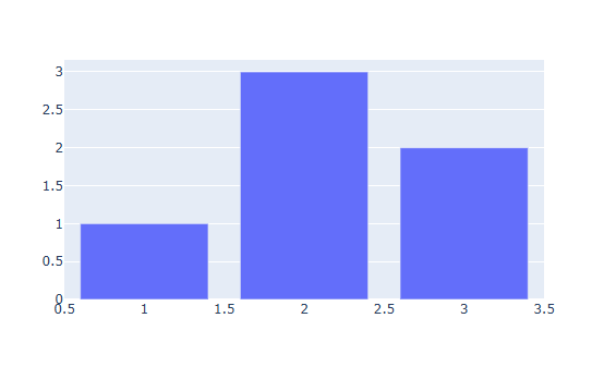
Margine 적용 방법
margin 이란 전체 크기(Figure) 와 그래프(Trace) 사이의 거리를 뜻합니다.
fig.update_layout(
        margin_l=left margine, # 왼쪽으로 얼마나 거리를 남겨둘건지
        margin_r=right margine, # 오른쪽으로 얼마나 거리를 남겨둘건지
        margin_b=bottom margine, # 밑으로 얼마나 거리를 남겨둘건지
        margin_t=top margine) # 위쪽으로 부터 얼마나 거리를 남겨둘건지
실제 사용
import plotly.express as px

fig = px.bar(x=["a", "b", "c"], y=[1, 3, 2])

# 그래프 크기와 margin 설정하기

fig.update_layout(
    width=600,
    height=400,
    margin_l=50,
    margin_r=50,
    margin_b=100,
    margin_t=100,
    # 백그라운드 칼라 지정, margin 잘 보이게 하기위함
    paper_bgcolor="LightSteelBlue",
)

fig.show()