
Plotly 타이틀 설정하기
말 그대로 그래프의 제목을 붙이는 작업을 하겠다.
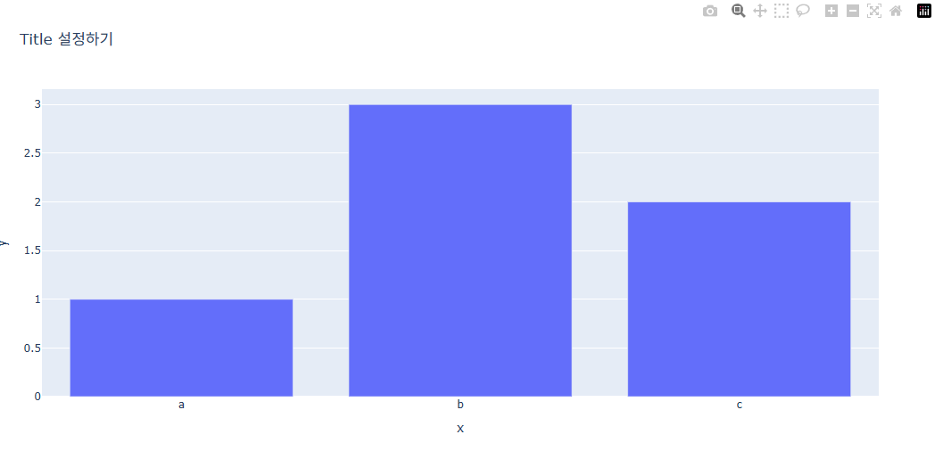
1) express 그래프로 만든 경우
import plotly.graph_objects as go

fig = go.Figure(
    data=[go.Bar(x=[1, 2, 3], y=[1, 3, 2])],
    layout=go.Layout(title=go.layout.Title(text="Title 설정하기")))
fig.show()
Title 설정하기 라는 제목이 생긴것을 볼 수 있다.
2) graph_object 그래프로 만든 경우
import plotly.graph_objects as go

fig = go.Figure(
    data=[go.Bar(x=[1, 2, 3], y=[1, 3, 2])],
    layout=go.Layout(title=go.layout.Title(text="Title 설정하기")))
fig.show()
결과는 위와 같다.
3) 두가지를 모두 커버하는 방법
fig.update_layout(title_text="타이틀 입력")udate_layout함수를 통해 이 두가지 방법을 모두 커버할 수 있다.
# express 방법
import plotly.express as px

fig = px.bar(x=["a", "b", "c"], y=[1, 3, 2])

fig.update_layout(title_text="타이틀 설정하기")

fig.show()
-------------------------------------------------------------
# graph_objects  방법
import plotly.graph_objects as go

fig = go.Figure(data=[go.Bar(x=[1, 2, 3], y=[1, 3, 2])])

fig.update_layout(title_text="타이틀 설정하기")

fig.show()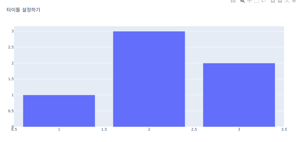
위치 지정
제목의 위치를 지정할 수도 있다.
fig.update_layout(
            title_x = (0~1) 사이값
            title_y = (0~1) 사이값
            title_xanchor = (`auto","left","center","right")
            title_yanchor = ("auto","top","middle","bottom")
            })
- title_x = 가로 축의 좌표로 0은 맨 왼쪽 1은 맨 오른쪽을 뜻합니다.
- title_y = 세로 축의 좌표로 0은 맨 아래 1은 맨 윗쪽을 뜻합니다.
- title_xanchor = 좌표를 중심으로 타이틀을 왼쪽, 또는 가운데, 오른쪽에 놓을지 설정합니다.
- title_yanchor = 좌표를 중심으로 타이틀을 위에, 또는 가운데, 아래에 놓을지 설정합니다.
import plotly.express as px
fig = px.bar(x=["a", "b", "c"], y=[1, 3, 2], title="Title 설정하기")

# 타이틀 위치 설정부분
fig.update_layout(
                 title_x = 0.5,
                 title_y = 0.9,
                 title_xanchor = "center",
                 title_yanchor = "middle")

fig.show()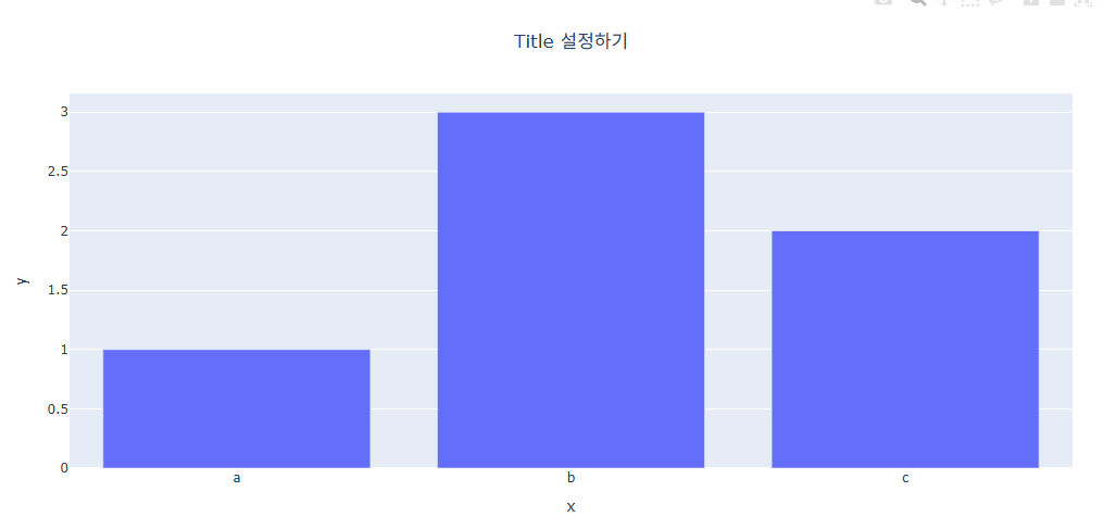
폰트 스타일 지정(크기, 색, 서체)
fig.update_layout(
        title_font_size = 폰트 사이즈
        title_font_color = "색 지정"
        title_font_family = "폰트 지정"
        )
폰트 패밀리의 글꼴 모음
- serif : 삐침 있는 명조계열의 글꼴 모음
- sans-serif : 삐침 없는 고딕계열의 글꼴 모음
- cursive : 손 필기체 같은 느낌의 글꼴 모음
- monospace : 글자 폭과 간격이 일정한 글꼴 모음
- fantasy : 위 폰트들을 제외한 나머지 화려한 글꼴 모음
import plotly.express as px
fig = px.bar(x=["a", "b", "c"], y=[1, 3, 2], title="Title 설정하기")

fig.update_layout(
        # 타이틀 위치 설정 부분
        title_y = 0.9,
        title_x = 0.5,
        title_xanchor = 'center',
        title_yanchor ='middle',
        # 폰트 스타일 추가 부분
        title_font_size = 25,
        title_font_color = "red",
        title_font_family = "Times")

fig.show()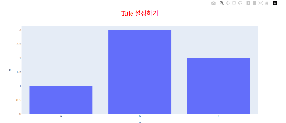
Plotly 축 타이틀 설정하기(Axes Title)
말 그대로 축의 제목을 설정합니다.
1) express 그래프
express 를 통해 시각화를 하는경우 아래와 같이 자동으로 데이터 컬럼명으로 축의 타이틀이 생성됩니다.
import plotly.express as px

# 데이터 불러오기
df = px.data.tips()

#그래프 그리기
fig = px.scatter(df, x="total_bill", y="tip")

fig.show()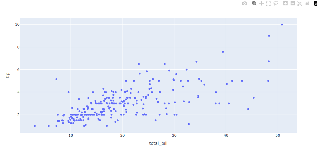
- 축 제목 변경법
fig = px.scatter(df, x="total_bill", y="tip",
    labels=dict(total_bill="Total Bill ($)", tip="Tip ($)"))
2) graph_object 그래프
graph_object를 통해 시각화를 하는경우 자동 생성이 되지 않습니다 . 별도의 코드를 통해 축 타이틀을 추가합니다.
fig.update_xaxes(title_text='X축 타이틀명')
fig.update_yaxes(title_text='Y축 타이틀명')
이런식으로 사용합니다.
import plotly.graph_objects as go
import plotly.express as px

#데이터 생성
df = px.data.tips()
x = df["total_bill"]
y = df["tip"]
fig = go.Figure(data=go.Scatter(x=x, y=y, mode='markers'))

fig.update_xaxes(title_text='Total Bill ($)')
fig.update_yaxes(title_text='Tip ($)')

fig.show()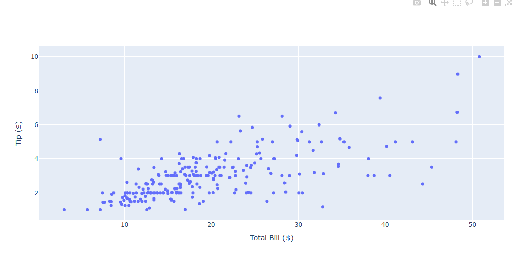
축 타이틀 스타일 설정방법
축 레이블은 글자크기, 색, 서체 변경이 가능합니다.
fig.update_xaxes(title_font_size =30,
                 title_font_color='crimson',
                 title_font_family='Courier')
fig.update_yaxes(title_font_size =30,
                 title_font_color='crimson',
                 title_font_family='Courier')
- fig.update_xaxes() : x축 타이틀 스타일을 업데이트 할떄 사용
- fig.update_yaxes() : y축 타이틀 스타일을 업데이트 할때 사용
- title_font_size = 폰트 사이즈를 숫자로 입력합니다.
- title_font_color= 원하는 색을 지정합니다.
- title_font_family = HTML font family로 plotly를 구동하는 web browser에서 지원하는 폰트를 지원합니다.
import plotly.express as px

# 데이터 불러오기
df = px.data.tips()

#그래프 그리기
fig = px.scatter(df, x="total_bill", y="tip")

# 축 타이틀 스타일 지정부분
fig.update_xaxes(title_text='Total Bill ($)',
                 title_font_size =30,
                 title_font_color='crimson',
                 title_font_family='Courier')
fig.update_yaxes(title_text='Tip ($)',
                 title_font_size =30,
                 title_font_color='crimson',
                 title_font_family='Courier')

fig.show()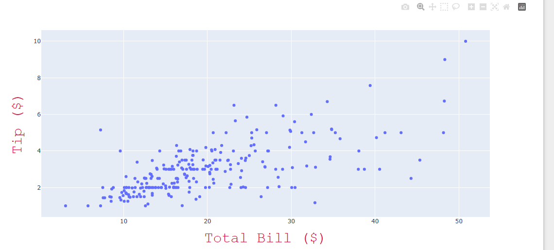
축 타이틀 위치 지정 방법
Trace 와 축 타이틀 사이 간격을 조절하며 위치 지정이 가능합니다.
fig.update_xaxes(title_standoff= 100)
fig.update_yaxes(title_standoff= 100)
- fig.update_xaxes() : x축 타이틀 스타일을 업데이트 할떄 사용
- fig.update_yaxes() : y축 타이틀 스타일을 업데이트 할때 사용
- title_standoff : 축 타이틀과 Trace 사이의 거리, 거리를 키울수록 Trace의 크기가 줄어듭니다.(Figure 사이즈는 고정이기에..)
import plotly.express as px

# 데이터 불러오기
df = px.data.tips()

# 그래프 그리기
fig = px.scatter(df, x = "total_bill", y = "tip")

# 축 타이틀 스타일 + 위치 지정 부분
fig.update_xaxes(title_text='Total Bill ($)',
                 title_font_size =30,
                 title_font_color='crimson',
                 title_font_family='Courier',
                 title_standoff= 100)
fig.update_yaxes(title_text='Tip ($)',
                 title_font_size =30,
                 title_font_color='crimson',
                 title_font_family='Courier',
                 title_standoff= 100)

fig.show()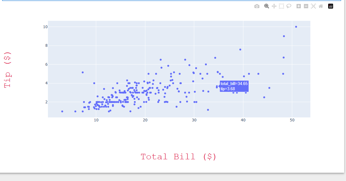
축 타이틀삭제 방법
express 를 통해 시각화하여 자동 생성되는 축 타이틀 또한 삭제가 가능.
import plotly.express as px

# 데이터 불러오기
df = px.data.tips()

#그래프 그리기
fig = px.scatter(df, x="total_bill", y="tip")

# 축 레이블 삭제하기
fig.update_xaxes(title=None)
fig.update_yaxes(title=None)

fig.show()
- fig.update_xaxes() : x축 타이틀 스타일을 업데이트 할떄 사용
- fig.update_yaxes() : y축 타이틀 스타일을 업데이트 할때 사용
- title =None
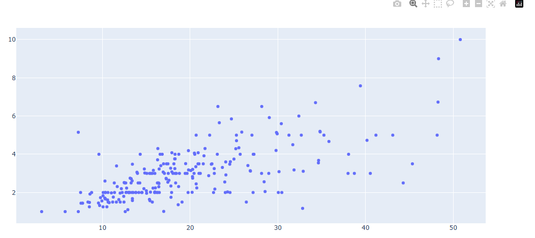
Plotly 축 범위 지정하기
축 범위를 조절하는 방법, 축의 범위를 역방향으로 전환하는 방법, Log 스케일로 변환하는 방법
fig.update_xaxes(range=[min, max])
fig.update_yaxes(range=[min, mam])
예제)
import plotly.express as px
#데이터 불러오기
df = px.data.iris()

# Figure 생성
fig = px.scatter(df, x="sepal_width", y="sepal_length", facet_col="species")

# 축 범위 지정
fig.update_xaxes(range=[0, 5])
fig.update_yaxes(range=[0, 10])

fig.show()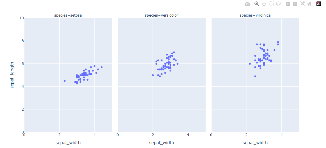
축 범위 역방향으로 지정하기
fig.update_xaxes(autorange="reversed")
fig.update_yaxes(autorange="reversed")
예제)
import plotly.express as px
#데이터 불러오기
df = px.data.iris()

# Figure 생성
fig = px.scatter(df, x="sepal_width", y="sepal_length", facet_col="species")

# y 축 reverse
fig.update_yaxes(autorange="reversed")

fig.show()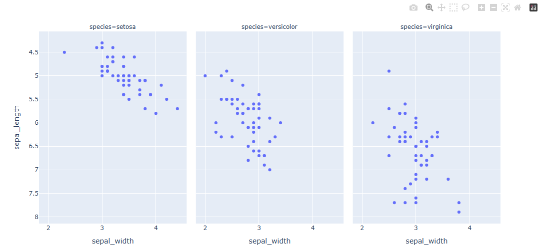
Log 스케일 지정하기
fig.update_xaxes(type="log")
fig.update_yaxes(type="log")
예제)
import plotly.graph_objects as go
import numpy as np

#데이터 생성
x = np.linspace(1, 200, 30)

# Figure 생성
fig = go.Figure(go.Scatter(x=x, y=x**3))

# 축 Log 스케일로 변환
fig.update_xaxes(type="log")
fig.update_yaxes(type="log")

fig.show()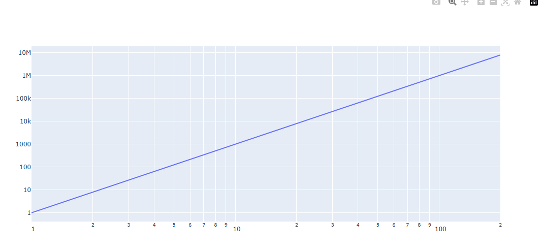

안녕하세요 게임개발을 공부하고 있는 돼지인간 입니다.