1. 학습한 내용
https://getbootstrap.com/docs/5.2/
→ 부트스트랩 document 페이지
customize 메뉴 : 부트스트랩만 단순히 사용하는 것 + 커스텀해서 추가적인 기능 활용
layout 메뉴(핵심!) :
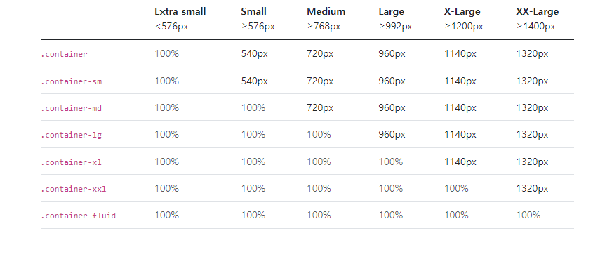
container : max-width가 바뀜
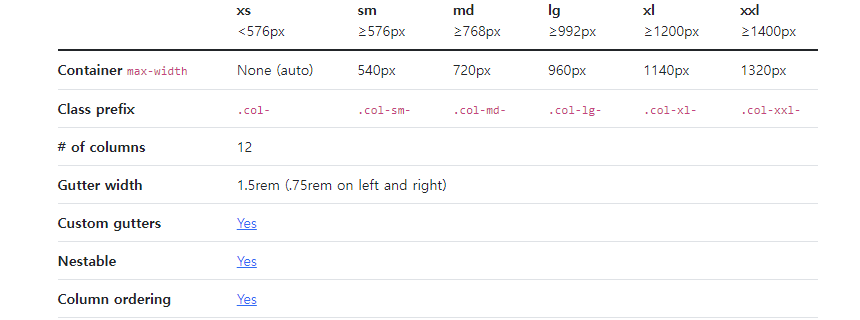
grid 메뉴
: https://getbootstrap.com/docs/5.2/layout/grid/
Utilites 메뉴
: Changing display 가 중요
content의 Typography 메뉴
: 글자 크기 관련
→ 나머지 다른 메뉴(images, tables, figures)들은 스스로 확인하기
-
아래 componets의 기능들(복사 붙여넣기 하면 바로 그 기능 사용 가능)
Alerts
Badge
Breadcrumb(메뉴 구조)
Buttons(버튼의 색깔, 형태, 크기 등)
Button group(관련 있는 버튼끼리 붙어서 그룹으로 나옴)
card(많이 사용함)
carousel(슬라이드 자동으로 넘어가면서 이미지가 나오는 것)
Modal(alert와 비슷 다름 / 많이 활용)
Navbar(메뉴 바를 만들어서 쉽게 메뉴를 펼칠 수 있게 만드는 것)
Nav & tabs
Pagination(페이지 1, 2, 3 버튼 만들어서 다음 버튼 누르면, 페이지 4, 5 이렇게 넘어가는 형태)
Progress(애니메이션도 가능)
Toasts(퉁 튀어 나오는 메시지)
→ 디자이너들이 아닌 개발자들이 유용하게 잘 사용할 수 있게 만듦 -
Helpers 기능들
Clearfix
Color & background
Ratio(이미지 비율 지원)
Postion(sticky ...등)
Visually hidden 등 -
Utilities 기능들
Borders(테두리 선 효과들)
Display(경우마다 포인트를 보이고 안보이게 만들 수 있음)
Spacing(margin, padding, gap)
Text(글자 시작, 크기, overflow(넘칠 때 word break))
Vertical align
Visibility
- https://themes.getbootstrap.com : 다양한 부트스트랩 템플릿을 활용할 수 있는 사이트
0527 / bootstrap / index-exam.html & https://getbootstrap.com/docs/5.2/examples 내용을 참고해서 페이지 소스 검사, 필요한 소스만 가져오기 & 이미지들은 이미지 소스가 저장된 페이지를 url로 연결시켜서 가져올 수 있었음
<!doctype html>
<html lang="en">
<head>
<meta charset="utf-8">
<meta name="viewport" content="width=device-width, initial-scale=1">
<title>Bootstrap demo</title>
<link href="https://cdn.jsdelivr.net/npm/bootstrap@5.2.0-beta1/dist/css/bootstrap.min.css" rel="stylesheet" integrity="sha384-0evHe/X+R7YkIZDRvuzKMRqM+OrBnVFBL6DOitfPri4tjfHxaWutUpFmBp4vmVor" crossorigin="anonymous">
</head>
<body>
<header>
<div class="px-3 py-2 bg-dark text-white">
<div class="container">
<div class="d-flex flex-wrap align-items-center justify-content-center justify-content-lg-start">
<a href="/" class="d-flex align-items-center my-2 my-lg-0 me-lg-auto text-white text-decoration-none">
<svg class="bi me-2" width="40" height="32" role="img" aria-label="Bootstrap"><use xlink:href="#bootstrap"/></svg>
</a>
<ul class="nav col-12 col-lg-auto my-2 justify-content-center my-md-0 text-small">
<li>
<a href="#" class="nav-link text-secondary">
<svg class="bi d-block mx-auto mb-1" width="24" height="24"><use xlink:href="#home"/></svg>
Home
</a>
</li>
<li>
<a href="#" class="nav-link text-white">
<svg class="bi d-block mx-auto mb-1" width="24" height="24"><use xlink:href="#speedometer2"/></svg>
Dashboard
</a>
</li>
<li>
<a href="#" class="nav-link text-white">
<svg class="bi d-block mx-auto mb-1" width="24" height="24"><use xlink:href="#table"/></svg>
Orders
</a>
</li>
<li>
<a href="#" class="nav-link text-white">
<svg class="bi d-block mx-auto mb-1" width="24" height="24"><use xlink:href="#grid"/></svg>
Products
</a>
</li>
<li>
<a href="#" class="nav-link text-white">
<svg class="bi d-block mx-auto mb-1" width="24" height="24"><use xlink:href="#people-circle"/></svg>
Customers
</a>
</li>
</ul>
</div>
</div>
</div>
<div class="px-3 py-2 border-bottom mb-3">
<div class="container d-flex flex-wrap justify-content-center">
<form class="col-12 col-lg-auto mb-2 mb-lg-0 me-lg-auto" role="search">
<input type="search" class="form-control" placeholder="Search..." aria-label="Search">
</form>
<div class="text-end">
<button type="button" class="btn btn-light text-dark me-2">Login</button>
<button type="button" class="btn btn-primary">Sign-up</button>
</div>
</div>
</div>
</header>
<div class="container col-xxl-8 px-4 py-5">
<div class="row flex-lg-row-reverse align-items-center g-5 py-5">
<div class="col-10 col-sm-8 col-lg-6">
<img src="https://getbootstrap.com/docs/5.2/examples/heroes/bootstrap-themes.png" class="d-block mx-lg-auto img-fluid" alt="Bootstrap Themes" width="700" height="500" loading="lazy">
</div>
<div class="col-lg-6">
<h1 class="display-5 fw-bold lh-1 mb-3">Responsive left-aligned hero with image</h1>
<p class="lead">Quickly design and customize responsive mobile-first sites with Bootstrap, the world’s most popular front-end open source toolkit, featuring Sass variables and mixins, responsive grid system, extensive prebuilt components, and powerful JavaScript plugins.</p>
<div class="d-grid gap-2 d-md-flex justify-content-md-start">
<button type="button" class="btn btn-primary btn-lg px-4 me-md-2">Primary</button>
<button type="button" class="btn btn-outline-secondary btn-lg px-4">Default</button>
</div>
</div>
</div>
</div>
<div class="container px-4 py-5" id="custom-cards">
<h2 class="pb-2 border-bottom">Custom cards</h2>
<div class="row row-cols-1 row-cols-lg-3 align-items-stretch g-4 py-5">
<div class="col">
<div class="card card-cover h-100 overflow-hidden text-white bg-dark rounded-4 shadow-lg" style="background-image: url('https://getbootstrap.com/docs/5.2/examples/features/unsplash-photo-1.jpg');">
<div class="d-flex flex-column h-100 p-5 pb-3 text-white text-shadow-1">
<h2 class="pt-5 mt-5 mb-4 display-6 lh-1 fw-bold">Short title, long jacket</h2>
<ul class="d-flex list-unstyled mt-auto">
<li class="me-auto">
<img src="https://github.com/twbs.png" alt="Bootstrap" width="32" height="32" class="rounded-circle border border-white">
</li>
<li class="d-flex align-items-center me-3">
<svg class="bi me-2" width="1em" height="1em"><use xlink:href="#geo-fill"/></svg>
<small>Earth</small>
</li>
<li class="d-flex align-items-center">
<svg class="bi me-2" width="1em" height="1em"><use xlink:href="#calendar3"/></svg>
<small>3d</small>
</li>
</ul>
</div>
</div>
</div>
<div class="col">
<div class="card card-cover h-100 overflow-hidden text-white bg-dark rounded-4 shadow-lg" style="background-image: url('https://getbootstrap.com/docs/5.2/examples/features/unsplash-photo-2.jpg');">
<div class="d-flex flex-column h-100 p-5 pb-3 text-white text-shadow-1">
<h2 class="pt-5 mt-5 mb-4 display-6 lh-1 fw-bold">Much longer title that wraps to multiple lines</h2>
<ul class="d-flex list-unstyled mt-auto">
<li class="me-auto">
<img src="https://github.com/twbs.png" alt="Bootstrap" width="32" height="32" class="rounded-circle border border-white">
</li>
<li class="d-flex align-items-center me-3">
<svg class="bi me-2" width="1em" height="1em"><use xlink:href="#geo-fill"/></svg>
<small>Pakistan</small>
</li>
<li class="d-flex align-items-center">
<svg class="bi me-2" width="1em" height="1em"><use xlink:href="#calendar3"/></svg>
<small>4d</small>
</li>
</ul>
</div>
</div>
</div>
<div class="col">
<div class="card card-cover h-100 overflow-hidden text-white bg-dark rounded-4 shadow-lg" style="background-image: url('https://getbootstrap.com/docs/5.2/examples/features/unsplash-photo-3.jpg');">
<div class="d-flex flex-column h-100 p-5 pb-3 text-shadow-1">
<h2 class="pt-5 mt-5 mb-4 display-6 lh-1 fw-bold">Another longer title belongs here</h2>
<ul class="d-flex list-unstyled mt-auto">
<li class="me-auto">
<img src="https://github.com/twbs.png" alt="Bootstrap" width="32" height="32" class="rounded-circle border border-white">
</li>
<li class="d-flex align-items-center me-3">
<svg class="bi me-2" width="1em" height="1em"><use xlink:href="#geo-fill"/></svg>
<small>California</small>
</li>
<li class="d-flex align-items-center">
<svg class="bi me-2" width="1em" height="1em"><use xlink:href="#calendar3"/></svg>
<small>5d</small>
</li>
</ul>
</div>
</div>
</div>
</div>
</div>
<div class="container">
<footer class="py-5">
<div class="row">
<div class="col-6 col-md-2 mb-3">
<h5>Section</h5>
<ul class="nav flex-column">
<li class="nav-item mb-2"><a href="#" class="nav-link p-0 text-muted">Home</a></li>
<li class="nav-item mb-2"><a href="#" class="nav-link p-0 text-muted">Features</a></li>
<li class="nav-item mb-2"><a href="#" class="nav-link p-0 text-muted">Pricing</a></li>
<li class="nav-item mb-2"><a href="#" class="nav-link p-0 text-muted">FAQs</a></li>
<li class="nav-item mb-2"><a href="#" class="nav-link p-0 text-muted">About</a></li>
</ul>
</div>
<div class="col-md-5 offset-md-1 mb-3">
<form>
<h5>Subscribe to our newsletter</h5>
<p>Monthly digest of what's new and exciting from us.</p>
<div class="d-flex flex-column flex-sm-row w-100 gap-2">
<label for="newsletter1" class="visually-hidden">Email address</label>
<input id="newsletter1" type="text" class="form-control" placeholder="Email address">
<button class="btn btn-primary" type="button">Subscribe</button>
</div>
</form>
</div>
</div>
<div class="d-flex flex-column flex-sm-row justify-content-between py-4 my-4 border-top">
<p>© 2022 Company, Inc. All rights reserved.</p>
<ul class="list-unstyled d-flex">
<li class="ms-3"><a class="link-dark" href="#"><svg class="bi" width="24" height="24"><use xlink:href="#twitter"/></svg></a></li>
<li class="ms-3"><a class="link-dark" href="#"><svg class="bi" width="24" height="24"><use xlink:href="#instagram"/></svg></a></li>
<li class="ms-3"><a class="link-dark" href="#"><svg class="bi" width="24" height="24"><use xlink:href="#facebook"/></svg></a></li>
</ul>
</div>
</footer>
</div>
</body>
</html> → 결과(아래 사진)
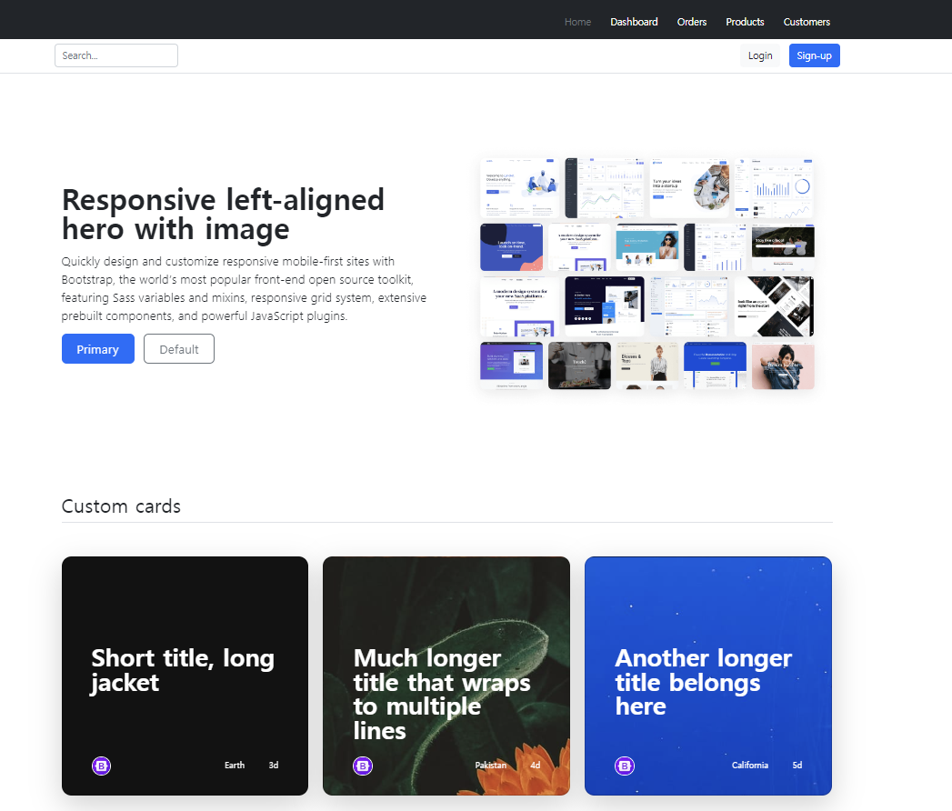
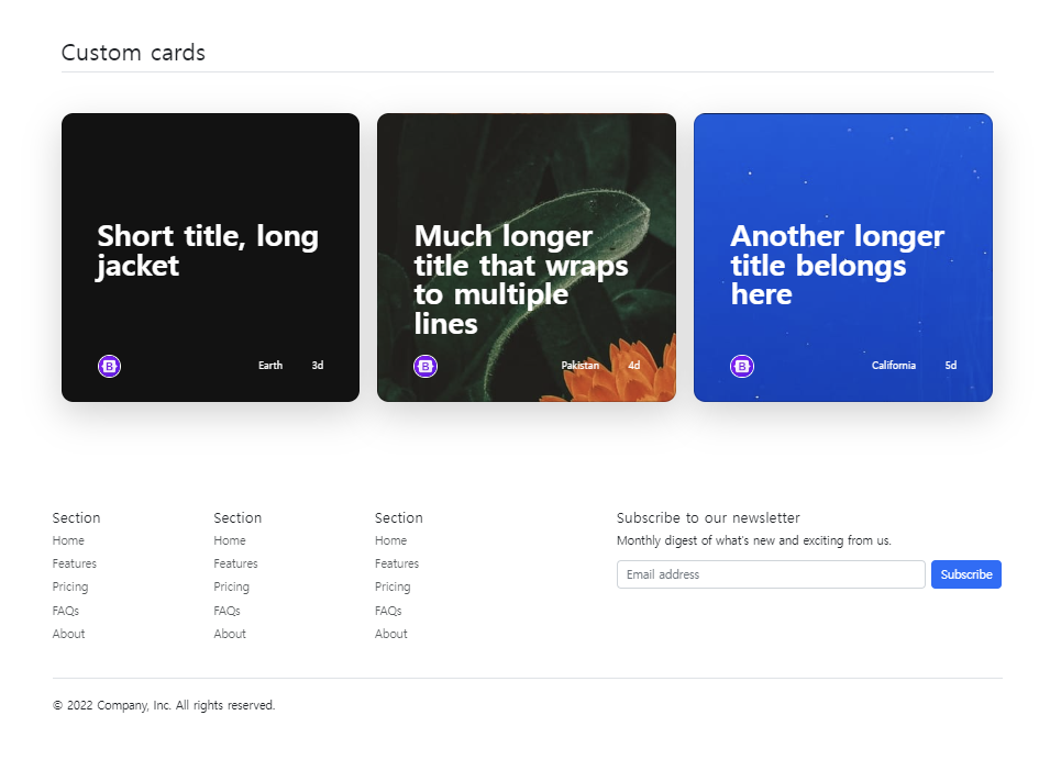
→ 그냥 필요한 기능들을 페이지 소스를 통해서 확인하고, 붙여넣음
→ 쉽게 페이지를 만들 수 있었음(완전 편리)
→ 다른 html 파일들은 그냥 bootstrap 사이트를 확인하면서 기능들을 파악하고 활용하는 것이 좋을 듯!
2. 학습한 내용 중 어려웠던 점 또는 해결못한 것들
1) 페이지 소스를 가져올 때, 헷갈리는 점들 또는 익숙하지 않는 기능들을 알아보는 것?
3. 해결방법 작성
1) 부트스트랩 사이트의 다양한 기능들을 활용해서 나만의 사이트 만들기(과제 연계)
4. 학습 소감
1) 쉽게 페이지를 만들 수 있도록 다양한 예시와 기능들을 확인할 수 있었고, 이러한 점들은 내가 신속하게 만들 필요가 있을 때 유용할 수 있겠다라는 생각을 하게 됨
2) 부트스트랩 뿐만 아니라 기본적으로 html에서 내가 스스로 작성할 수 있을 정도의 실력을 만들어보고 픔