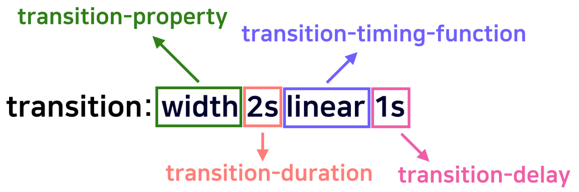
transition 이란
transition-property
transition-duration
transition-timing-function
transition-delay으로 이루어져 있다.
transition-property란?
property 란 속성 이라는 뜻이다. transition-property란 어떤 속성에 transition효과를 줄지 설정한다. 속성에는 all, none, property, initial, inherit 이 있다.
transition-property: all;기본값이며 모든 속성에 효과가 나타난다.transition-property: none;효과를 받지 못한다. (변환을 안하는 게 아니라, 서서히 변환하는 과정 없이 갑자기 뙇! 변하게 된다.)transition-property: width, height;효과를 적용하고 싶은 css 속성을 설정하면 지정된 속성에 transition 효과가 나타난다. 효과를 속성별로 개별적으로 주고싶을 때 쓰자.transition-property: initial;속성의 기본값으로 설정해주는 것입니다.transition-property: inherit;부모 요소의 속성값을 상속받습니다.
<!DOCTYPE html>
<html lang="ko">
<head>
    <meta charset="UTF-8">
    <meta http-equiv="X-UA-Compatible" content="IE=edge">
    <meta name="viewport" content="width=device-width, initial-scale=1.0">
    <title>transition_property</title>
    <style>
        body {
        margin: 40px 20px;
        }
        .box {
        width: 64px;
        height: 64px;
        margin: 10px 0px;
        background-color: skyblue;
        transition-duration: 2s;
        /* duration 은 트랜지션이 끝날 때까지 걸리는 진행 시간을 정합니다. 단위는 초(s) 또는 밀리초(ms) 를 사용합니다. */
        }

        input {
        float: right;
        position: fixed;
        top: 10px;
        right: 10px;
        zoom: 3;
        /* zoom은 체크박스 사이즈 조절 */
        }

        /* 체크박스를 활성화시켰을때 */
        input:checked ~ .box.a {
        width: 100%;
        border-radius: 20px;
        background-color: #ffcdd2;
        }

        input:checked ~ .box.b {
        width: 100%;
        background-color: #ffcdd2;
        }

        .a {
        transition-property: all;
        }
        /* all : 모든 속성에 적용합니다 */

        .b {
        transition-property: width, background-color;
        }

    </style>
</head>
<body>
    <input type="checkbox">
    <div class="box a"></div>
    <p> box 1</p>
    <div class="box b"></div>
    <p> box 2</p>
</body>
</html>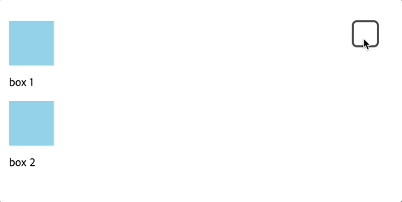
box 1에는 transition-property: all;을 적용하였다.
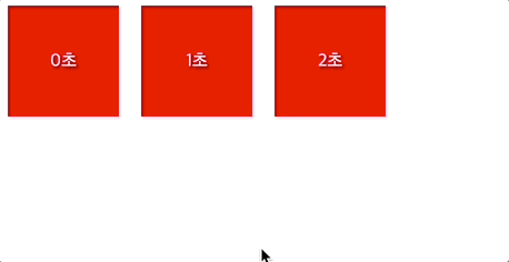
transition -delay
delay란?
transition이 일어날 때 얼마만큼 기다렸다가 실행할지 결정해주는 속성이다.- 초 단위를 나타내는
s나 밀리 초를 나타내는ms로 나타낸다.- 음수 값을 지정해준 경우에는 음수값의 절대값 시간만큼 지연되었다가 시작한다.
<!DOCTYPE html>
<html lang="ko">
<head>
    <meta charset="UTF-8">
    <meta http-equiv="X-UA-Compatible" content="IE=edge">
    <meta name="viewport" content="width=device-width, initial-scale=1.0">
    <title>delay</title>

    <style>
        /* body에 해준 flex는 박스들을 가로 정렬 해주려고 해준 것이고
            box에 해준 flex는 박스 안 글자를 중앙정렬 해주기 위해서 플렉스 해준 것이다. */
        body {
            display: flex;
        }
        .box {
            display: flex;
            justify-content: center;
            align-items: center;
            color: white;
            /* 박스크기 정의 */
            width: 100px;
            height: 100px;
            background: red;

            margin-right: 20px;
        }
        .a {
            transition-delay: 0s;
        }
        .b {
            transition-delay: 1s;
        }
        .c {
            transition-delay: 2s;
        }
        div:hover {
            background: blue;
        }
    </style>
</head>
<body>
    <div class="box a">0초</div>
    <div class="box b">1초</div>
    <div class="box c">2초</div>
</body>
</html>
결과
transition - timing - function 이란?
transition의 진행 속도를 설정할 수 있습니다
transition-timing-function: linear: 등속으로 움직입니다.
transition-timing-function: ease: 끝 지점에서 천천히, 그 외는 빠르게 움직입니다 (기본값)
transition-timing-function: ease-in: 느리게 시작된 후 빠름 흐름으로 끝납니다.
transition-timing-function: ease-out: 감속, 애니메이션이 빠르게 시작된 후 느리게 끝납니다.
transition-timing-function: ease-in-out:ease와 비슷하지만,그 변화 정도가ease의 경우처럼 급격하지는 않습니다.cubic-bezier(n, n, n, n)를 사용해 베지어 곡선에 원하는 컨트롤 포인트를 직접 넣어줄 수도 있습니다.cubic bezier 곡선이란 부드러운 곡선을 모델링 하기 위해 컴퓨터 그래픽에서 널리 쓰이는 것으로 4개의 컨트롤 포인트를 사용해transition의 시작과 끝까지의 효과를 제어합니다.
<!DOCTYPE html>
<html>
 <head>
   <title>transition-timing-function 설명</title>
 </head>
 <body>
   박스에 마우스를 올려 보세요.
   <div class="ease">ease</div>
   <div class="linear">linear</div>
   <div class="ease-in">ease-in</div>
   <div class="ease-out">ease-out</div>
   <div class="ease-in-out">ease-in-out</div>
   <div class="step-start">step-start</div>
   <div class="step-end">step-end</div>
 </body>
</html>
div {
background-color: coral;
color: white;
text-align: center;
width: 100px;
margin-bottom: 5px;
padding: 5px;
transition-duration: 1s;
}
.ease:hover {
width: 300px;
transition-timing-function: ease;
}
.linear:hover {
width: 300px;
transition-timing-function: linear;
}
.ease-in:hover {
width: 300px;
transition-timing-function: ease-in;
}
.ease-out:hover {
width: 300px;
transition-timing-function: ease-out;
}
.ease-in-out:hover {
width: 300px;
transition-timing-function: ease-in-out;
}
.step-start:hover {
width: 300px;
transition-timing-function: step-start;
}
.step-end:hover {
width: 300px;
transition-timing-function: step-end;
}결과
transition - duration이란?
duration은
transition이 일어나는 지속시간을 설정해 줄 수 있습니다. 위에서delay만 사용하였을 경우에는 지연시간 후에CSS속성값이 갑자기 확 변해 애니메이션과 같은 효과를 가져올 수 없었습니다.- 초 단위를 나타내는
s나 밀리 초를 나타내는ms로서 나타냅니다. 지정해 주지 않을 시에는0s를 의미하며transition의 효과가 나타나지 않습니다.
.first{
        transition-delay: 0s;
    }
    .second{
        transition-delay: 1s;
    }
    .third{
        transition-delay: 2s;
    }
    div:hover{
        background: blue;
    }
얼레벌레 돌아가는 Frontend Developer