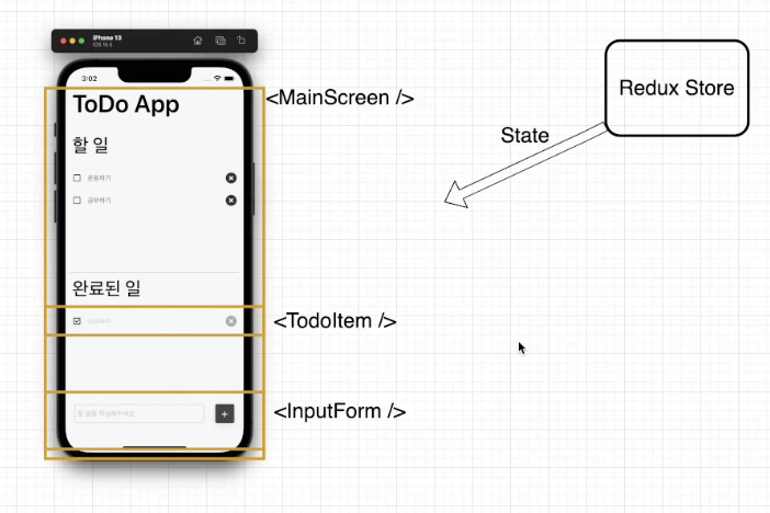
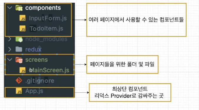
1. Todo App 구조 생성
리액트 스니펫 확장프로그램
ES7+ React/Redux/React-Native snippets
https://marketplace.visualstudio.com/items?itemName=dsznajder.es7-react-js-snippets
을 설치하면
함수형 component 을 만들 때, rafce 단축키를 치면 리액트 기본코드가 생성된다.
리액트 네이티브 기본 코드를 생성하려면 rnfes 치기
사용하면 도움이 되는 확장프로그램
- code spell checker : 스펠링 잘못 작성하면 표시해줌
- community material theme : 테마
- Tabnine AI Autocomplete for Javascript, Python, Typescript, PHP, Go, Java, Ruby & more : 어떤것을 작성할지 예측해서 알려줌
- ESLint : 문법 잘못한거 표시
2. Core Components를 이용한 UI 작성하기
SafeAreaView 컴포넌트
장치의 안전 영역 경계 내에서 콘텐츠를 렌더링함. iOS 11이상에서 적용됌
StatusBar 컴포넌트
앱의 상태 표시줄을 제어할 때 사용
https://reactnative.dev/docs/statusbar
3. 스타일링
inline styles
<Text style={{ marginBottom: 35 }} />StyleSheet 객체
<Text style={styles.pageTitle} />

const styles = StyleSheet.create({
	pageTitle: {
    	marginBottom: 35,
    }
})
스타일시트 코드를 추천함!
1. 스타일링 코드가 분리되서 가독성이 좋음
2. 스타일시트를 사용하면 이미 정해놓은 스타일을 캐시하므로 다시 렌더링할 때 인라인 스타일보다 성능이 좋아짐
OS로 분기처리
paddingTop: Platform.OS === "android" ? 20 : 0,안드로이드일 때 상단 패딩에 20을 주는데,
ios는 이미 safeAreaView 컴포넌트로 처리했기 때문에 이부분은 필요가 없다
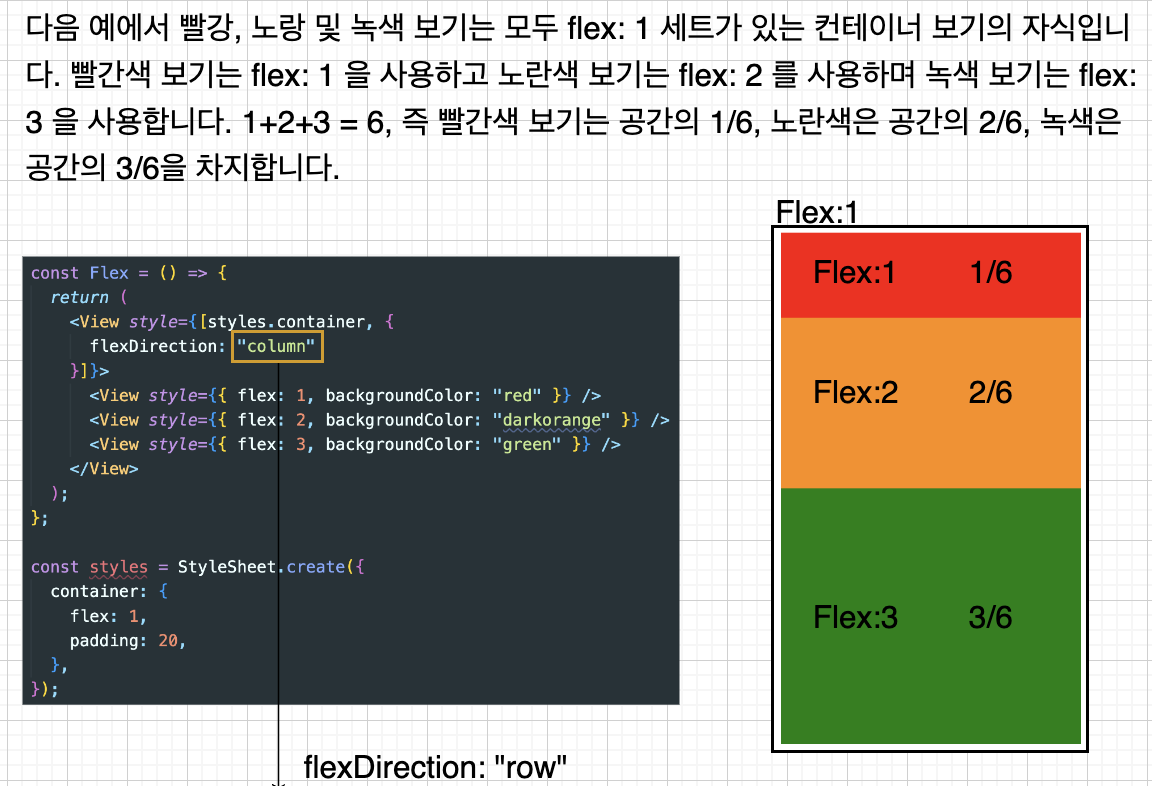
4. Flexbox
layout을 만들 때 주로 사용한다
부모 요소에 flex 1을 줘서 화면 전체를 채우고
자식 요소에 각각 flex 숫자를 달리해서 화면의 비중을 정함
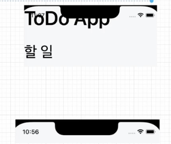
5. stylesheet로 코드 작성하기
전체 코드
import { Platform, SafeAreaView, StyleSheet, Text, View } from "react-native";
import React from "react";
import { StatusBar } from "expo-status-bar";

const MainScreen = () => {
  return (
    <SafeAreaView style={styles.container}>
      <StatusBar barStyle={"default"} />
      <Text style={styles.pageTitle}>ToDo App</Text>
      <View style={styles.listView}>
        <Text style={styles.listTitle}>할 일</Text>
      </View>
      <View style={styles.separator} />
      <View style={styles.listView}>
        <Text style={styles.listTitle}>완료된 일</Text>
      </View>
    </SafeAreaView>
  );
};

export default MainScreen;

const styles = StyleSheet.create({
  container: {
    flex: 1,
    paddingTop: Platform.OS === "android" ? 20 : 0,
    backgroundColor: "#f7f8fa",
  },
  pageTitle: {
    marginBottom: 35,
    paddingHorizontal: 15,
    fontSize: 54,
    fontWeight: "600",
  },
  separator: {
    marginHorizontal: 10,
    marginTop: 25,
    marginBottom: 10,
    borderBottomWidth: 1,
    borderBottomColor: "rgba(0,0,0,0.2)",
  },
  listView: {
    flex: 1,
  },
  listTitle: {
    marginBottom: 25,
    paddingHorizontal: 15,
    fontSize: 41,
    fontWeight: "500",
  },
  emptyListText: {
    paddingTop: 10,
    paddingBottom: 15,
    paddingHorizontal: 15,
    fontSize: 15,
    lineHeight: 20,
    color: "#737373",
  },
});
5. input 스타일링
KeyboardAvoidingView
공식문서 링크
밑에 입력칸 같은거 넣을 때, 버튼 있을 때
키보드가 올라와도 가려지지 않게 감싸주는 컴포넌트
padding : 뷰 하단에 패딩 설정
height : 뷰의 높이 자체를 변경
position : 뷰의 위치 설정
 <KeyboardAvoidingView
      behavior={Platform.OS === 'ios' ? 'padding' : 'height'}
      style={styles.container} />
Pressable
공식문서 링크
누르는 행동을 감지할 수 있는 요소
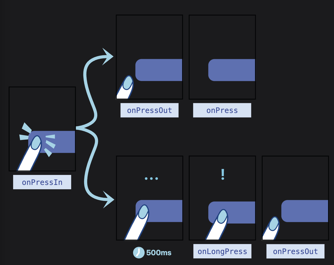
눌렀을 때 > onpressin
떼면 > onpressout > 그 후에 onpress 상태
오래 누르면 > onlongpress > 떼면 onpressout
스타일링하기
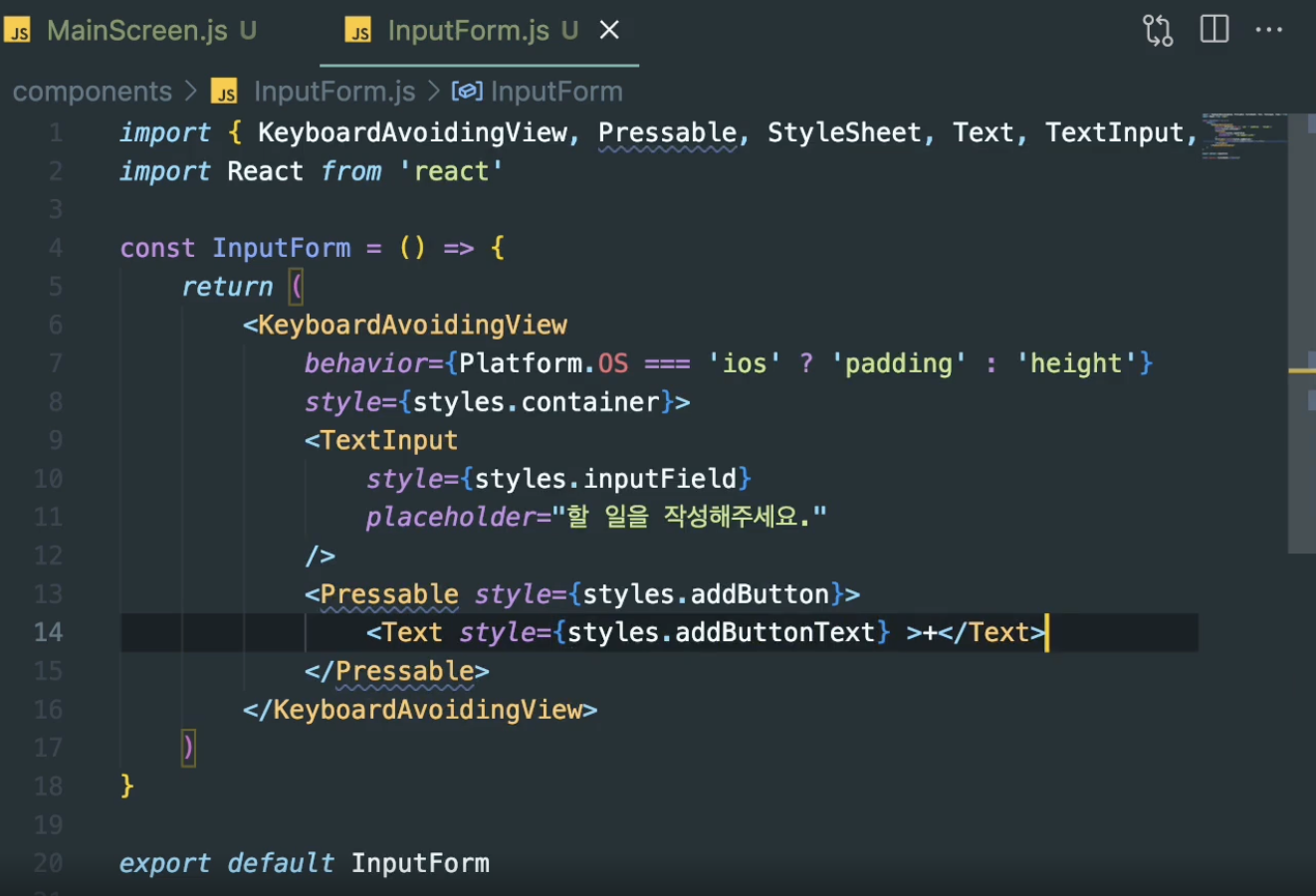
inputform 컴포넌트
import {
  KeyboardAvoidingView,
  Pressable,
  StyleSheet,
  Text,
  TextInput,
} from "react-native";
import React from "react";

const InputForm = () => {
  return (
    <KeyboardAvoidingView
      behavior={Platform.OS === "ios" ? "padding" : "height"}
      style={styles.addFormcontainer}
    >
      <TextInput style={styles.inputField} placeholder="할 일을 작성해주세요" />
      <Pressable style={styles.addButton}>
        <Text style={styles.addButtonText}>+</Text>
      </Pressable>
    </KeyboardAvoidingView>
  );
};

export default InputForm;

const styles = StyleSheet.create({
  addFormcontainer: {
    flexDirection: "row",
    marginTop: "auto",
    marginBottom: 30,
    paddingHorizontal: 20,
    backgroundColor: "#f7f8fa",
  },
  inputField: {
    flex: 1,
    height: 42,
    borderRadius: 4,
    padding: 5,
    marginRight: 25,
    borderWidth: 1,
    borderColor: "rgba(0,0,0,0.2)",
    color: "#000000",
    fontSize: 15,
    textAlignVertical: "center",
  },
  addButton: {
    justifyContent: "center",
    alignItems: "center",
    width: 42,
    height: 42,
    borderRadius: 4,
    backgroundColor: "rgba(0,0,0,0.7)",
    shadowColor: "#000000",
    shadowOpacity: 0.14,
    shadowRadius: 8,
    shadowOffset: {
      width: 0,
      height: 4,
    },
  },
  addButtonText: {
    color: "white",
    fontSize: 25,
  },
});
6. Todo items 생성하기
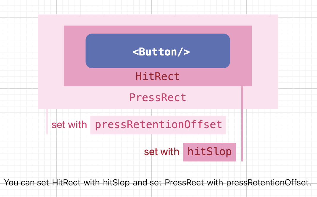
버튼으로 정해진 그 부분만 눌러서 활성화를 시키는게 아니고
hitRect라고 버튼 주변의 요소를 설정해주면
그부분을 눌러도 버튼 누른 것이 적용됌!
리액트 네이티브 디버거 열기
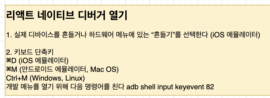
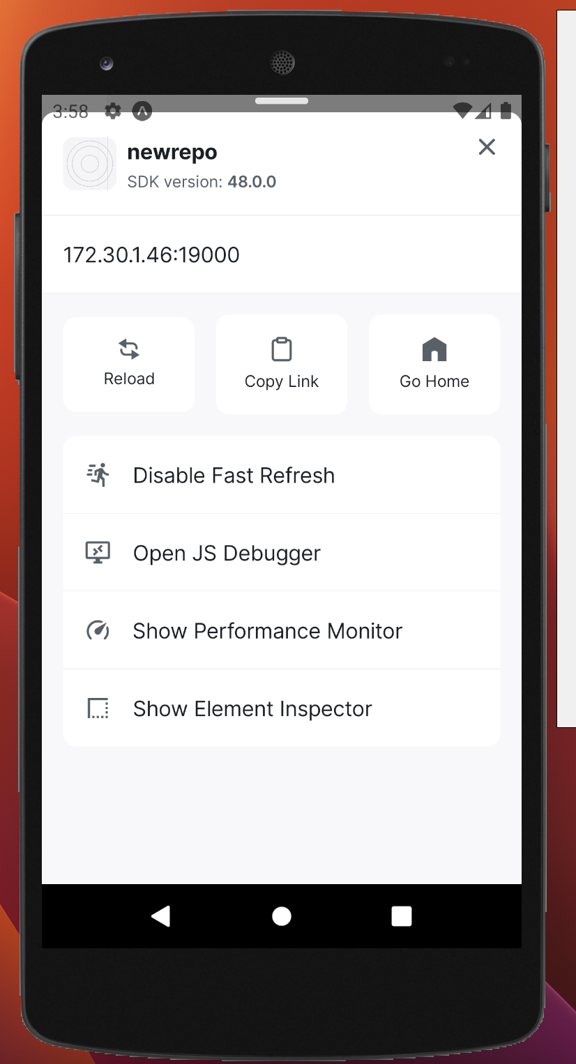
맨 마지막 show 어쩌구 클릭
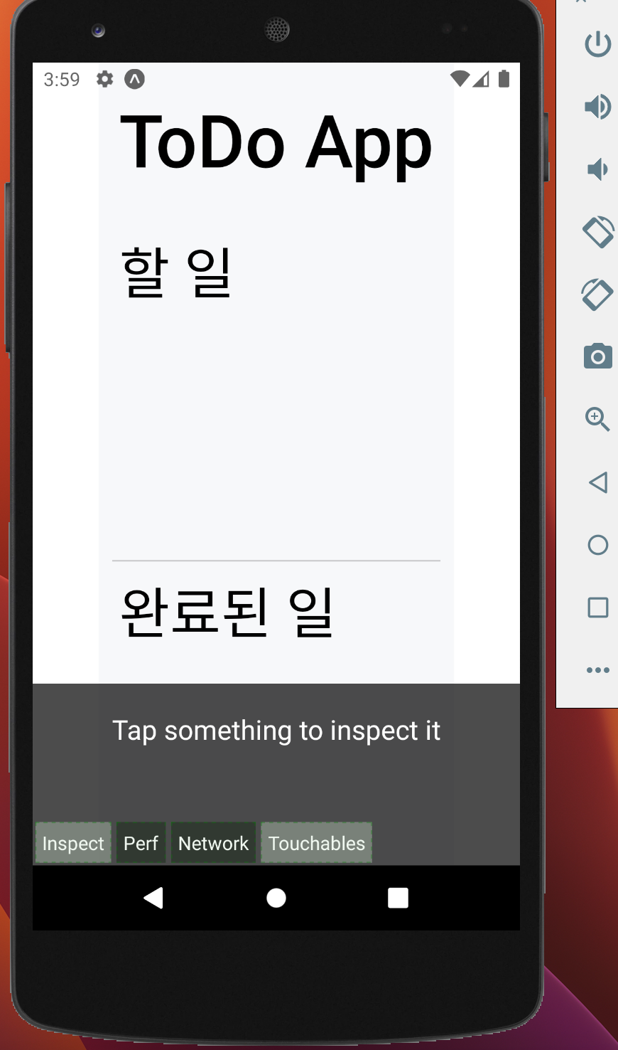
터쳐블드 클릭하면 터치 영역을 볼 수 있음
SVG 사용하기
라이브러리 설치
리액트 네이티브에서 svg를 사용하려면 아래 두 라이브러리를 다운받아야 함
https://www.npmjs.com/package/react-native-svg
https://www.npmjs.com/package/react-native-svg-transformer
- react-native-svg : svg요소나 속성들을 리액트 네이티브에서 사용할 수 있게 해줌
- react-native-svg-transformer : svg파일을 import해서 사용받을 수 있게 해줌
단 react-native-svg는 expo는 공식문서를 보면 다른 명령어를 치라고 나와있다.
아래처럼 쳐야한다! expo는!!
npx expo install react-native-svg
npm i react-native-svg-transformer
위 명령어를 이용해서 설치해준다
metro.config.js 파일 생성하기
이것도 expo와 cli 사용자의 내용이 다르다
https://www.npmjs.com/package/react-native-svg-transformer
여기서 확인하고 만드는게 좋음
expo 기준으로,
metro.config.js 파일을 만들고 아래 코드를 작성한다
const { getDefaultConfig } = require("expo/metro-config");

module.exports = (() => {
  const config = getDefaultConfig(__dirname);

  const { transformer, resolver } = config;

  config.transformer = {
    ...transformer,
    babelTransformerPath: require.resolve("react-native-svg-transformer"),
  };
  config.resolver = {
    ...resolver,
    assetExts: resolver.assetExts.filter((ext) => ext !== "svg"),
    sourceExts: [...resolver.sourceExts, "svg"],
  };

  return config;
})();
에러가 생겼을 때
Invariant Violation: requireNativeComponent: "RNSVGSvgViewAndroid" was not found in the UIManager.
나같은 경우 이런 에러가 생기고 빌드가 안됐다.
react-native-svg가 제대로 연결되지 않아 발생하는 문제라고 한다
npx expo install react-native-svg
이 명령어로 깔면 해결된다.
SVG 다운받기
https://www.svgrepo.com/
위 사이트 추천함
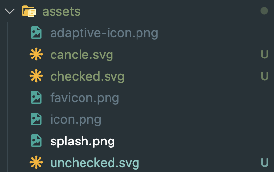
x버튼과 체크박스 버튼, 체크된 상태 버튼 세개 다운받기
asset 폴더에 다운받은 파일을 넣어준다
SVG파일을 임포트했는데 너무 클 경우
<svg width="24px" height="24px"svg파일에 직접 들어가서 width랑 height값을 적정 크기로 입력해준다.
TodoItem.js 전체 코드
메인페이지 할일 밑에 todoitem 임포트하고 적기
import { Pressable, StyleSheet, Text, View } from "react-native";
import React from "react";
import UncheckedIcon from "../assets/unchecked.svg";
import CheckedIcon from "../assets/checked.svg";
import CancleIcon from "../assets/cancle.svg";

const TodoItem = () => {
  return (
    <View style={styles.itemContainer}>
      <Pressable style={styles.itemCheckbox} hitSlop={10}>
        <UncheckedIcon />
        <CheckedIcon style={styles.itemCheckboxCheckedIcon} />
      </Pressable>
      <Text style={[styles.itemText, styles.itemTextChecked]}>코딩하기</Text>
      <Pressable
        style={[styles.deleteButton, styles.deleteButtonDone]}
        hitSlop={10}
      >
        <CancleIcon />
      </Pressable>
    </View>
  );
};

export default TodoItem;

const styles = StyleSheet.create({
  itemContainer: {
    flexDirection: "row",
    alignItems: "center",
    paddingTop: 10,
    paddingBottom: 15,
    paddingHorizontal: 15,
    backgroundColor: "#f7f8fa",
  },
  itemCheckbox: {
    justifyContent: "center",
    alignItems: "center",
    width: 20,
    height: 20,
    borderRadius: 6,
    marginRight: 13,
  },
  itemCheckboxCheckedIcon: {
    shadowColor: "#000000",
    shadowOpacity: 0.14,
    shadowRadius: 8,
    shadowOffset: {
      width: 0,
      height: 4,
    },
  },
  deleteText: {
    marginRight: "auto",
    paddingRight: 25,
    fontSize: 15,
    lineHeight: 20,
    color: "#737373",
  },
  itemTextChecked: {
    opacity: 0.3,
    textDecorationLine: "line-through",
  },
  deleteButton: {
    opacity: 0.8,
  },
  deleteButtonDone: {
    opacity: 0.3,
  },
});