05. forecast(시계열 분석)
1. 배경 및 설치
- fbprophet
- install
- 윈도우 유저는 Visual C++ Build Tool을 먼저 설치해주세요
- https://go.microsoft.com/fwlink/?LinkId=691126
- conda install pandas-datareader
- conda install -c conda-forge fbprophet
- pip install fbprophet
y=asin(2πft+t0)+b
- 위의 공식을 파이썬으로 구현한 코드
import matplotlib.pyplot as plt
import numpy as np
%matplotlib inline

def plotSinWave(amp, freq, endTime, sampleTime, startTime, bias):
    """
    plot sine wave
    y = a sin(2 pi f t + t_0) + b
    """
    time = np.arange(startTime, endTime, sampleTime)
    result = amp * np.sin(2 * np.pi * freq * time + startTime) + bias

    plt.figure(figsize=(12, 6))
    plt.plot(time, result)
    plt.grid(True)
    plt.xlabel("time")
    plt.ylabel("sin")
    plt.title(str(amp) + "*sin(2*pi" + str(freq) + "*t+" + str(startTime) + ")+" + str(bias))
    plt.show()

    plotSinWave(2, 1, 10, 0.01, 0.5, 0)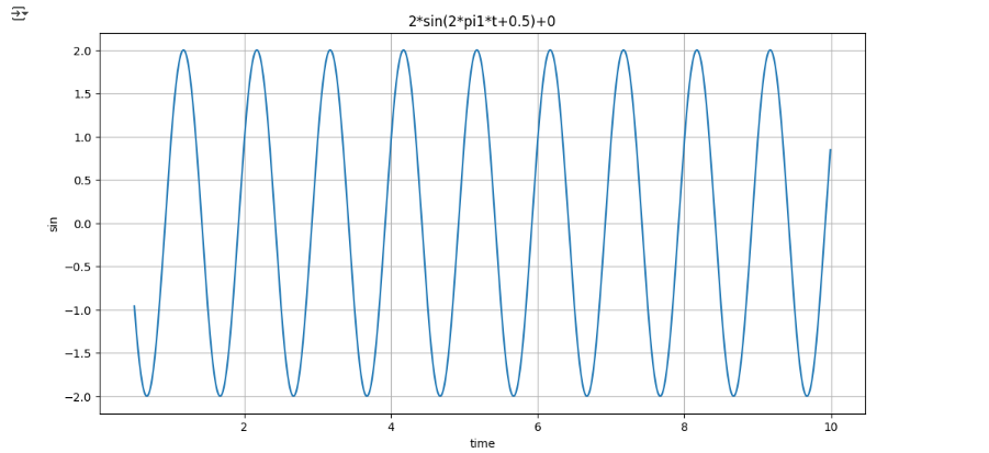
- 디폴트값을 지정하여 원하는 값만 입력하면 나머지 값은 디폴트값으로 자동입력
def plotSinWave(**kwargs):
    """
    plot sine wave
    y = a sin(2 pi f t + t_0) + b
    """
    endTime = kwargs.get("endTime", 1)
    sampleTime = kwargs.get("sampleTime", 0.01)
    amp = kwargs.get("amp", 1)
    freq = kwargs.get("freq", 1)
    startTime = kwargs.get("startTime", 0)
    bias = kwargs.get("bias", 0)
    figsize = kwargs.get("figsize", (12, 6))

    time = np.arange(startTime, endTime, sampleTime)
    result = amp * np.sin(2 * np.pi * freq * time + startTime) + bias

    plt.figure(figsize=(12, 6))
    plt.plot(time, result)
    plt.grid(True)
    plt.xlabel("time")
    plt.ylabel("sin")
    plt.title(str(amp) + "*sin(2*pi" + str(freq) + "*t+" + str(startTime) + ")+" + str(bias))
plt.show()plotSinWave()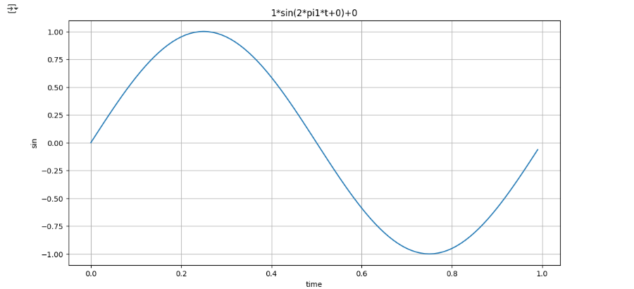
plotSinWave(amp=2, freq=0.5, endTime=10)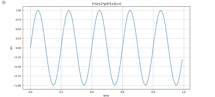
- 위 코드를 함수화 (drawSinWave.py)
%%writefile ./drawSinWave.py

import numpy as np
import matplotlib.pyplot as plt

def plotSinWave(**kwargs):
    """
    plot sine wave
    y = a sin(2 pi f t + t_0) + b
    """
    endTime = kwargs.get("endTime", 1)
    sampleTime = kwargs.get("sampleTime", 0.01)
    amp = kwargs.get("amp", 1)
    freq = kwargs.get("freq", 1)
    startTime = kwargs.get("startTime", 0)
    bias = kwargs.get("bias", 0)
    figsize = kwargs.get("figsize", (12, 6))

    time = np.arange(startTime, endTime, sampleTime)
    result = amp * np.sin(2 * np.pi * freq * time + startTime) + bias

    plt.figure(figsize=(12, 6))
    plt.plot(time, result)
    plt.grid(True)
    plt.xlabel("time")
    plt.ylabel("sin")
    plt.title(str(amp) + "*sin(2*pi" + str(freq) + "*t+" + str(startTime) + ")+" + str(bias))
    plt.show()

if __name__ == "__main__":
    print("hello world~!!")
    print("this is test graph!!")
    plotSinWave(amp=1, endTime=2)
import drawSinWave as dSdS.plotSinWave()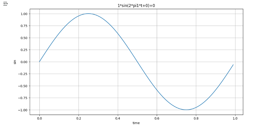
dS.plotSinWave(freq=5)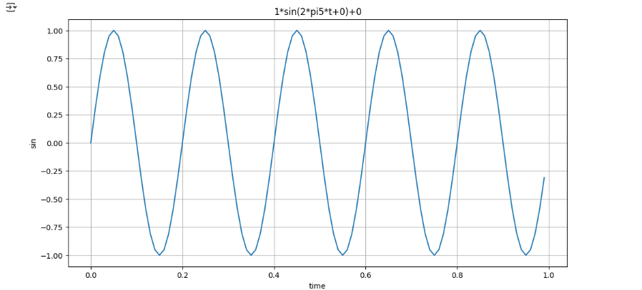
2. Fbprophet 기초
import pandas as pd
import numpy as np
import matplotlib.pyplot as plt
%matplotlib inline- 1
time = np.linspace(0, 1, 365*2)
result = np.sin(2*np.pi*12*time)
ds = pd.date_range("2018-01-01", periods=365*2, freq="D")
df = pd.DataFrame({"ds": ds, "y": result})
df.head()
df["y"].plot(figsize=(10, 6));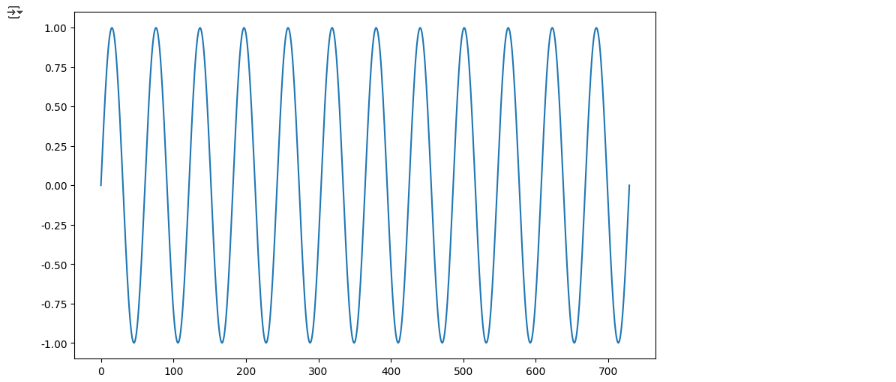
from prophet import Prophet

m = Prophet(yearly_seasonality=True, daily_seasonality=True)
m.fit(df);
future = m.make_future_dataframe(periods=30)
forecast = m.predict(future)
m.plot(forecast);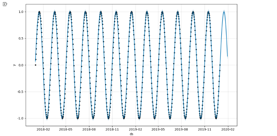
- 2
time = np.linspace(0, 1, 365*2)
result = np.sin(2*np.pi*12*time) + time
ds = pd.date_range("2018-01-01", periods=365*2, freq="D")
df = pd.DataFrame({"ds": ds, "y": result})
df["y"].plot(figsize=(10, 6));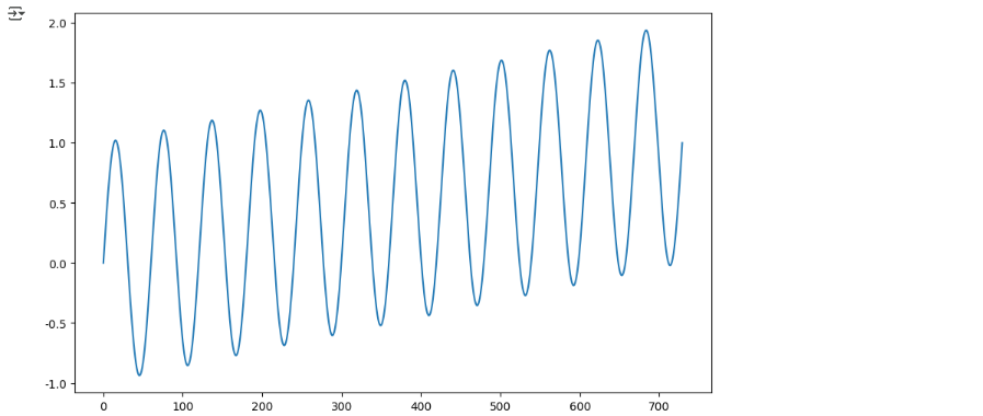
m = Prophet(yearly_seasonality=True, daily_seasonality=True)
m.fit(df)
future = m.make_future_dataframe(periods=30)
forecast = m.predict(future)

m.plot(forecast);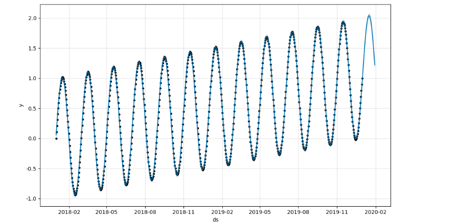
- 3
time = np.linspace(0, 1, 365*2)
result = np.sin(2*np.pi*12*time) + time + np.random.randn(365*2)/4
ds = pd.date_range("2018-01-01", periods=365*2, freq="D")
df = pd.DataFrame({"ds": ds, "y": result})
df["y"].plot(figsize=(10, 6));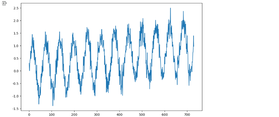
m = Prophet(yearly_seasonality=True, daily_seasonality=True)
m.fit(df)
future = m.make_future_dataframe(periods=30)
forecast = m.predict(future)
m.plot(forecast);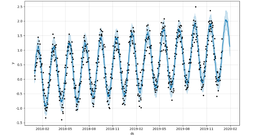
import pandas as pd
import pandas_datareader as web
import numpy as np
import matplotlib.pyplot as plt

from prophet import Prophet
from datetime import datetime

%matplotlib inline
pinkwink_web = pd.read_csv("./05_PinkWink_Web_Traffic.csv",
encoding="utf-8",
thousands=",",
names=["date", "hit"],
index_col=0)
pinkwink_web = pinkwink_web[pinkwink_web["hit"].notnull()]
pinkwink_web.head()
from google.colab import drive
drive.mount('/content/drive')

# 전체 데이터 그려보기
pinkwink_web["hit"].plot(figsize=(12, 4), grid=True);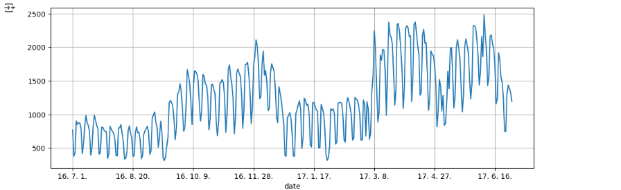
# trend 분석을 시각화하기 위한 x축 값을 만들기
time = np.arange(0, len(pinkwink_web))
traffic = pinkwink_web["hit"].values
fx = np.linspace(0, time[-1], 1000)
# 에러를 계산할 함수
def error(f, x, y):
return np.sqrt(np.mean((f(x) - y) ** 2))fp1 = np.polyfit(time, traffic, 1)
f1 = np.poly1d(fp1)
f2p = np.polyfit(time, traffic, 2)
f2 = np.poly1d(f2p)
f3p = np.polyfit(time, traffic, 3)
f3 = np.poly1d(f3p)
f15p = np.polyfit(time, traffic, 15)
f15 = np.poly1d(f15p)print(error(f1, time, traffic))
print(error(f2, time, traffic))
print(error(f3, time, traffic))
print(error(f15, time, traffic))
plt.figure(figsize=(12, 4))
plt.scatter(time, traffic, s=10)
plt.plot(fx, f1(fx), lw=4, label='f1')
plt.plot(fx, f2(fx), lw=4, label='f2')
plt.plot(fx, f3(fx), lw=4, label='f3')
plt.plot(fx, f15(fx), lw=4, label='f15')

plt.grid(True, linestyle="-", color="0.75")
plt.legend(loc=2)
plt.show()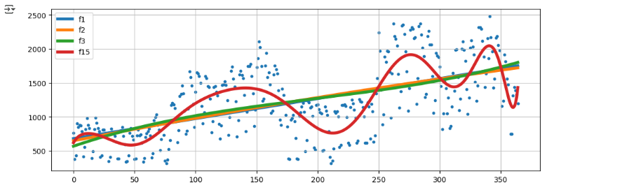
df = pd.DataFrame({"ds": pinkwink_web.index, "y": pinkwink_web["hit"]})
df.reset_index(inplace=True)
df["ds"] = pd.to_datetime(df["ds"], format="%y. %m. %d.")
del df["date"]
df.head()
m = Prophet(yearly_seasonality=True, daily_seasonality=True)
m.fit(df);

# 60일에 해당하는 데이터 예측
future = m.make_future_dataframe(periods=60)
future.tail()
# 예측 결과는 상한/하한의 범위를 포함해서 얻어진다
forecast = m.predict(future)
forecast[["ds", "yhat", "yhat_lower", "yhat_upper"]].tail()
m.plot(forecast);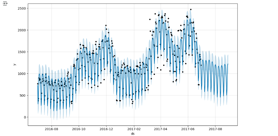
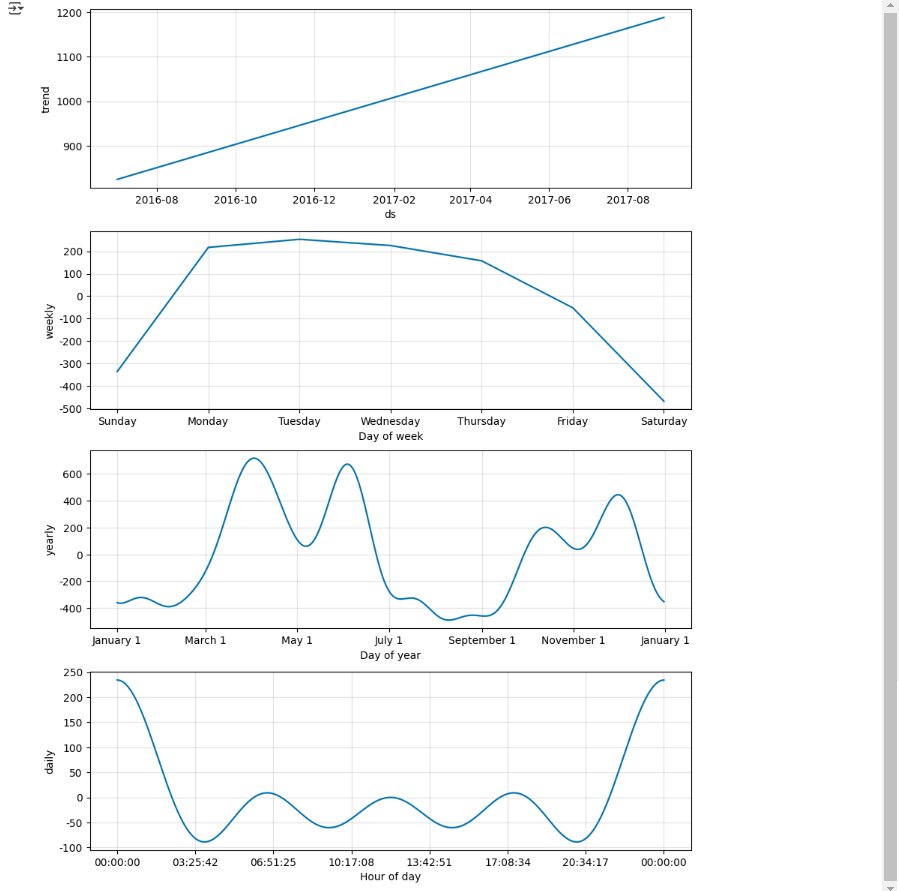
m.plot_components(forecast);