타이타닉 생존자 예측
잭은 정말 살 수 없었나?
Data 불러오기
- 캐글 & PinkWink github
- 컬럼의 의미 파악
- pcalss:객실등급 /survived:생존유무 /sibsp:형제or부부의 수 /parch:부모or자녀의 수 /fare:지불요금 /boat:탈출 보트번호
데이터 탐색적 분석_EDA
#생존상황(생존율과 실제 생존수)
f,ax = plt.subplots(1,2, figsize=(16,8))

titanic['survived'].value_counts().plot.pie(ax=ax[0], autopct='%1.1f%%', shadow=True, explode=[0,0.05])
ax[0].set_title('Pie plot - survived')
ax[0].set_ylabel('')    #null처리

sns.countplot(x='survived', data=titanic, ax=ax[1])
ax[1].set_title('Count plot - survived')
plt.show()

#성별에 따른 생존현황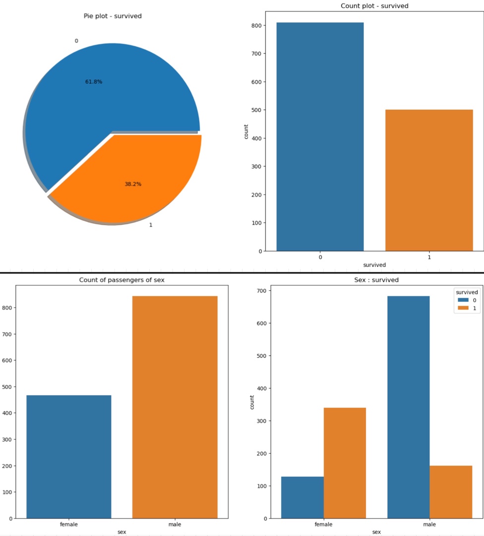
- 0사망 1생존-> 38.2% 생존율
- 탑승객은 남성이 여성보다 2배가 많지만 생존자는 생존여성 1/2정도
=> 남성의 생존 가능성이 더 낮음
# 경제력 대비 생존률(선실등급에 따른 생존율)
pd.crosstab(titanic['pclass'], titanic['survived'], margins=True)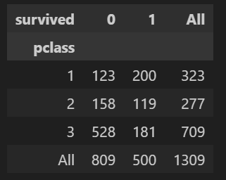
- 1등급 선실에서의 생존율이 높음
# 1등급 선실에는 여성이 많았나?
grid = sns.FacetGrid(titanic, row='pclass', col='sex', height=4, aspect=2)
grid.map(plt.hist, 'age', alpha=0.8, bins=20)
grid.add_legend;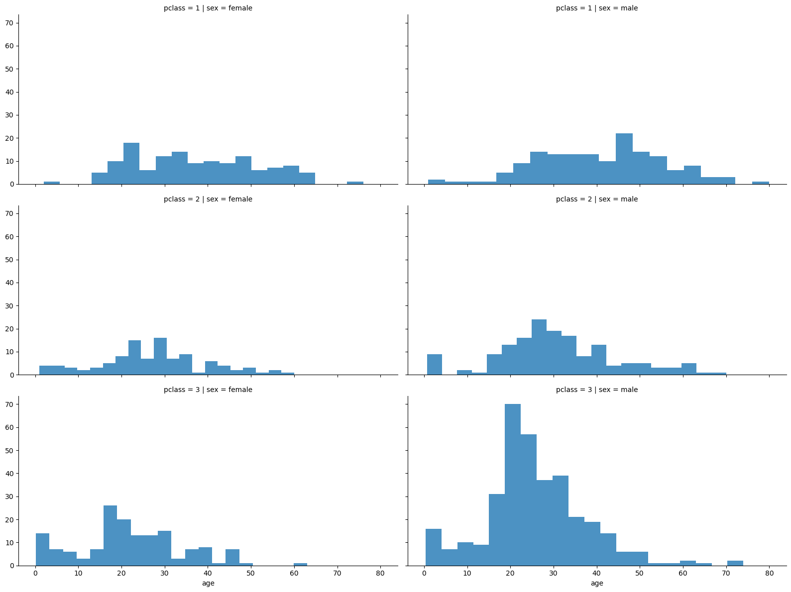
- 3등실에는 남성이 많았다 (특히 20대 남성)
pip install plotly_express
import plotly.express as px
- 마우스로 드래그하면 데이터를 바로바로 보여줌
# 나이별 생존률
fig = px.histogram(titanic, x='age')
fig.show()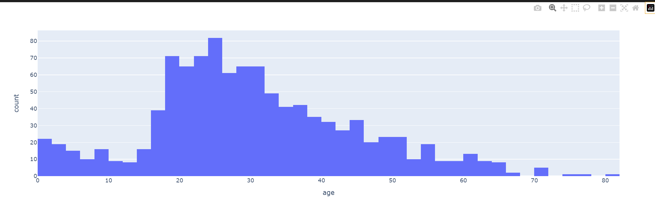
# 나이를 5단계 구간정하기
titanic['age_cat']=pd.cut(titanic['age'], bins=[0,7,15,30,60,100],
                            include_lowest=True,
                            labels=['baby','teen','young','adult','old'])

plt.figure(figsize=(12,4))
plt.subplot(131)
sns.barplot(x='pclass',y='survived', data=titanic)
plt.subplot(132)
sns.barplot(x='age_cat',y='survived', data=titanic)
plt.subplot(133)
sns.barplot(x='sex',y='survived', data=titanic)
plt.show() 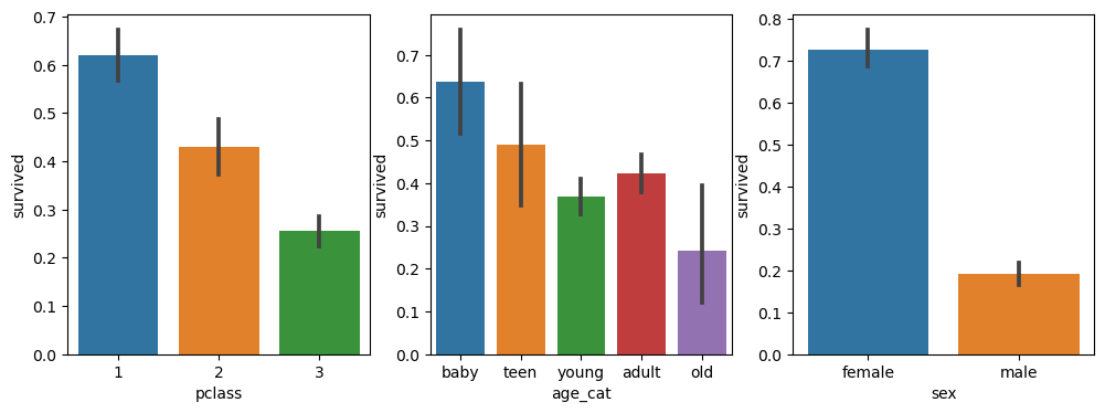
- 1 pclass, baby, 여성이 생존율이 높다는 것을 알 수 있음
# 성별을 나눠 나이별 생존/사망
fig, axes = plt.subplots(nrows=1, ncols=2, figsize=(14,6))
women= titanic[titanic['sex']=='female']
men= titanic[titanic['sex']=='male']

ax = sns.histplot(women[women['survived']==1]['age'], bins=20, label='survived', ax=axes[0], kde=False)       #kde=False밀도함수 제거
ax = sns.histplot(women[women['survived']==0]['age'], bins=40, label='not survived', ax=axes[0], kde=False)   #bins를 더 잘게 쪼갬으로써 상대적 비교
ax.legend(); ax.set_title('Female')

ax = sns.histplot(men[men['survived']==1]['age'], bins=18, label='survived', ax=axes[1], kde=False)       #kde=False밀도함수 제거
ax = sns.histplot(men[men['survived']==0]['age'], bins=40, label='not survived', ax=axes[1], kde=False)   #bins를 더 잘게 쪼갬으로써 상대적 비교
ax.legend(); ax.set_title('Male')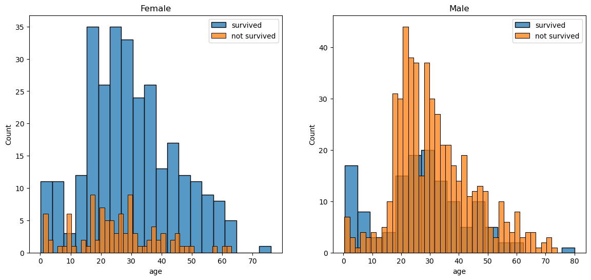
# 탑승객 이름으로 사회적 신분
import re
title = []
for idx, dataset in titanic.iterrows():
    tmp = dataset['name']
    title.append(re.search('\,\s\w+(\s\w+)?\.', tmp).group()[2:-1])
titanic['title'] = title
... 중간과정 몇몇 생략...
# 귀족 구분
Rare_f = ['Dona','Lady','the Countess']
Rare_m = ['Capt','Col','Don','Dr','Jonkheer', 'Major', 'Master', 'Rev', 'Sir']
for each in Rare_f:                              #Rare_m동일하게
    titanic['title'] = titanic['title'].replace(each, 'Rare_f')

titanic[['title','survived']].groupby(['title'], as_index=False).mean()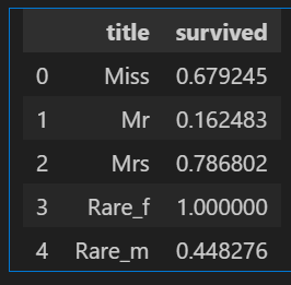
- 귀족 남성이더라도 여성들보다 생존율이 높은것은 아님을 알 수 있음
머신러닝 돌리기 전 준비
- 문자를 숫자로 바꾸기
# 성별을 숫자로 바꾸기
from sklearn.preprocessing import LabelEncoder

le = LabelEncoder()
le.fit(titanic['sex'])
le.classes_             #array(['female', 'male']

titanic['gender'] =le.transform(titanic['sex'])


# fit과 transform 동시:   le.fit_transform(df['sex'])

# 다시 문자로 역변: le.inverse_transform(titanic['gender'])- 결측치 처리 -> notnull() 이용하여 모두 제거함
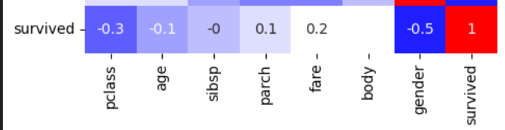
- 상관관계 파악 -> corr()후 heatmap
DecisionTreeClassifier 활용
#데이터 나누기
from sklearn.model_selection import train_test_split

X = titanic[['pclass', 'age', 'sibsp', 'parch', 'fare', 'gender']]
y = titanic['survived']

X_train,X_test,y_train,y_test = train_test_split(X,y, test_size=0.2, random_state=13)

# 결정나무 알고리즘
from sklearn.tree import DecisionTreeClassifier

dt= DecisionTreeClassifier(max_depth=4, random_state=13)
dt.fit(X_train,y_train)

# 성능확인
from sklearn.metrics import accuracy_score

pred = dt.predict(X_test)
print(accuracy_score(y_test, pred))  # 0.7655
detail하게 - 특정 데이터 선정
import numpy as np

one_man = np.array([[3, 18, 0, 0, 5, 1]])
print('Jack : ', dt.predict_proba(one_man))
print('Jack : ', dt.predict_proba(one_man)[0,1])
Jack : [[0.83271375 0.16728625]] - 사망/생존
Jack : 0.16728624535315986 - 생존율
∴ 즉 Jack(잭)은 데이터상으로 예측하면 16%의 생존율을 가지고 있다

Hello